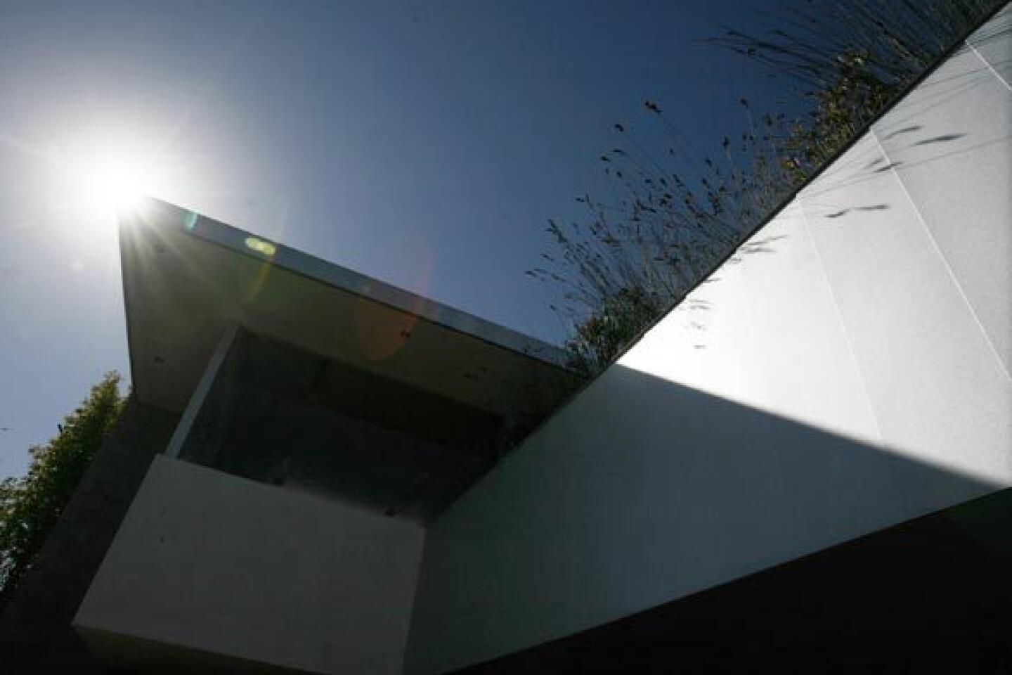
In Santa Monica, architect Jesse Bornstein builds a split-level home for modern living.
CONSIDER ALL the potential architectural solutions for modern living, and the split-level house hardly seems an obvious candidate -- not to the average person who summons the image of some postwar dwelling that appears half-sunken in quicksand, its tiny basement windows barely poking aboveground, the front door opening to dual sets of stairs and the immediate puzzle: Do I go up? Or do I go down?
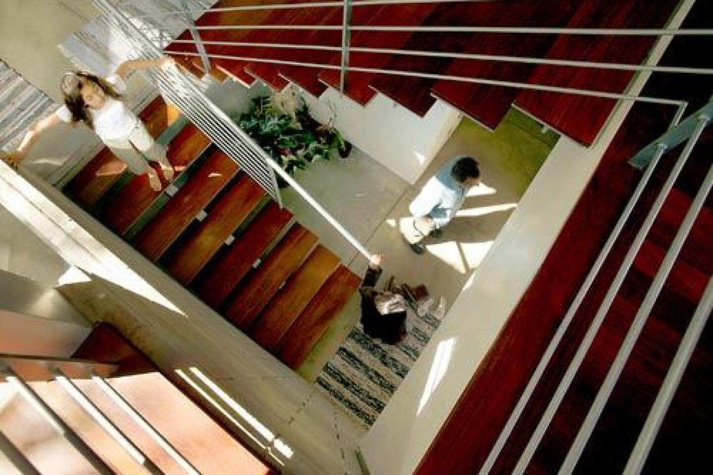
There is no such confusion in the Santa Monica home of Jesse Bornstein. Rather than a traditional two-story house, the architectŌĆÖs ŌĆ£split-planeŌĆØ design calls for half-flights of stairs to separate three levels: the main living and dining areas, the childrenŌĆÖs bedrooms and family room, and the master suite and sitting room. The open stairwell serves as the houseŌĆÖs spine, cleverly keeping the interiors free-flowing yet divided into distinct rooms.
The result embodies what so many people seek: more living space without the McMansion effect; light-filled rooms that feel connected to the outdoors yet still private; and a modern look that comes off as neither cold nor industrial. And all on a tight, sloping lot.
ŌĆ£ItŌĆÖs breaking down the box and breaking preconceived notions of what a house should be like,ŌĆØ Bornstein says. ŌĆ£It really obscures the conventional notion of floor plates stacked one on top of another.ŌĆØ
The house is a case study for anyone coping with the challenges of urban living. HereŌĆÖs a look at five common design dilemmas and how this one house addresses them all:
1 Walk into enough modern houses these days and youŌĆÖll probably come upon the open-floor plan taken to an extreme: a vast, wall-less space that feels more like a convention hall than a home. Try to relax with a good book in the study, and you canŌĆÖt escape the din of ŌĆ£CSIŌĆØ at the other end of the house. Host a simple dinner party and you find thereŌĆÖs no hiding clutter when living, dining and sleeping areas flow together in a door-less layout.
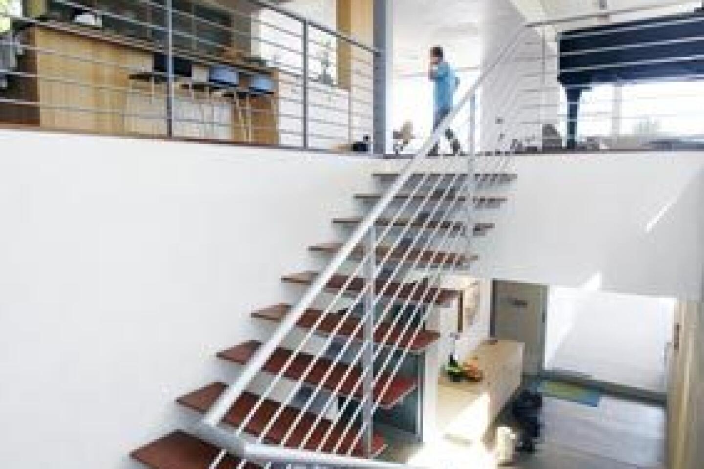
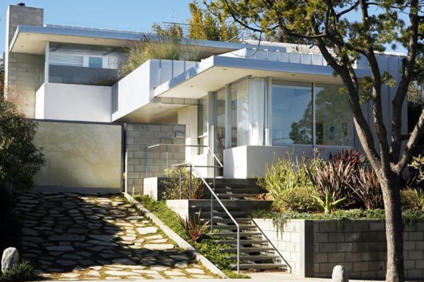
BornsteinŌĆÖs split-plane design solves those dilemmas. Center stringer stairs -- steps with a single support beam underneath and no riser, for a more open look -- guide visitors into the homeŌĆÖs entry and up through its core. ŌĆ£ThereŌĆÖs the same sort of formula and language going on,ŌĆØ Bornstein says, adding that using the same style of stairs from the sidewalk to the top floor makes traveling through the entire property an orderly and logical procession.
The ground floor consists of two kidsŌĆÖ bedrooms and a family room, all set in the back half of the property. Climb half a flight of stairs to the front half of the house, and you find the heart of the home: the kitchen, dining area and living room. Climb another half-flight of stairs, back toward the rear of the house, and you come upon a quiet sitting room, a small meditation area and the master suite.
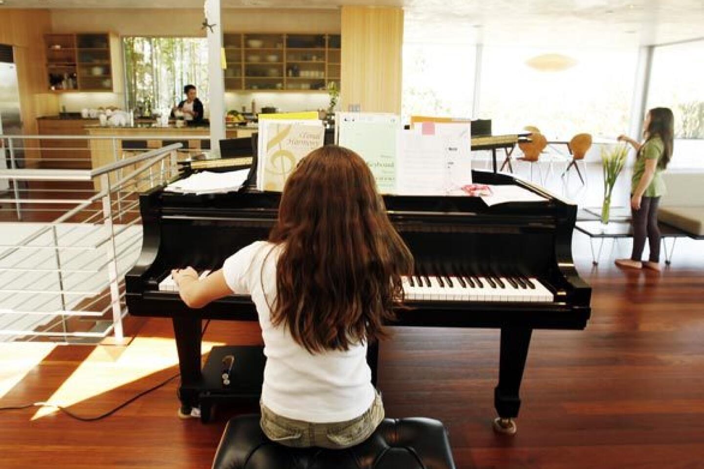
The result is a layout where stairs play the psychological role of walls, separating spaces yet allowing natural light, air and people to flow freely. Standing in the kitchen, Bornstein can monitor the kids as they play in the family room downstairs yet still feel as though heŌĆÖs in a different domain. Walk toward the master suite and a narrowing staircase provides a clue that youŌĆÖre transitioning from public to private space.
When Bornstein and wife Shaun want more division, pocket doors slide out to partition virtually every room in the house. If company comes over, for example, the couple can close off the ground floor and lead guests up to the main living and dining areas without worrying if the family room is tidy. Bornstein says the partitions are open 90% of the time, but in the rare instances when they are closed, white translucent glass allows natural light to pass through.
ŌĆ£The kids love this multilevel thing as much as the adults do, perhaps more,ŌĆØ says Bornstein, who took the split-plane idea even further: Above the bathroom sandwiched between two bedrooms for daughters Olivia, 9, and Kalia, 11, he created a bonus play area that the girls can reach from ladders in either bedroom. ŌĆ£We have our sitting room above the kitchen,ŌĆØ Bornstein says, ŌĆ£and they have their loft space as well.ŌĆØ
2 Walk through BornsteinŌĆÖs house for the first time, and the biggest surprise is just how much room unfolds before your eyes. Given the structureŌĆÖs modest presence from the street, you donŌĆÖt expect 4,655 square feet of living space on the 8,000-square-foot lot, an illusion helped by shed roofs that follow the grade of the land, helping the house to feel naturally scaled to the site.
The multiple levels are a large factor in the feeling of spaciousness, but smaller gestures contribute as well. The sitting room on the top floor could have been enclosed in drywall or left totally open as a mezzanine overlooking the kitchen. Instead, Bornstein chose a happy medium: a large pass-through lets natural light and fresh air into the space. Stand up and you can see the kids having breakfast at the counter below; sit down and youŌĆÖre ensconced in a quiet, cozy reading nook.
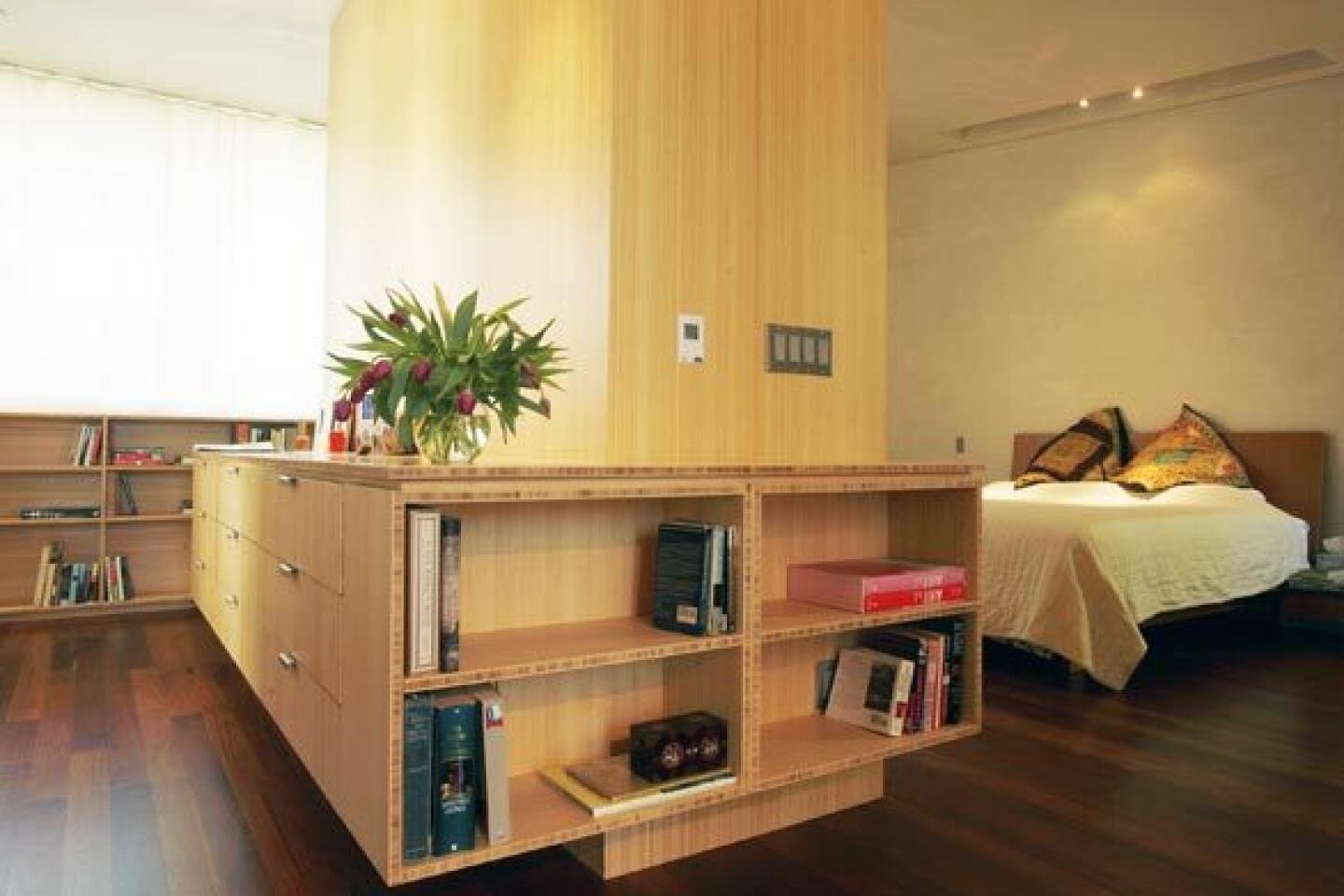
So many built-in cabinets and shelves have been placed unobtrusively at every level of the house, youŌĆÖll actually witness that California rarity: unused storage.
ŌĆ£ItŌĆÖs a luxury to have this space,ŌĆØ says Shaun Bornstein, a former aerospace engineer who manages her husbandŌĆÖs architectural practice. She motions to bamboo bookcases, some still empty, lining the top-floor sitting room. ŌĆ£I feel like I can breathe.ŌĆØ
Space also was a factor for Resa and Tom Nikol, who commissioned Bornstein to double the size of their 1950s Mar Vista home. The result, they say, is a distinctly modern yet livable space for them and their kids, 9 and 12.
ŌĆ£The outside is subtle but architecturally beautiful,ŌĆØ says Tom, creative director for the print advertising group at Sony Pictures Television, who wanted the house to sing, not scream. ŌĆ£ItŌĆÖs not overbuilt in terms of its presence from the street.ŌĆØ
3 Glass walls and titanic sliding doors are tempting, but some homeowners discover all too late that a wide view isnŌĆÖt necessarily a good view. When the daily panorama is a power-line-filled sky, the neighbor brushing his teeth or the stares of passing motorists, all that glass quickly becomes a curse.
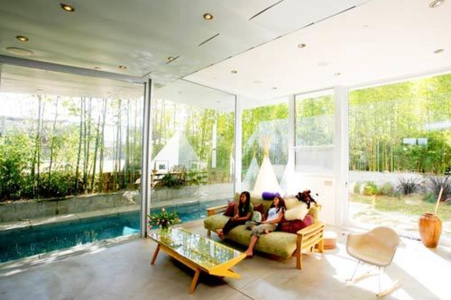
The trick, of course, is controlling the view: connecting to the landscape without feeling overly exposed to the outside world. In the BornsteinsŌĆÖ house, every room connects to nature -- from the glassed-in family room looking out to a ring of timber bamboo, to the master bathroom, where tops of those towering Bambusa oldhamii sway in the windows.
ŌĆ£YouŌĆÖre not looking at anything except the green out there,ŌĆØ Bornstein says from the bathroom. ŌĆ£In the morning, during certain times of year especially, you get the morning light coming in -- that sunrise -- and it sets the whole thing aglow.ŌĆØ
In the main living area, window glass is flush with the ceiling and the roof outside runs flat. ŌĆ£ThereŌĆÖs this horizontal plane effect, which to my way of thinking extends the eye into the landscape,ŌĆØ Bornstein says. ŌĆ£Your eye is drawn out further because thereŌĆÖs no header.ŌĆØ
In contrast, the architect gently sloped the ceiling down on another side of the room, so the whole space feels more intimate. Bornstein uses the terms ŌĆ£containmentŌĆØ and ŌĆ£inversionŌĆØ to describe the design, but the average person will simply feel the effect: the expansiveness of the view opening in the distance, and the pleasant feeling of being wrapped -- sheltered from the noise and eyes of the outside world and beyond.
4 It may be a sore point for some purists, who groan at the contention that some modern homes come off as overly cold, perhaps even corporate.
ŌĆ£During home tours, thatŌĆÖs the one thing people comment on the most,ŌĆØ Shaun says. ŌĆ£They say, ŌĆśFor a modern home, itŌĆÖs very warm.ŌĆÖ ŌĆØ
The first factor at play is the palette of materials. Sustainably harvested machiche, a red-tinged South African wood thatŌĆÖs twice as hard as oak, runs up the stair treads, through the main living space and across the second-floor sun deck.
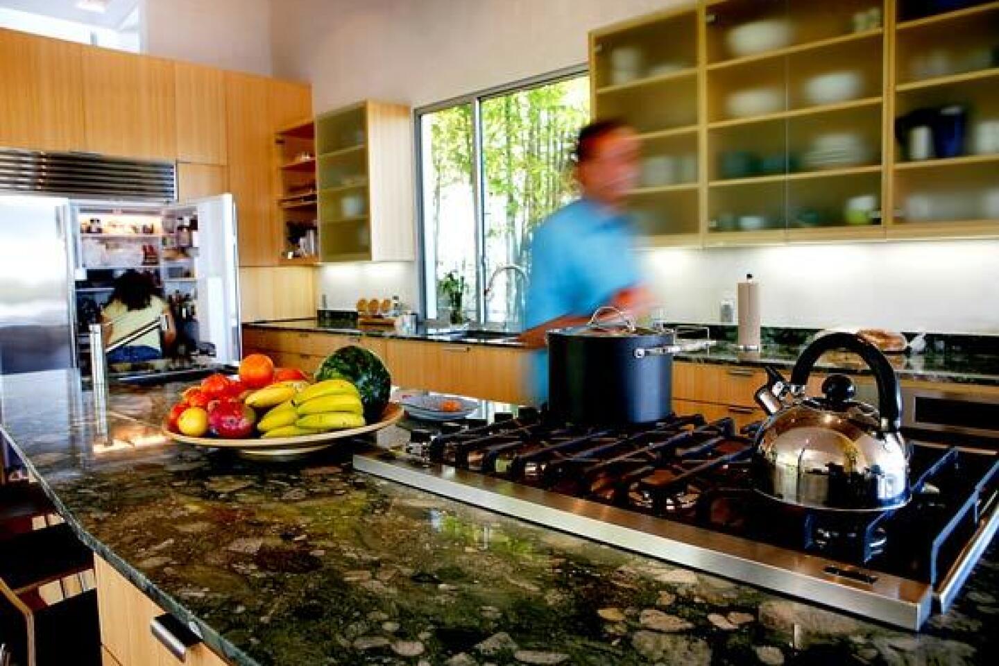
All the case work, including kitchen cabinetry, bedroom built-ins and bathroom vanities, were constructed of amber-hued Plyboo, or bamboo plywood. The consistent approach, Bornstein says, helps the space to feel like a unified design.
All walls are white, but with a subtle sheen and texture. Light and shadow change hour to hour, room to room.
ŌĆ£This is the poor manŌĆÖs Venetian plaster,ŌĆØ Bornstein says, running his fingers over the Diamond finish that has been troweled onto blue board, similar to standard drywall. The trowel marks give the material depth and warmth -- ŌĆ£a craft quality,ŌĆØ he says.
Linearity -- the way the stairs, roof lines, even floorboards run in the same direction, like the grain in a piece of wood -- lend a sense of synchronization, as though the pieces were always meant to fit together.
Whereas some architects equate decoration with visual distraction, Shaun says their abundant framed photos and other personal effects are essential elements, bringing more meaning to the design.
ŌĆ£Those paintings and photographs are done by family members,ŌĆØ she says, pointing out a portrait by JesseŌĆÖs father, a fine artist trained in France who started designing buildings as a means of supporting his family. ŌĆ£I feel like when you surround yourself with your loved ones -- thatŌĆÖs energy.ŌĆØ
5 The home office is a paradox: how to make it a convenient place to work yet keep it as separate as possible from the rest of the house?
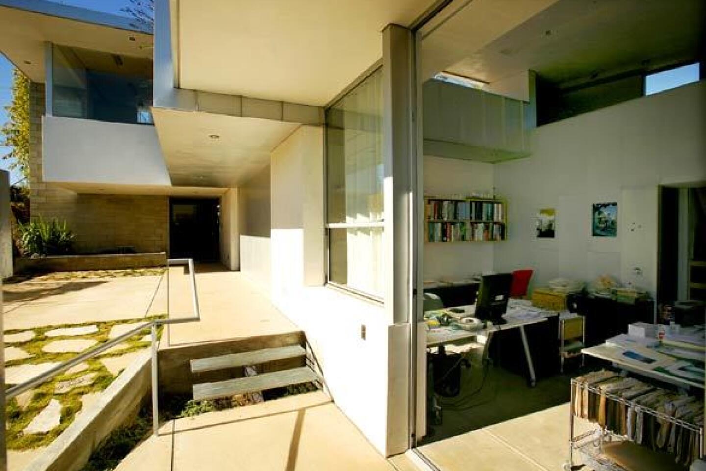
For Bornstein, like a growing number of homeowners, the answer is a separate entrance. The office sits on the ground floor overlooking the street, separated from the main living areas by the garage and reached through its own exterior door.
ŌĆ£ThereŌĆÖs a greater degree of separation,ŌĆØ says Bornstein, who must walk out of the house for the 20-step commute to the office. ŌĆ£You feel like youŌĆÖre going to work.ŌĆØ
And you feel like youŌĆÖre leaving work when the day is over. Twenty steps and youŌĆÖre back near those machiche-lined stairs, ushered back into the comfort of home.
More to Read
Sign up for The Wild
WeŌĆÖll help you find the best places to hike, bike and run, as well as the perfect silent spots for meditation and yoga.
You may occasionally receive promotional content from the Los Angeles Times.
