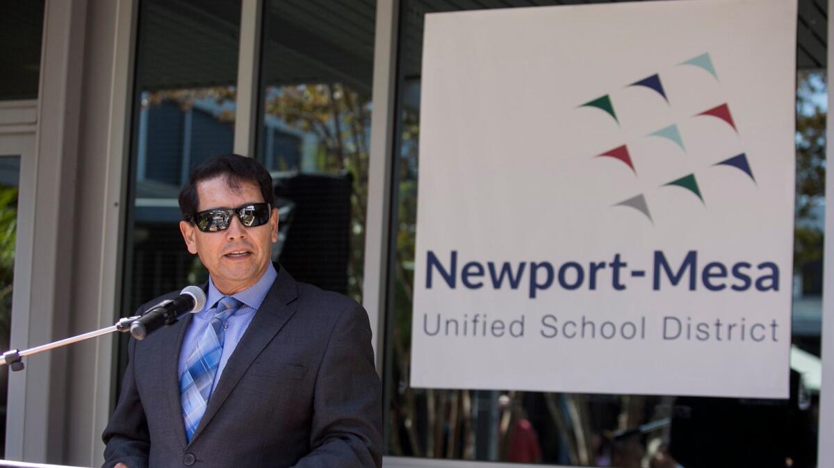
Column: Newport-Mesa logo is unclear, uninspiring, unnecessary

- Share via
There have been some memorably bad logos.
The incomprehensible and mercilessly lampooned zig-zag-shaped logo of the 2012 London Olympics comes to mind. Some other logos have turned into public relations disasters when viewers saw unintentionally pornographic images in them. Best leave those to the imagination.
With such historical failures in mind, I’d like to address Newport-Mesa Unified School District’s recent unveiling – tah-dah! – of its new logo, a collection of nine, multi-colored triangular shapes shooting in an upward direction.
The new design is being rolled out as part of Newport-Mesa’s 50th anniversary celebration, and the shapes are meant to represent the district’s nine zones.
“It’s contemporary and forward thinking,” board President Karen Yelsey told the Daily Pilot when the new logo was revealed. “To me we’re moving forward and moving up like birds flying in the sky.”
I beg to differ.
So, apparently, did three of the seven school board trustees who voted against the new logo. As Trustee Martha Fluor, who cast one of the dissenting votes, put it: “I’m all in favor of the logo being changed, but we shouldn’t have to explain what it means. Is it birds? A boomerang? I don’t know.”
Or, as one of my sons commented after his first look at the district’s new logo, “I’m pretty sure I’ll forget it by tomorrow.”
Ouch. That’s pretty much the opposite of what a logo is meant to achieve.
Is Newport-Mesa’s new logo a complete flop? I wouldn’t go that far.
But is it unclear, uninspiring and unnecessary? Absolutely.
For those who can’t remember Newport-Mesa’s old logo – or didn’t realize that the district even had one in the first place – I’ll give you a little refresher. The outgoing emblem features an oval containing a sailboat and an outline of two people holding hands. It’s no Nike swoosh, but it’s quaint and harmless, as far as logos go.
For those who question why a school district needs a logo at all, some logo aficionados would likely point to a long and storied tradition of using representative symbols that dates back thousands of years. Ancient Egyptians and Greeks stamped everything from pottery to metalwork with markings identifying their makers and often denoting a certain quality.
During medieval times, nobles proudly displayed symbolic coats of arms and craftsmen’s products were labeled with identifying marks. By the start of the 20th century, what we would recognize as logo designs incorporated symbols associated with quality and with well-recognized images relating to nautical, agricultural, or other themes.
Many observers date the advent of the modern age of logo design to the 1950s and 1960s, when successful logos became seen as a key part of corporate marketing strategies. Today logos are considered pretty much indispensable, even for public entities like school districts. While often appearing simple in design, the best ones are carefully crafted to create a memorable brand identity targeted to a specific market.
Marketing experts tell us that the successes of companies such as Apple, McDonald’s and Starbucks have in large measure been due to their clever marketing campaigns, and that their logos are critical elements of those plans.
Even non-corporate logos are often seen as highly effective branding mechanisms. Consider, for instance, the I❤️NY campaign, or the Red Cross’ simple and highly recognizable logo.
Newport-Mesa said it spent $8,000 on its new logo, which was developed with the help of a Los Angeles design firm. No other costs will be associated with implementing the logo, it said, and the design will only be put into use as the district undergoes its normal replacement process for printed materials, signage and other items.
So not a lot of money was spent on this. That’s a relief, although it’s hard to support any expenditure that doesn’t directly contribute to better education.
Even so, wouldn’t it have been far better to enlist the talents of students, many of whom would undoubtedly be eager to work on the new logo project? The board could have authorized a districtwide contest or asked for submissions from art and design classes.
Not only would a student initiative have saved a few bucks, but it would have given the community a far better reason to buy into the design change in the first place. I’ll bet the kids would have come up with something a little more compelling than a vague collection of projectiles.
There are many difficult issues in education these days, and Newport-Mesa has its own particular set of challenges. In recent months, board meetings have been bombarded by distraught parents and teachers agitating to replace the problem-plagued Swun Math curriculum and momentum is gaining for a drive to impose term limits on school board trustees.
Amid such controversies, an exercise in rebranding seems like a bit of a misfire. It’s not a huge mistake, and it likely won’t further stoke the anger of parents who are hoping for greater openness and responsiveness of the part of the administration and board.
But those shooting arrows in the new logo – or whatever the heck those pointy things are meant to represent – might be seen as just another distracting stunt that will land like a dud on the district’s doorstep.
PATRICE APODACA is a former Newport-Mesa public school parent and former Los Angeles Times staff writer. She lives in Newport Beach.
All the latest on Orange County from Orange County.
Get our free TimesOC newsletter.
You may occasionally receive promotional content from the Daily Pilot.


