Is it an Olympic logo? Or a coquettish scamp?
- Share via
As if there wasn’t enough to argue about in the world today, the new logo for the 2024 Summer Olympics in Paris has sparked a voluble and often hilarious debate.
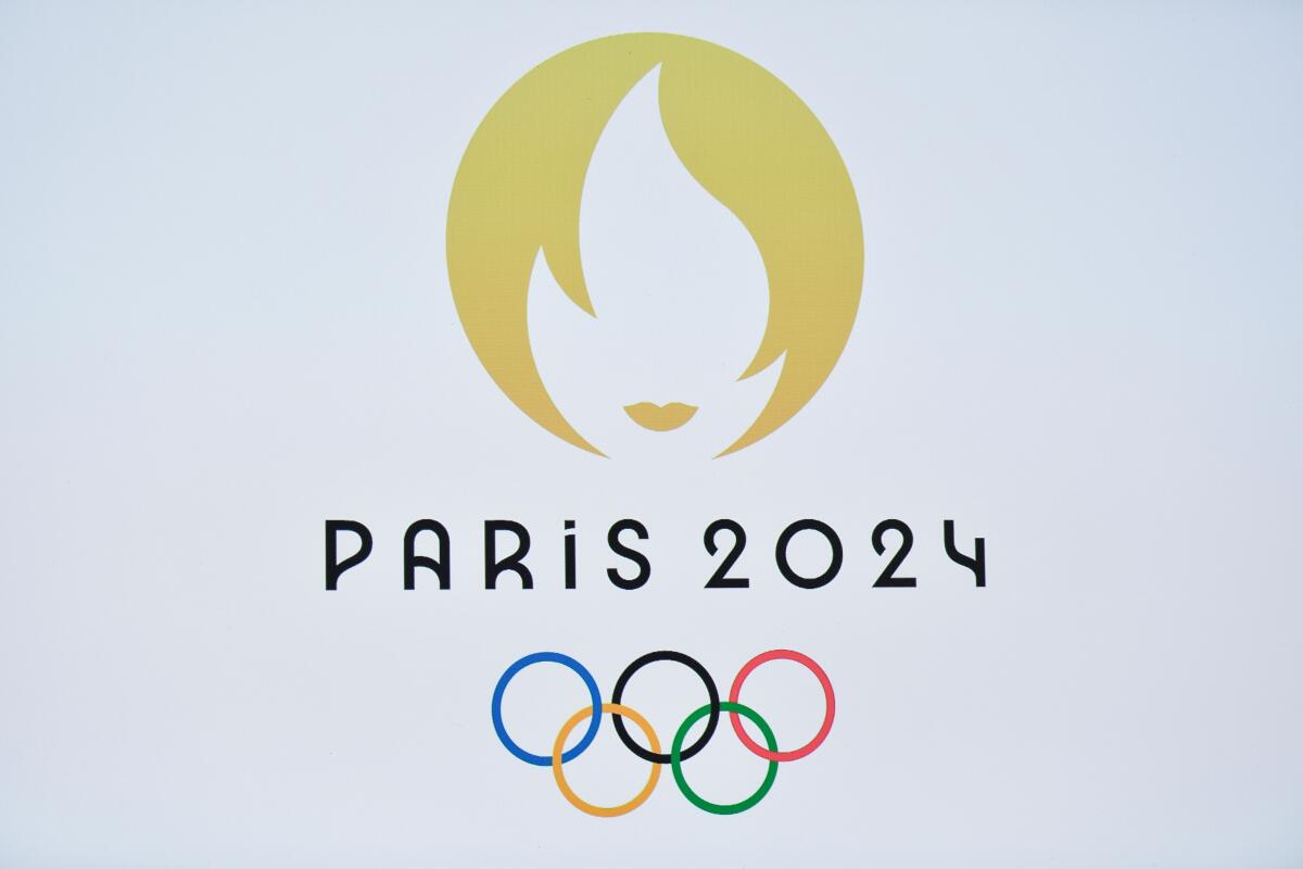
The Art Deco-inspired design combines three images: a gold medal, the Olympic flame and a pair of lips meant to evoke Marianne, the French national icon.
At least that’s what Paris 2024 organizers say.
Since the logo’s debut earlier this week, interpretations on social media have veered in markedly different directions. Some say the design reminds them of the logo for the dating app Tinder. Others liken it to an advertisement for a beauty salon.
Twitter has given rise to a running thread about the supposed, and extravagant, life of the logo.
“The French Olympic logo tumbles out of bed on a Parisian morning,” one tweet states. “She tousles her messy bob, dons Breton stripes and ballet flats and whisks down the stairs from her fifth-floor apartment to grab a baguette before enigmatically texting two men who are pursuing her romantically.”
Says another: “Leonard Cohen’s third album is entirely about a train journey he had from Paris to Brussels sitting across the aisle from the French Olympic logo. They never spoke.”
For what it’s worth, organizers have published the results of a quick survey. They say it shows 83% of French people approve of the design.
More to Read
Go beyond the scoreboard
Get the latest on L.A.'s teams in the daily Sports Report newsletter.
You may occasionally receive promotional content from the Los Angeles Times.

