Commentary: CaliforniaŌĆÖs ugly license plate doesnŌĆÖt reflect our great state
On a family road trip this summer across several western states, my kids kept track of the license plates we saw in a quest to find one from each state. They spotted chili peppers on New Mexico plates, sandstone arches on UtahŌĆÖs and the silhouette of the Rocky Mountains on ColoradoŌĆÖs.
It started off as a way to cope with the great American tradition of backseat boredom. But the imagery wound up spurring conversations about national icons. Why is there an orange on the Florida plate? WhatŌĆÖs that mountain on the South Dakota plate? Hey, look at that cool cactus they have in Arizona.
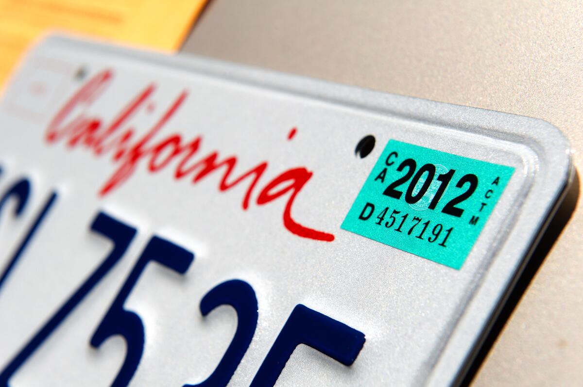
As the list hit about 30, it became obvious that our home state of California must have the most uninspired license plate in America. Just a plain white background with blue letters and numbers, and a red ŌĆ£CaliforniaŌĆØ scrawled across the top in an ugly cursive font. As if thatŌĆÖs not bad enough, the lower portion of the plate says ŌĆ£dmv.ca.gov,ŌĆØ which might be the most boring combination of letters ever written.
Compare that with the poetry emblazoned across the bottom of other plates: ŌĆ£Virginia is for lovers.ŌĆØ ŌĆ£Home means Nevada.ŌĆØ Or my favorite, spotted on a plate from Quebec: ŌĆ£Je me souviens,ŌĆØ French for ŌĆ£I remember.ŌĆØ
A DMV spokesperson told me the web address was put on the California plate ŌĆ£to encourage people to visit itŌĆØ before going to an office. As for the plain white background and blue letters, the DMV said thatŌĆÖs designed to make it easier for police to see.
California license plates werenŌĆÖt always so drab. Early versions evoked the Golden State with a gold background, and later, gold lettering on a black, and then blue background. When California switched to the white background in the 1980s, the design incorporated our golden sunsets with that art deco yellow sun. But the state discontinued the sun design in 1987, and since then the plate has only been slightly modified, with some changes to the fonts and the addition of that horrid url.
ItŌĆÖs time for an update. California has so much to brag about. Ocean. Mountains. Sunshine. EarthŌĆÖs biggest trees. A throughline of entrepreneurship and creativity thatŌĆÖs shaped the human experience from the gold rush to Hollywood and Silicon Valley. We should not have such a boring plate.
Of course, state residents can pay extra for a specialty plate that features icons like Yosemite and Lake Tahoe, images by California artists Wayne Thiebaud and Charles M. Schulz, or even the classic 1960s-style black-and-gold design. The fees support designated charities and allow Californians to show off what they love about the state. ThatŌĆÖs fine, but these make up less than 4% of the millions of license plates the state issues. The majority of California drivers who get the basic plate should also sport something that better represents this spectacular place.
ItŌĆÖs true that we are a varied, complex state that cannot be boiled down to a single symbol. California is so many things at once, and that vibrancy is at the core of our identity and our power. But what I realized in watching my children respond to the iconography rolling along the interstates is that each license plate isnŌĆÖt just a tool to identify a vehicle. ItŌĆÖs a little ambassador, a reflection of how one state wants others to see it. California has so much style. Our license plates should too.
What design would you like to see on CaliforniaŌĆÖs license plate? Send your suggestions to [email protected]
More to Read
A cure for the common opinion
Get thought-provoking perspectives with our weekly newsletter.
You may occasionally receive promotional content from the Los Angeles Times.
