DIY decorating for renters: A new L.A. at Home series
Dorothy said, ŌĆ£ThereŌĆÖs no place like home.ŌĆØ I disagree. Every place can be home. Even that place with the bare walls, the wannabe DJ next door and the A/C unit older than your first car.
IŌĆÖve lived in six apartments in seven years. From a studio with blue carpeting to an old Victorian with soaring ceilings, every one of those places I have made my home.
ThatŌĆÖs the point of this new column and video series: to look at design through the eyes of the space-starved, budget-minded renter. My monthly tips and projects wonŌĆÖt be DIY just for the sake of being crafty. They will be designed for renters, by a renter. My goal is to provide practical solutions for some of you ŌĆö and entertainment for the rest of you.
As I wrote ŌĆ£The First Apartment Book: Cool Design for Small Spaces,ŌĆØ I traveled the country coming up with ideas on how to turn apartments into homes that reflected the people who lived in them. ThereŌĆÖs this misperception that design is about matching colors and arranging pretty knickknacks. ItŌĆÖs not. Home is the ultimate form of self-expression. ItŌĆÖs where you make memories.
If youŌĆÖre about to give the typical renterŌĆÖs excuse about why you donŌĆÖt bother to decorate, stop.
Consider this: When I first walked into my current apartment, I faced a 650-square-foot white box with zero architectural details. It was your classic L.A. rental. But it was mine. I just had to work within the constraints of a renter.
In the living room, I had a low-cost cabinet built for the wall air-conditioner. It hides the ugly unit when I have company over, and I just slide open a door when I need cool air.
I channeled Ralph Lauren and installed custom plaid temporary wallpaper on the wall behind my TV. That sets the living room apart from the rest of the apartment.
A separate home office just wasnŌĆÖt going to fit, so I repurposed my prized vintage desk ŌĆö a steal on Craigslist ŌĆö and used it as a sideboard in my dining area. It housed all my files and ugly desk stuff. None of my dinner guests noticed that I had been working here all day.
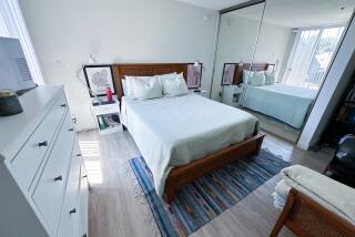
My bedroom is barely big enough to fit a queen bed, and the only window looks onto an alley. To get around this, I bought magic ŌĆö more commonly known as top-down, bottom-up roman shades. They can block out any part of the view. I use them to hide the ugly part of the alley but allow the trees to show. YouŌĆÖd think I lived in the hills.
The point is most renters like me donŌĆÖt live in the hills. We live in studios. We live with roommates. We live with Armani Casa tastes on garage-sale budgets. We arenŌĆÖt Dorothy. We never wanted to be. So in the months to come, here and through videos of our online DIY projects, weŌĆÖll look at ways to conquer the boring rental ŌĆö beige walls and all.
In our first video for ŌĆ£The Apt. Life,ŌĆØ we have a fitting project: a DIY welcome mat. Using three colors of Flor carpet squares, a ruler, a pen and an X-Acto knife, we walk through the step-by-step process, offering detailed instructions in our accompanying video.
Kyle Schuneman is a Los Angeles-based interior designer who, in addition to his decorating work for residential clients and show houses, has styled catalogs for stores such as Target and CB2. ŌĆ£The Apt. LifeŌĆØ will appear here at the beginning of every month.


