1950s Buff, Straub & Hensman house in Pasadena remade for modern living
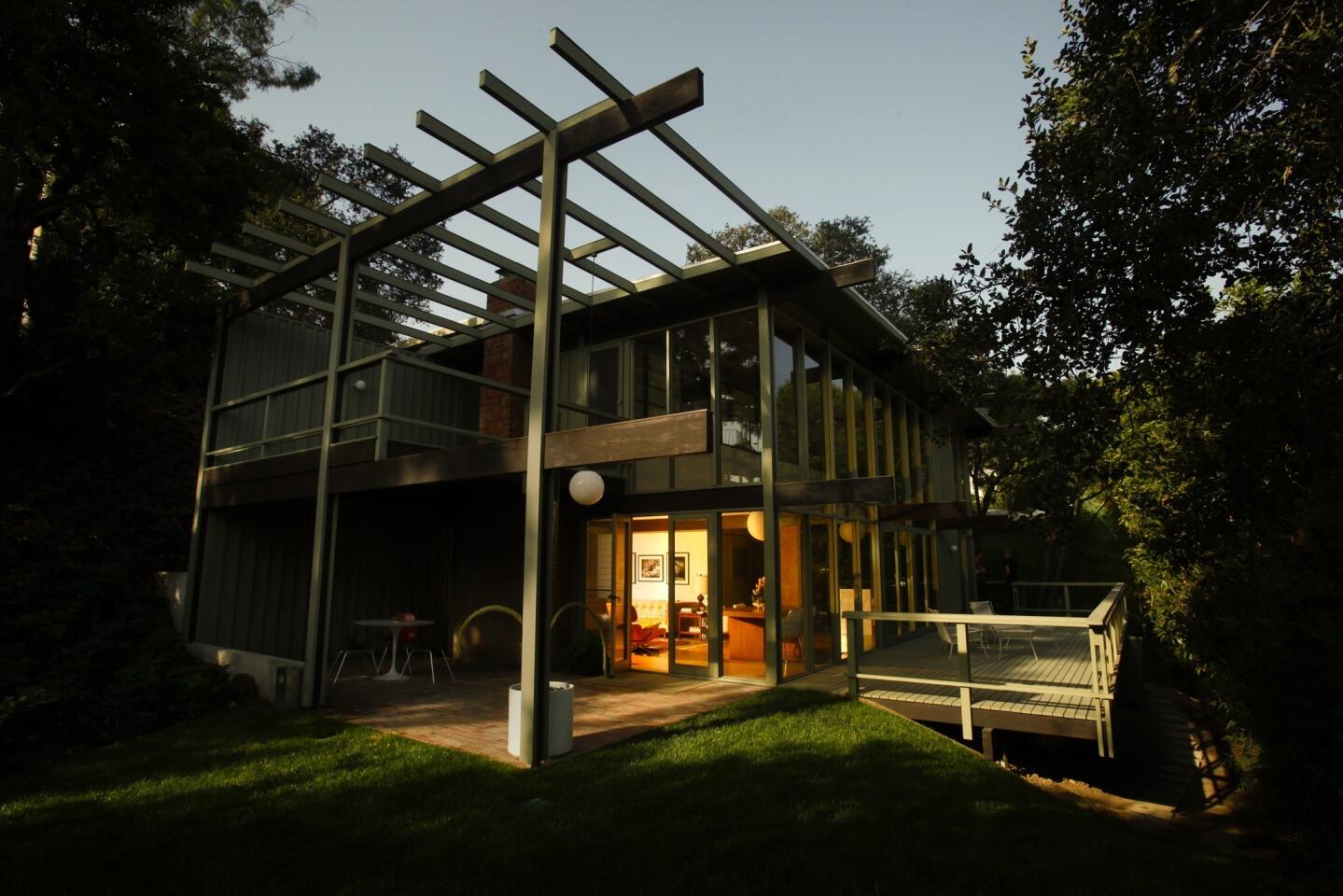
Perhaps the biggest single change that owner Christophe Burusco and designer Scott Lander made to the midcentury house in Pasadena: They removed a 150-square-foot dining room added by a prior owner. With the addition removed, the logical indoor-outdoor flow of the house was restored, and doors and windows once again open up to a deck. (Mark Boster / Los Angeles Times)
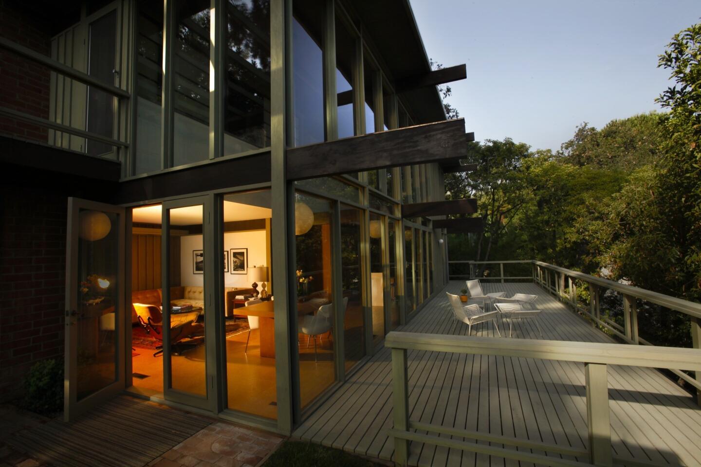
“I wanted to restore the deck back to the original design,” owner Burusco said. (Mark Boster / Los Angeles Times)
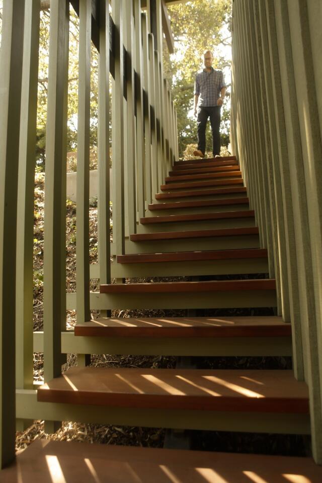
Owner Christophe Burusco heads down stairs leading to his front door. His designer, Scott Lander, researched the avocado-green stain originally used on the house, then had the batten-trimmed redwood finished in the same hue. The stained redwood also appears inside the house, on the north-facing wall of each room. (Mark Boster / Los Angeles Times)
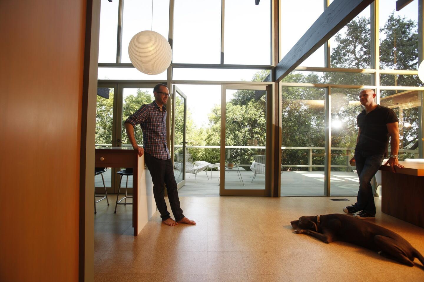
Owner Christophe Burusco, left, and designer Scott Lander in what today would be called a great room, with glass looking onto the rear deck and flooring made of cork. (Mark Boster/ Los Angeles Times)
Advertisement
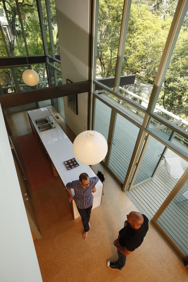
The compact kitchen feels larger than it actually is thanks to the high ceiling and walls of glass. (Mark Boster / Los Angeles Times)
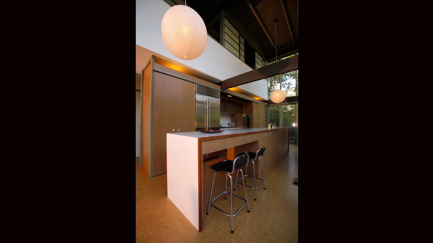
The kitchen is new yet looks like a time capsule: white Formica counters, cork-tile flooring and Noguchi globe lanterns -- just like the house’s original kitchen. The chrome-and-leather stools are vintage 1970s pieces by Charlotte Perriand. (Mark Boster / Los Angeles Times)
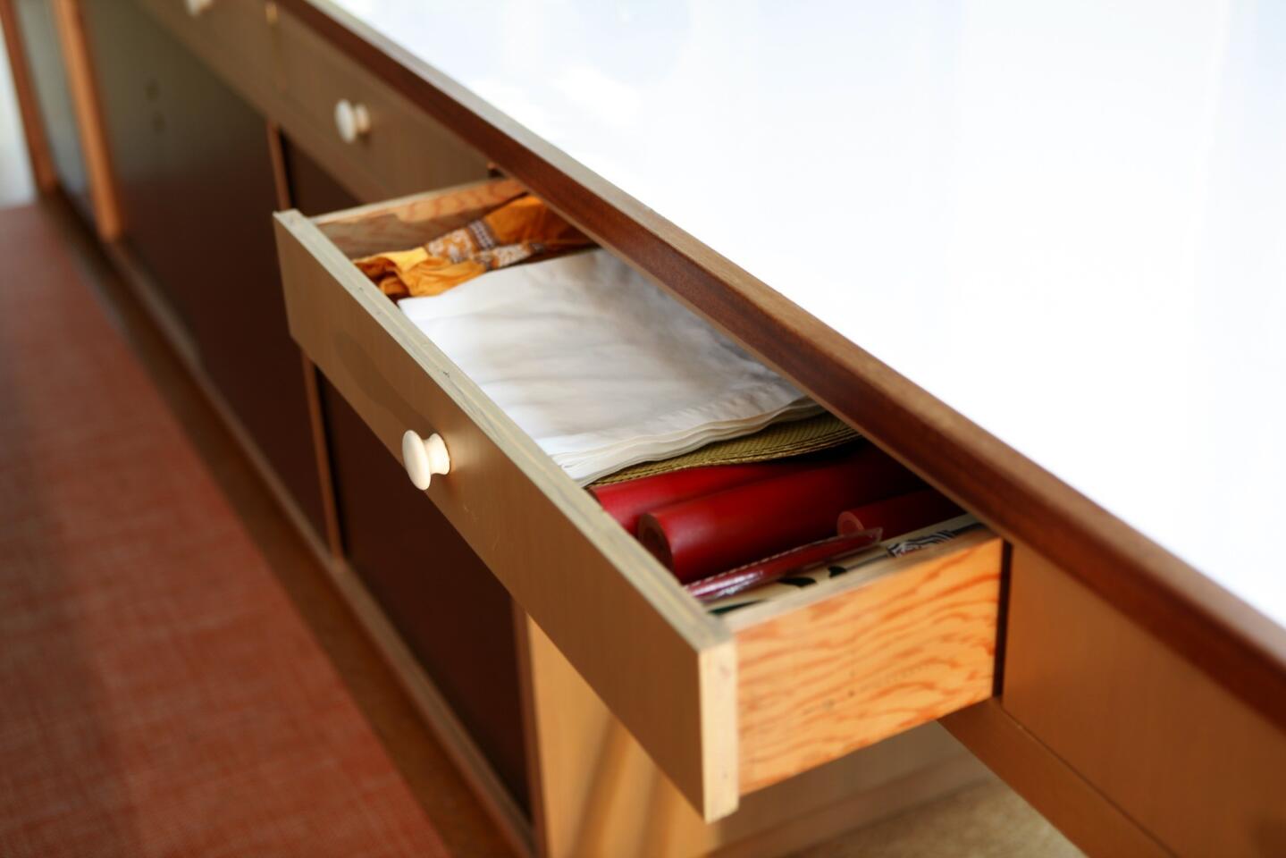
Vertical-grain Douglas fir drawer and cabinet fronts also were nods to the house’s original materials. Designer Scott Lander replated, recast or found replacements for all the original hardware throughout the house. New porcelain drawer pulls in the kitchen were made using the kitchen’s original hardware to create the mold. (Mark Boster / Los Angeles Times)
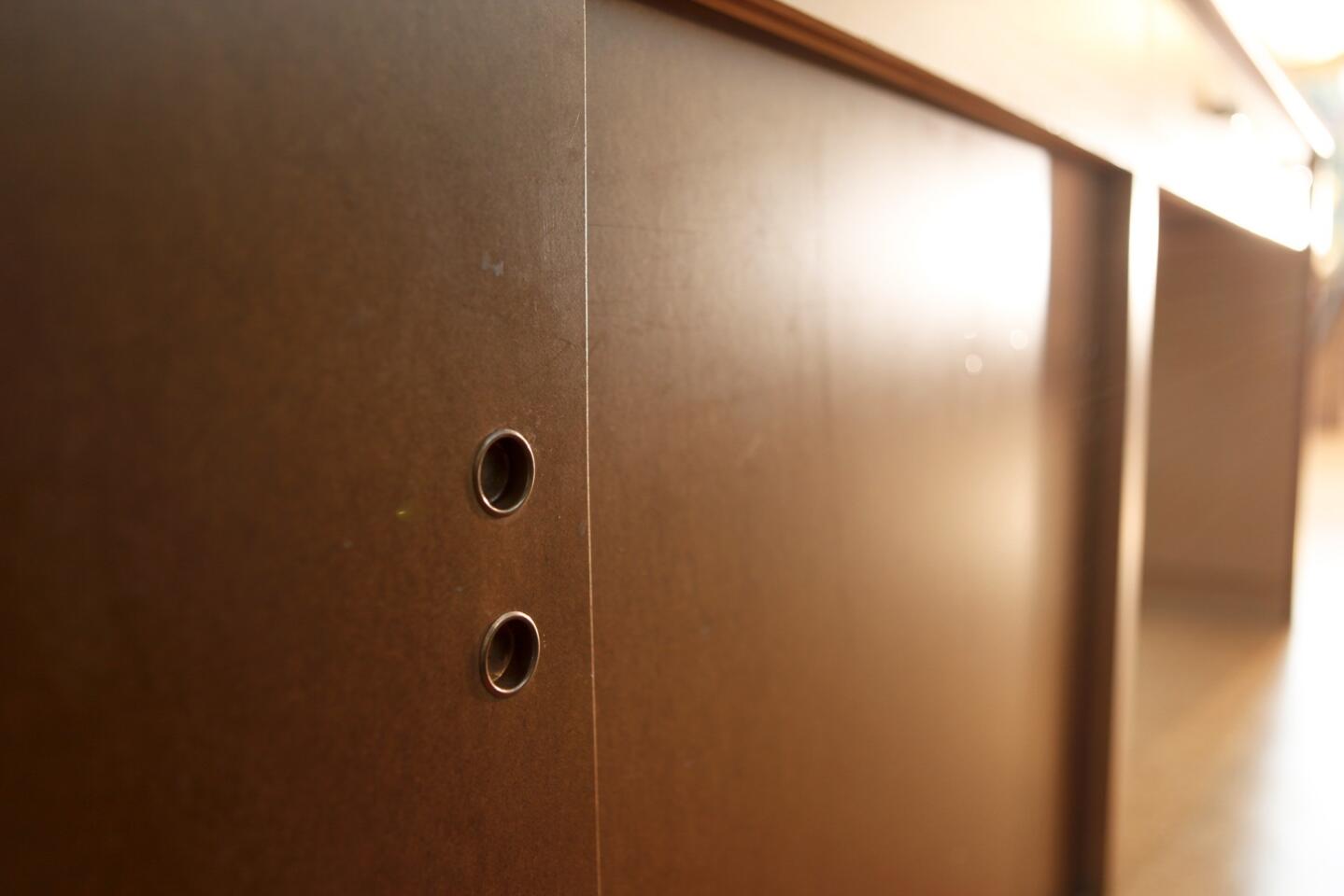
Detail of the Masonite doors to kitchen cabinets that sit under an old-school Formica countertop. “I think it shows you don’t have to use granite or Ceasarstone to make a midcentury kitchen look updated,” designer Scott Lander said. “Formica and Masonite are really cool-looking finishes.” (Mark Boster / Los Angeles Times)
Advertisement

Accessories have a touch of the vintage, but the appliances? Thoroughly modern. (Mark Boster / Los Angeles Times)
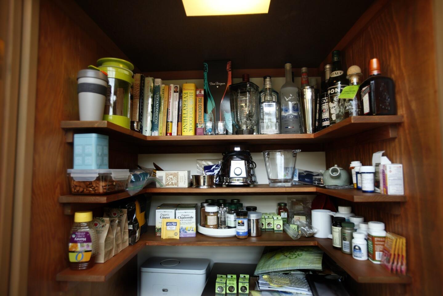
U-shaped shelves make the most of the pantry. (Mark Boster / Los Angeles Times)
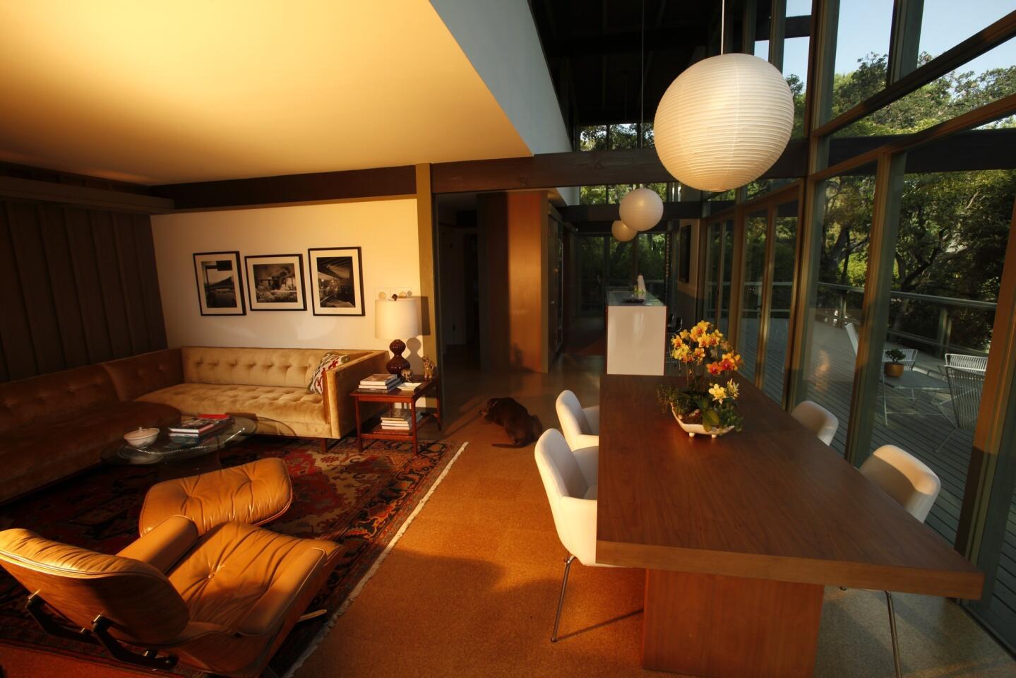
In the living area off of the kitchen and dining area, designer Scott Lander helped owner Christophe Burusco to select an upholstered sectional sofa from Los Angeles-based Lawson Fenning. (Mark Boster / Los Angeles Times)
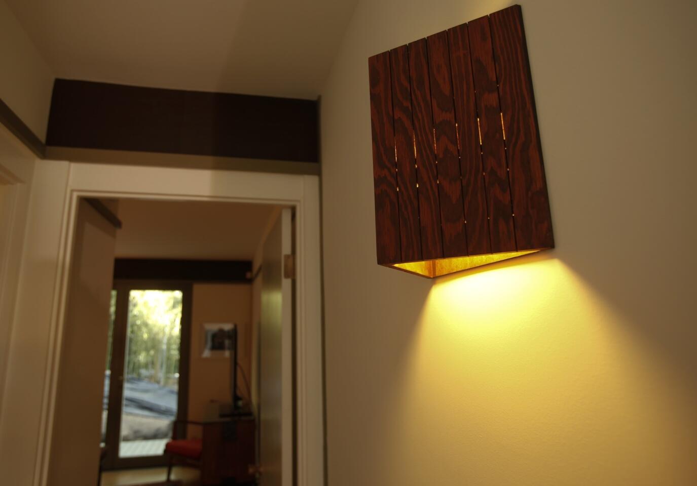
A triangular wood sconce in the hallway. (Mark Boster / Los Angeles Times)
Advertisement
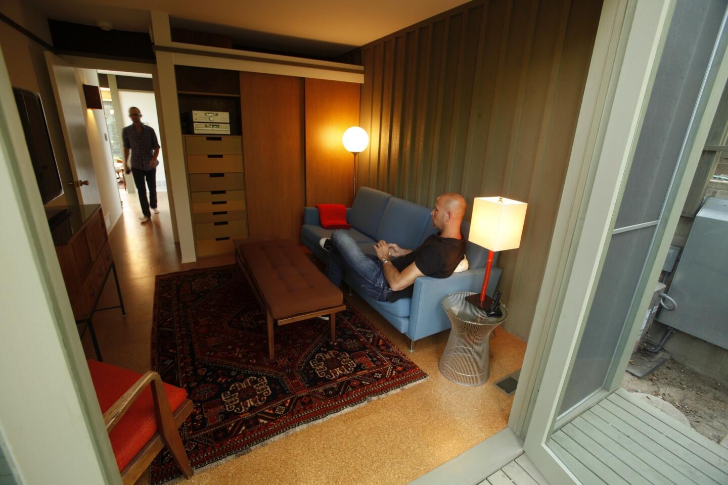
Home owner Christophe Burusco walks toward designer Scott Lander in the downstairs bedroom, used as a media room. The board-and-batten wall and cork flooring are not only nods to the period design but also ways of blurring the line between indoor and out. (Mark Boster / Los Angeles Times)
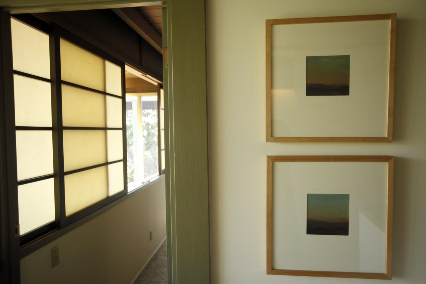
Shoji-style sliding screens on the upper level. (Mark Boster / Los Angeles Times)
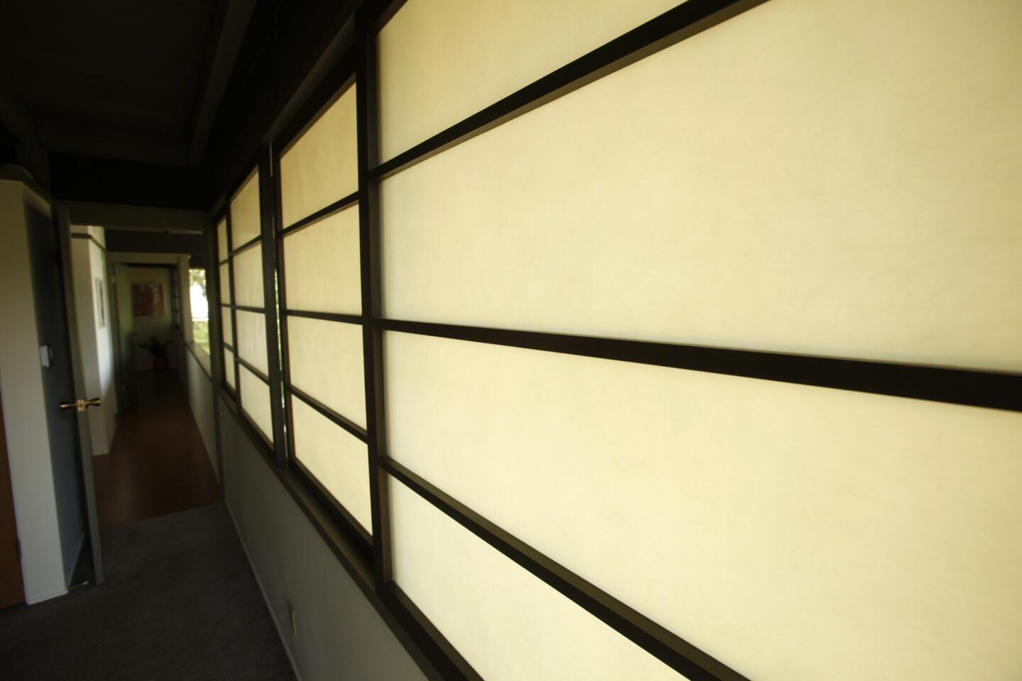
The screens can be closed, giving the two upstairs bedrooms more separation from the rest of the house, or opened up for views of downstairs or the wild landscape beyond. (Mark Boster / Los Angeles Times)
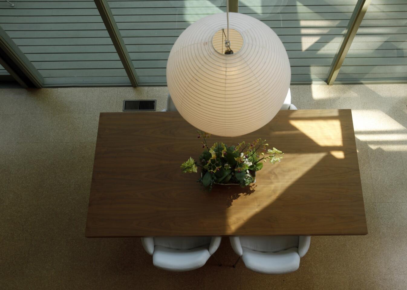
The view from upstairs, looking down onto the streamlined walnut dining table, a gift from designer Scott Lander to his client. Damaged Jalousie windows, the louvered glass often used by Buff, Straub & Hensman, were replaced. (Mark Boster / Los Angeles Times)
Advertisement
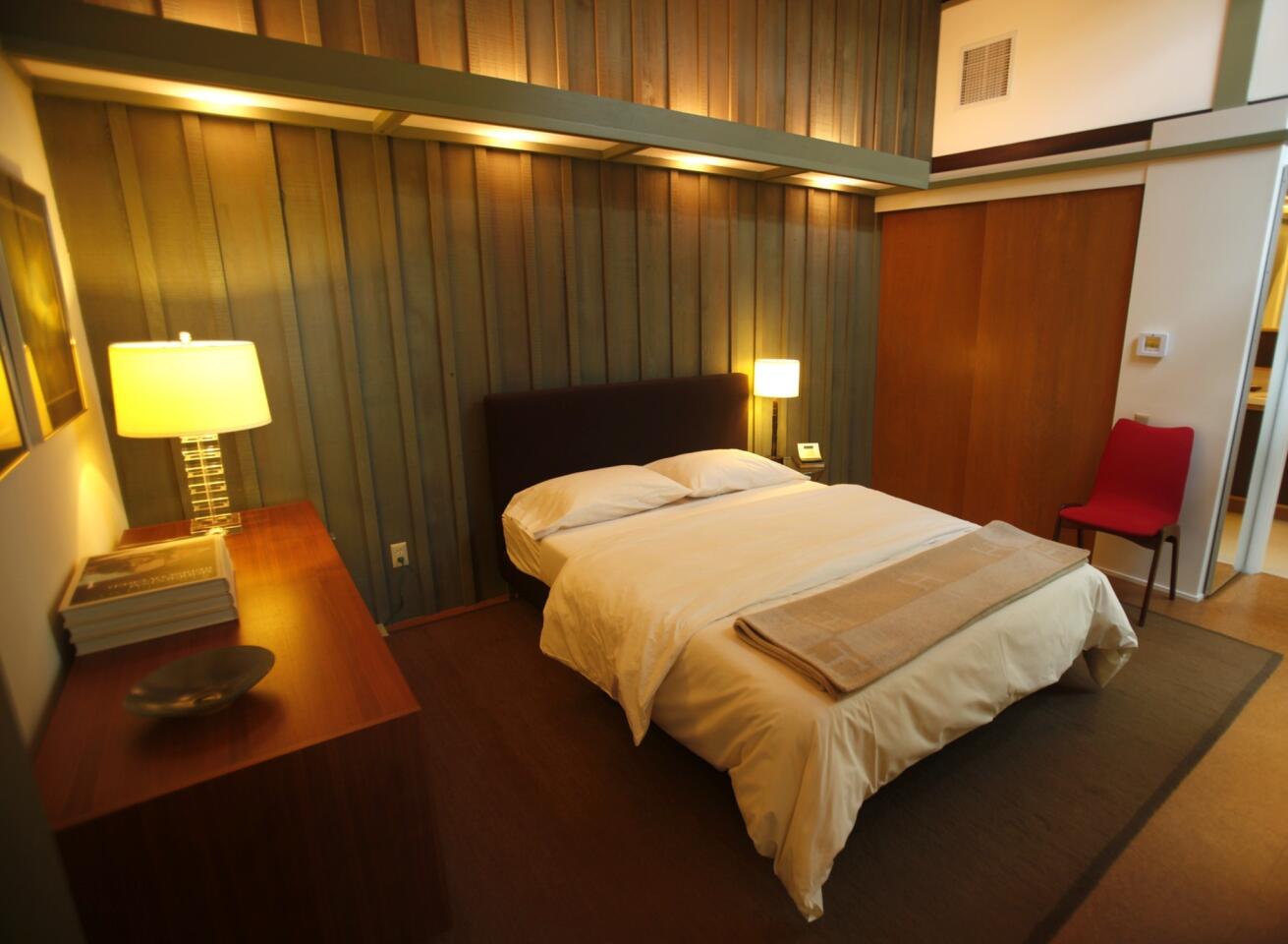
Though Christophe Burusco took down a dining room addition because it detracted from the house’s original design, he and his designer, Scott Lander, had no qualms completing a guest bedroom and bath that a previous owner had begun to frame out under the carport in what had been a workshop area reached from the foyer. (Mark Boster / Los Angeles Times)
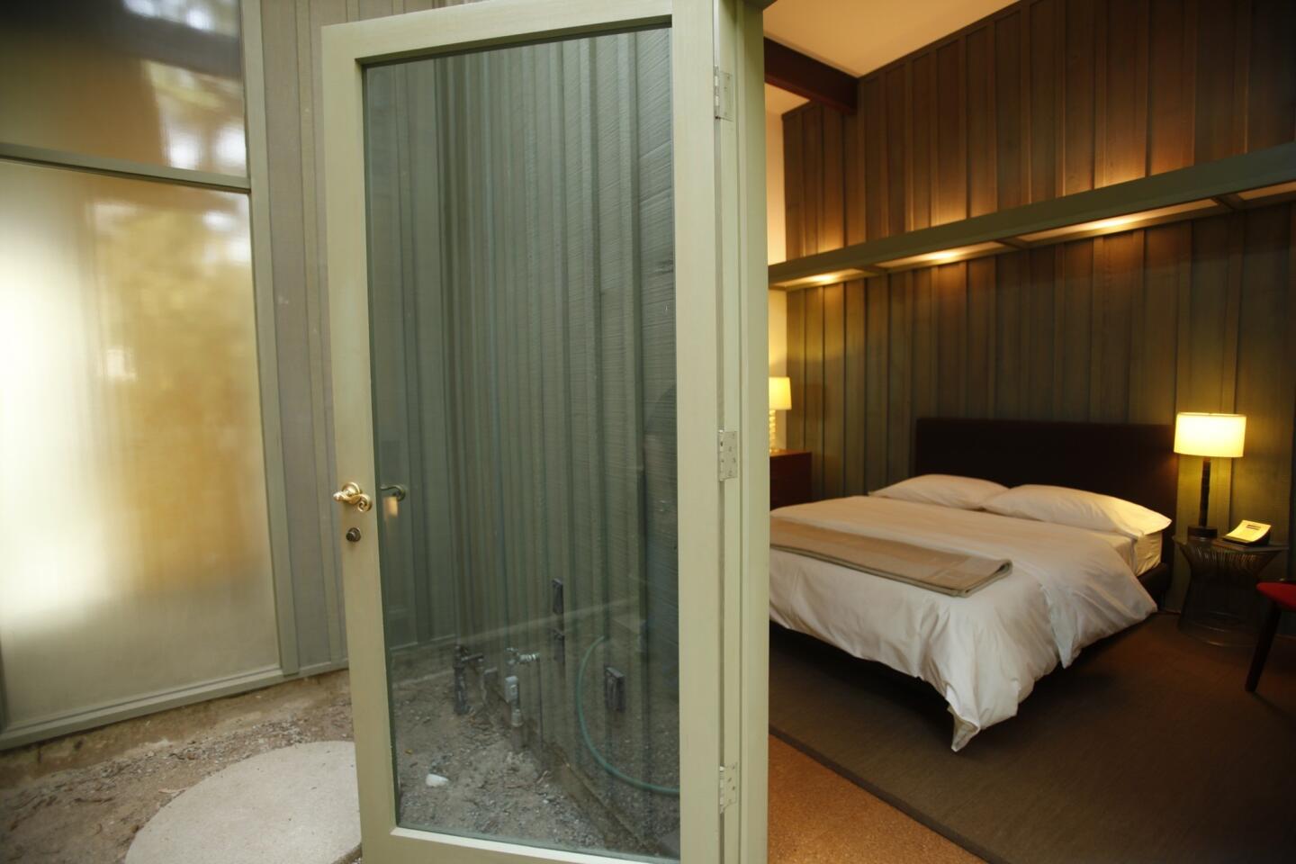
“Scott borrowed other elements from the house to make it look original,” Burusco says of the guest quarters. “It’s nice to have the space, and since I didn’t change the footprint of the house, I don’t think it’s a detraction.” (Mark Boster / Los Angeles Times)
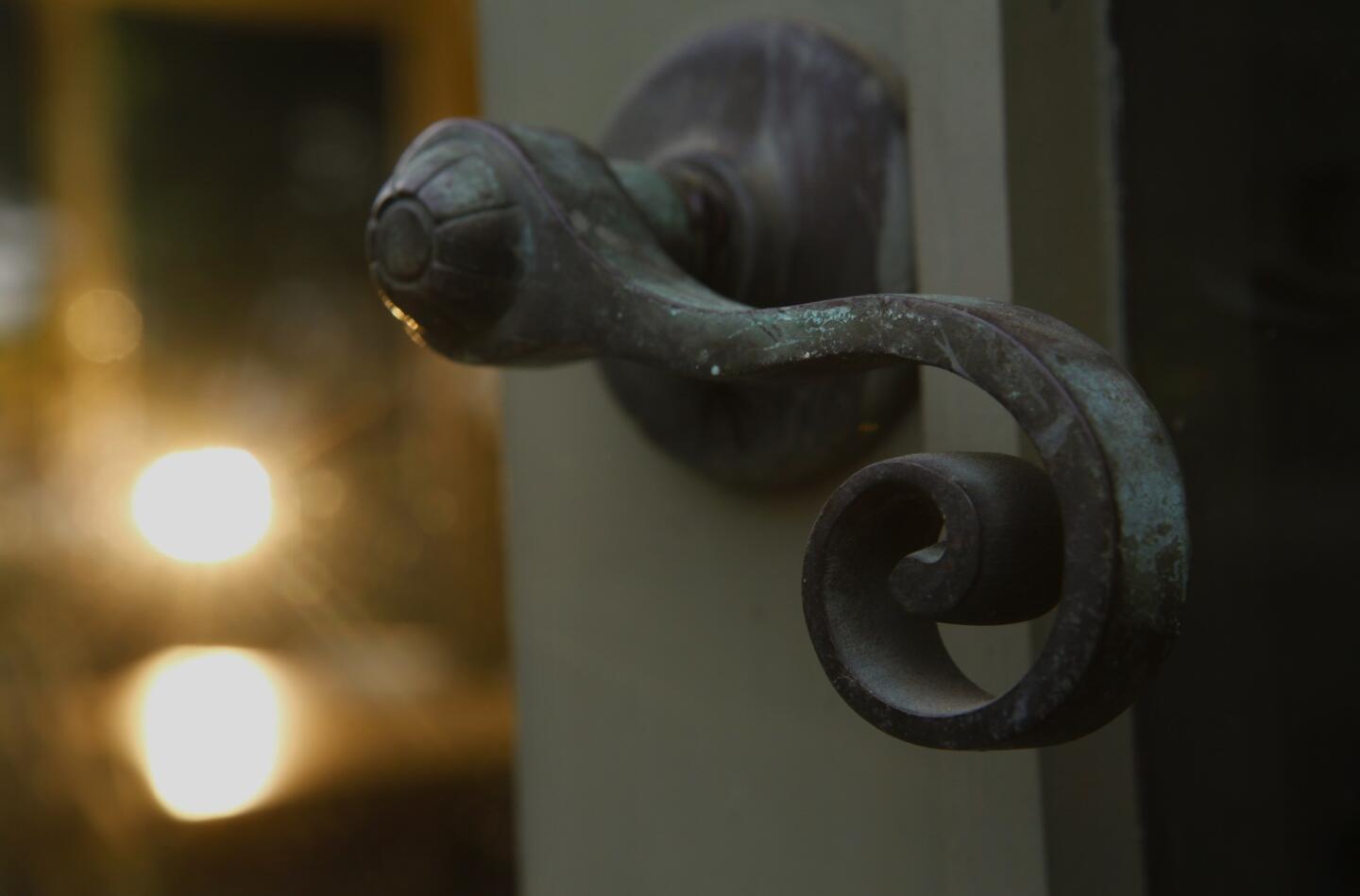
The patina on an original patio door handle speaks to the vintage elements preserved in the house. (Mark Boster / Los Angeles Times)
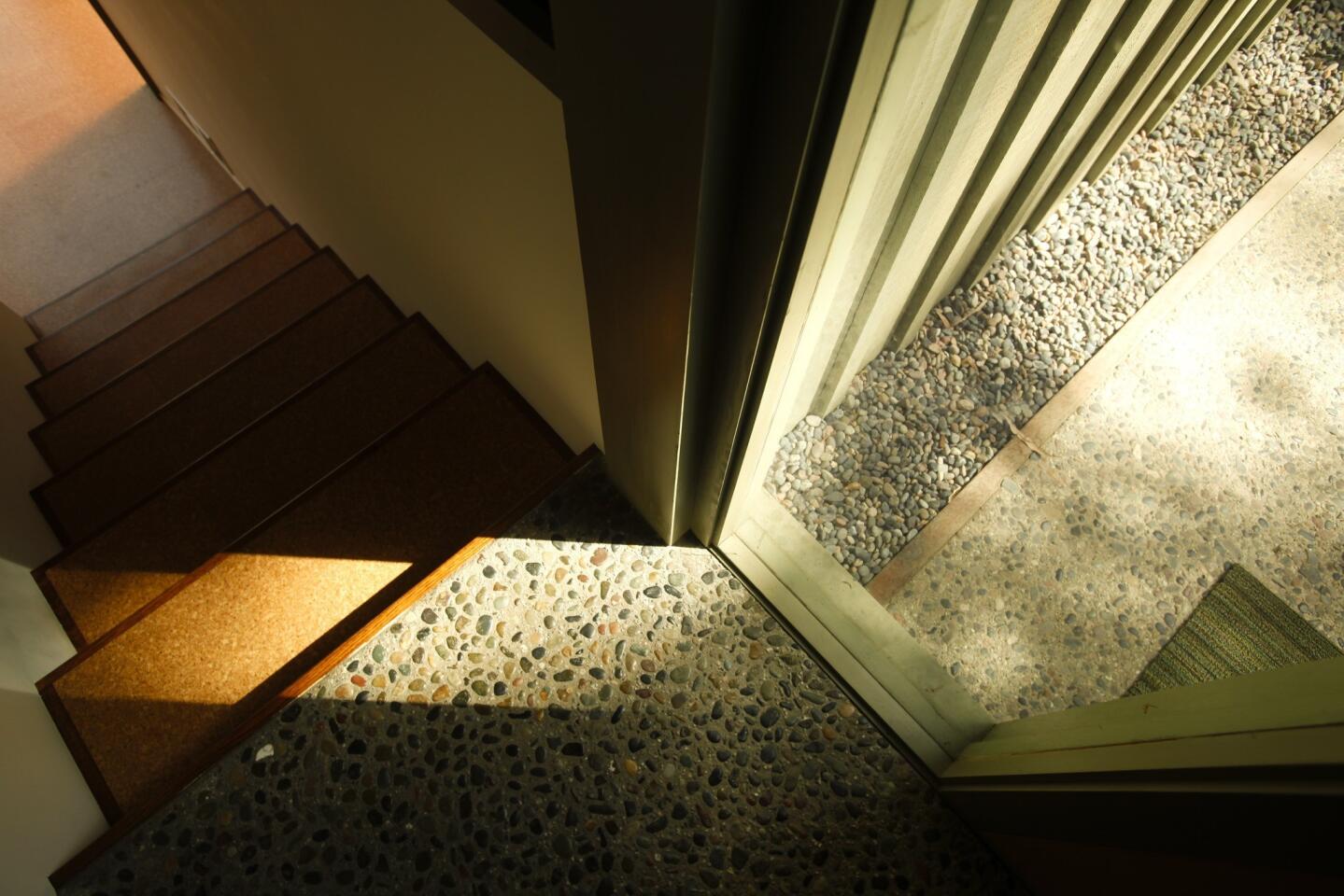
Outside blends with inside. (Mark Boster / Los Angeles Times)
Advertisement
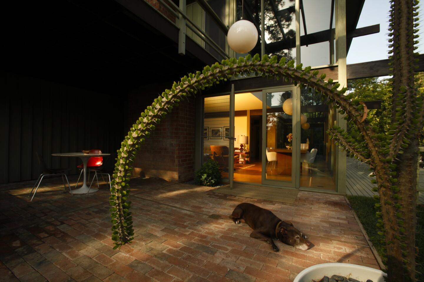
Homeowner Christophe Burusco’s dog, Bruno, finds a cool spot on the back patio. “Fortunately, the right person who cared about this house got it,” said Dennis Smith, president of Buff, Smith & Hensman Architects. “He did all the right things.”
More design profiles: California homes and gardens (Mark Boster / Los Angeles Times)


