A Neutra-style house without the designer price tag
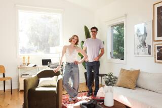
It all started in 2005, when film producer Mark Gill moved in with screenwriter Hanna Weg and asked, ŌĆ£Honey, can I move the couch?ŌĆØ Little did they know this modest request would lead to a two-year makeover that transformed a nondescript clapboard-and-stucco box to a modern jewel.
Weg bought the two-bedroom hillside house in Silver Lake 12 years ago, before she and Gill met and married. She was drawn to it because it felt like a treehouse in the sky, came with a pool and had a separate space below the living quarters that could serve as her office. But the architecture was all wrong.
ŌĆ£Midcentury modern is in my DNA,ŌĆØ says Weg, screenwriter of ŌĆ£The Beautiful and the Damned,ŌĆØ an upcoming film starring Keira Knightley thatŌĆÖs based on the F. Scott Fitzgerald novel. Weg grew up with Eames furnishings purchased for the Altadena home that her mother and graphic designer Saul Bass commissioned in 1958 ŌĆö Case Study House No. 20, designed by Buff, Straub & Hensman ŌĆö before they divorced.
Gill, a self-described ŌĆ£recovering studio executiveŌĆØ and co-founder of the production company the Film Department, had refurbished four traditional homes in Hancock Park. But after visiting landmarks designed by Richard Neutra, he became a fan of the L.A. modernistŌĆÖs clean lines. Like Weg, Gill began dreaming of life in a light-filled modern house that embraced the outdoors.
Buying a Neutra home or building anew seemed like logical options. But the price of designer real estate five years ago, when the couple was house hunting, was beyond their reach. They didnŌĆÖt think they would find a place with a similar view, pool and office. And they wanted to put down roots in Silver Lake and make room for GillŌĆÖs son, Jack, who sleeps over twice a week.
So they hired Roger Sherman a Culver City architect and co-director of cityLAB a UCLA architecture and urban design think tank, to renovate.
ŌĆ£In many ways, remodeling was more interesting and greener than starting from scratch,ŌĆØ Sherman says. ŌĆ£We live in what I call the ŌĆśre-ŌĆÖ era, as in recycle, reuse, restore. Rather than starting with tabula rasa, itŌĆÖs a matter of how clever you can be at re-engineering a place to make it better.ŌĆØ
The 1963 house was a 2,000-square-foot ŌĆ£ranchburgerŌĆØ at the top of the hill, a 20-foot-tall garage at street level and a small studio sandwiched between. The problem was, it was already built out to allowable limits. ShermanŌĆÖs solution was to keep the same footprint but make the house more efficient by optimizing wasted space, reducing clutter and opening up the floor plan.
The most obvious changes are visible on the front fa├¦ade, once yellow-painted siding and stucco, now pristine white steel-troweled stucco. Sherman shaved off the eaves, then extended walls three feet higher to create the illusion of a flat roof.
He tripled the number of windows, specifying many that run nearly from floor to ceiling and all with frames of aluminum instead of wood. The horizontal bands of glass give the house a Neutra-like transparency, flooding interiors with daylight and expanding views out.
The entrance, formerly an unsightly jumble that was difficult to navigate, got redesigned from the foundation up and turned into a courtyard for privacy. Concrete steps lead down to WegŌĆÖs office, and a stairway of steel and tropical hardwood rises to the main house.
ŌĆ£The courtyard works in a very Greek way,ŌĆØ Sherman says. ŌĆ£There are different pathways and whitewashed walls. ItŌĆÖs an Escher-like geometrical puzzle.ŌĆØ
Weg and Gill decided to live at home during the remodel, which consisted of a series of self-contained projects. Beginning with the cramped kitchen, Sherman raised the ceiling and replaced the pink marble floor and dated equipment with a maple floor, white cabinetry and stainless-steel appliances and countertops.
In the living room, flimsy glass sliders made way for telescoping glass doors that stretch 45 feet across.
ŌĆ£This required the surgical insertion of steel beams and laminated wood beams that allowed us to put in longer spans of glass,ŌĆØ Sherman says. The result makes the living and dining rooms an extension of the backyard, and vice versa.
Next, Sherman eked out guest quarters for Jack, now 12. That meant lowering the ceiling in the double-height garage to squeeze in a 400-square-foot rec room above it. Shrinking and reconfiguring the master bedroom yielded space for a spiral staircase linking the rec room to the rest of the house.
Weg and Gill initially planned to have the spiral staircase custom-fabricated out of resin to resemble a strand of DNA. When that proved too costly, they scoured the Internet until they found a sculptural stainless steel and maple Italian design worthy of highlighting through a new window over the garage.
ŌĆ£It took a year and three months to get it delivered, and when it was, it came without English instructions,ŌĆØ Weg says.
But this was a long, drawn-out remodel with a happy ending. Though Weg and Gill decline to reveal their costs, now that the dust has settled the couple say they finally have a Neutra-style house without the Neutra-size price tag.


