Research and respect go into restoring a John Lautner guesthouse

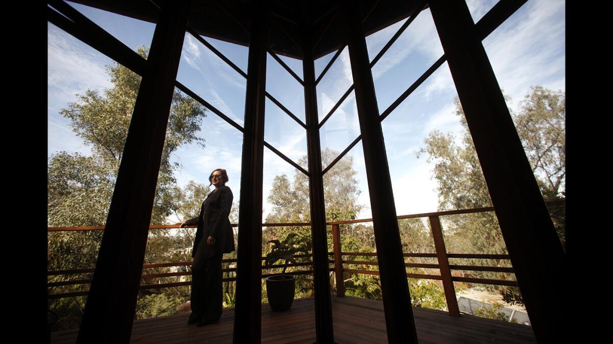
Designer Michelle Marks is framed by the living room bay windows of the newly remodeled 1938 guesthouse by famed architect John Lautner.
Although most of us know about architect John Lautner through iconic works such as the circular Chemosphere house or the Silvertop estate, his first official commission in Los Angeles was a modest 600-square-foot guesthouse, a refuge that has the peaceful feeling of a cabin with warm wood floors and paneling, and floor-to-ceiling glass windows overlooking an Echo Park canyon.
Today the house looks much as it did when it was completed in 1940, thanks to a major restoration project.
After a period as a rental, the house had fallen into disrepair. Routine wear and tear included termite damage to some of the homeŌĆÖs wood framing and water damage to the ceiling. In addition, the floors, bathroom and kitchen needed to be replaced.
ŌĆ£Disrepair is just lack of maintenance,ŌĆØ said Michelle Marks of WWFF Design, who was hired along with partner Diana Kunce to update the space last year. ŌĆ£There was a lot left for us to preserve. We worked to reimagine the house within the parameters that Lautner designed for the house.ŌĆØ
At the suggestion of architect Frank Escher, who restored LautnerŌĆÖs Chemosphere, the duo consulted the Lautner archives at the Getty Research Institute. This would prove useful in deciphering some of the homeŌĆÖs unusual construction details. In the process of restoring segments of the roof, they discovered that Lautner had stretched canvas between each ceiling rafter, in lieu of drywall, prior to installing the roof. After consulting plans and vintage publications at the Getty, they learned that he had created a similar canvas roof for a tent shelter he built at Taliesin West, Frank Lloyd WrightŌĆÖs school in Arizona. ŌĆ£We had never come across something like that,ŌĆØ Marks said. ŌĆ£It was exciting. We learned it was a very inexpensive way to achieve a flat ceiling.ŌĆØ
In an effort to keep the original spirit of the house, the designers chose modest materials they felt would complement LautnerŌĆÖs design and not stand out as new. ŌĆ£We picked things we thought he would appreciate,ŌĆØ added Marks.
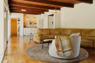
The new red oak floor was installed in the same manner and pattern as the original floors. The red brick fireplace was left untouched along with the built-in couch Lautner designed. Some windows were rebuilt, and drywall was added to the ceiling, although sections of the early canvas are still visible from below. Interior beams were refinished and repainted in the same red hue as the originals. New cabinetry and storage were selected to blend in with the look, including integrated handles ŌĆö routed finger pulls in the kitchen cabinets ŌĆö like the ones Lautner had designed.
ŌĆ£It was really nice to see the architectŌĆÖs hand,ŌĆØ added Kunce.
The kitchen, which featured tile counters and wood-front cabinetry, needed to be gutted. New stained redwood custom cabinets were installed along with Heath tile in a warm ocher to suit the woodsy feeling of the house. The geometric tile pattern was inspired by the acute angles of the main corner windows in the living room.
ŌĆ£ItŌĆÖs a completely different atmosphere here,ŌĆØ said Marks. ŌĆ£It feels like Northern California.ŌĆØ
To help open up the kitchen and keep the horizontal lines of the space, the designers removed a full-size refrigerator from the 1970s and installed a smaller refrigerator underneath the Eurostone countertop.
To add space in the bedroom, they removed a low closet underneath a window and created a simple open storage closet behind a wall leading to the bathroom. In the bathroom, a wall-mounted sink and toilet improved the roomŌĆÖs tiny footprint along with a glass walk-in shower. In another space-saving move, the pair replaced the bathroomŌĆÖs original swing door with a slider.
So as not to overpower LautnerŌĆÖs design, Marks and Kunce furnished the rooms with midcentury wood furniture from Danish Modern, a simple pendant lamp by Los Angeles designer Brendan Ravenhill and midcentury-inspired lamps and ceramics they found on EBay.
Indeed, the contrast between old and new is almost indistinguishable. In the end, the designers have created a flexible space that not only preserves the memory of Lautner but also serves the homeownerŌĆÖs desire for an adaptive space for parties, reading and guests.
ŌĆ£Even though the studio is one of his earliest works, his design spirit was strong,ŌĆØ Marks said. ŌĆ£We approached the job with the goal of continuing his functional simplicity, honest materials and love of geometry.ŌĆØ
Twitter: @lisaboone19
More to Read
Sign up for The Wild
WeŌĆÖll help you find the best places to hike, bike and run, as well as the perfect silent spots for meditation and yoga.
You may occasionally receive promotional content from the Los Angeles Times.


