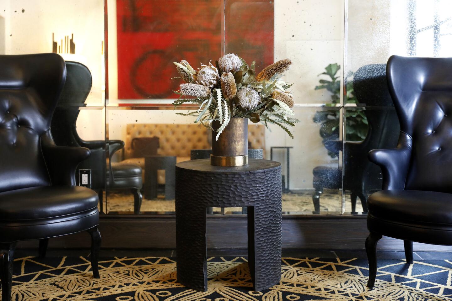
The subtle ways the Hotel Figueroa’s redesign is a tribute to women
- Share via
The Hotel Figueroa is nearly finished with the two-year, top-to-bottom, inside-and-out renovation that has transformed it from a dowdy lodging appealing to budget travelers into a stylish trendsetter for creative sophisticates.
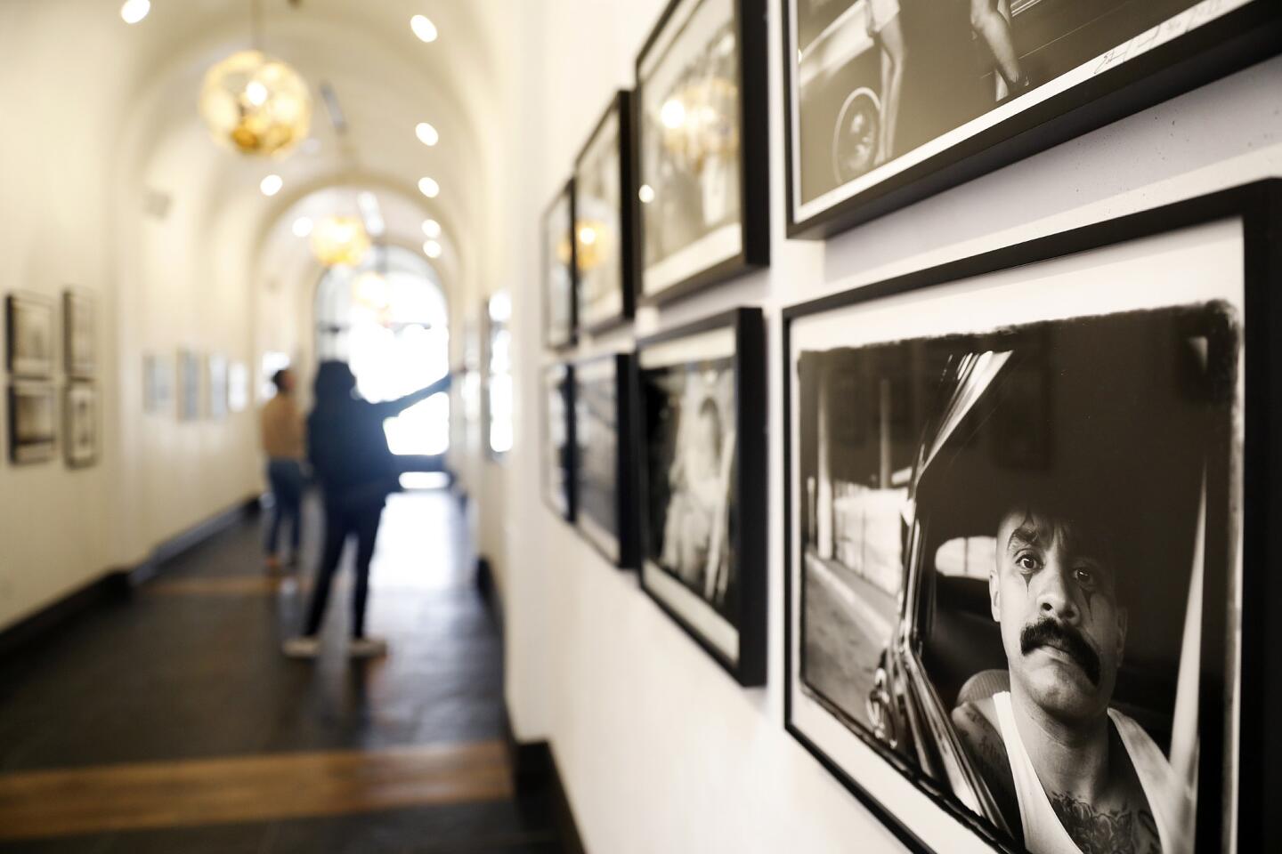
The hotel was built in 1926 as a haven for female travelers. The Los Angeles Times noted that it was “the largest project of its kind to be financed, built, owned, and operated by women.” The hotel’s new redesign channels that legacy into a tribute to women, especially artists.
Now there’s a kind of cozy, warm and welcoming vibe to the place that gives the hotel’s public and private spaces a residential feel that sparks a try-this-at-home impulse.
Our behind-the-scenes tour of the more than $55-million makeover before its recent opening to the public highlighted how designers modernized the 1920s fixer-upper without losing its historic, residential feel. No doubt you can borrow some of their design principles for the place you call home, too.
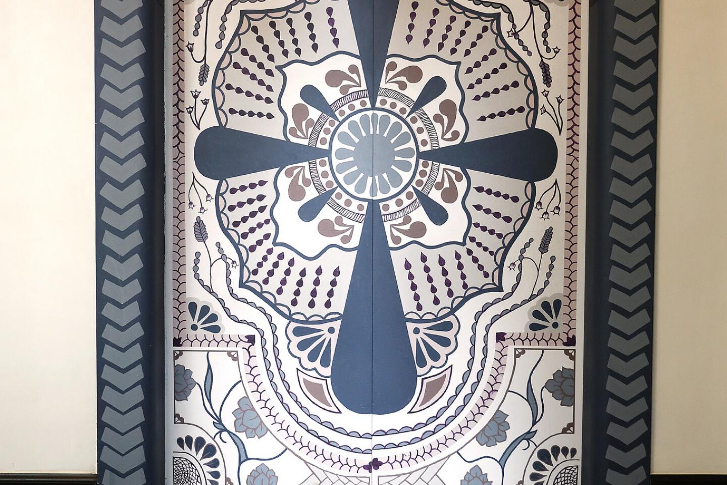
Add art with a message
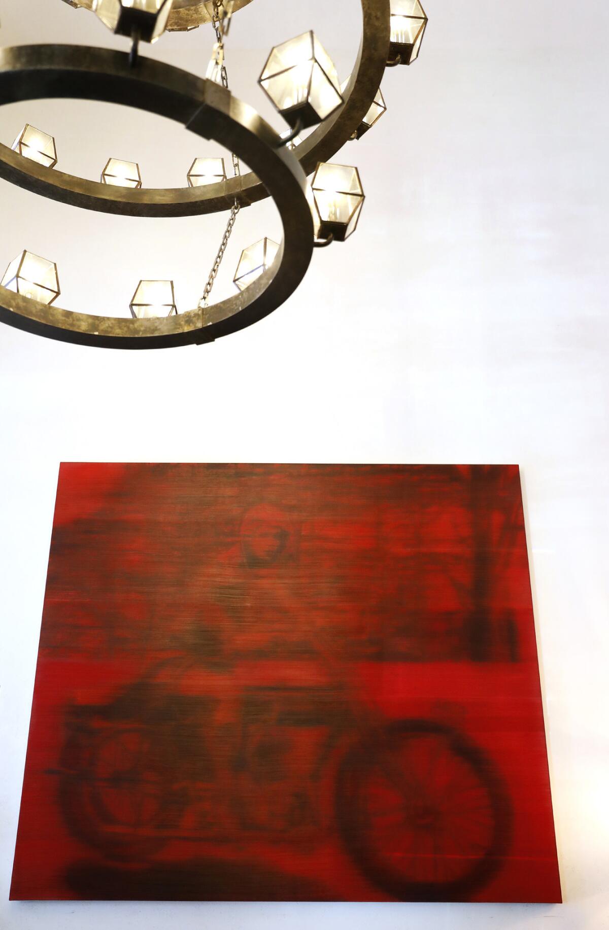
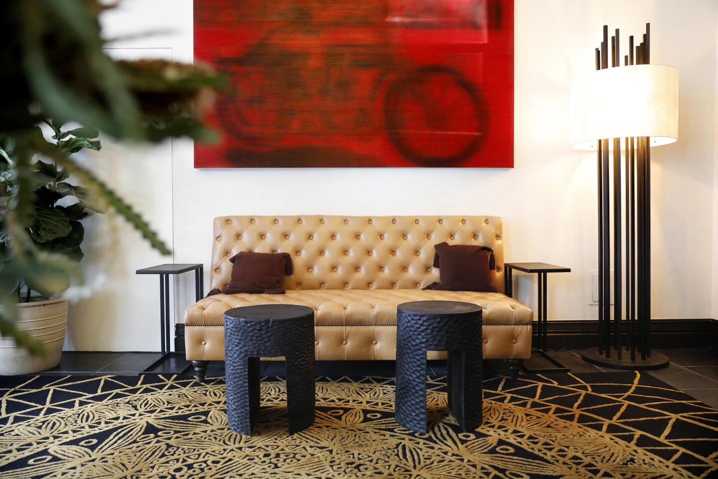
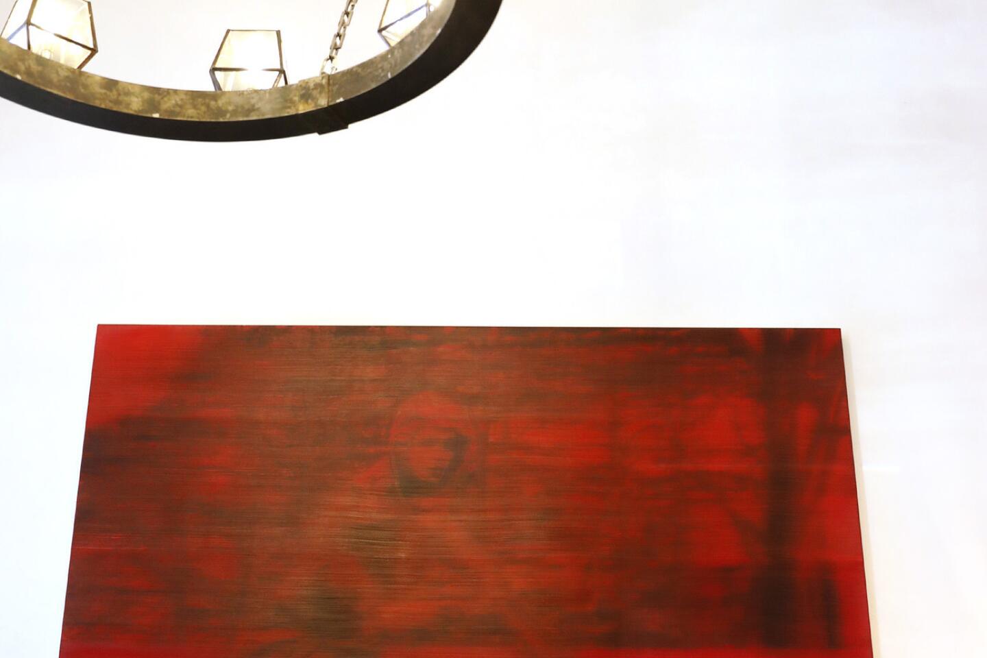
Santa Monica artist Alison Van Pelt portrayed the hotel’s first managing director and pioneering aviatrix Maude Bouldin, astride a motorcycle, at Hotel Figueroa. It is an 8-foot-square painting in the guest lobby.
An 8-foot-square painting in the lobby sets the tone for artwork throughout the hotel. Santa Monica artist Alison Van Pelt portrayed the hotel’s first managing director, the pioneering aviatrix Maude Bouldin, astride a motorcycle. The lobby’s art gallery features all female artists in a newly acquired permanent collection that emphasizes history and a sense of place.
Embrace the feminine side, boldly
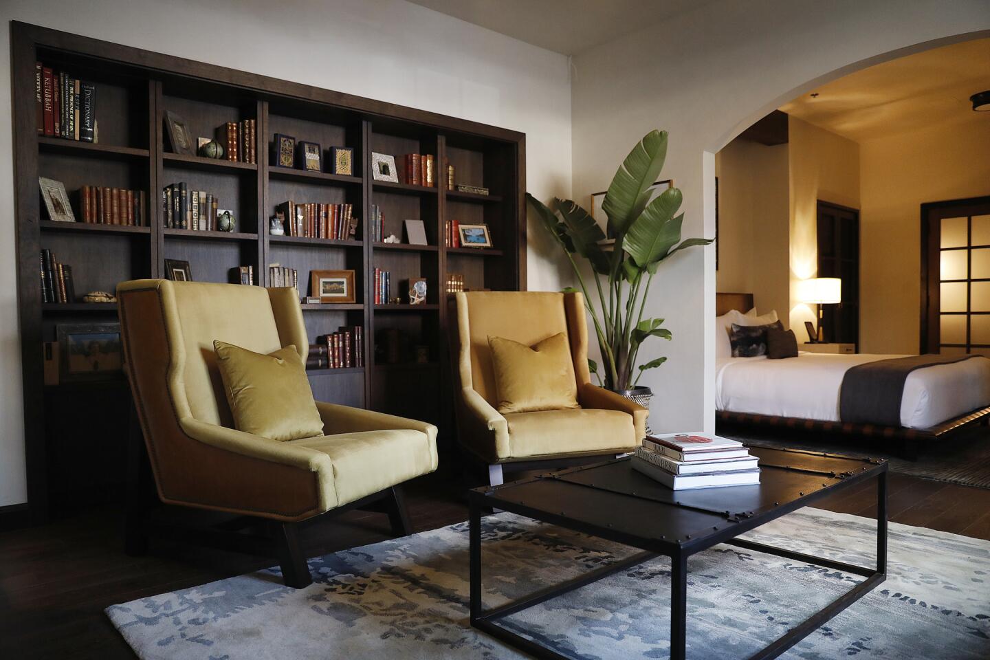
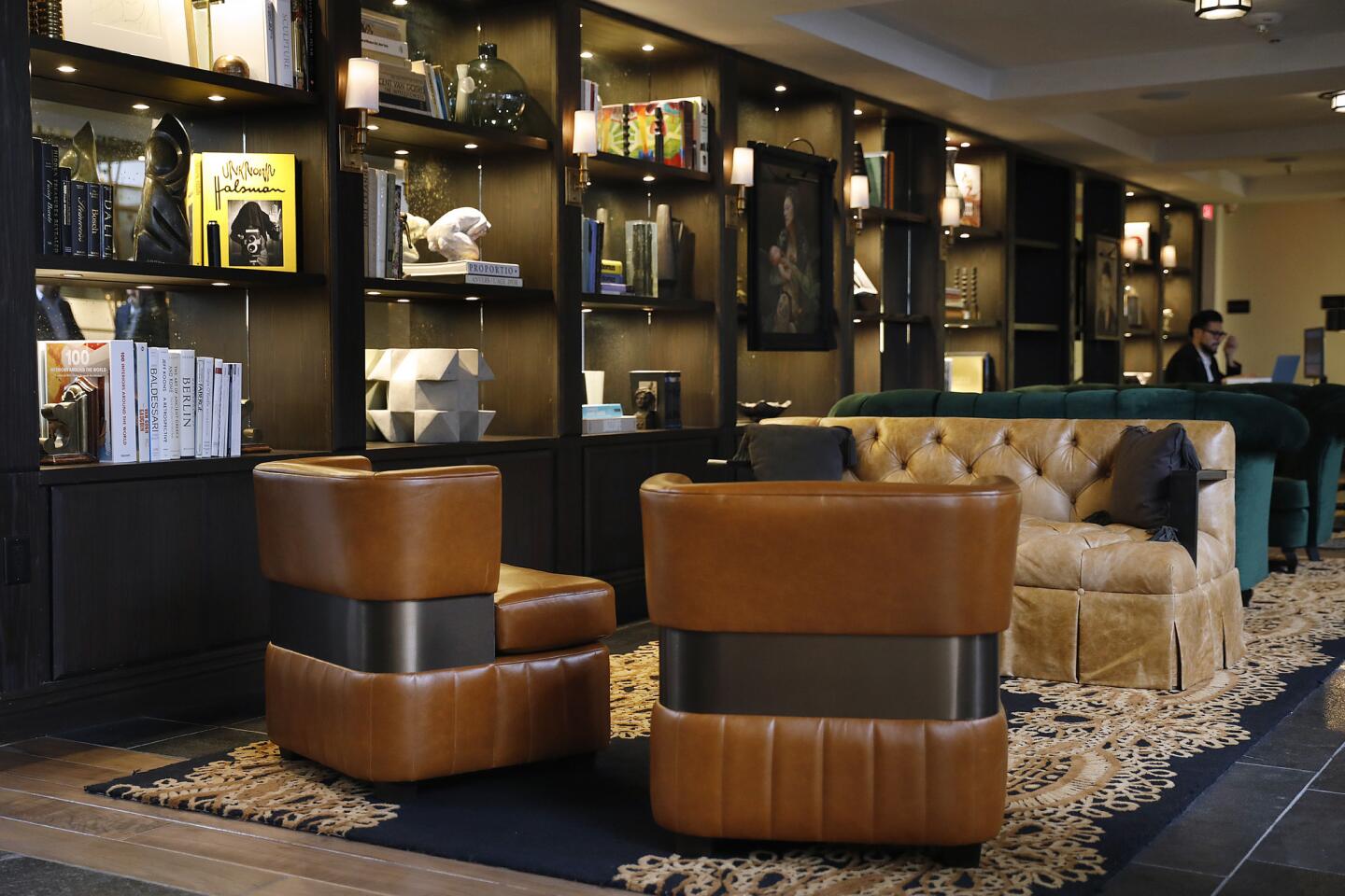
Man caves and boudoirs have their place, but a blend of both welcomes all. The hotel’s feminine feel comes from curvy wing chairs, plump ottomans and button-tufted booths. Assertive but earthy colors such as moss, ochre and chestnut highlight soothing upholstery in plush, touchable velvet, suede and chenille. Plucked-from-nature surfaces show up as marble tabletops, wood floors, slate tile and shower floors of smooth river pebbles.
Bring the light inside
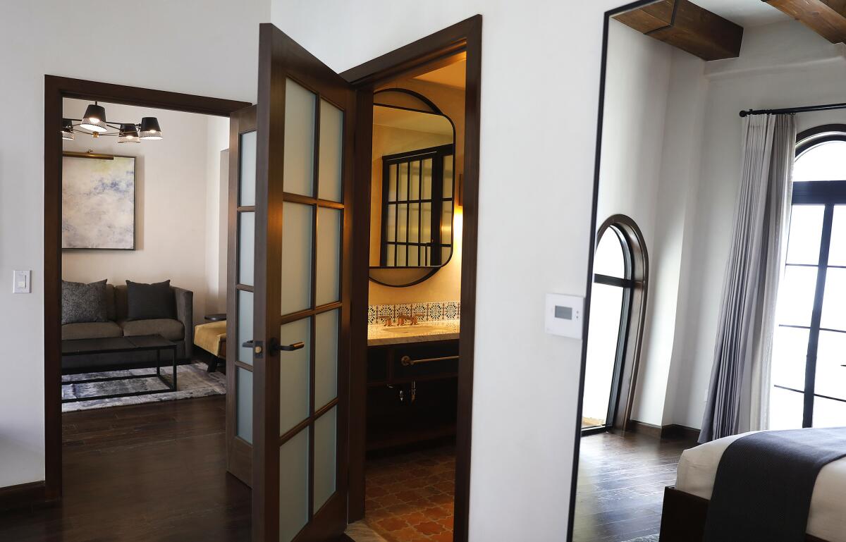
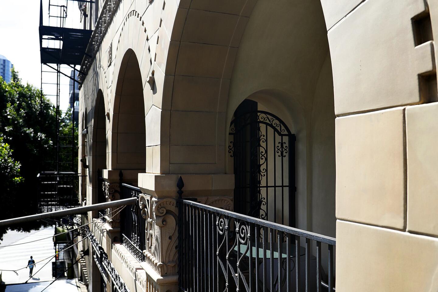
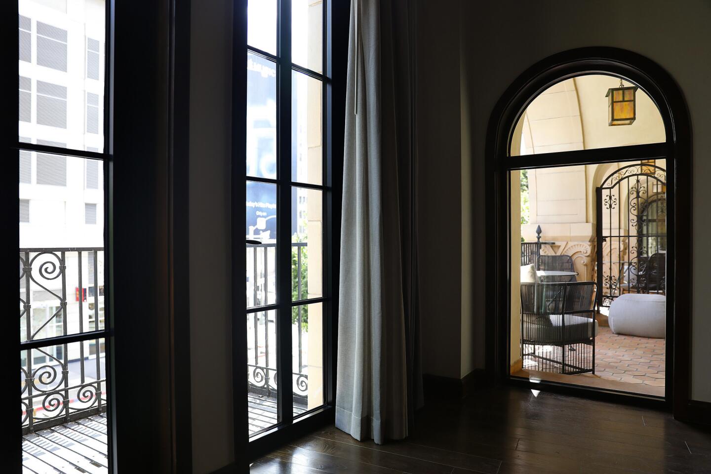
“Even though the hotel had this unique charm to it, part of the lightness and brightness was lost” over the course of its many renovations, said Christian Schulz, principal of the Santa Monica-based interior design firm Studio Collective. His team restored street-facing windows and repaired and wired skylights for nighttime illumination. “It was important to us to have a street presence on Figueroa,” Schulz said. Now, the former fortress-feeling structure embraces pedestrian life, like a friendly neighbor.
Indoor lighting matters
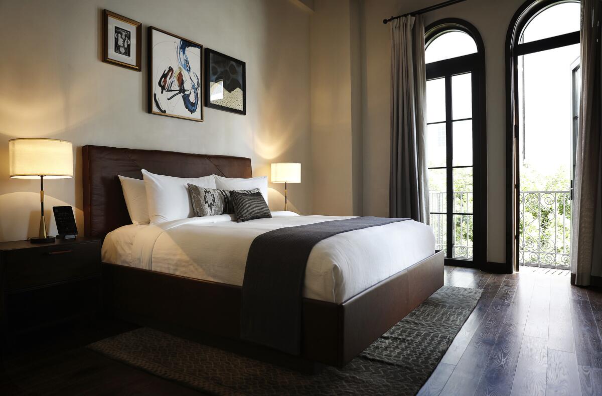
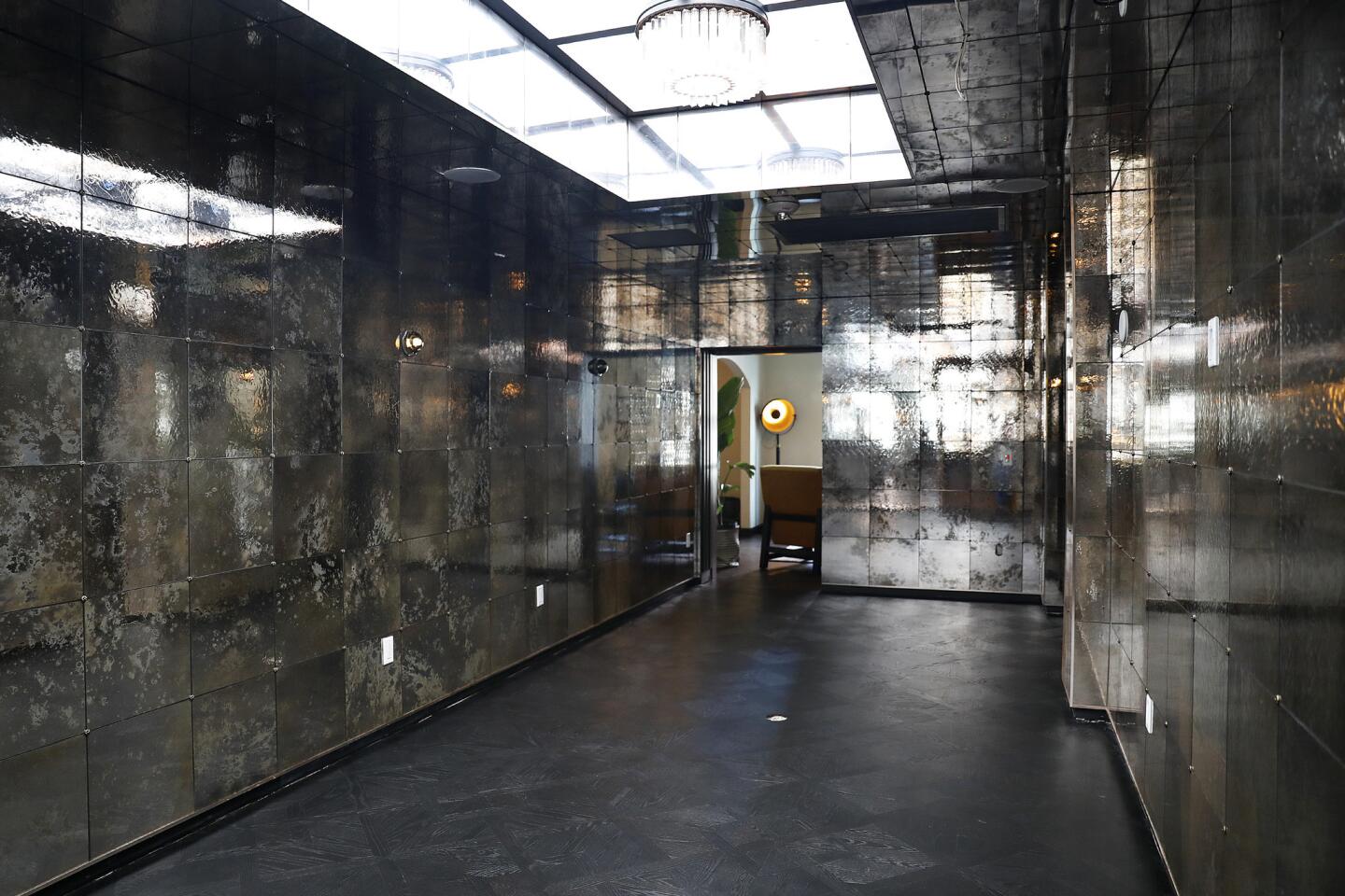
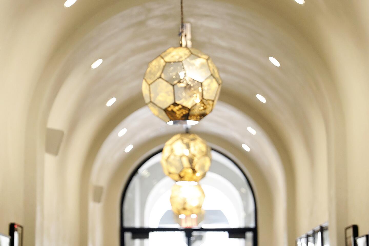
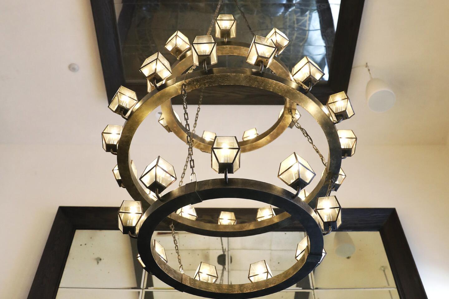
Strategically placed, warm-toned LED lighting bathes guests in a flattering glow. Lights placed variously in the floor, on the wall posts and overhead combine to highlight the best features of guests and decor. Lampshades made of antiqued mirror, frosted glass and alabaster or gold-painted paper further filter the soft illumination.
Usher guests in with style
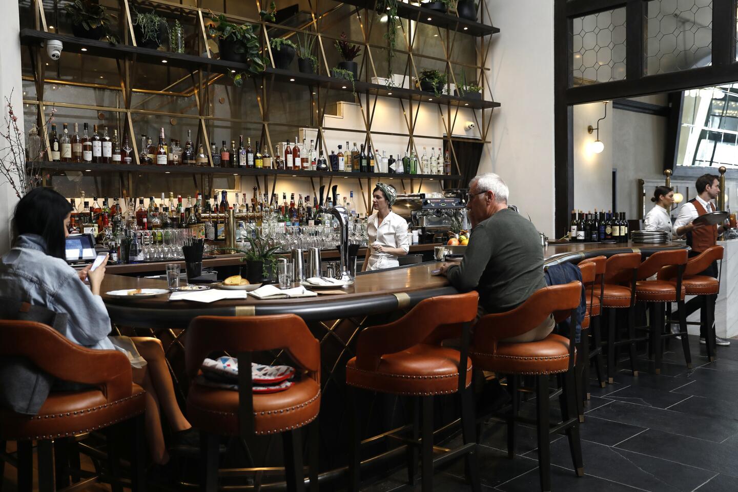
The building now has two entries — one for “stay,” one for “play,” said hotel developer Bradley Hall, managing partner of Capital Hall Partners, which has invested in the project and its redesign. Weary travelers can transition slowly through the separate guest entry, while also glimpsing the action at the adjacent public bar and lobby.
Engineer for engagement

The public “play” entry opens into a bar and high-ceilinged lobby, with nary a distracting television screen. Instead, the inviting seating arrangements allow for conversation, communal dining and a kind of approachability. “We want people to create an emotional connection instead of staring at a screen,” said co-owner Jack vanHartesvelt, president of Hartland Hotels, an investor focused on hotel operations.
Emphasize comfort
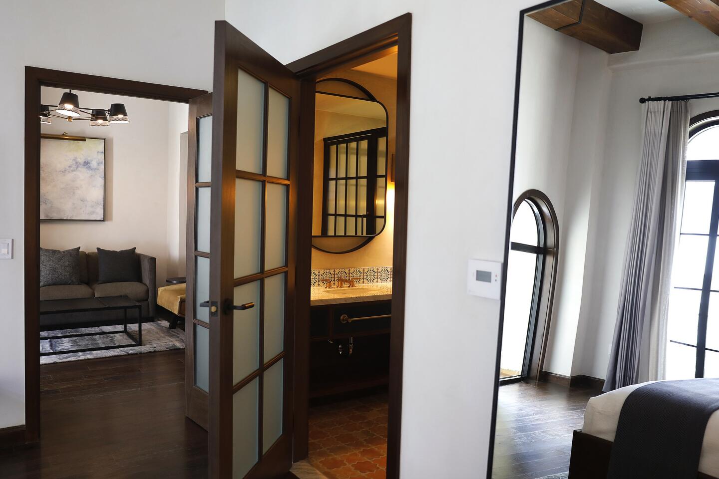
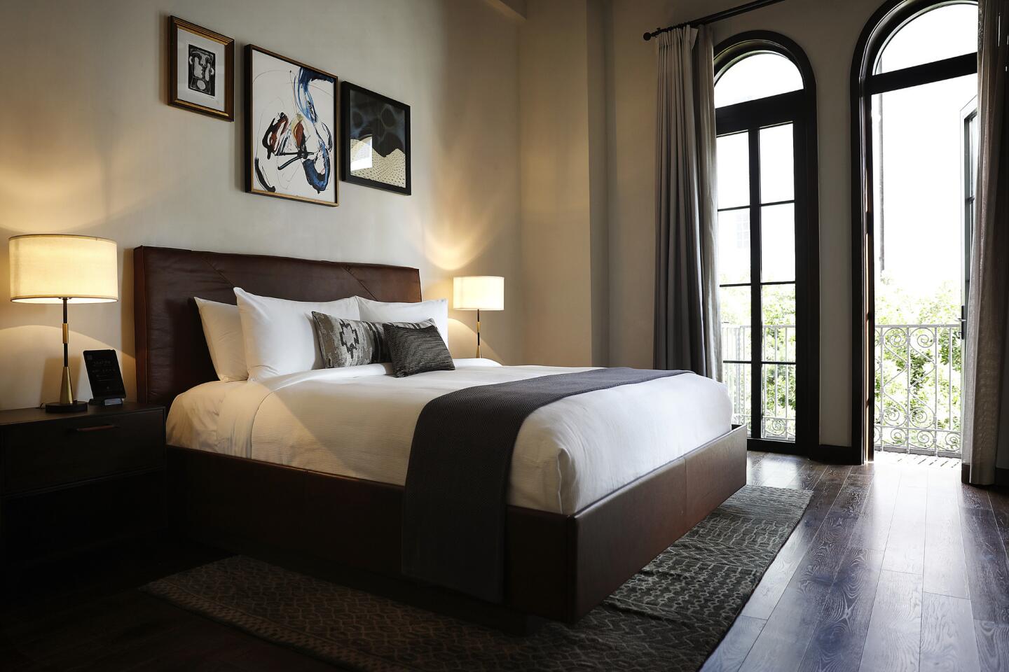
Though suites have spacious seating areas, even the smallest rooms feel engaging with their mix of linen, leather, velvet and marble. The designers were told to “give the guest rooms the most comfortable beds and make the bathrooms feel special,” Schulz said. Guests get pillow-top mattresses, a snuggly bed throw, crisp linens and a choice of pillows from a 16-item menu. Windows are extra sound-proof and double shades block light.
Make bathrooms memorable
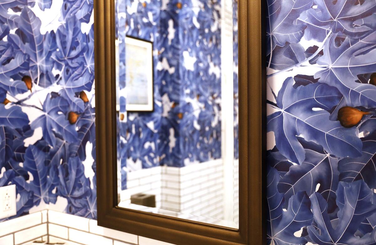
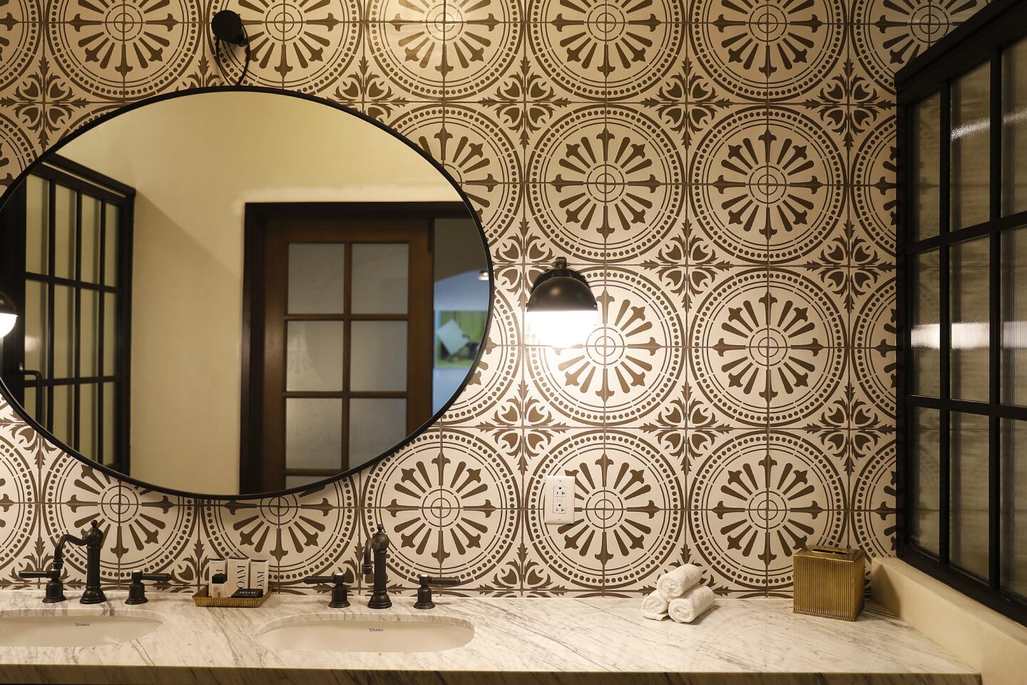
Bathrooms don’t have to be dull to feel soothing. The hotel’s oversize rain shower nozzle adds a spa-like experience. More compelling: a custom, trademarked fig-leaf wallpaper pattern rendered in a signature shade of cerulean. Soft-textured, polished plaster makes the walls look and feel like suede but wear like ceramic tile.
Embrace the variation
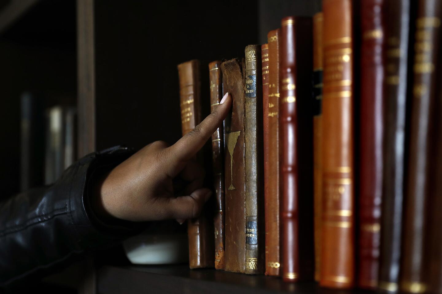
After shrinking to 268 guest rooms, nearly 40 floor plans emerged. Schulz and design partner Adam Goldstein united the rooms with a palette of cerulean, soft white, satiny brass and dark wood. Art, books and antiques extend a residential feel.
Respect history
While Hotel Figueroa’s reinvention isn’t a preservation project, it is sort of a rescue. “We’re hoping for a timeless feel, so guests will be able to feel comfortable and grow up with the hotel,” said vanHartesvelt. “We’re stewards of this place,” he said, “but with an opportunity to rehabilitate it and bring it into the future.”
Hotel Figueroa, 939 S. Figueroa St., Los Angeles.
For an easy way to follow the L.A. scene, bookmark L.A. at Home and join us on our Facebook page for home and garden design, Instagram, Twitter and Pinterest.
ALSO:
Go inside four DTLA boutique hotels where style is the thing
Sign up for The Wild
We’ll help you find the best places to hike, bike and run, as well as the perfect silent spots for meditation and yoga.
You may occasionally receive promotional content from the Los Angeles Times.
