They found a real estate unicorn: A house with great ŌĆśbones,ŌĆÖ ready for decorating
First-time house hunters Tom Balamaci and Patrick Wildnauer looked at more than 100 houses online and visited 30 in person during a seven-month search.
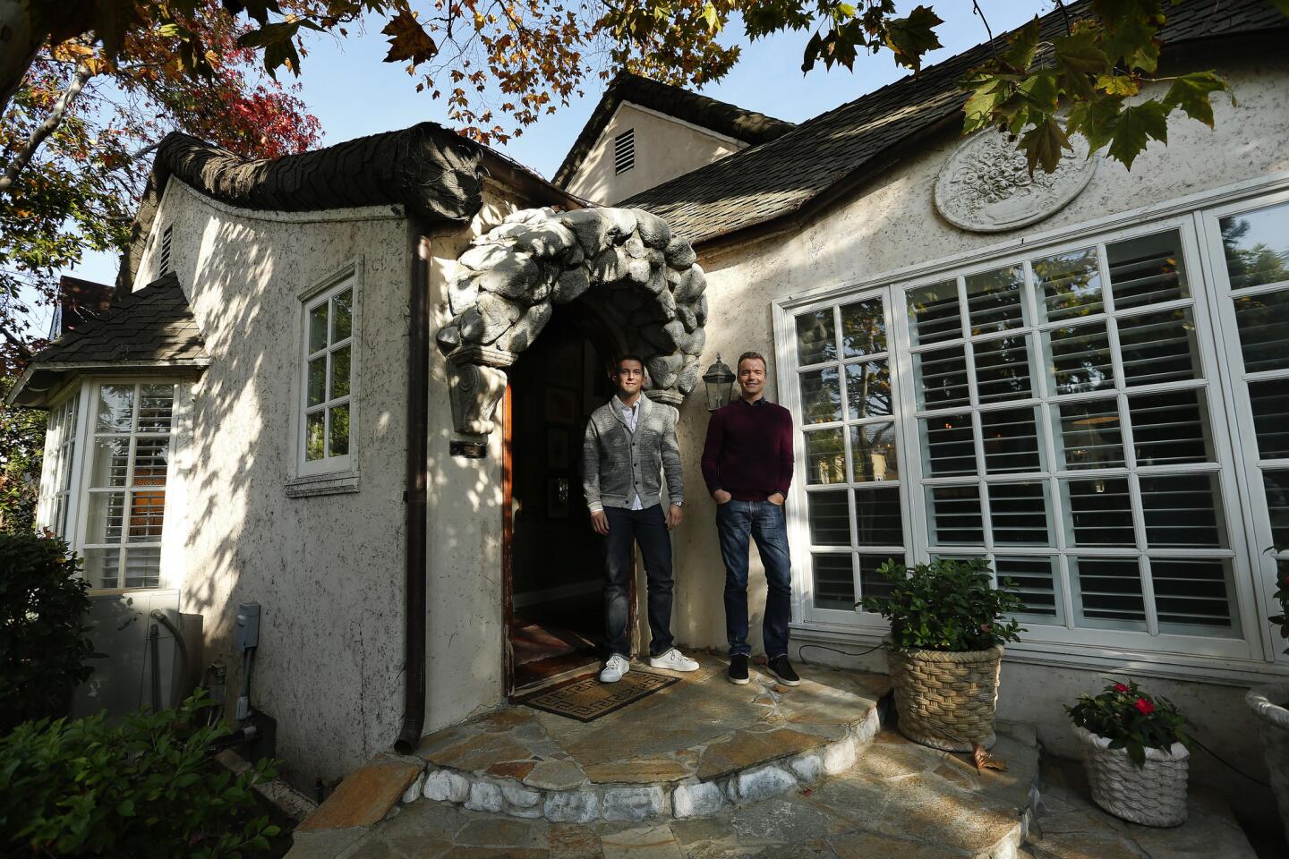
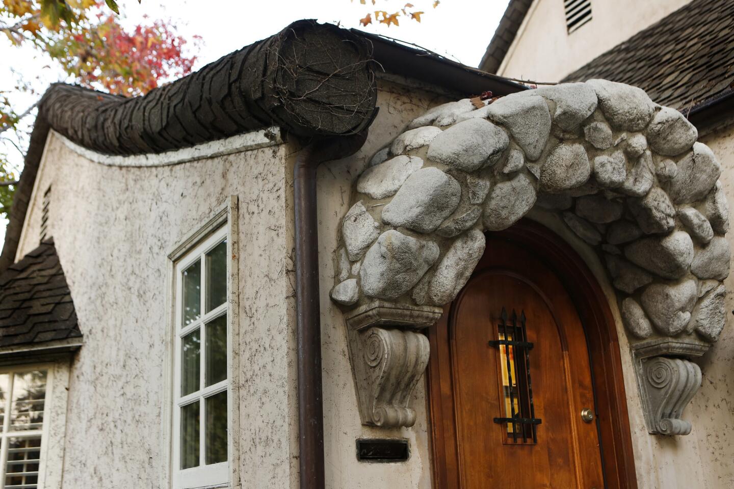
They finally settled on a 1927 English-inspired cottage in the Wilshire Vista neighborhood. A great layout for entertaining and proximity to work and friends sealed the deal.
ŌĆ£We knew this was the one,ŌĆØ Balamaci said of the three-bedroom, two-bath charmer. ŌĆ£It had traditional style but the kind of openness you want in California.ŌĆØ
Before settling happily ever after into the 1,661-square-foot, storybook-style home, however, there was work to be done.
And thatŌĆÖs where Los Angeles-based interior designer, Amalia Gal came in.
Budget-friendly
The mission: refresh the homeŌĆÖs dated design details while capitalizing on original architectural elements and showcasing the coupleŌĆÖs personality. And do it all on a budget.
Although a hard-and-fast number wasnŌĆÖt assigned to expenditures, Gal said smart financial choices and creative sourcing were important.
ŌĆ£The approach was, letŌĆÖs do this with quality products but not go overboard,ŌĆØ Gal said. High-end finishes and fixtures were balanced with antique and vintage resources found on eBay and One Kings Lane. An unexpected bonus: a stylish 1920s black piano scored for free-to-a-good-home.
D.I.Y. saves dough
In addition, Wildnauer, a senior project manager at Valerio Architects, was able to cut costs by doing some trim and finishing work himself.
ŌĆ£The bones of the house were in good shape; we didnŌĆÖt need to update the electrical ŌĆ” and the roof was relatively new,ŌĆØ said Balamaci, who works as general manager for the Zoe Report at Rachel Zoe Inc., ŌĆ£so all that stuff we didnŌĆÖt really want to spend money on had already been done and we were able to come in and focus on the fun stuff, the decorating.ŌĆØ
Gal said the color palette of the home was designed to transition from dark to light as one moves through the space. ŌĆ£The idea was going from dark to medium to lighter and brighter.ŌĆØ
Welcome home
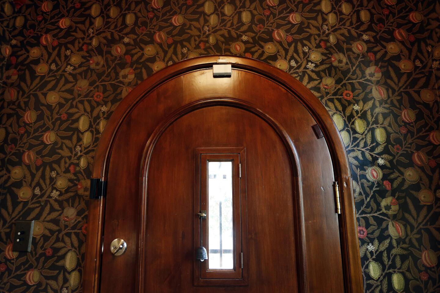
The small, coved entryway was wallpapered with a darkly patterned Morris & Co. design purchased from Egg & Dart in Los Angeles and appointed with an antique table and mirror. Wildnauer installed crown molding, and the ceiling was painted in flat, Dunn Edwards Red Craft to match the walls.
Molding magic
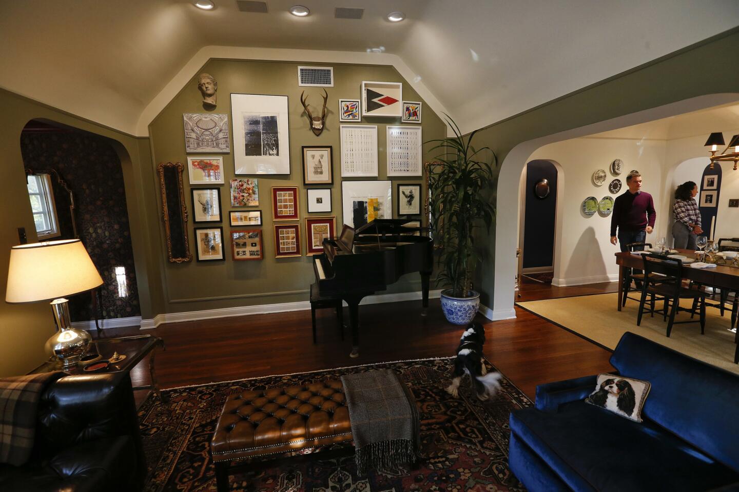
In the living room, a river rock fireplace anchors a generous space lined with paned, cottage windows and capped with a vaulted, barrel ceiling.
Before
After
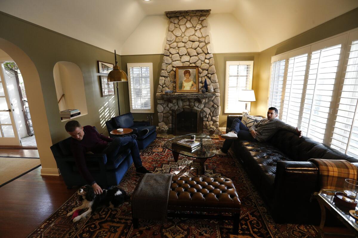
ŌĆ£There wasnŌĆÖt any delineation between the walls and the ceiling,ŌĆØ said Gal, ŌĆ£and Patrick wanted the room to be a dark color ŌĆ” so I came up with the idea of installing molding so we could stop the paint [at the trim line] and keep it from feeling too heavy.ŌĆØ The walls were painted Union Springs in velvet by Dunn Edwards and the ceiling was brushed with flat, Dunn Edwards paint in Historic White.
On display
A gallery wall was also on the wish list. ŌĆ£Most of their pieces were flat and two-dimensional,ŌĆØ said Gal of a collection that included prints from a trip to Istanbul, a map of Los Angeles and an etching from PatrickŌĆÖs ancestral home in France. ŌĆ£We needed to add some textural pieces to create interest, so they got the mirrors, the antlers and the Hellenic bust.ŌĆØ

Gal designed the gallery layout, and she and Wildnauer executed the installment and added molding.
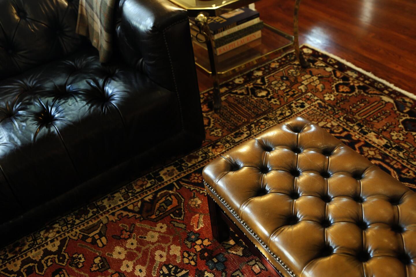
The wall provides a focal point in the room and adds to the masculinity and character of the space. Orange vintage armchairs were reupholstered in deep blue velvet to coordinate with a Persian area rug and face a long leather sofa from Restoration Hardware.
ŌĆ£They wanted to have a gigantic sofa,ŌĆØ said Gal, ŌĆ£when they have parties, six people can sit on it.ŌĆØ
Guess whatŌĆÖs missing?
A painting of TomŌĆÖs grandmother holds pride of place on the mantel, obscuring an awkward niche and lending an aura of family history.
WhatŌĆÖs not in the living room? A television. ŌĆ£We like to watch TV,ŌĆØ said Balamaci, ŌĆ£but we didnŌĆÖt want one in the living room, itŌĆÖs just too much of a distraction. We wanted this to be a room for conversation when friends are over or for reading or the piano when itŌĆÖs just us.ŌĆØ
Bargain hunting
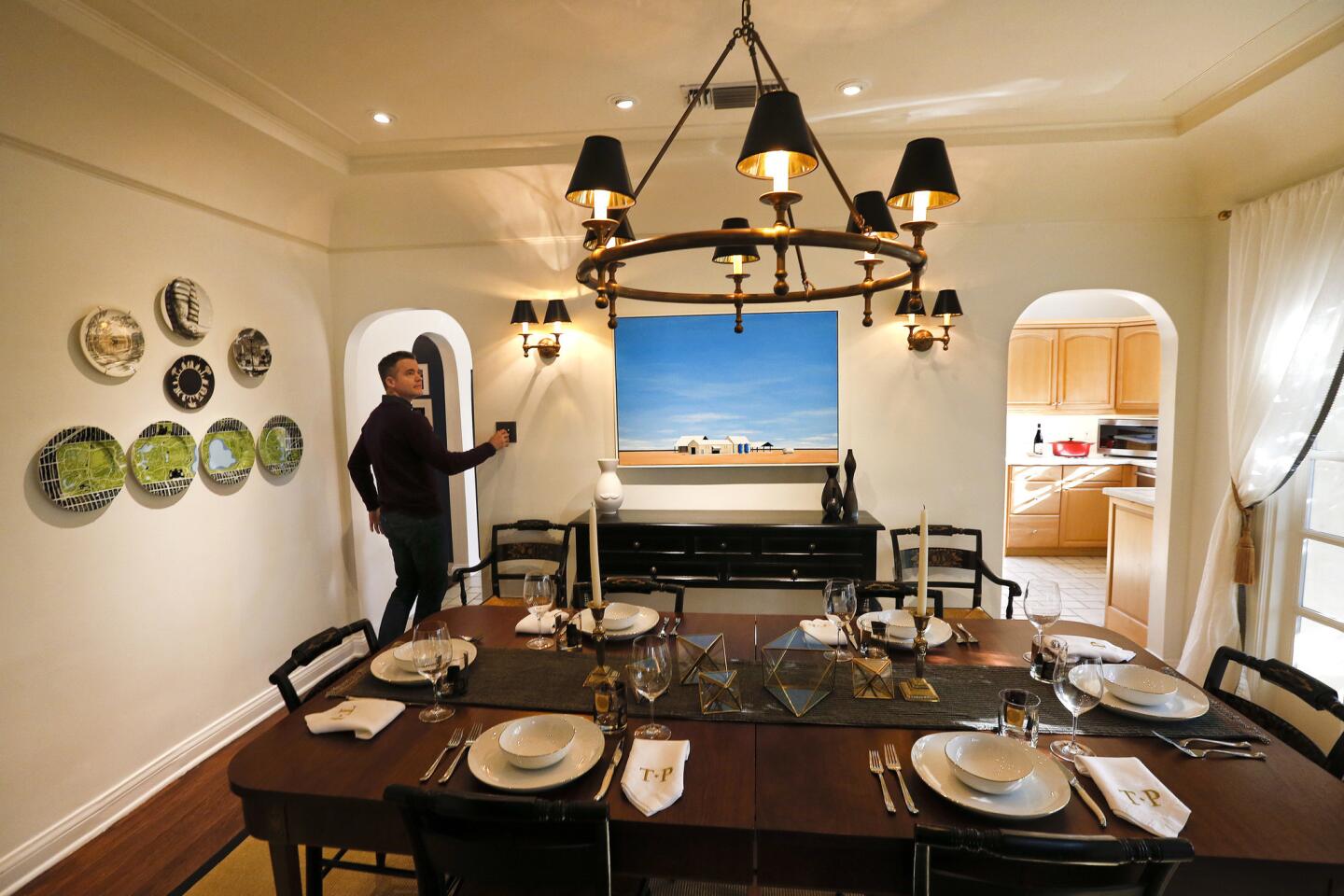
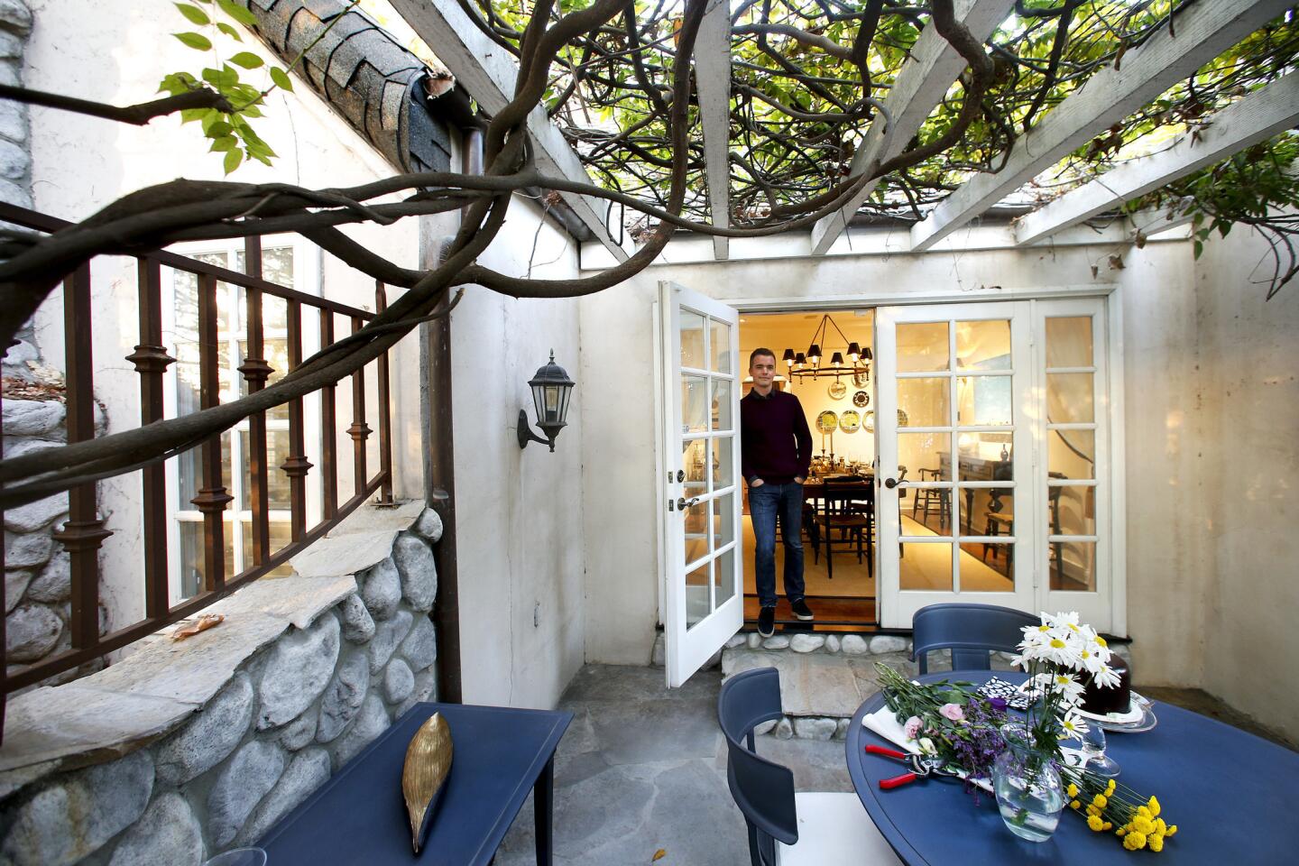
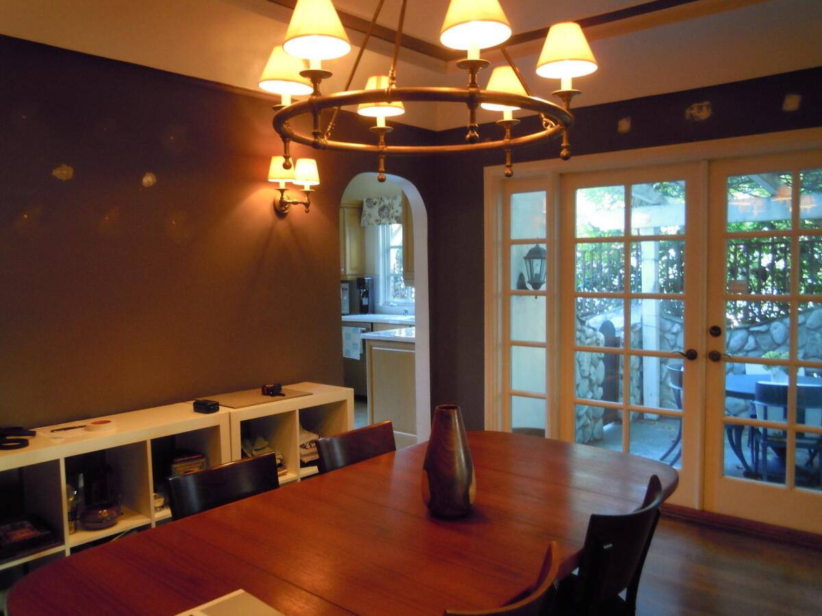
The previously purple dining room was repainted in Silver Lake from Dunn Edwards and features a set of French doors that lead to a private, pergola-covered patio.
ŌĆ£I think my favorite thing about the house is the layout, particularly the dining room,ŌĆØ said Wildnauer.
Before
After

ŌĆ£For our first Thanksgiving here we had 12 people,ŌĆØ said Balamaci, ŌĆ£and seating extended onto the patio without making it feel like the kidŌĆÖs table.ŌĆØ
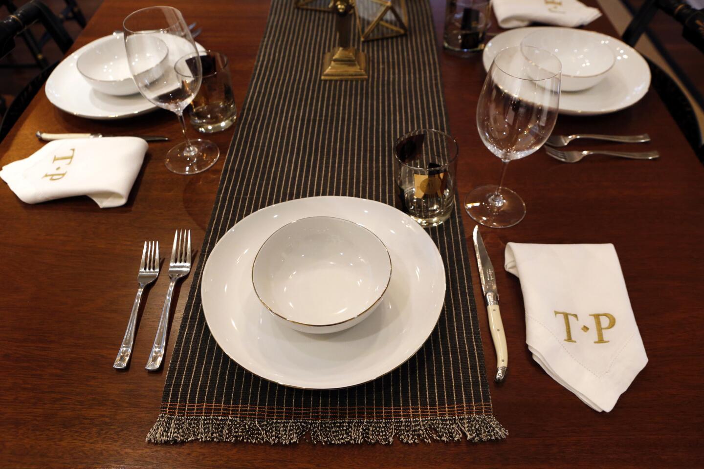
The tableŌĆÖs antique, 1940s Hitchcock chairs were found on eBay. ŌĆ£Honestly, it was a great deal,ŌĆØ said Balamaci, ŌĆ£and we got them for less than the price of going to Pottery Barn.ŌĆØ
The traditional, Federal-style chairs coexist happily with a new, contemporary painting by Lukasz Ratajczyk found on SaatchiArt.com. ŌĆ£ItŌĆÖs a great resource,ŌĆØ said Balamaci, ŌĆ£because it has all media at a variety of price points. ItŌĆÖs a nice way to get a piece of art without breaking the bank.ŌĆØ
Drawing the eye
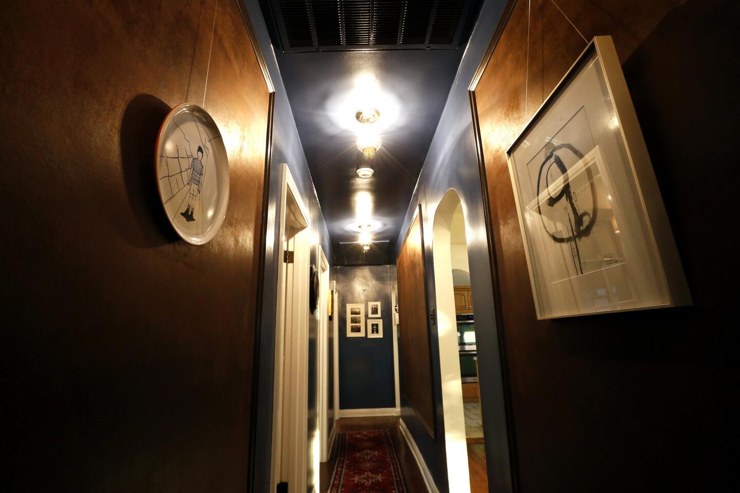
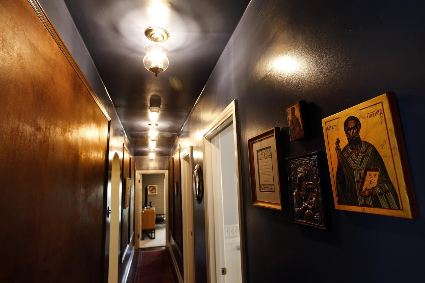
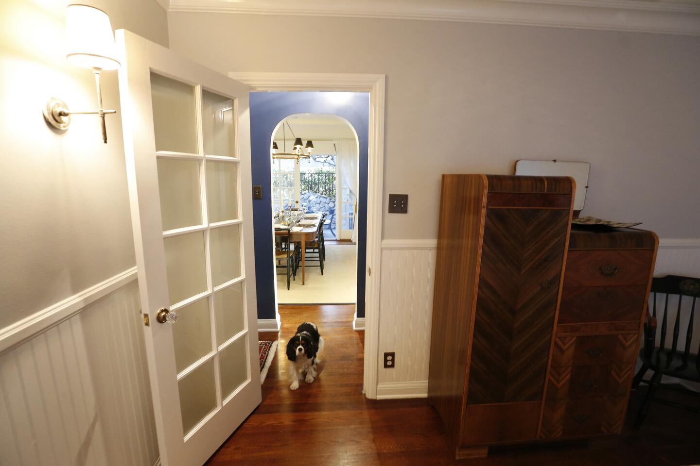
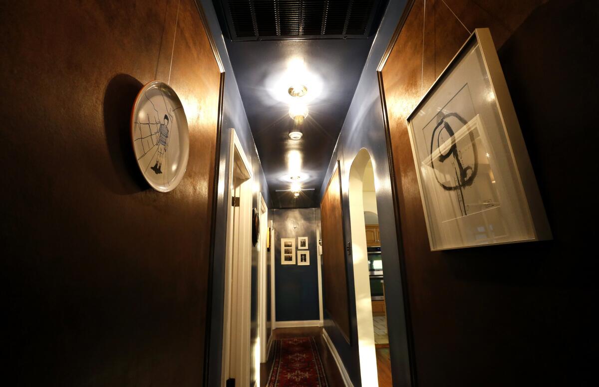
In the hallway leading from the dining room, Gal said Tom envisioned a dark, glossy passageway, but Patrick feared high-gloss paint would expose imperfections on the vintage plaster walls. As a compromise, Gal used a saturated, Newbury Port paint by Dunn Edwards with a semigloss finish and added sueded wall panels with an art rail and molding for texture. ŌĆ£As they collect more art we plan to layer it on the panels,ŌĆØ said Gal. ŌĆ£ItŌĆÖs a narrow space, but it makes it interesting.ŌĆØ
Before
After
At rest
Since the closet in the master bedroom and the closet in the guest room shared a wall, Gal and the homeowners combined the two to create roomier storage and more organization for the master. ŌĆ£We stole the closet from the guest room,ŌĆØ said Balamaci. ŌĆ£They didnŌĆÖt have the same amount of clothes in the 1920s that we have now.ŌĆØ
Before
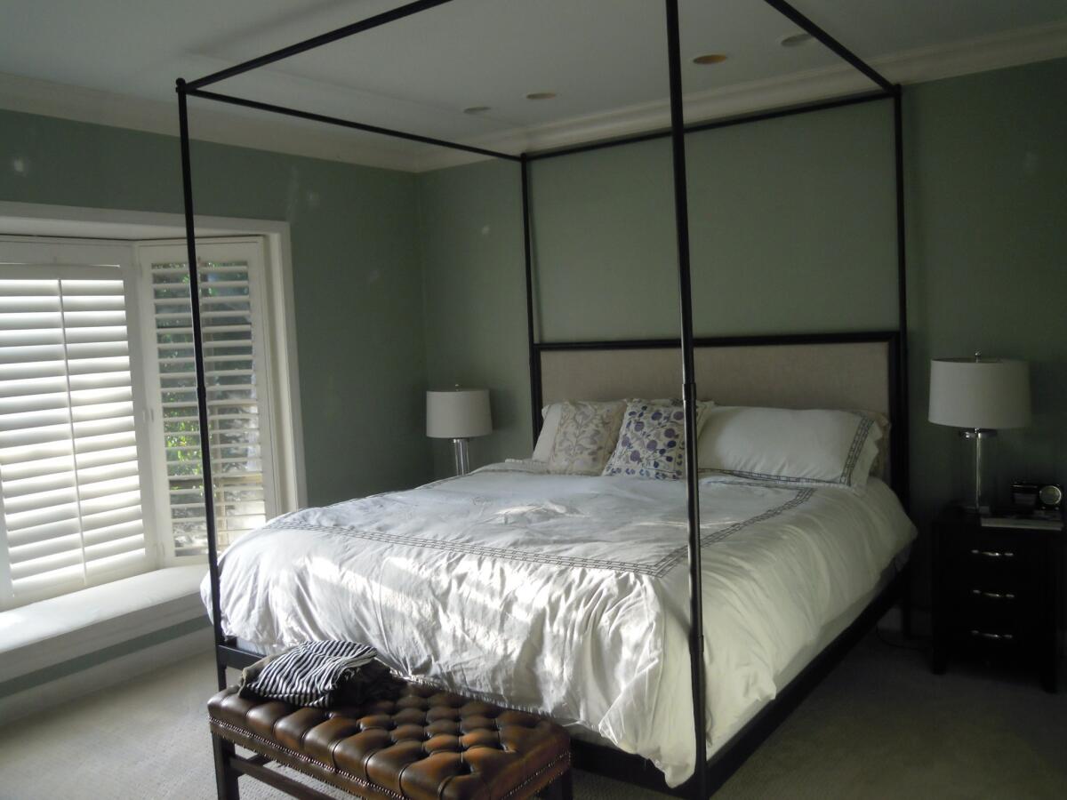
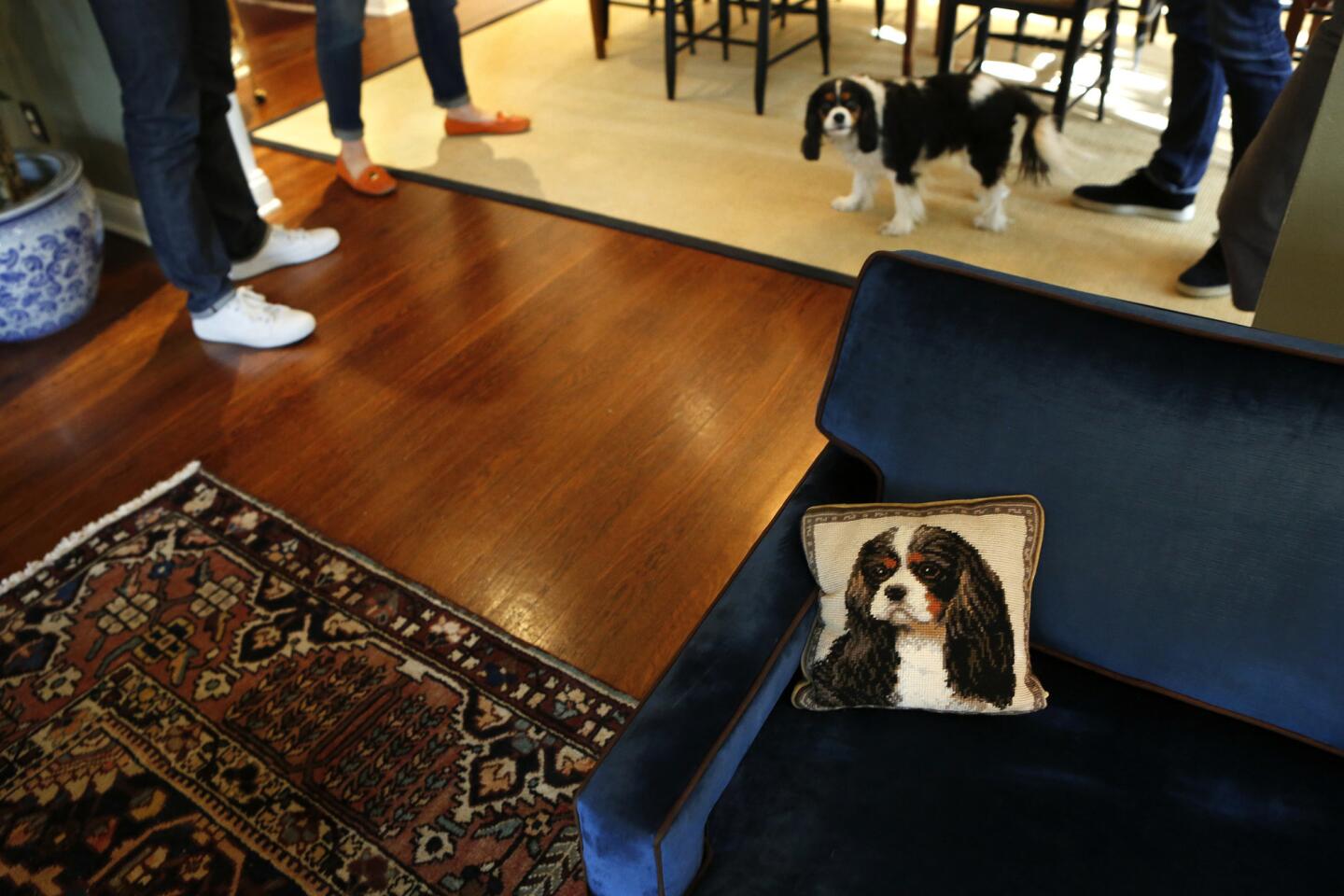
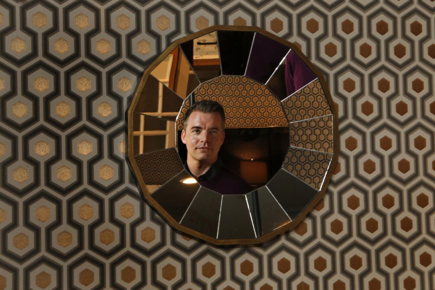
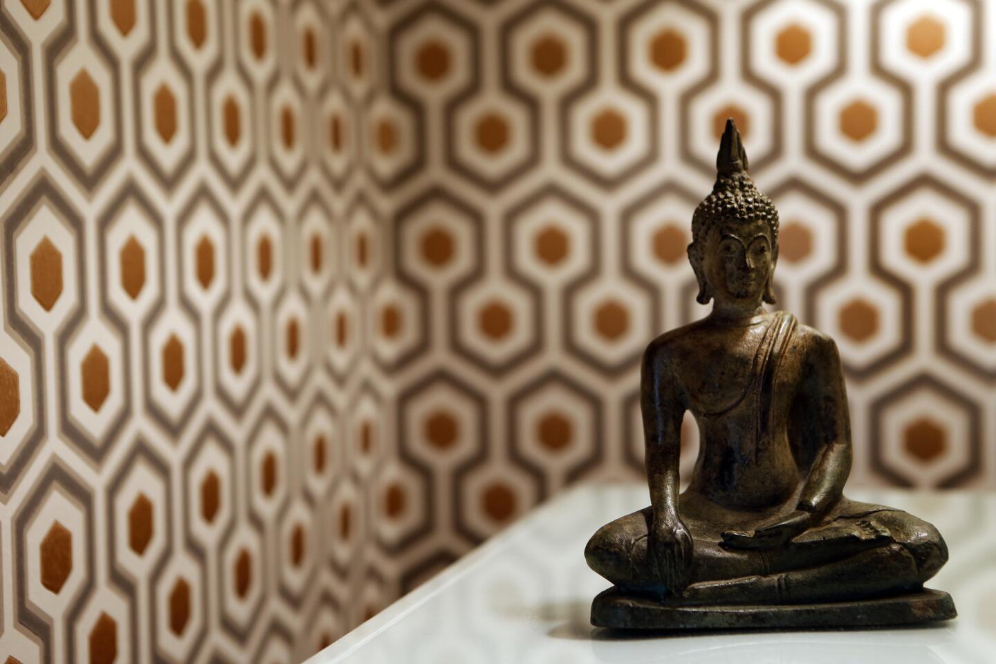
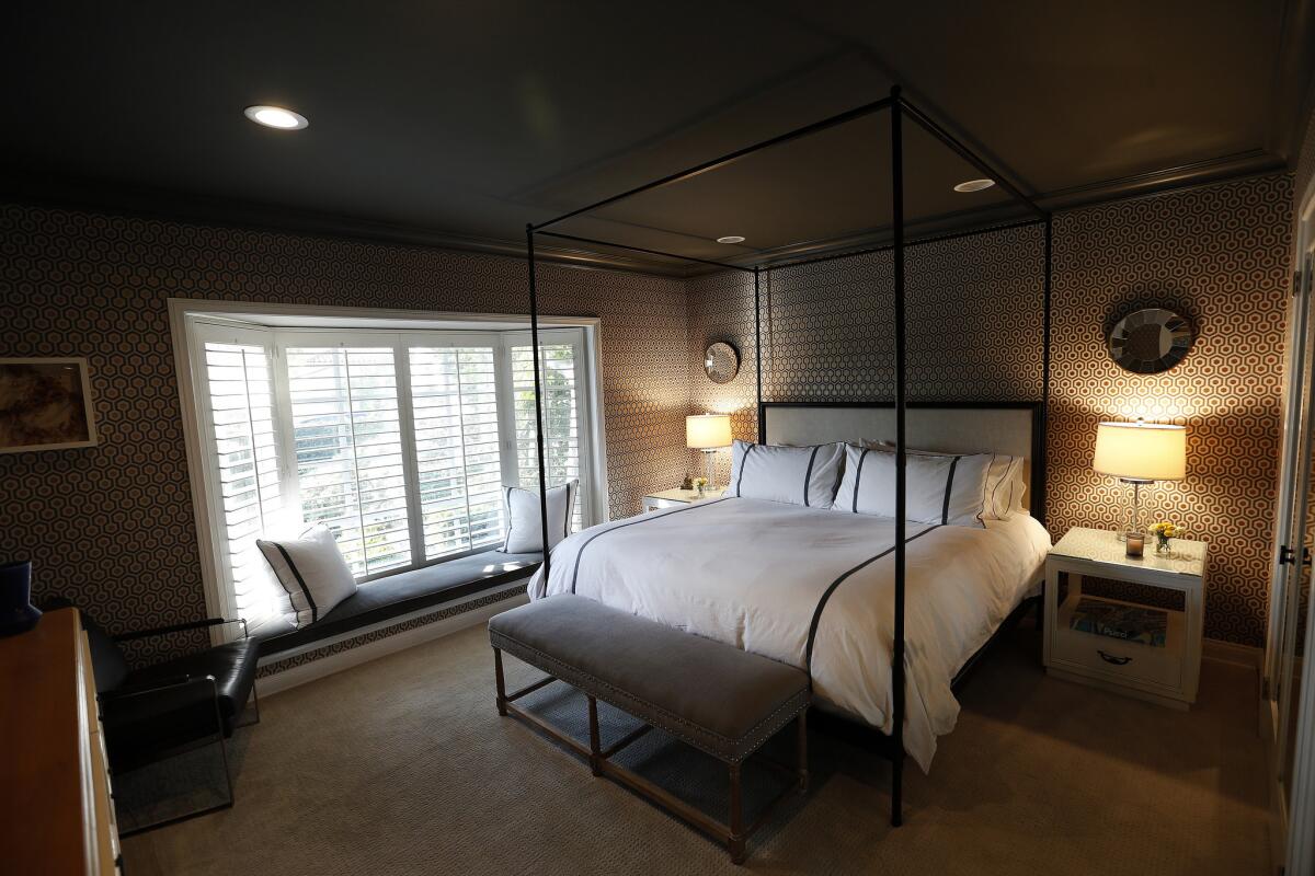
In addition to the re-imagined closet, the master bedroom makeover included new wall coverings by British designer David Hicks, a painted ceiling and a reupholstered window seat. (Their King Charles Spaniel Buckie ŌĆö named after the pioneer of the geodesic dome, architect Buckminster Fuller ŌĆö thinks itŌĆÖs just for her.)
After
The cozy-meets-glam guest room received a palette inspired by a special piece of art.
ŌĆ£It was a housewarming gift from a good friend,ŌĆØ said Balamaci of an elegantly framed painting that hangs on the wall. ŌĆ£Her father, who was [jeweler] Claude Arpels of Van Cleef and Arpels, painted it for her mother.ŌĆØ Gal painted the room Silver Lake as well to match the painting and added an antique family dresser, crystal chandelier and curtains.
No finish line
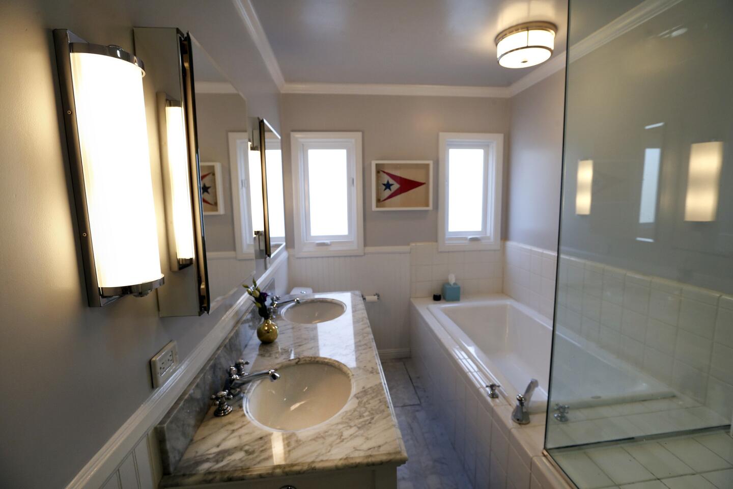
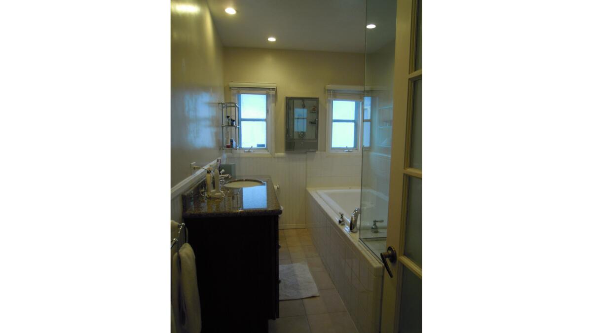
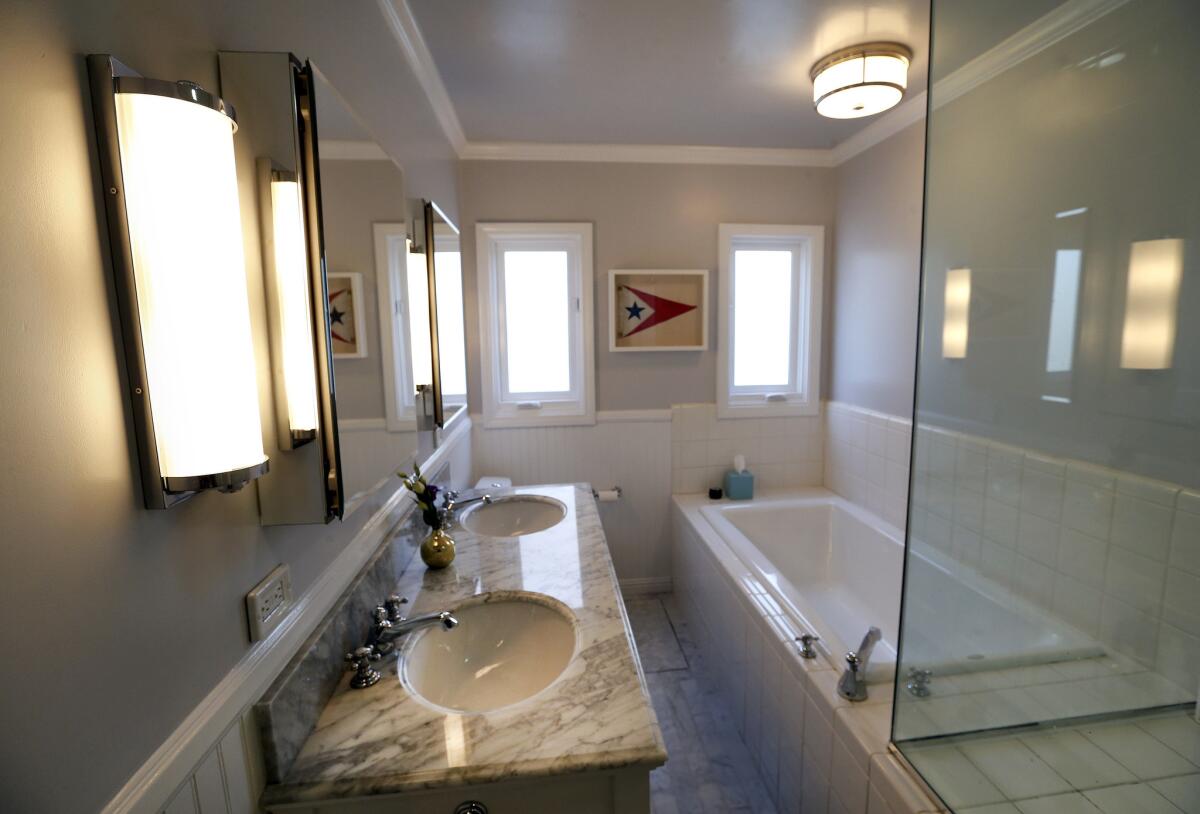
In the main bathroom, a dated vanity, mirror and fixtures including the tub filler and shower fittings were replaced with period-appropriate pieces from Restoration Hardware. The white marble counter top and marble tile flooring were coordinated with light colored walls (again, Silver Lake, in a semi-gloss), frameless twin medicine cabinets and a vintage sailing pennant.
Before
After
ŌĆ£We basically touched the entire house in some way,ŌĆØ said Gal, ŌĆ£and there will be a phase three, but weŌĆÖre not there yet.ŌĆØ
Future plans include updating the kitchen and den area, and enlarging the half-bathroom into a full bath with a new hallway entrance.
Let the adventures of homeownership begin.
For more musings on all things home design and lifestyle follow me on Twitter @ThsAmericanHome.
ALSO
YouŌĆÖve never seen a kitchen island sink like this
Is it time for America to embrace smart toilets and bidets?
YouŌĆÖve never seen a fire extinguisher that looks like this
