Updating a grand Spanish home into something warmer, more modern
- Share via
When husband and wife Peter Luttrell and Stephanie White moved into their home atop Mt. Washington, they had a challenge Angelenos often face: How do you marry old Spanish-style architecture with a modern lifestyle and furnishings?
To help them find a solution, they turned to interior designer Deirdre Doherty. Luttrell, the founder of an Internet marketing start-up, and White, a family physician, had already seen her effortlessly meld old and new in a friend’s home in Los Feliz.
“She just has this impeccable ability to balance old California Spanish with modern without making it feel old,” Luttrell said.
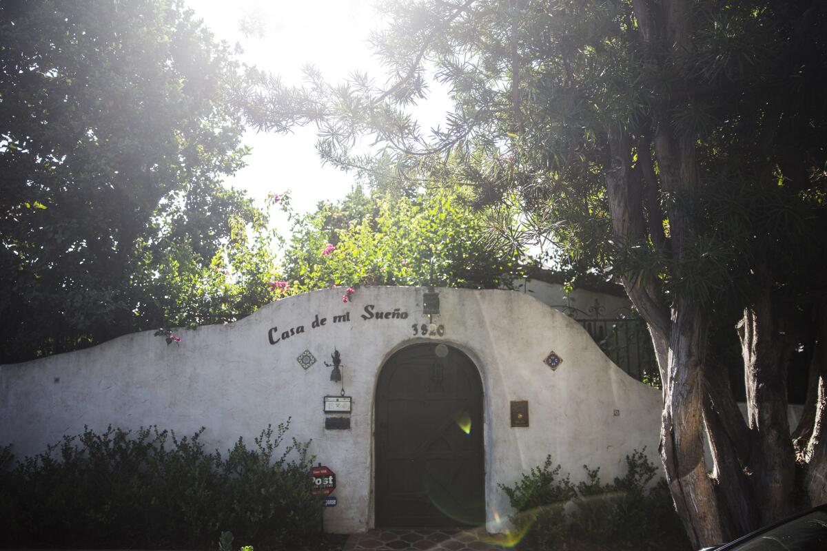
It was a talent that would be put to the test given the renown of the couple’s 1936 Spanish Colonial Revival-style home, which was recently added to Los Angeles’ historic cultural monument list. The couple own Casa de Mi Sueno, or “Home of My Dreams, which is believed to have been designed by Sophie Cubbison (of Mrs. Cubbison’s stuffing mix fame) and was owned by her and her husband, Harry.
Apart from its original owner, the home itself is a celebrity. “An Architectural Guidebook to Los Angeles,” a “bible” of L.A. architecture, calls the home “much more convincing than most of the 19th-century adobes.”
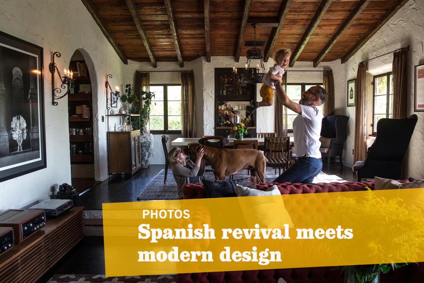
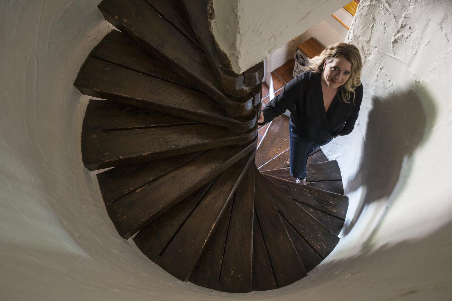
It is believed that Cubbison, who is a descendant of one of California’s pioneer families, drew a lot of inspiration from her childhood memories of Mexican adobes. A step through the home’s arched, adobe-style wall, massive inset wooden door and thick wood trim is like walking through a little portal in time.
In renovating, the couple aimed to “remove all the modern pimples” that were added to the home over the years, while adding a touch of modernity in subtle ways, Luttrell said.
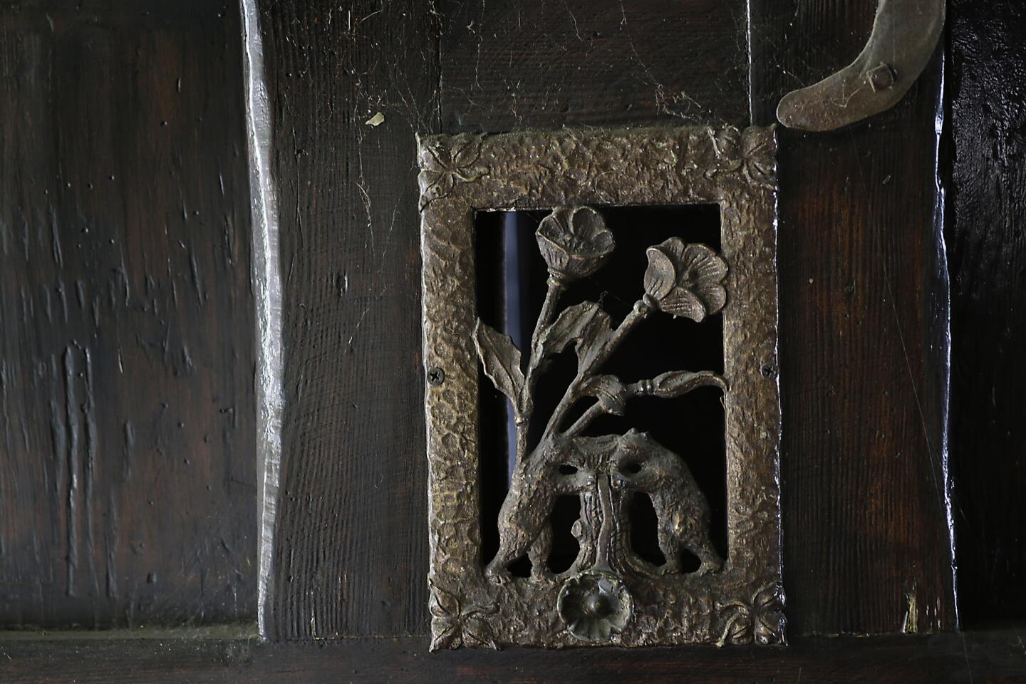
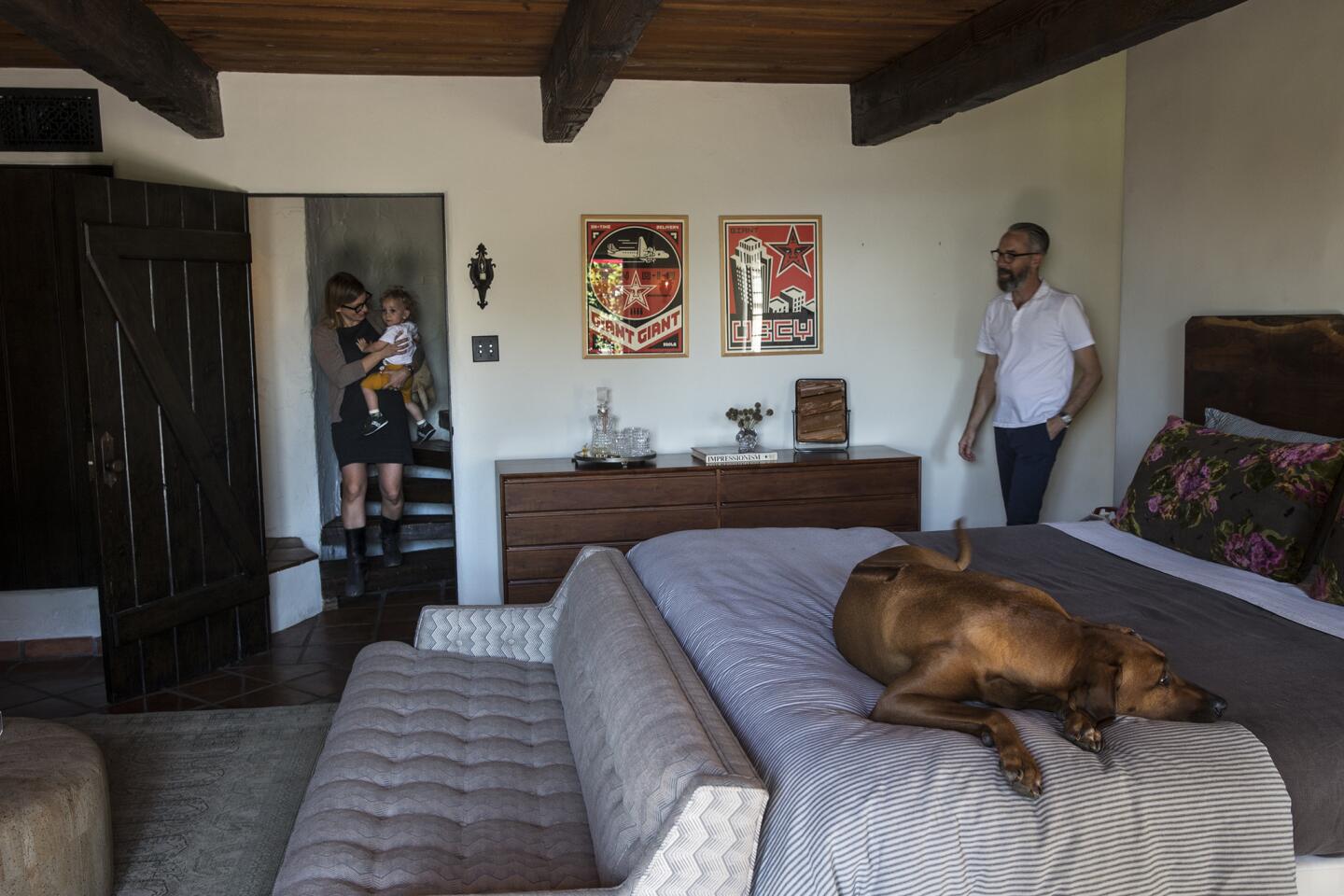
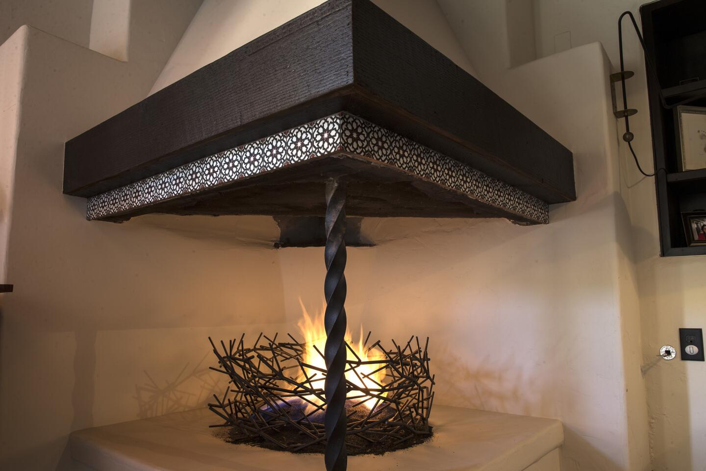
Doherty began by staining the yellow pine on the ceiling, doors and cabinets, as well as the oak floors, a darker color. She also sourced antique Spanish hardware and commissioned craftsmen who could replicate the original door pulls that still remained in the home. The move gave the home a warmer feel without compromising its history.
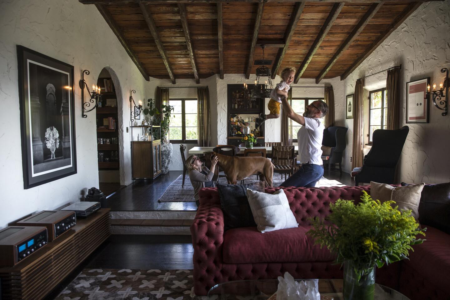
Doherty then designed custom furniture that would blend the old and new. In the living room, a large, custom, tufted, rusty-red couch fits easily with the couple’s Eames lounge chair and Noguchi table.
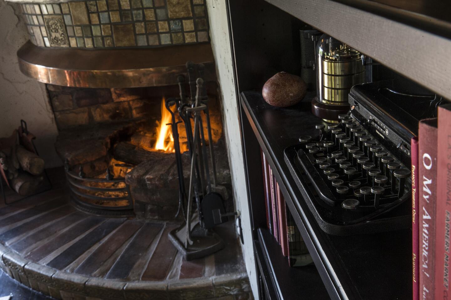
A new patchwork hide rug sported a cross pattern similar to one usually used in tile, a material found throughout the home.
In the dining room, Doherty created a linen lacquered dining table and three styles of chairs — a Friso Kramer-style schoolroom chair and two other midcentury chairs — all reupholstered and refinished in the same color family.
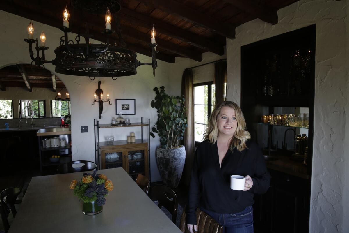
“It is important when making choices to mix and match styles and eras in furniture or architecture to make sure one element is unified,” the designer said. “The easiest way to make it look cohesive is to make sure wood finishes match. That is one reason we refinished the dining chairs. Creating a uniformity in the wood color allowed us to play with the different shapes of the chairs and colors of fabric.”
Knowing the couple’s love for mixology, Doherty converted an awkward niche into a wet bar with a copper sink and screened cabinetry.
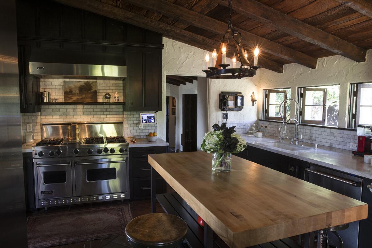
She updated the kitchen by adding stainless steel appliances, a backsplash of honed Carrara small-scale marble subway tile, and Carrara marble countertops. She also replaced a cumbersome pink-quartz-topped island with a more useful wood-topped island with open shelf space for additional storage.
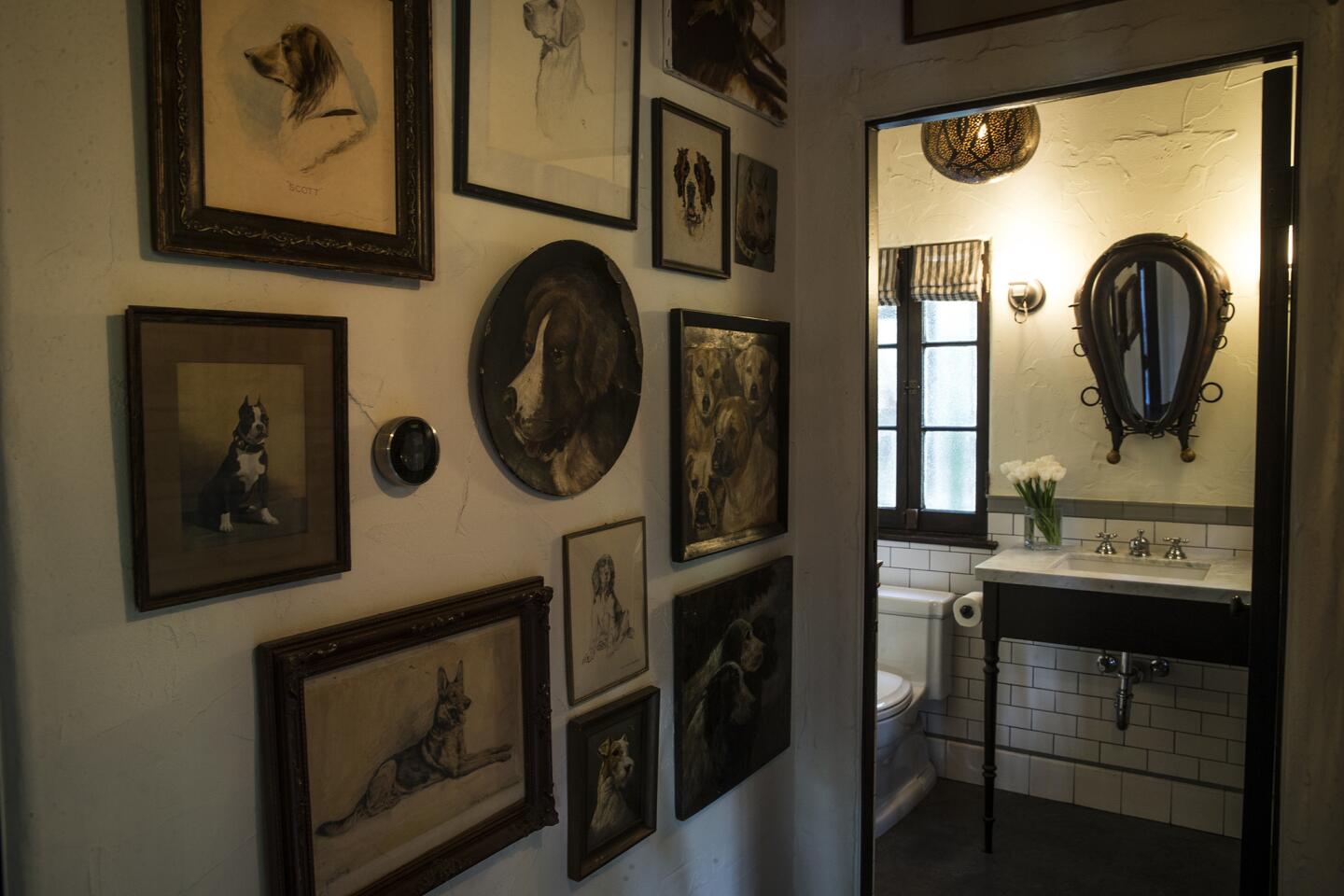
One of the biggest changes was to reconfigure a cramped room with an overlong and narrow bathroom into a more spacious playroom, powder room and full bath. “The flow now makes so much more sense,” White says.
Though Doherty used lighting and furnishings that had the same warm chocolate palette, she avoided from objects that were carved or heavily ornate.
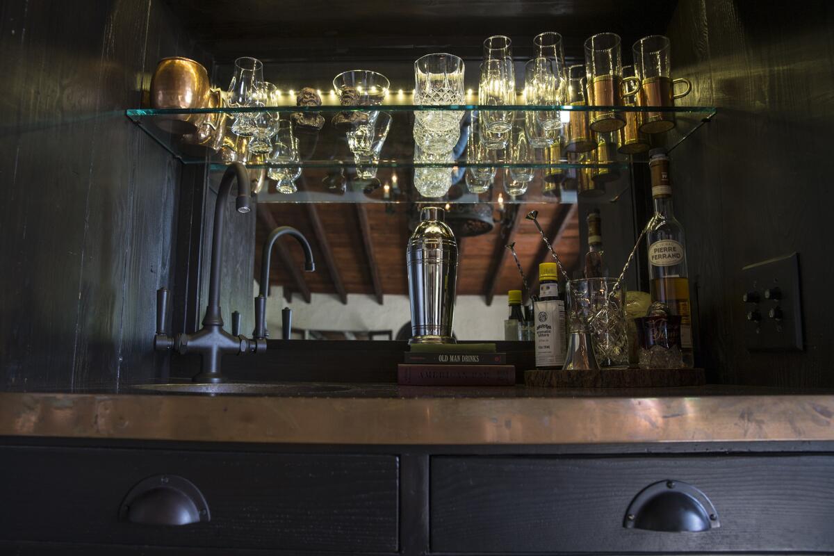
“That can really start to make a space feel heavy and out of date,” she said. Instead, the designer chose items that were simpler and more streamlined.
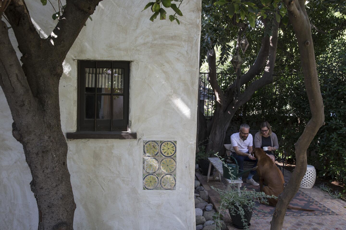
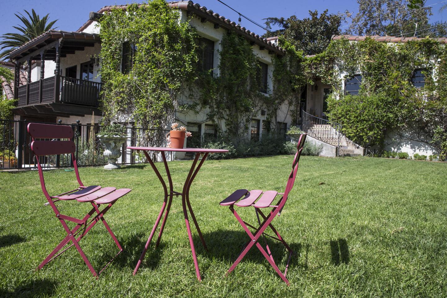
Though interiors are Doherty’s forte, Luttrell and White asked her to rework the exterior as well. To minimize the garden’s oppressive tone, Doherty replaced the home’s ungainly fountain with an oversize frog sculpture. She also broke up the large flagstone slabs in the garden and repurposed them into smaller steps, allowing more of the greenery to shine. “Now it feels like we’re in the middle of our own little park,” Luttrell says.
After more than four years of work, the couple have made the best of past and present. And with Thanksgiving approaching, the owners now have much to be grateful for, including their son, Lucas, almost 2.
“It’s a testament to how comfortable we feel in the home that we eventually started our family,” White says.
Follow our design and gardening boards on Pinterest
ALSO:
More Southern California home tours
The cactus store in Echo Park that’s taking over your Instagram feed
A cool way to honor the bridges that cross the L.A. River
