A look inside a rustic midcentury A-frame, and its charming makeover
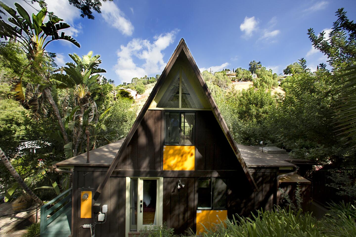
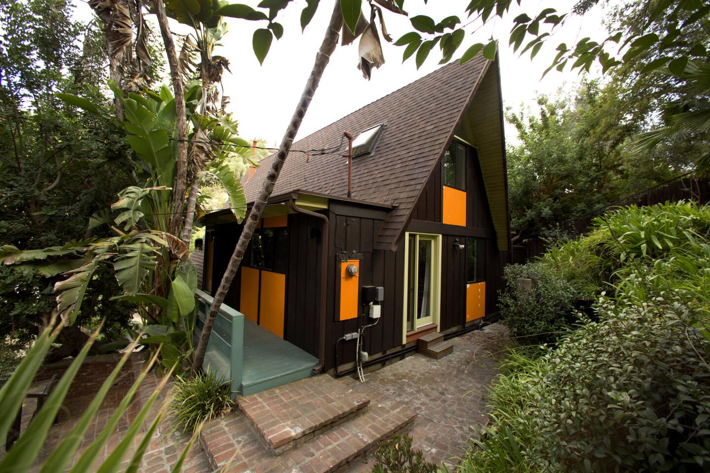
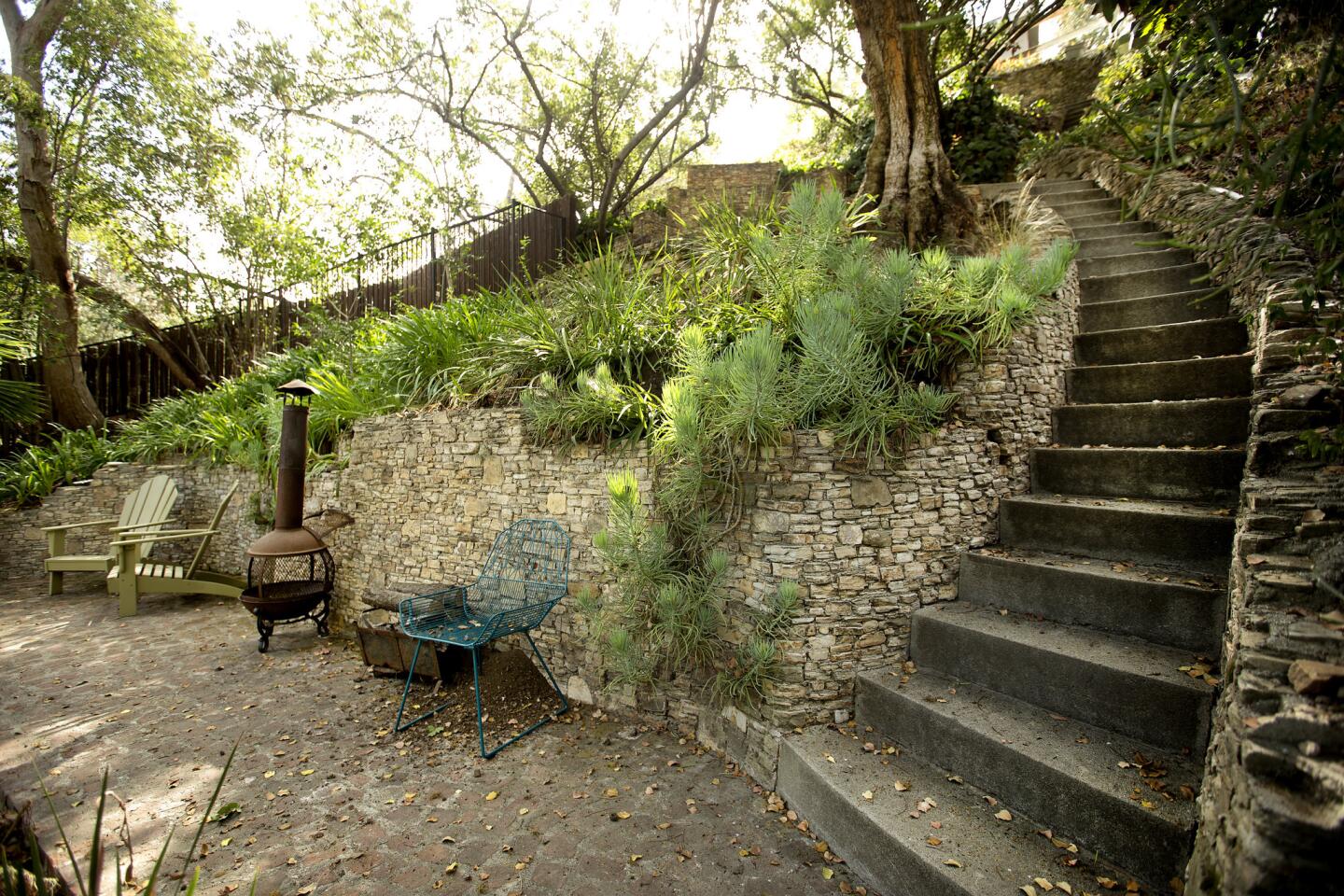
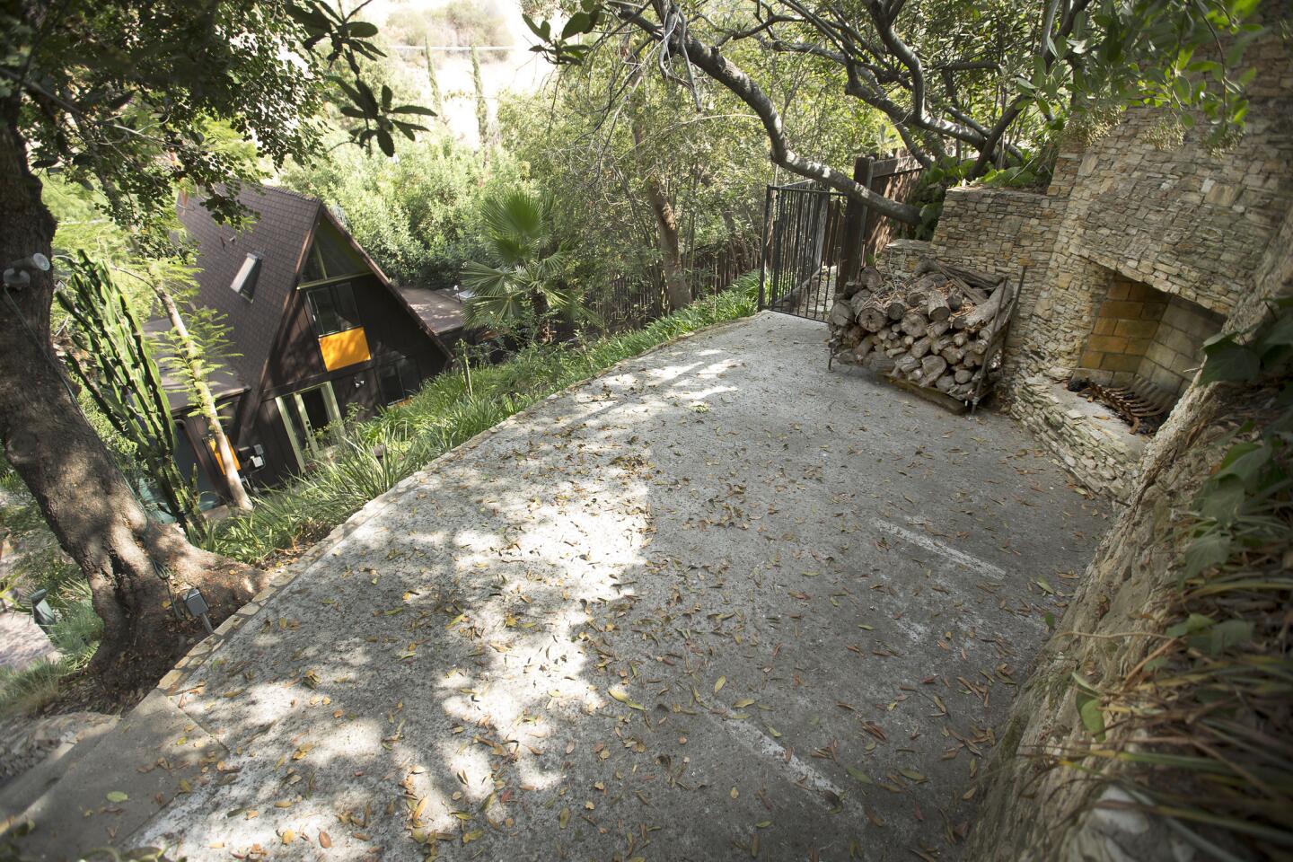
From the curb, there is nothing to see. But walk up the stairs toward the steep hillside, and there it is rising above the trees: a midcentury A-frame cabin so charming, it feels as though you have entered an enchanted forest.
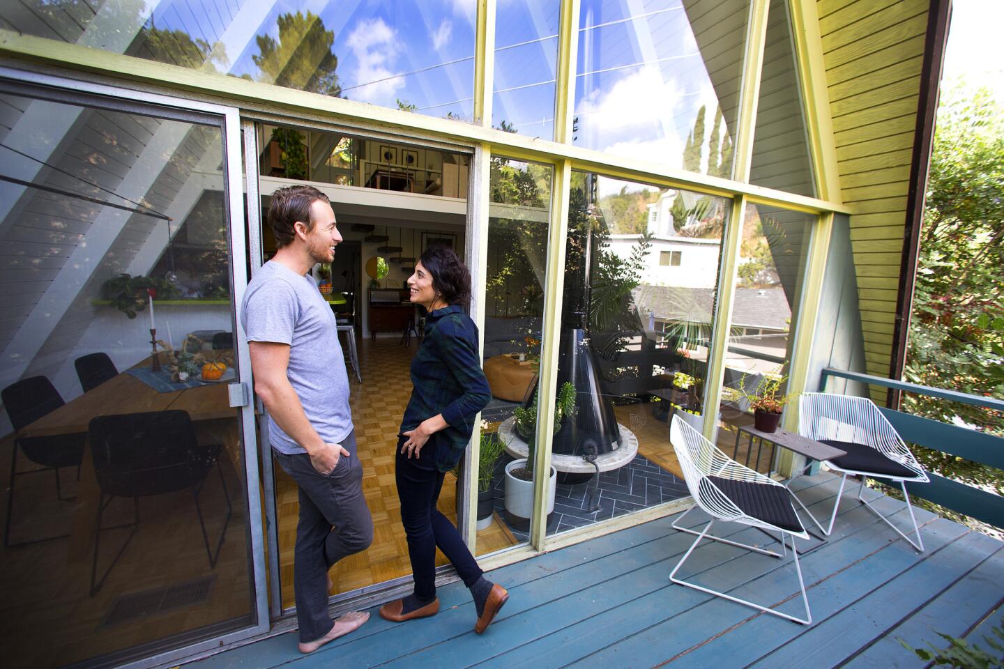
Comedian Jake Hurwitz and fianc├® Jillian Vogel were equally charmed, if not a bit jaded, the first time they toured the Mount Washington property.
ŌĆ£After more than a year of looking at houses, I thought, ŌĆśThis house is terrific. WeŌĆÖre never going to get it,ŌĆØ says Hurwitz, 32, who was instantly taken in by the A-frameŌĆÖs quirky sensibility.
When they learned their offer had been accepted, however, the couple realized that many of the elements that had charmed them about the house initially felt overwhelming now that it was empty.
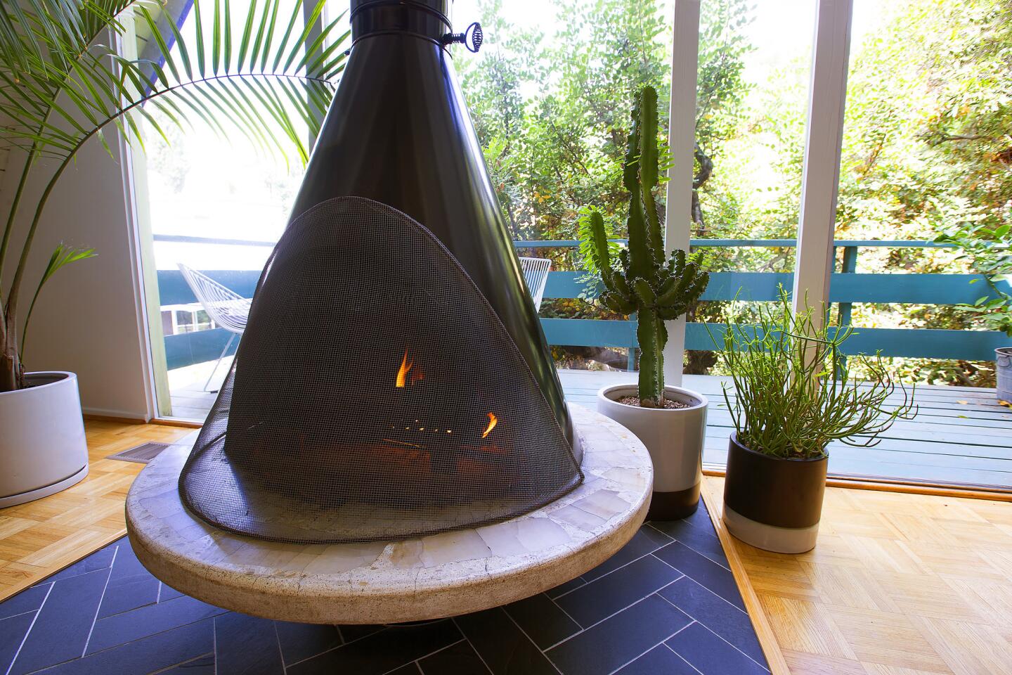
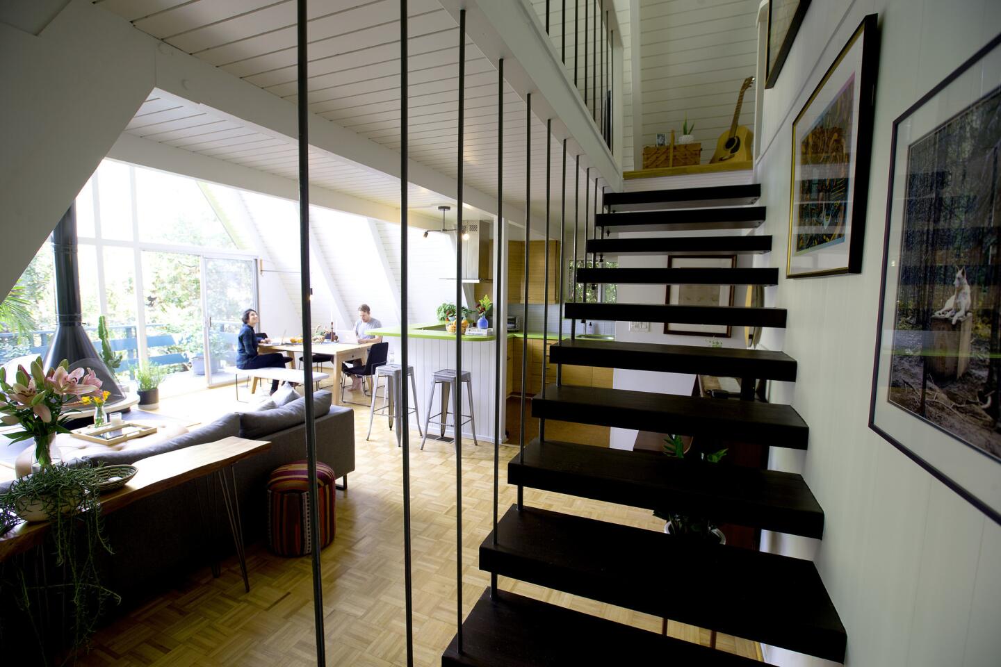
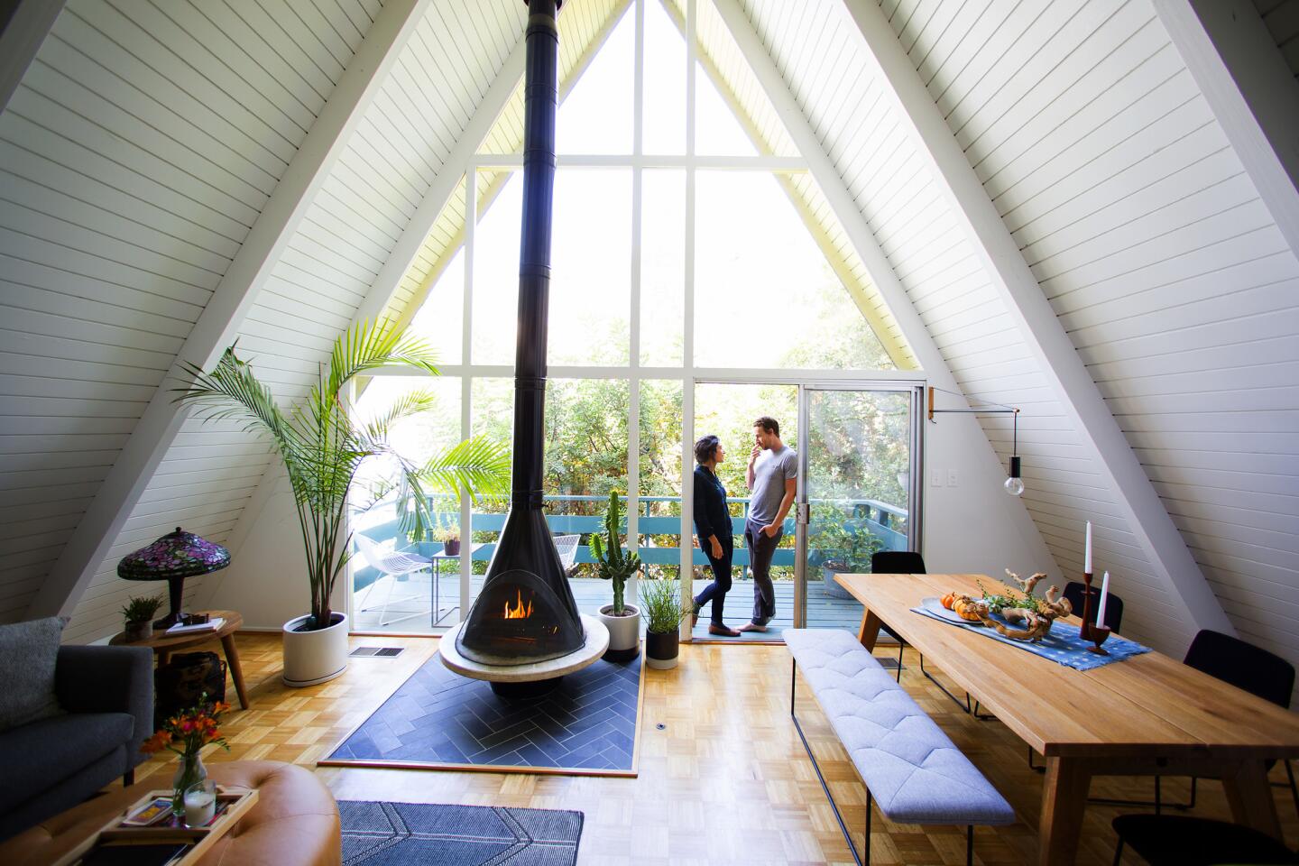
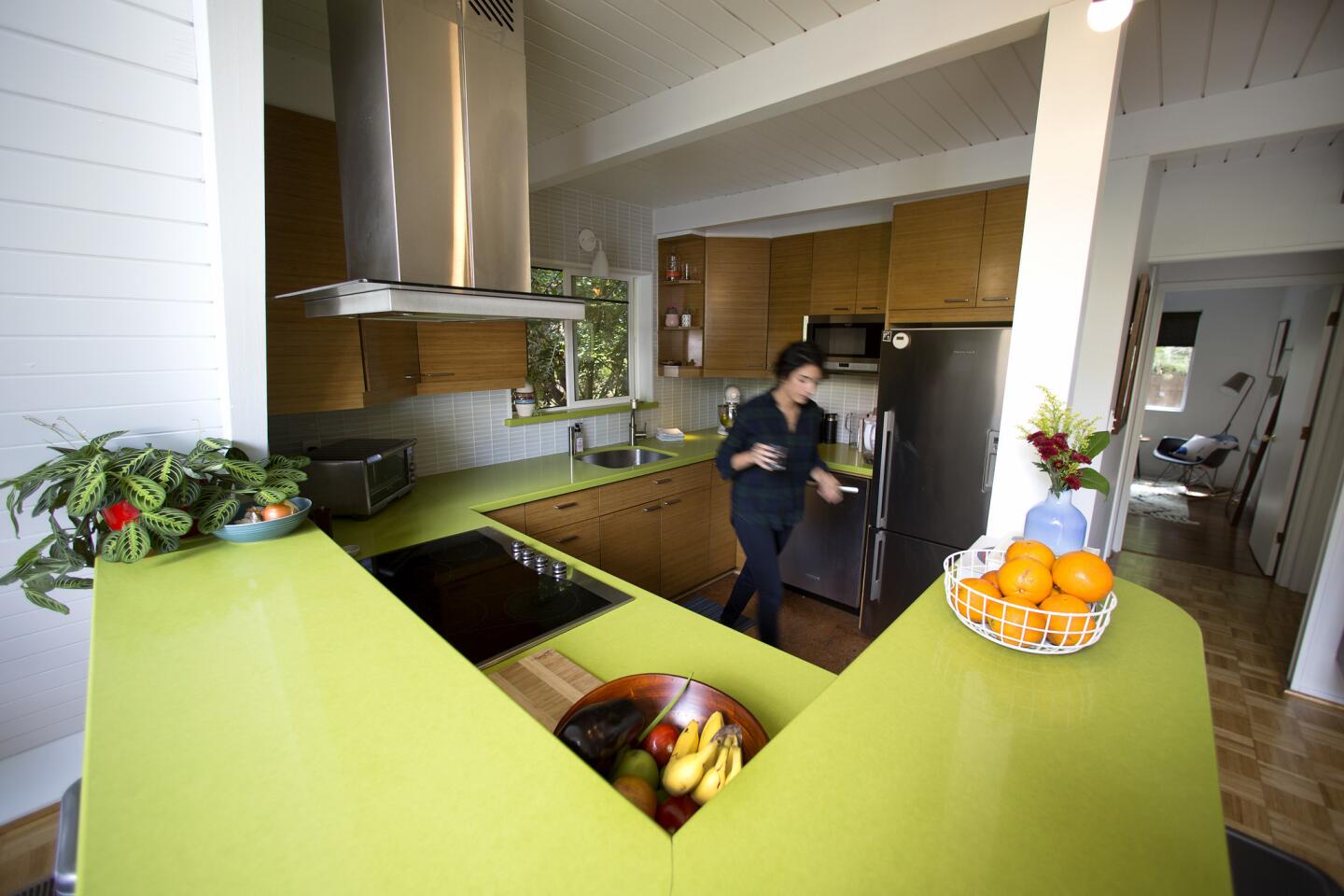
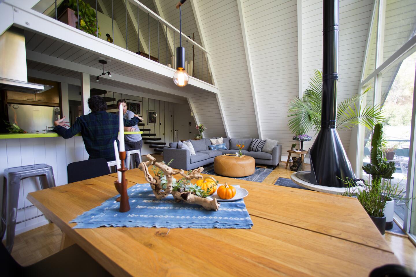
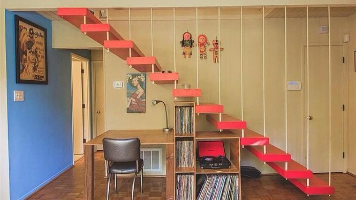
Sure, the home had arresting angles and a Hygge-style fireplace, but it also featured cartoonish red floating stairs, blue and yellow walls, outdated parquet floors and ŌĆö perhaps the worst ŌĆö lime-green countertops in the kitchen.
To help them reimagine the home, the couple hired Jennifer Wallenstein of September Workshop, through Homepolish, a service that connects homeowners with designers. The interiors, Wallenstein recalls, were jarring. ŌĆ£We needed to brighten the spaces, tone down the outrageous colors, and make it feel more modern and youthful.ŌĆØ
Working on a tight budget, the couple decided to update what they could, learn to live with what they couldnŌĆÖt afford to change, and create a home that better represented their personalities.
Wallenstein started by rethinking the floor plan, which was challenging due to the homeŌĆÖs angled walls.
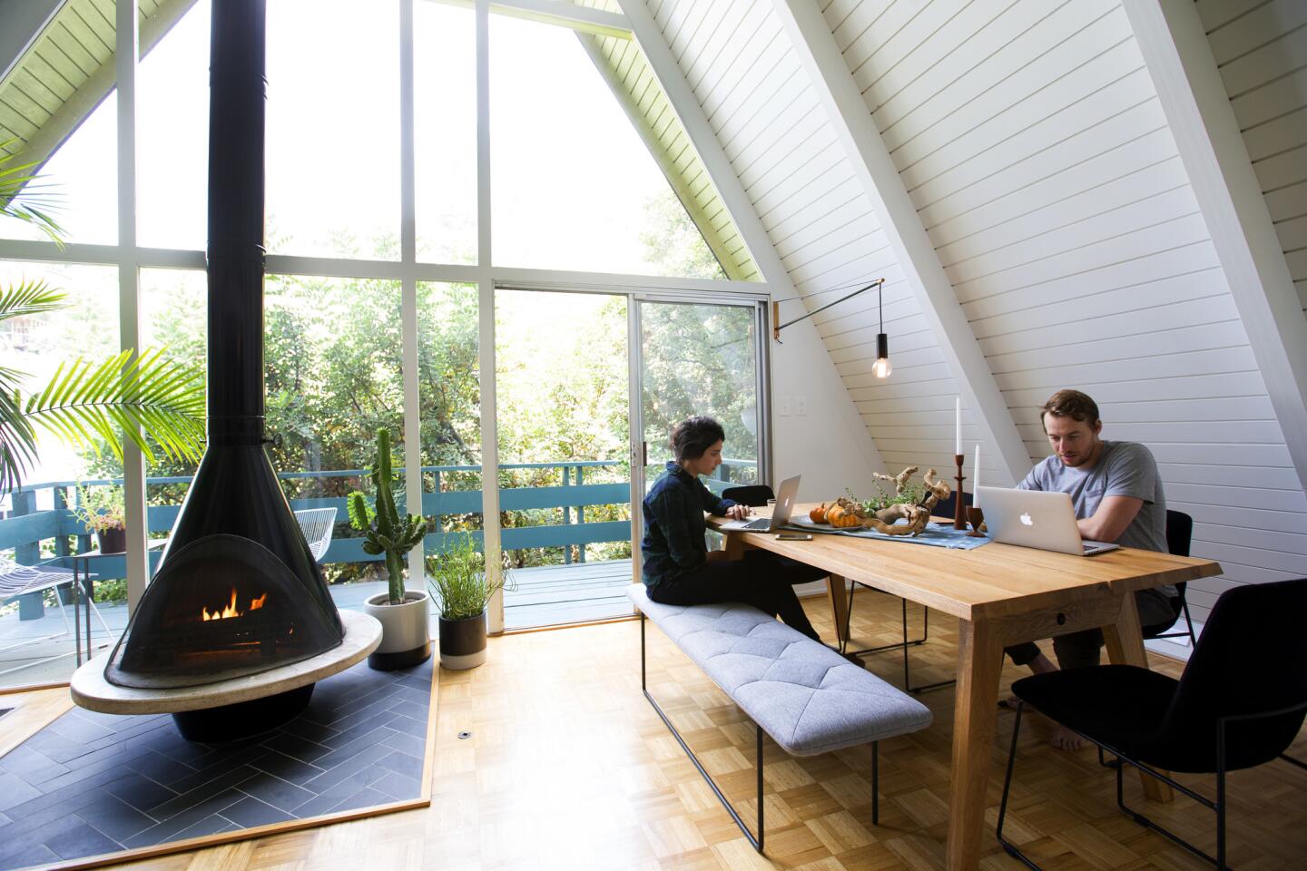
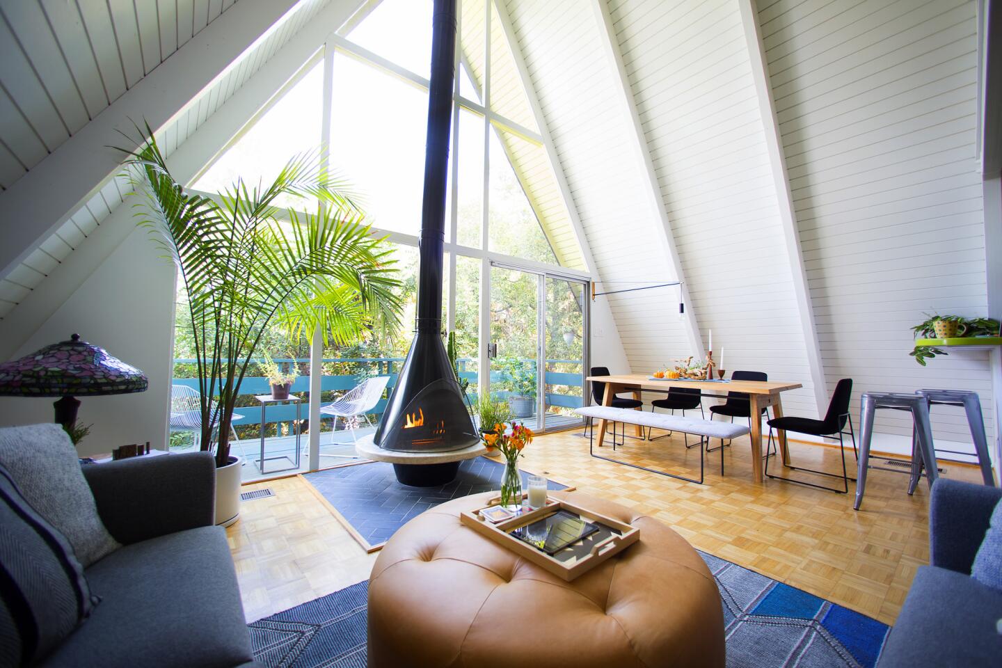
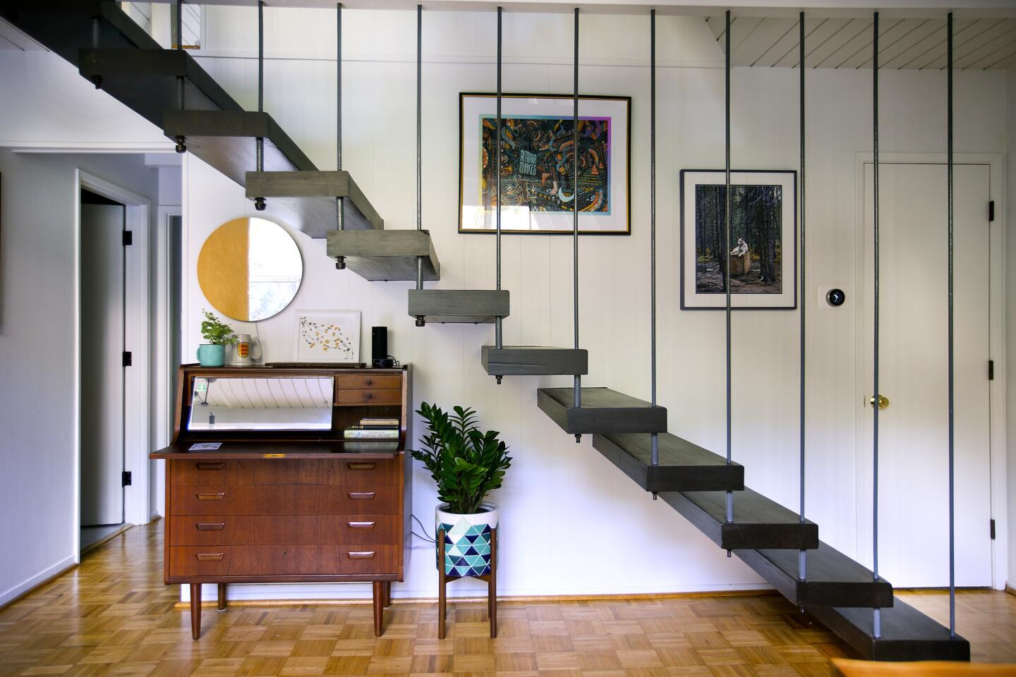
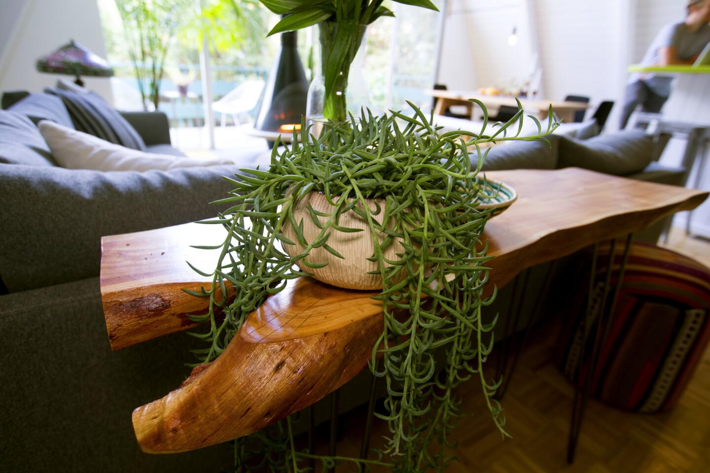
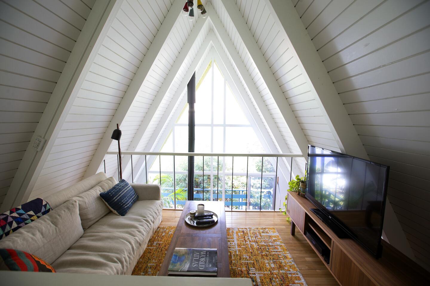
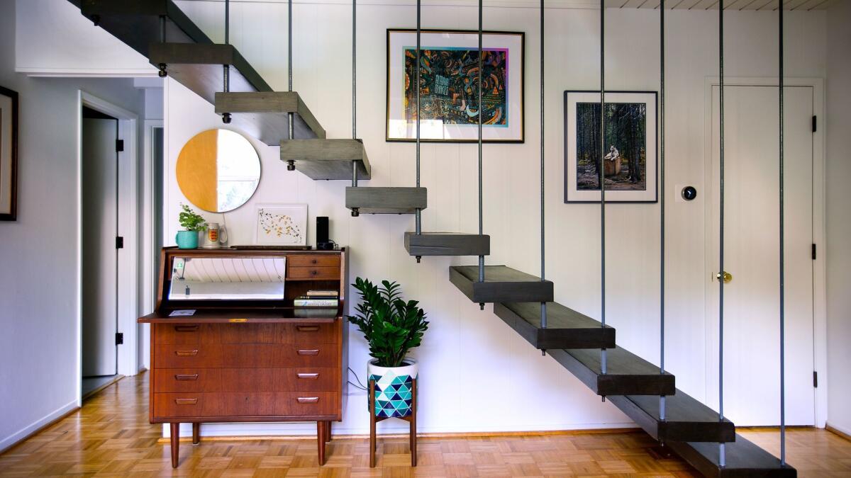
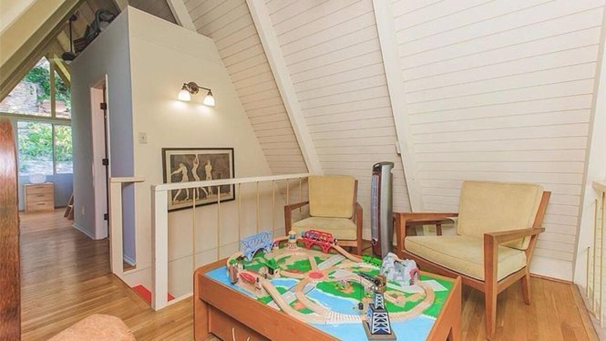
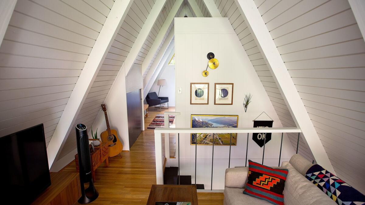
Knowing the couple liked to entertain, Wallenstein moved the TV to the second floor loft and created an open living and dining room on the first floor. By placing a tall console table behind the sofa and a vintage secretary underneath the stairway, she also created a subtle hallway and a place for them to drop their keys.
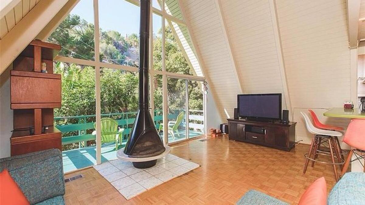
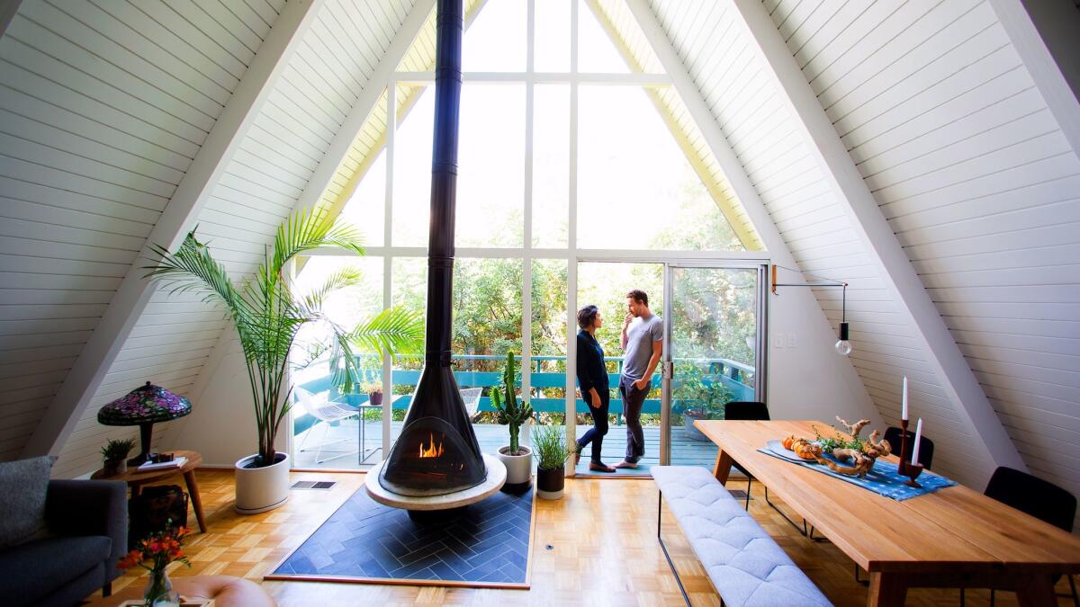
For a bit of glamour, Wallenstein refinished the parquet floors and installed black slate tile in a herringbone pattern underneath the fireplace. The red stairs were stripped and painted dark tones which helps to make the artwork on the wall stand out. ŌĆ£Painting the railing a charcoal color had a big affect,ŌĆØ says Wallenstein. ŌĆ£The dark contrast against the white walls gives the room a more sophisticated look.ŌĆØ
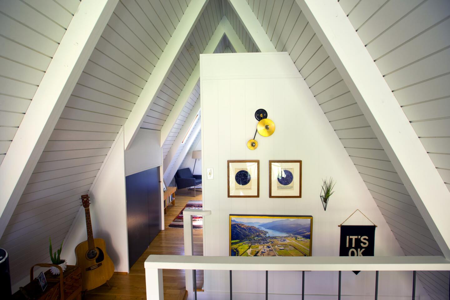
In a simple move that gave the home a more youthful feel, Wallenstein removed all of the lighting fixtures and replaced them with modern components from Park Studio, Amsterdam Modern, Horne and Urban Outfitters.
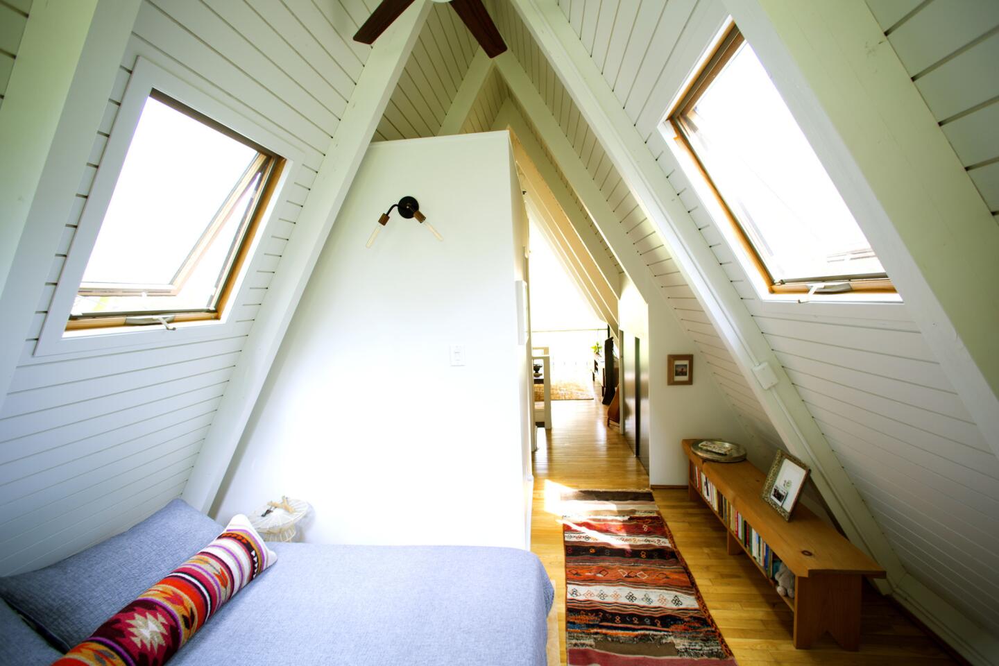
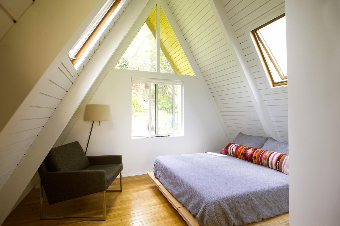
The couple chose soft white paint for all of the angled walls, which altered the perspective of the 1,500-square-foot home. ŌĆ£It made the house lighter and brighter,ŌĆØ Wallenstein says. ŌĆ£Now, when you walk in the house, your eyes are drawn to the wall of windows and the fireplace.ŌĆØ
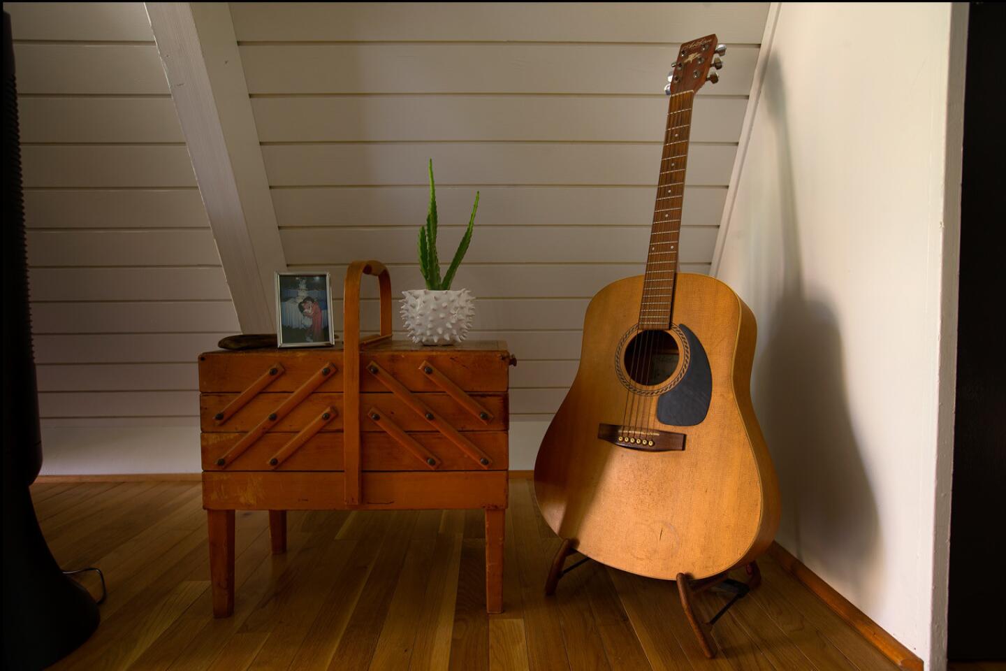
When it came to furnishings, WallensteinŌĆÖs goal was to create an aura of ŌĆ£warm minimalism.ŌĆØ This worked well for Hurwitz who describes himself as an obsessive declutterer. ŌĆ£As one of six kids, I learned at an early age that I donŌĆÖt need more than a drawer to survive,ŌĆØ he says with a laugh. ŌĆ£If someone gives me a gift, I immediately write a thank you note and get rid of it.ŌĆØ
So itŌĆÖs not surprising that the couple had only a handful of furnishings when they moved into their first house. This also allowed them to start fresh, choosing classic, clean-lined furnishings in cool tones from Article, Interior Defined and Wayfair to give the home a cozy feel. Paired with warm wood pieces, the furnishings help to balance the green countertops in the kitchen.
Admitting she "wanted to keep the charm that made the house so sweet,ŌĆØ Vogel, a comedy development executive, is pleased with the update.
Adds Hurwitz: ŌĆ£It still feels like a cabin.ŌĆØ
ŌĆ£The house didnŌĆÖt represent them,ŌĆØ Wallenstein says now. ŌĆ£They are young and have tons of energy and they get excited about design. Their house needed to feel fun.ŌĆØ
Twitter: @lisaboone19
For an easy way to follow the L.A. scene, bookmark L.A. at Home and join us on our Facebook page for home design, Instagram, Twitter and Pinterest.
ALSO:
This is how actor Walton Goggins throws a holiday cocktail party
Instagram-friendly Jungalow design guru says home decor should make you feel good
