Chefs Cimarusti and Echiverri cook up ideas for their home kitchen
- Share via
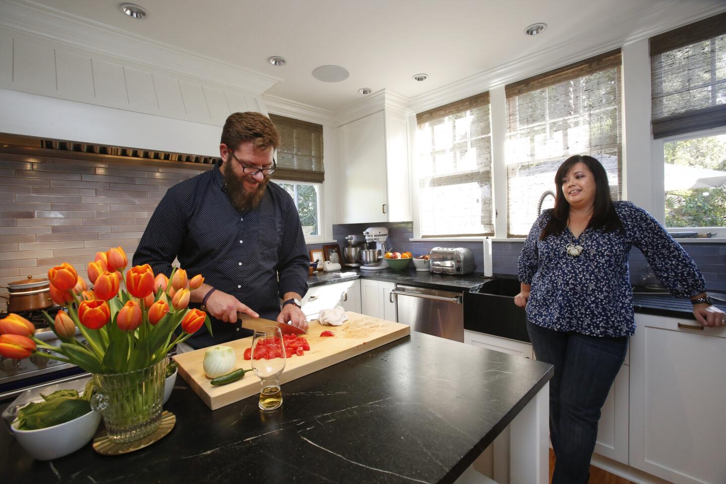
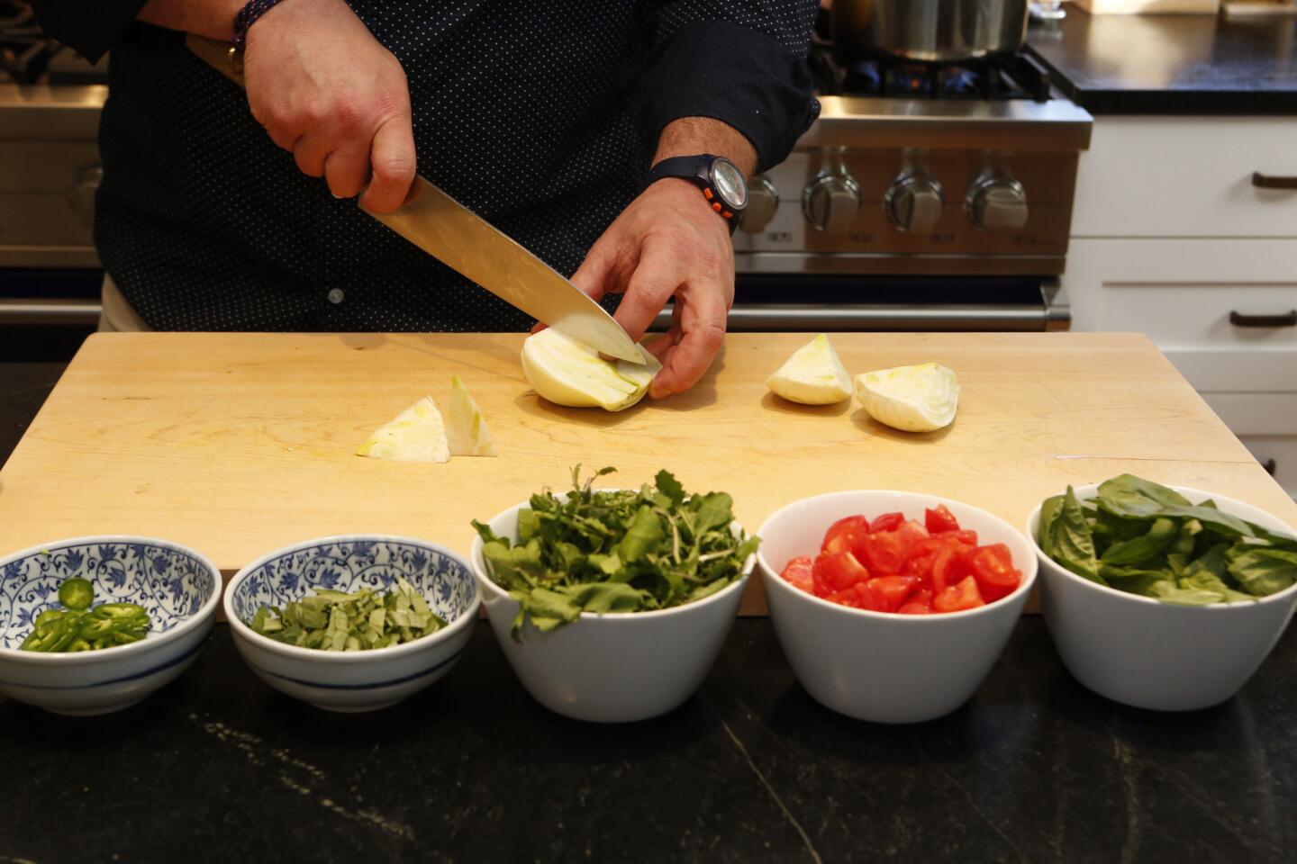
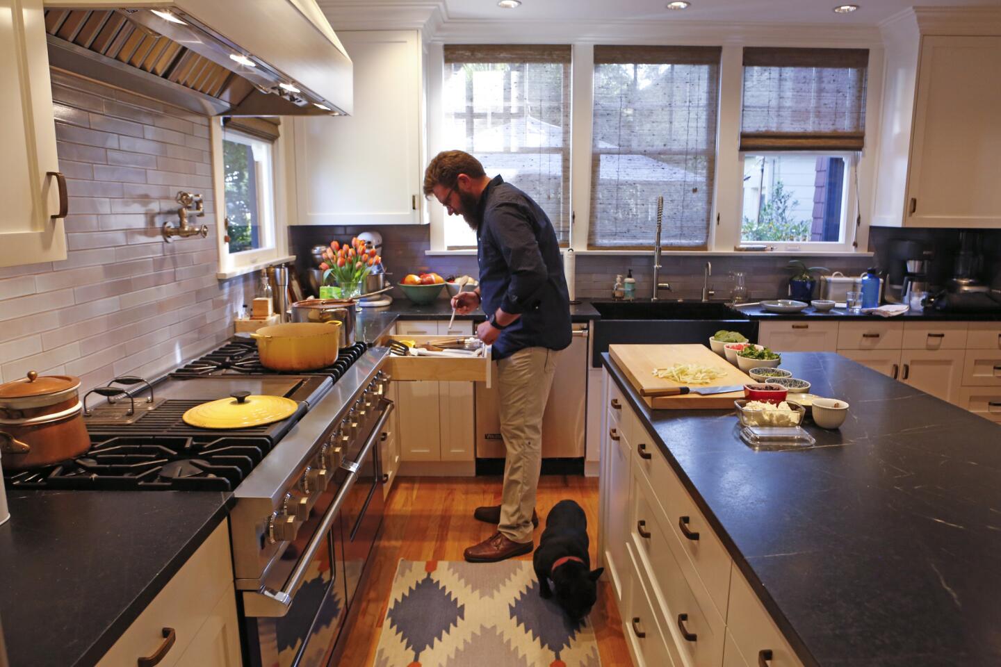
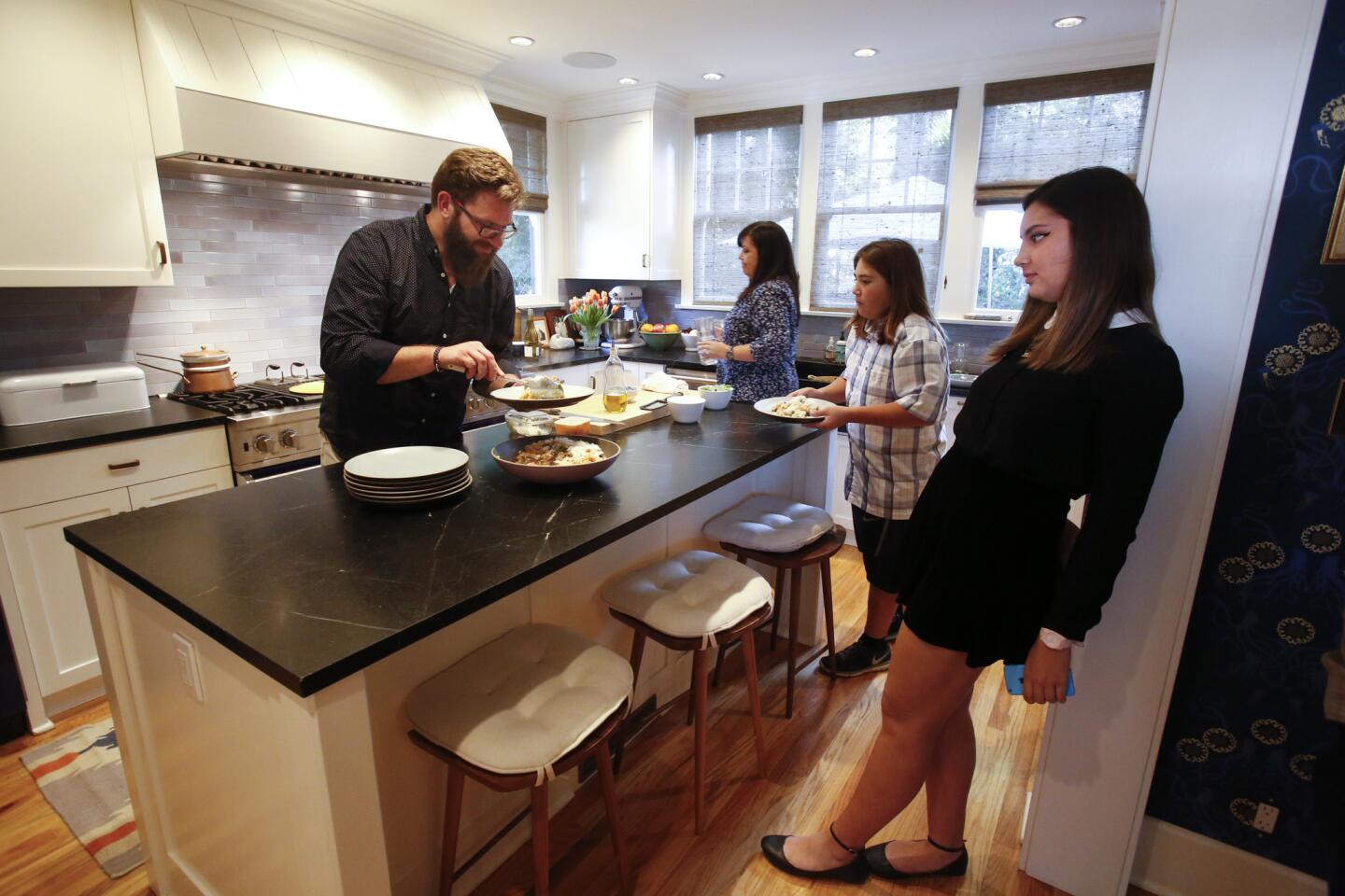
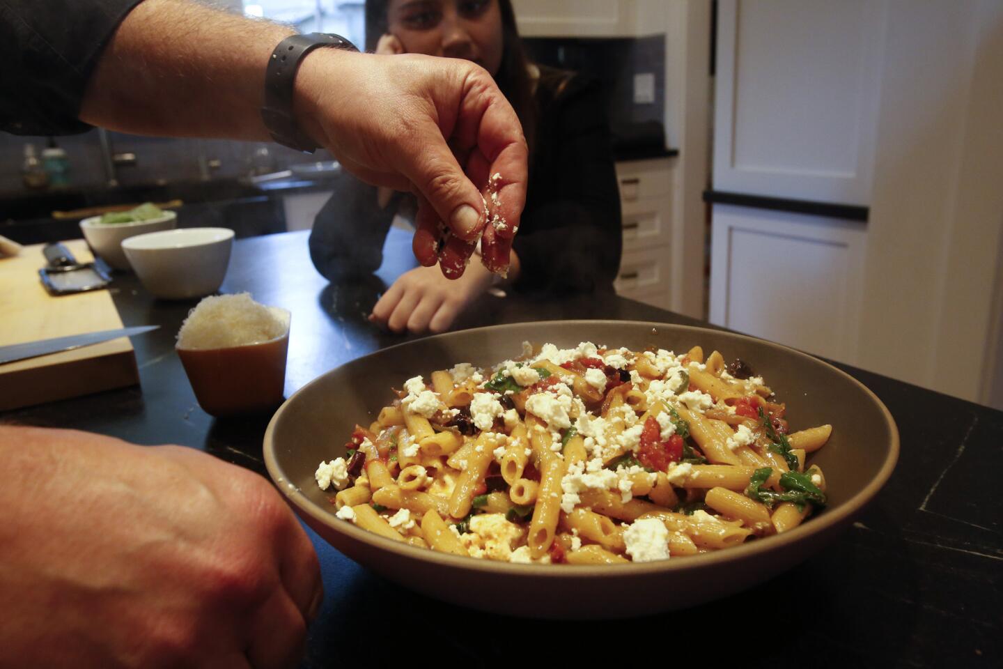
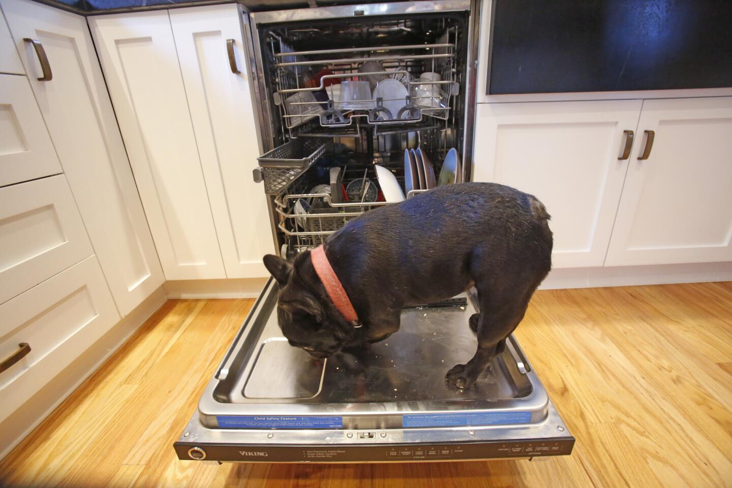
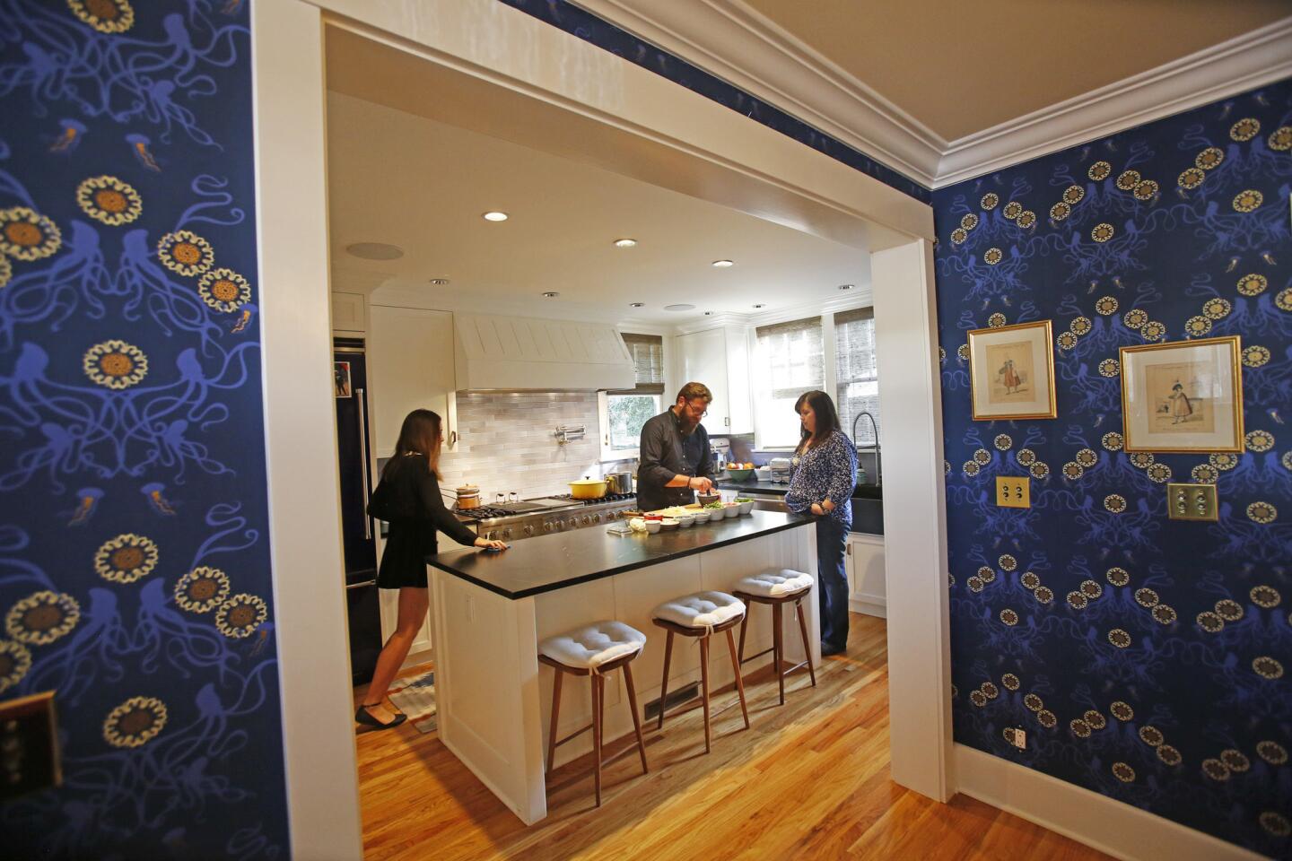
Tossed with olive oil, tomatoes, jalapeño, feta and Parmesan cheese, the expertly al dente Rustichella rigatoni is not your everyday mac ‘n’ cheese dinner. For Bella and Dante Cimarusti, however, it’s merely an after-school snack. It’s served at a soapstone counter island in an L-shaped kitchen with an East-Coast-boathouse-meets-West-Coast-farmhouse vibe, emboldened with cobalt blue Viking appliances and cornflower and periwinkle Heath Ceramic tile backsplashes.
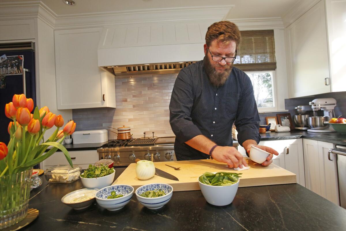
Such is life when your parents are Michael Cimarusti, who presides over Providence and Connie and Ted’s, and acclaimed pastry chef Crisi Echiverri, a couple who frequently find time to throw dinner parties at home. “We just had our third annual shellfish-apalooza at the house. There were 16 adults and six kids,” says Cimarusti, who will participate in the All-Star Chef Classic at L.A. Live on March 14.
Home tours: A peek inside the houses of Los Angeles >>
Whether they are feeding the family or a small army, restaurateurs Cimarusti and Echiverri happily share their modestly sized home kitchen, which is well equipped and handsomely appointed without looking like it belongs to professional chefs. To pull this off, within the somewhat limiting confines of a 1912 South Pasadena Craftsman house, they turned to architect Susan Masterman, a local specialist in historic homes.
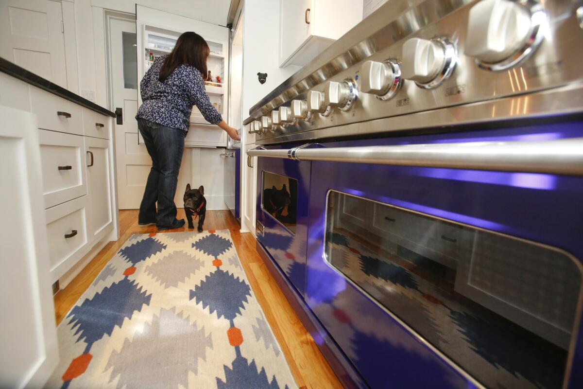
“It was daunting to do a kitchen for professional chefs of their caliber,” Masterman says. “But they didn’t want a state-of-the-art, crazy-sophisticated space with all the gadgets. They were adamant that the renovations respect the age of the house and that it be a real home kitchen for family and friends, nothing like the stainless steel kitchens they work in.”
They also wanted a larger, more formal dining room instead of the cramped breakfast nook off the existing kitchen, which was compromised by too many doorways and not enough continuous countertops. And the house’s 100-year-old floor plan suffered from poor circulation.

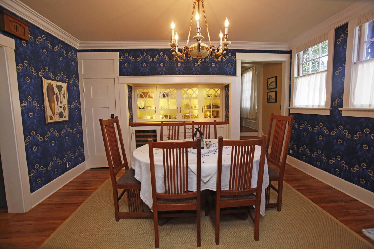
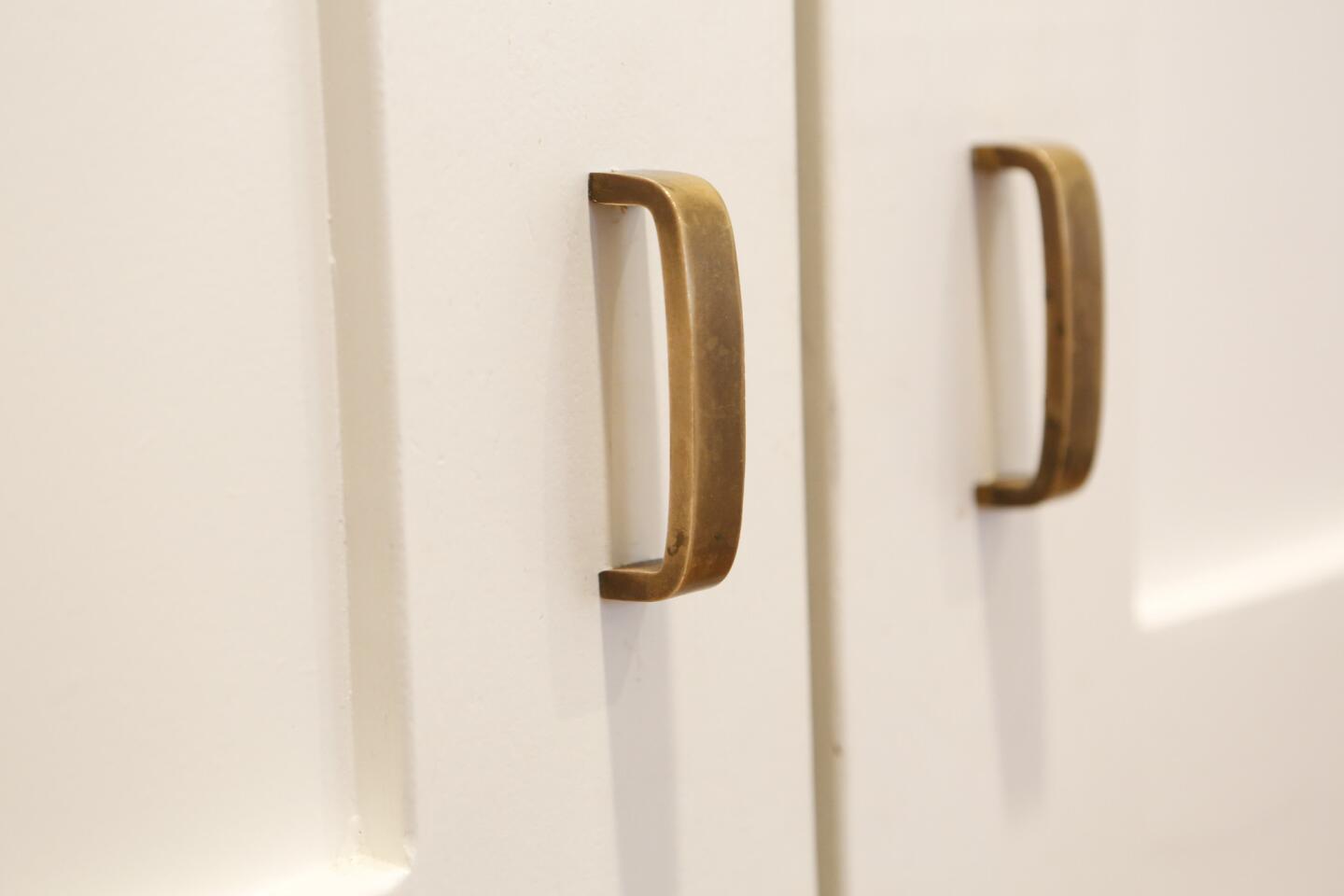
The architect proposed three changes that radically transformed the cooking, dining and entertaining spaces. She turned the original 202-square-foot kitchen into a dining room, complete with a custom Craftsman-style buffet and china cabinet with Gothic, arch-detailed glass doors that looks like it was an original part of the house, and a built-in wine refrigerator that clearly was not.
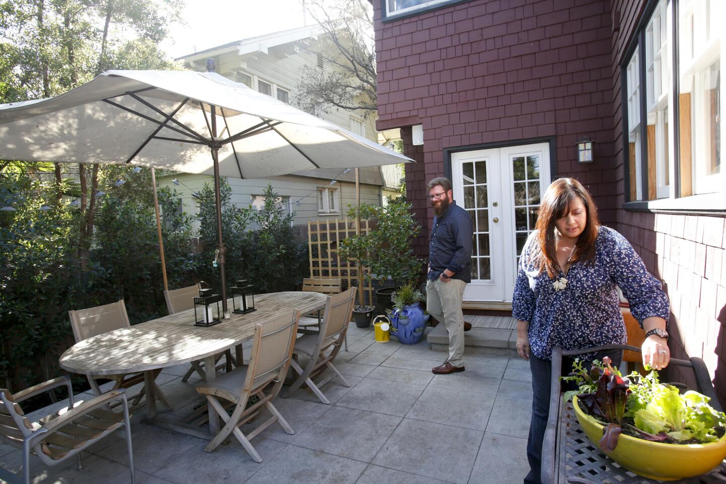
Masterman also created an additional passageway directly from the front door to the new dining room. And she pushed out the south wall of the old breakfast room about 7½ feet to build a new kitchen with an L-shaped configuration for cabinetry, appliances and long countertops. To brighten the room, Masterman added large windows over the apron sink that overlook a dining area in the backyard.
Stunning photos, celebrity homes: Get the free weekly Hot Property newsletter >>
Though the resulting kitchen measures a mere 187 square feet, it offers considerably more work surfaces. “In the old kitchen,” Echiverri says, “we were always fighting for counter space.” Now they have a generous center island with room for stools.
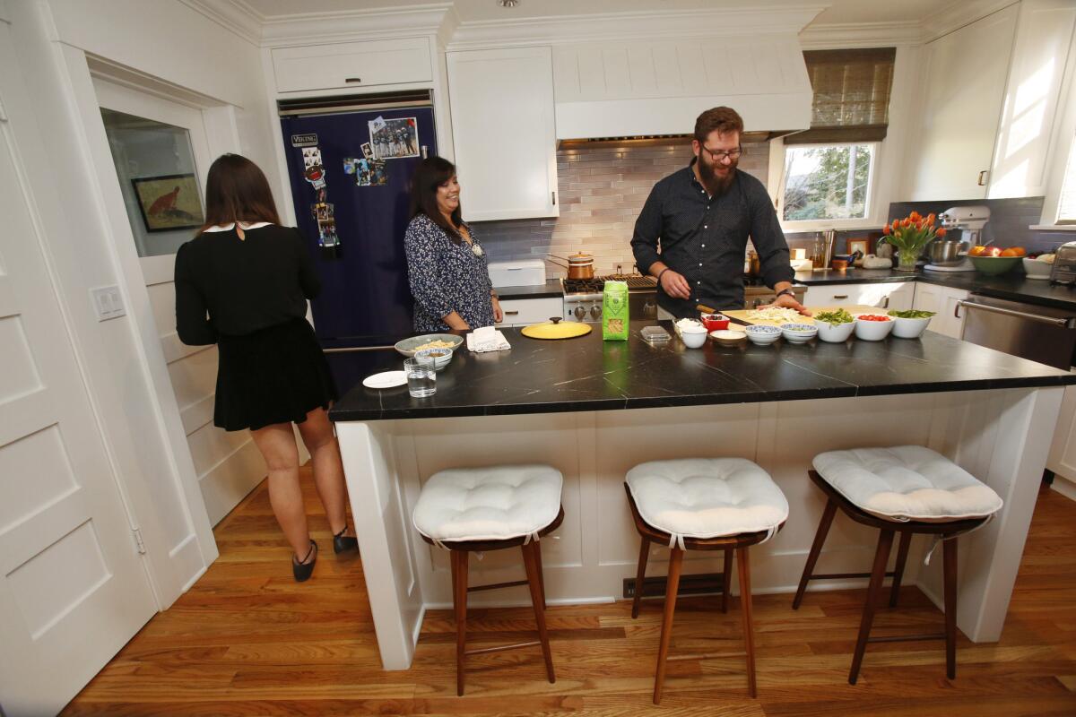
The renovation is period-correct, but with a 21st century decorating spin.
“For the last five years, we’ve been involved in different design projects,” Cimarusti says, “and discovered some great materials and resources.”
They’ve worked with the Inglewood architecture firm (fer) studio to build Connie and Ted’s, a modern seafood shack, which opened in 2013, and last summer revitalized the interiors of the 10-year-old Providence with South Pasadena designer Tamara Kaye-Honey. This summer, they are set to open Cape Seafood and Provisions with Connie and Ted’s partners Donato Poto and Craig and Amy Nickoloff. The new venture, designed and built by Los Angeles architect Leo Prats, will be a white-tiled fish and gourmet food shop with bright red accents.

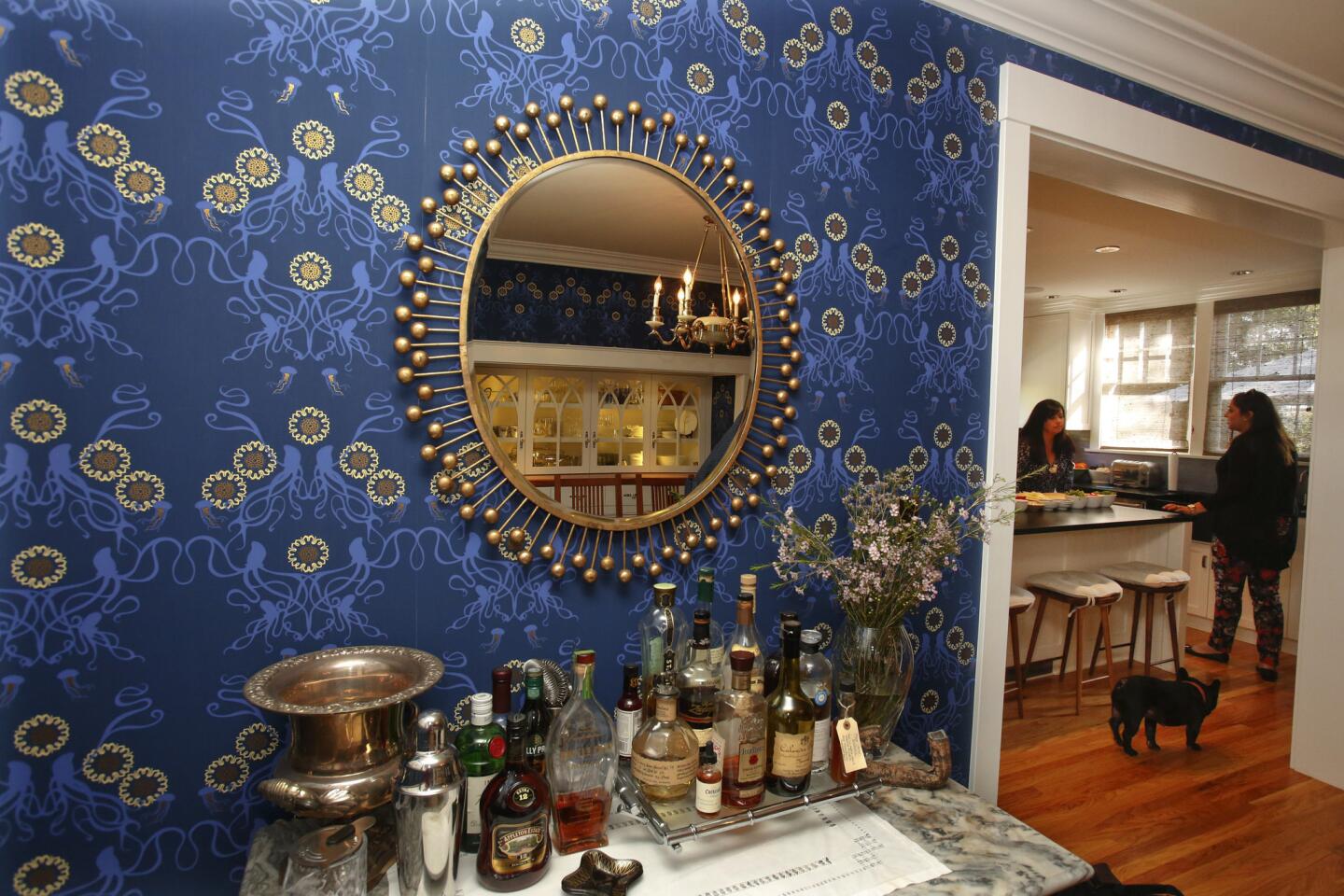
For their home, however, they dove into deep oceanic blues. In the dining room, where a Stickley dining table is covered in hand-embroidered linens from Barcelona, the walls are covered in Grow House Grow’s “Captain Smith,” a wallpaper that looks like a classic Art Nouveau pattern but upon closer inspection depicts jellyfish and squid.
“Both of us really prefer timeless as opposed to trendy,” says Echiverri, who created Pinterest boards for the project. “I loved that it looks old from afar and fits in the house, but it’s also playful and witty.”
The blue appliances and tiles in the kitchen add a jaunty, nautical jolt to a space that is first and foremost designed for efficiency. “You need the same thing at home as you do in a restaurant,” Cimarusti says. “Good appliances, ample storage for fresh and dry food, cabinets and drawers for your pots and pans and utensils.”

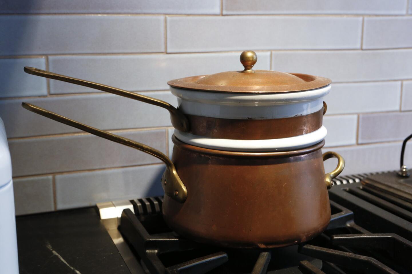
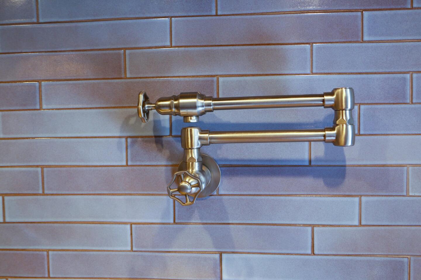
He stands by tried-and-true kitchen essentials, such as the Duralit toaster that was a Christmas gift 20 years ago, a white enameled metal breadbox, copper pots and a pot filler faucet over the stove. “That rages,” Ciramusti says, laughing. “If you leave it on for an hour, the whole house will be flooded.”
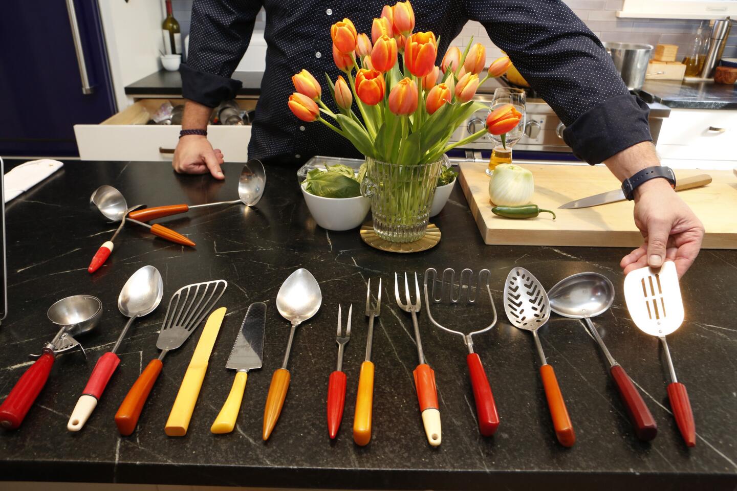
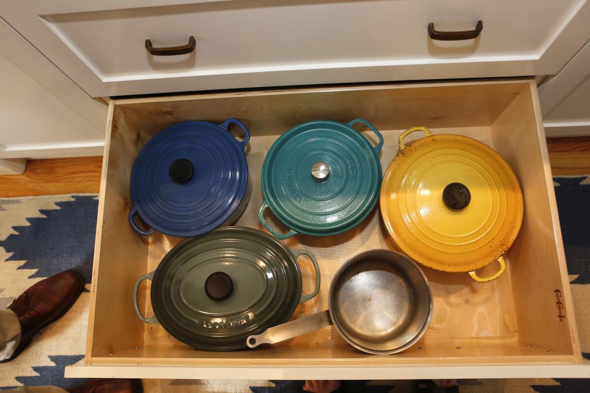
He also admits to having one drawer dedicated to an obsessive collection of vintage Bakelite-handle cooking tools — “The design is so much better than modern ones” — and had Coastal Cabinets of Gardena design heavy-duty drawers for Creuset cookware.
The two cooks chose Tom Shadley, who makes soapstone butter dishes for Providence, to craft soapstone countertops and a sink with a grooved draining surface for wet pots and pans. “I love the look of marble, but I knew it would be horrible with stains,” Echiverri says. “Soapstone gets dings. The first one really killed me, but now I don’t mind.”
“If it looks too professional, it reminds you of work,” Cimarusti says of the highly functional but user-friendly and attractive kitchen. “We wanted a place where everyone can gather and mill around.”
MORE HOME TOURS
More to Read
Eat your way across L.A.
Get our weekly Tasting Notes newsletter for reviews, news and more.
You may occasionally receive promotional content from the Los Angeles Times.
