Back to the hacienda: a 1920s home revived for a new century
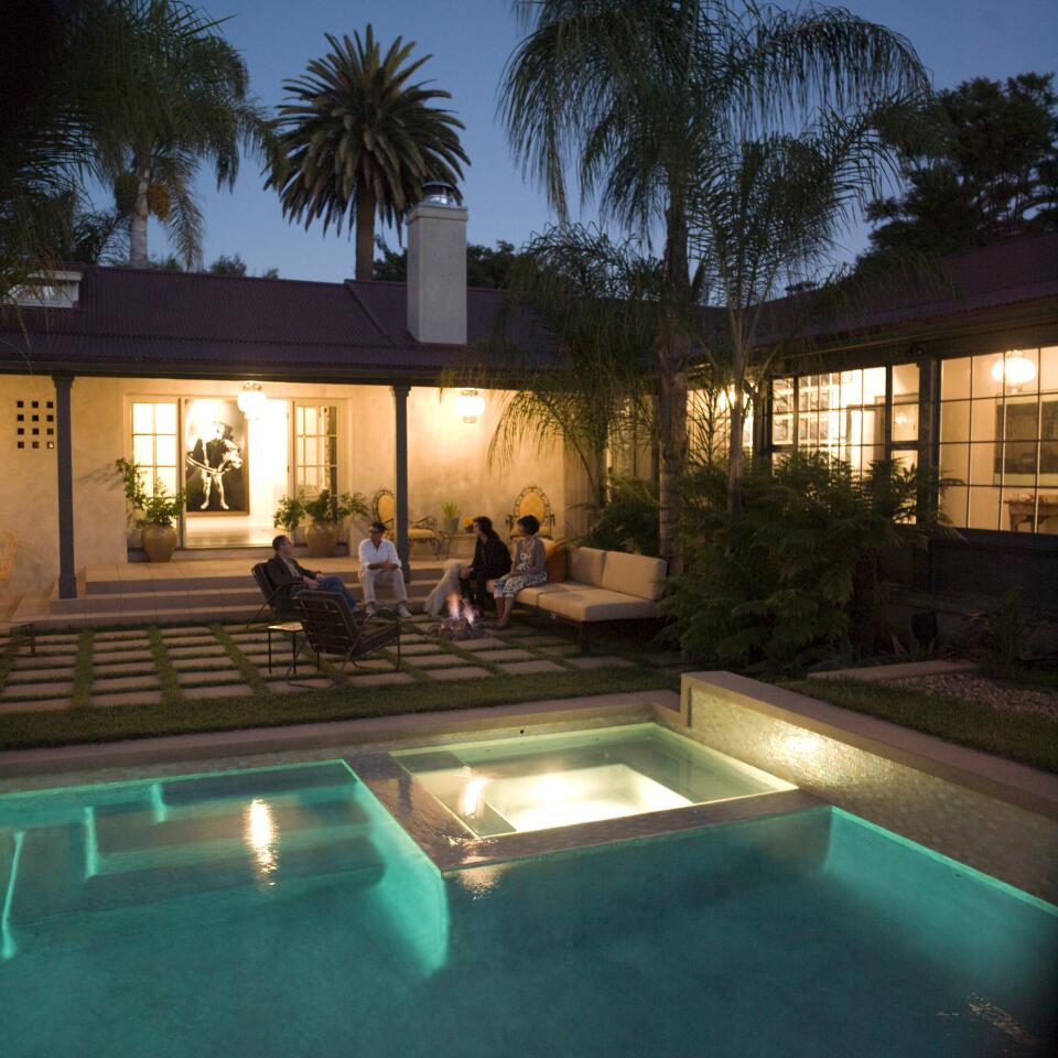
Lucinda and David Schiff’s home is a classic 1920s hacienda in Pacific Palisades designed by architect John Byers for the actor Lionel Atwill. The problem: Previous owners made additions that spoiled its simplicity. With help from a team of designers, the Schiffs have finished remodeling, redecorating and relandscaping the property in a way that’s functional, fitting to their taste yet respectful of the original design. Architect Lewin Wertheimer installed French doors leading from the courtyard up to the living room, brightening the interior while greatly improving the appearance of the house from the outside. See what it looked like before the renovation in the next photo ... (Bob Chamberlin / Los Angeles Times)
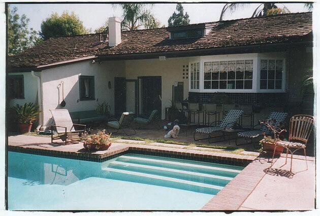
Before the recently completed renovation, the house had a hodgepodge of entryways and a New England-style bay window that stuck out like a sore thumb. Now ... (Bob Chamberlin / Los Angeles Times)
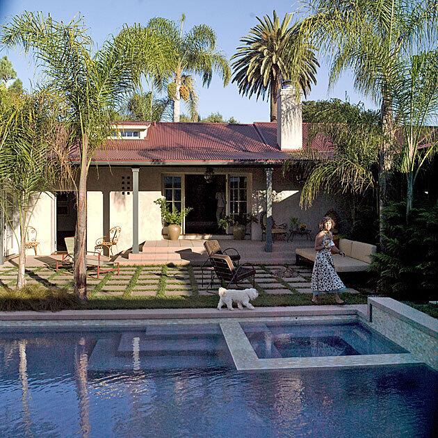
The facade is cleaner and less confused. An elevated concrete terrace punctuated with upright posts looks contemporary but also echoes the original hacienda columns on the front porch of the house. The pool was shortened into a standard rectangle, freeing up more space for seating. That’s homeowner Lucinda Schiff walking around the new spa, trailed by her Havanese terrier, Castro. (Bob Chamberlin / Los Angeles Times)
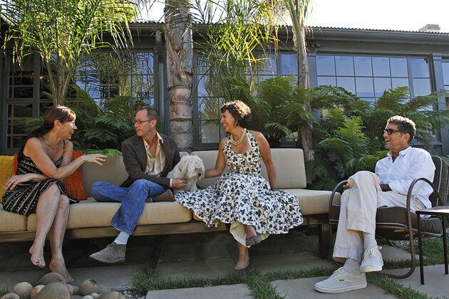
The newly enlarged seating area is grounded with concrete and grass. Decorator Sasha Emerson, left, architect Lewin Wertheimer and homeowner Lucinda Schiff share a long outdoor sofa designed by the project’s landscape designer, Jay Griffith. Lucinda’s husband, David Schiff, sits in a vintage chair. The outdoor cushions were made in Sunbrella fabric by BFR Upholstery. (Bob Chamberlin / Los Angeles Times)
Advertisement
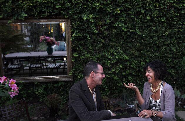
Wertheimer and Schiff sit in vintage Klisomos-style outdoor chairs purchased at Modern Way in Palm Springs. The mirror is an indoor piece that was brought outside and hung in front of a hedge to create the illusion of a window. (Bob Chamberlin / Los Angeles Times)
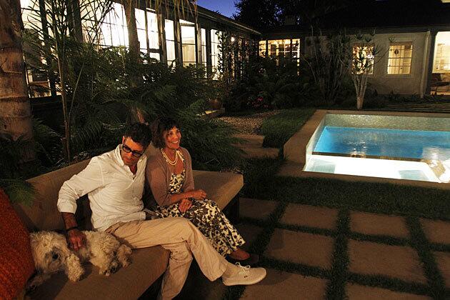
The Schiffs and Castro, pictured from a different angle in the courtyard. Behind them is the galleria, formerly a covered walkway that provides access to two bedroom suites. It’s now enclosed with operable windows and glass doors that make it feel like a solarium. (Bob Chamberlin / Los Angeles Times)
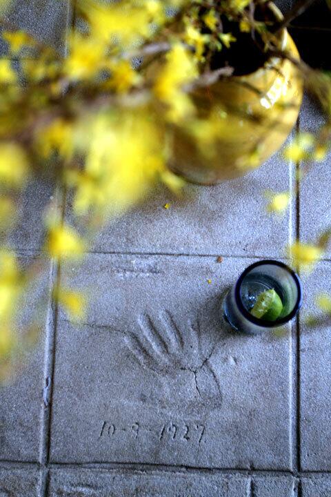
The handprint of actor Lionel Atwill, who commissioned the hacienda. It is set in concrete on the porch and dated Oct. 9, 1927. (Bob Chamberlin / Los Angeles Times)
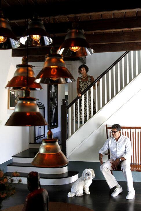
“The house had heart and soul and all the odd things about it added to its character,” renovation architect Wertheimer says. From the front door, three steps lead up to the living room. But the stairway created by original architect John Byers? It leads only to a crawl-space attic. “It’s a complete whimsy,” Wertheimer says. “Byers wanted you to come into this hall and feel you’d entered a two story house.”
David Schiff sits on a fanciful bench purchased at Wertz Brothers. “We thought it was American in the Sam Maloof tradition, but it’s more likely Danish,” interior designer Emerson says. “There’s no markings, so no one can figure it out.” The entry area also has a modern Danish table with a bentwood pedestal. “That’s not typical Spanish entry attire,” Emerson says. “David and Lucinda would have none of that. The decor is quirky and functional and I think uniquely them and the house.” (Bob Chamberlin / Los Angeles Times)
Advertisement
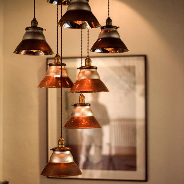
Emerson found old mercury glass light fixtures from a New England factory at Olde Good Things. She had them turned into a multi-piece pendant at Filament Lighting. (Bob Chamberlin / Los Angeles Times)
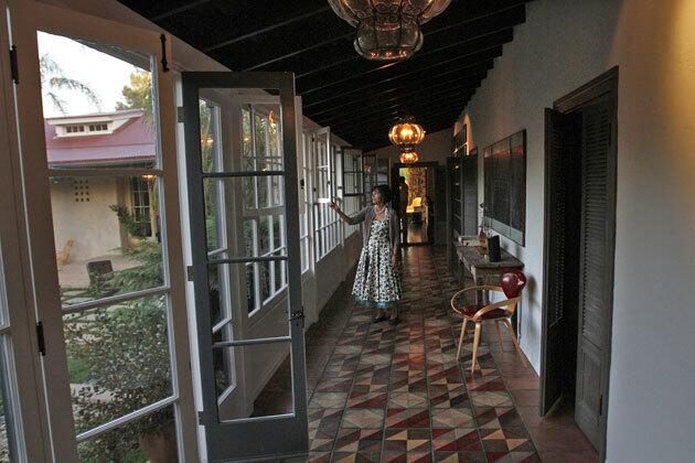
The galleria, once just a covered walkway, now is enclosed with working windows and French doors. At right, a shuttered door stained driftwood gray leads to a bedroom suite. The hallway lights were fabricated at K. Spiegelman Interiors. (Bob Chamberlin / Los Angeles Times)
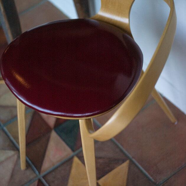
A galleria armchair, a 1958 bentwood classic by Norman Cherner, gets glammed up with a red leather seat. The elaborate floor was inspired by Moorish and Moroccan tiled floors that Lucinda Schiff had seen in Northern California. She and an artist friend spent a month painting the design by hand. (Bob Chamberlin / Los Angeles Times)
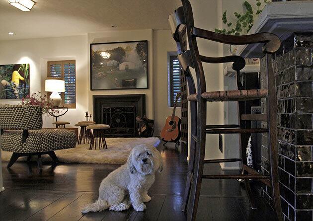
To complement the dark wood flooring in the family room area, Emerson covered the bar, right, in brown metallic tiles purchased in a close-out sale at Walk on Tile. The Old World bar stools, which the Schiffs already owned, were stained at Silver Boomerang in
Advertisement
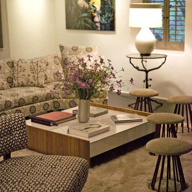
The family room is meant to be a casual place to hang out and watch TV. Emerson designed the L-shaped couch, which is upholstered in easy-care outdoor fabric by Perennials, as well as the room’s tufted swivel slipper chairs, one of which is pictured in the foreground, left. She had the couch and chairs fabricated by Silver Boomerang in
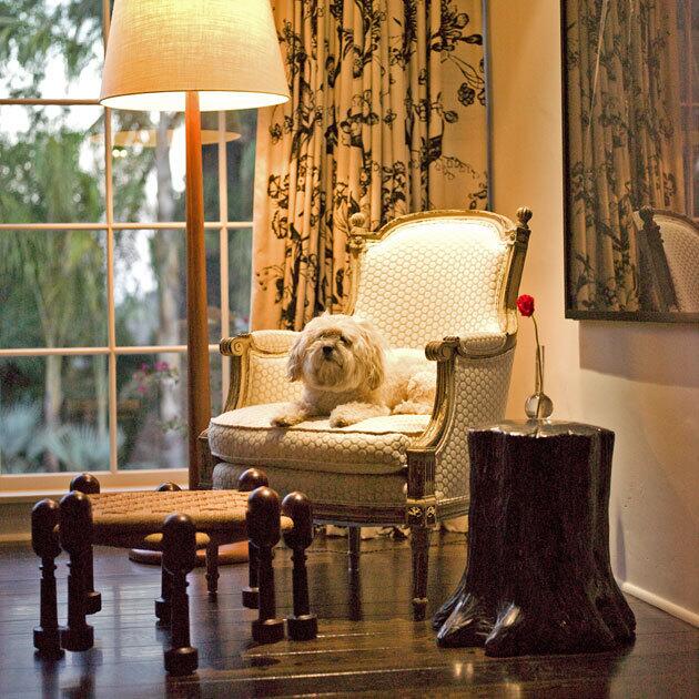
A sunlit corner of the living room, meanwhile, became a reading nook with a mixture of old and new pieces. The Schiffs owned the French chair. “The style and form dictated a simple fabric, so we covered it in white wool,” Emerson says. “I knew that it needed a lamp, and picked up a Danish floor lamp at the flea market because it looked clean next to the chair and gave the area a modern vibe.” So too did the tree stump table. It brings the outside in and provides a place for a book or drink. The final touch: a framed Adam Fuss photogravure of a communion dress on the wall. “The lace of the dress made sense next to the French chair,” Emerson says, and complements the patterned drapery made at F & R Interiors. (Bob Chamberlin / Los Angeles Times)
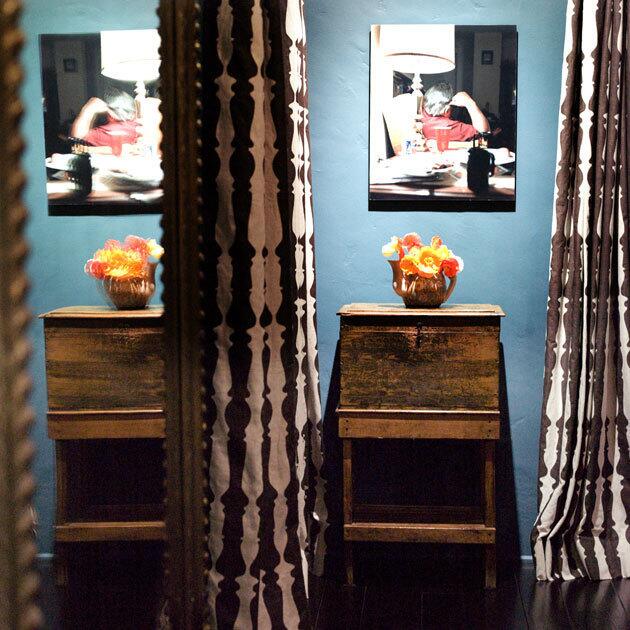
The vivid dining room paint, amplified by a mirror at left, was a custom shade created by color consultant Philippa Radon. In one corner, one of Lucinda Schiff’s purchases from long ago: an antique chest on a stand. “It came with a key, but I don’t know where that went,” she says. The photograph above it is by the late Tracey Baran. “She had a journalist style using light and color to beautify or amplify otherwise prosaic moments or subjects,” David Schiff says. (Bob Chamberlin / Los Angeles Times)
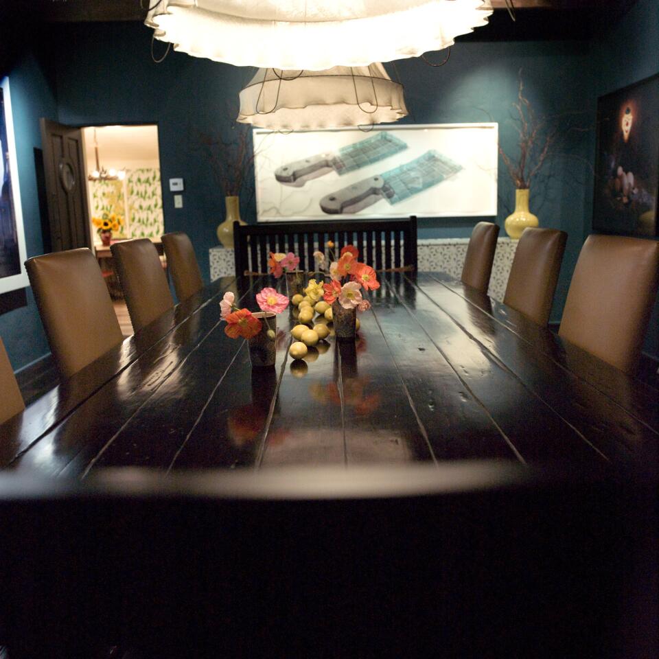
John Byers’ architecture, Wertheimer says, “has a sense of scale, and materials make them feel intimate and comfortable even when they have somewhat low ceilings, like the dining room. I think that’s something we’ve gotten too far away from. People think a tall ceiling is great, but it can ruin the scale of the room.” Dark during the day, the dining room comes alive at night thanks to large cloth-covered drum lights found at Big Daddy’s Antiques and artworks such as “The Cleavers,” a watercolor by three Cuban artists who go by Los Carpinteros. Emerson covered the floating buffet under the painting in a bird-patterned print from the Wallpaper Collective. (Bob Chamberlin / Los Angeles Times)
Advertisement

Some fresh color for the dining table. (Bob Chamberlin / Los Angeles Times)
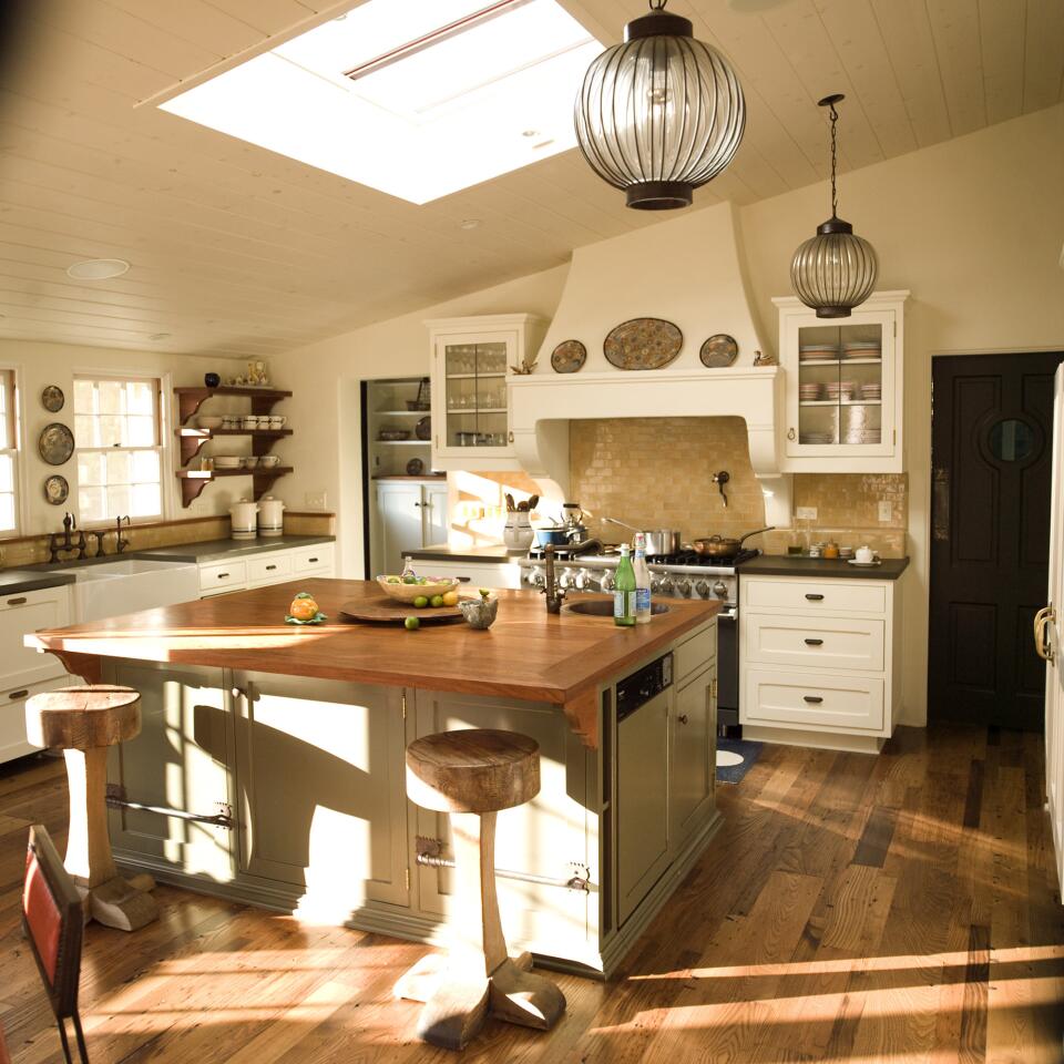
The kitchen at David and Lucinda Schiffs 1920s house, which they wanted to update for modern living, but in a way that respected and celebrated its period charm. (Bob Chamberlin / Los Angeles Times)
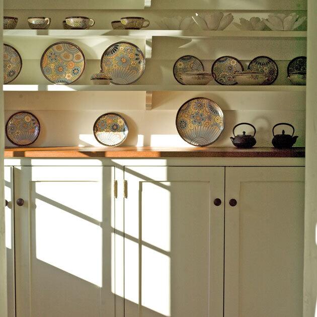
The kitchen pantry shows off a collection of Mexican tourist ware, popular during the mid-1900s. “I have always been influenced by the style of Monterey,” Lucinda Schiff says of the Mexican-influenced decorative arts movement popular in
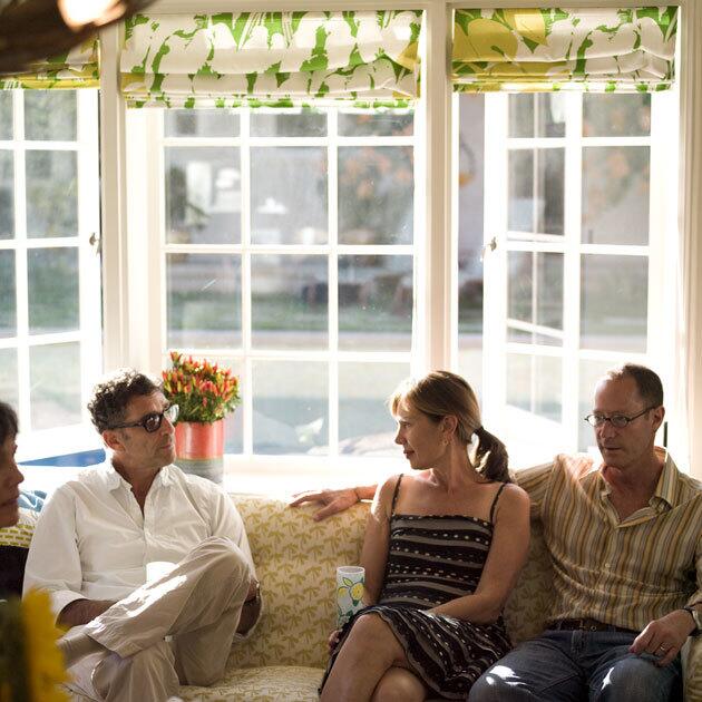
The kitchen has a seating area, but Wertheimer notes: no TV. “The idea was to make this room a hub that is vaguely modern,” Emerson adds. “It’s a light, bright room with that great view of the pool, so the colors really had to work.” She landed on yellow, green and a touch of orange. that’s David Schiff, from left, Emerson and Wertheimer on a vintage Danish sofa covered in outdoor fabric. (Bob Chamberlin / Los Angeles Times)
Advertisement
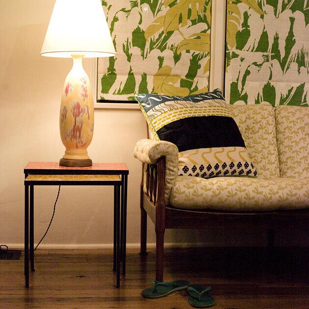
The Roman shades are made from a Christopher Farr print sold at Thomas Lavin. The ceramic lamp, one of a pair, is a flea market find. The pillow is a recent Anthropologie purchase. (Bob Chamberlin / Los Angeles Times)
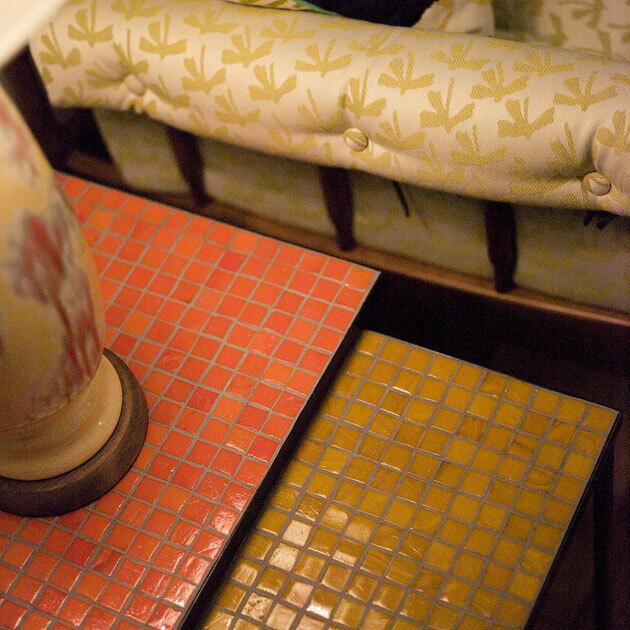
The vintage lamp sits on mosaic tile nesting tables from Plain Air. (Bob Chamberlin / Los Angeles Times)
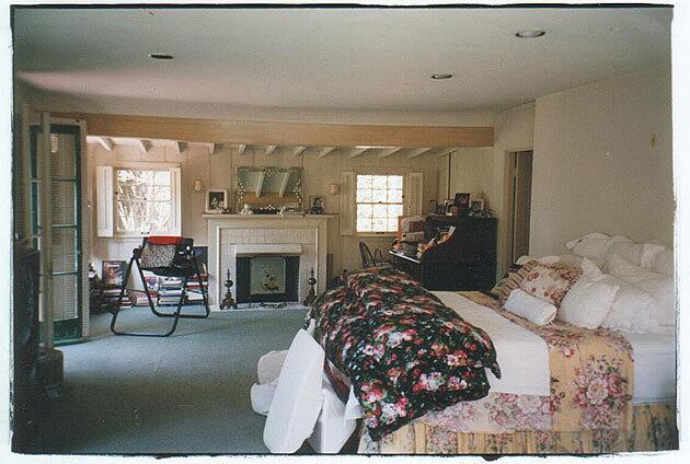
The master bedroom, before the renovation, and ... (Bob Chamberlin / Los Angeles Times)
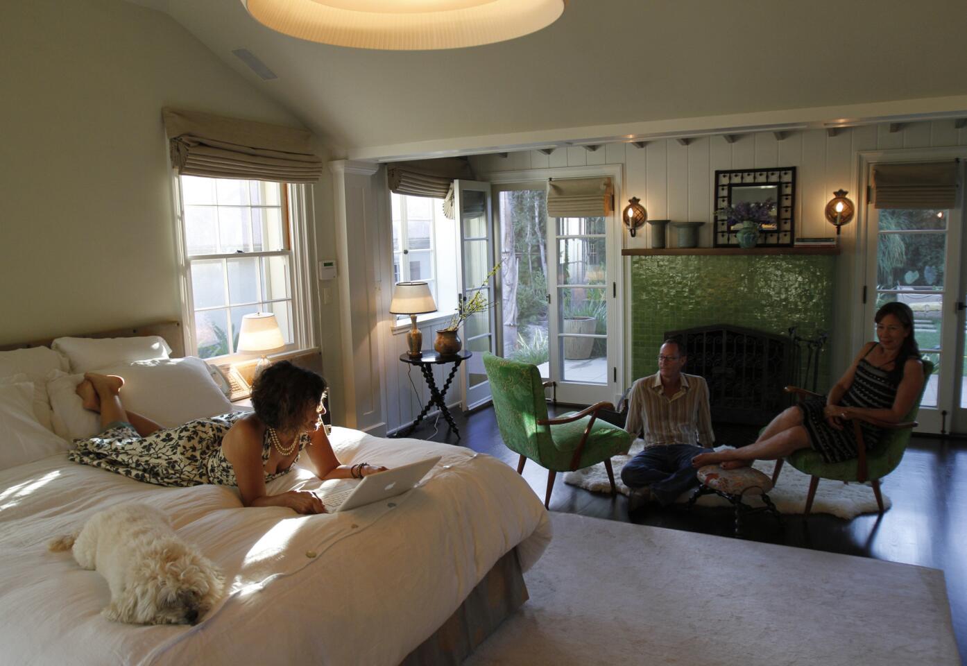
The master bedroom after. Wertheimer divided the space into a sleeping chamber, shown here, plus a sitting room with library shelves and a desk. The architect raised the ceiling above the bed to a accommodate a large lighting fixture. He flanked the fireplace with two new sets of French doors that lead to a private garden in what had been a driveway. The green tile on the hearth is from Mission Tile West, and 1940s French chairs from Dispela Antiques were upholstered in an equally lively velvet. “At first it was a lot of color,” Lucinda says. “Now I can’t live without it.” (Bob Chamberlin / Los Angeles Times)
Advertisement
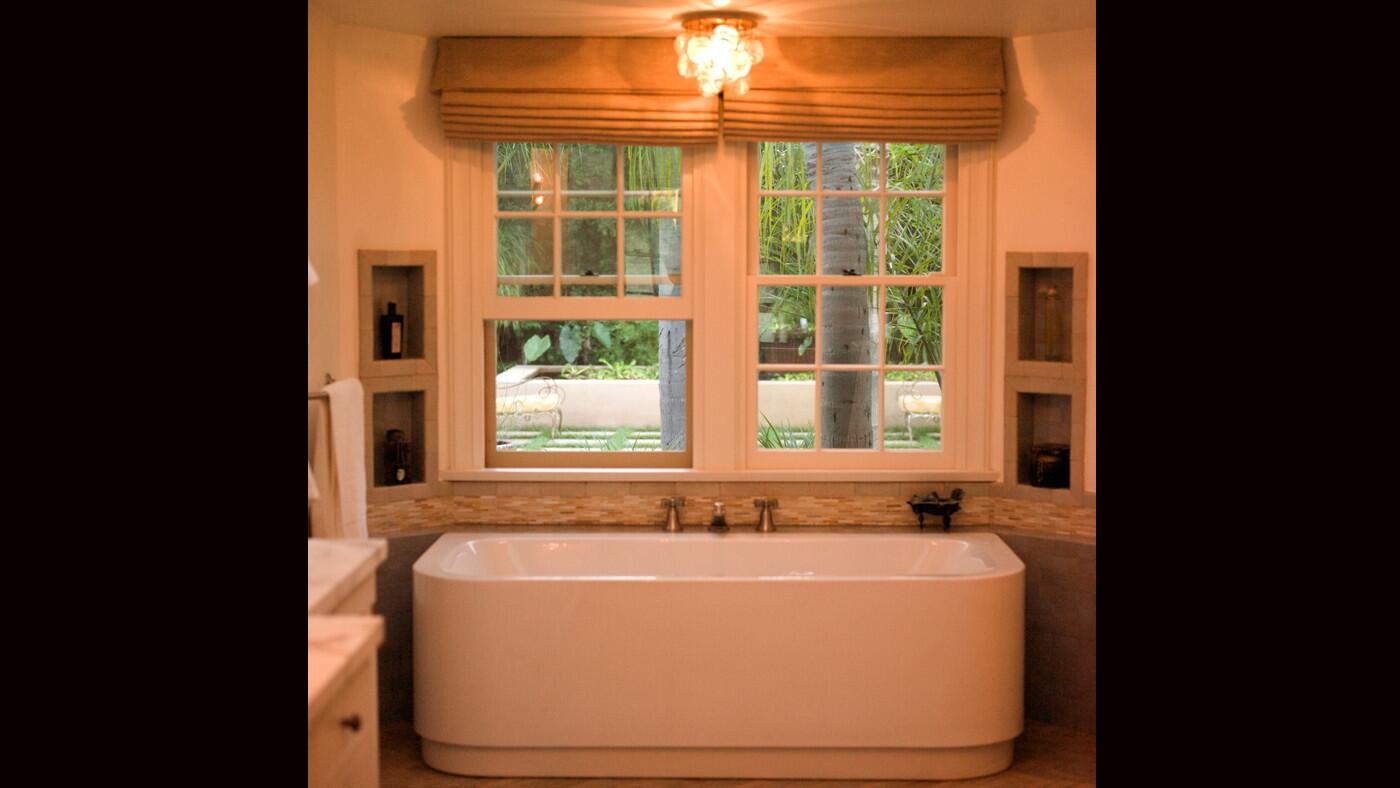
Wertheimer designed a new master bath with radiant-heat floors, a Happy D tub by Duravit and a mix of glass and ceramic tiles from Ann Sacks. The Italian vintage light fixture is from Filament Lighting. (Bob Chamberlin / Los Angeles Times)
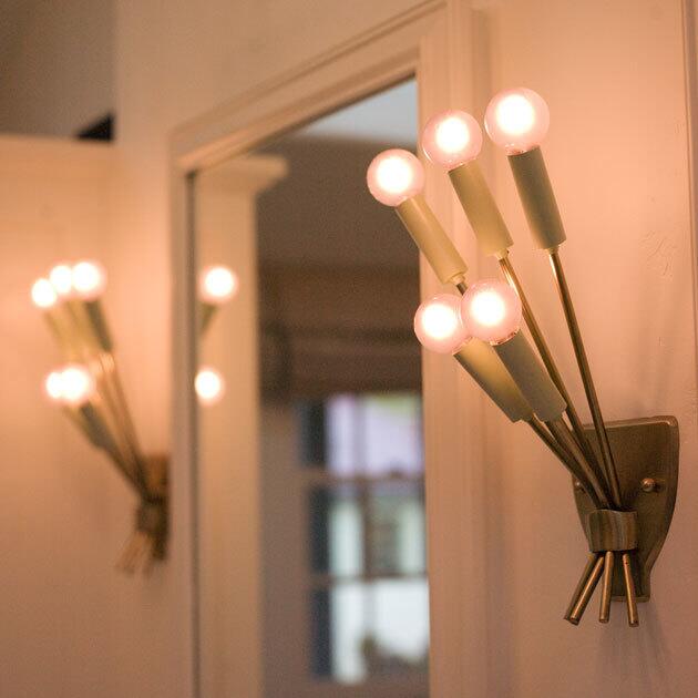
Emerson found three matching 1940s French brass sconces to illuminate his-and-hers mirrors. Lucinda Schiff added lavender light bulbs. (Bob Chamberlin / Los Angeles Times)
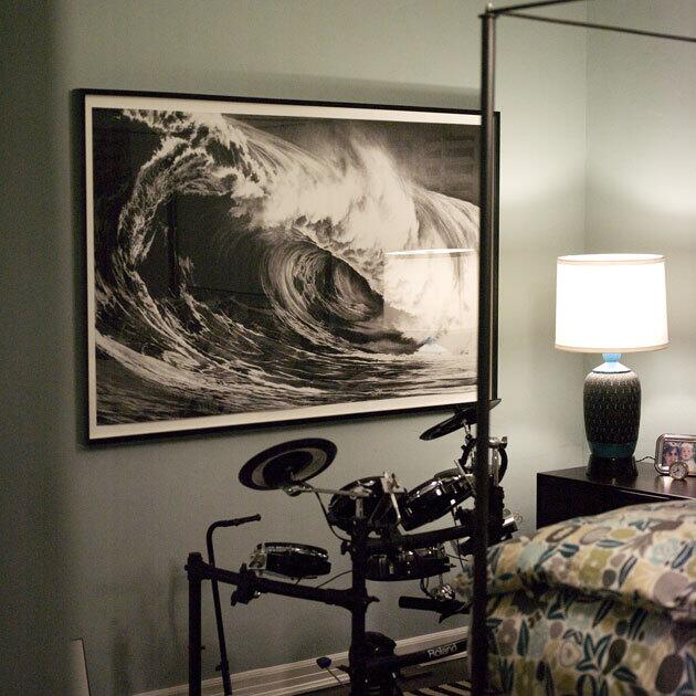
Son Henry’s room has a charcoal drawing by Robert Longo. The nightstand and lamp are vintage, and the duvet cover came from
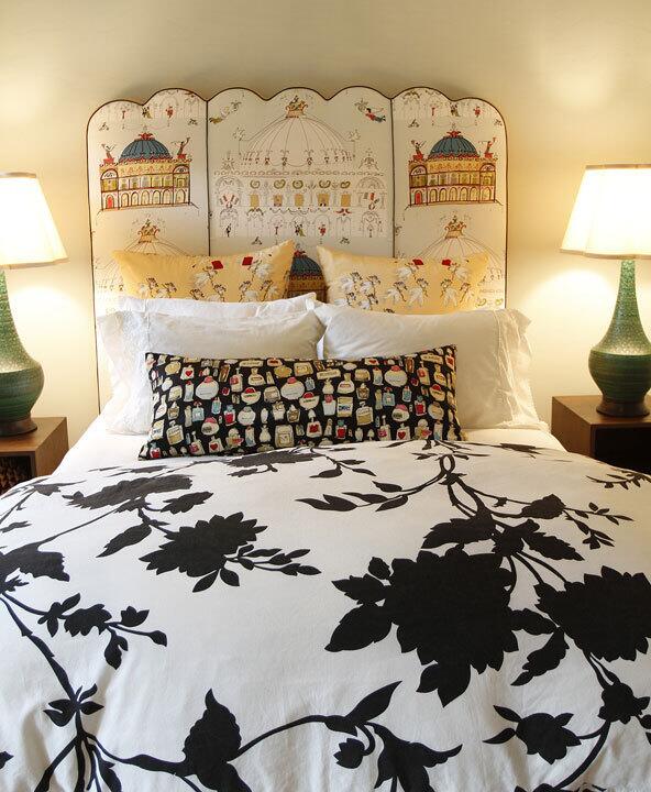
In a guest room sometimes occupied by Schiff’s daughter, another
Advertisement

Back outside, a minimalist fountain in rusted steel flows effortlessly into the new visual mix. (Bob Chamberlin / Los Angeles Times)
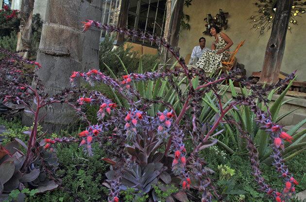
Homeowners David and Lucinda Schiff sit on their front porch, which retains the original hand-planed columns. In the foreground, succulents bloom in a garden that emphasizes
MORE
Virtual tours: Photo galleries of California homes
California living: Home decor, garden advice and more (Bob Chamberlin / Los Angeles Times)


