How Disney Hall has transformed a downtown L.A. neighborhood and the city beyond

- Share via
For this Grand Avenue project, we invited Justin Davidson, the architecture critic for New York magazine (and a frequent commentator on that famously dense city), to cast his eye on the evolving cultural density of Grand Avenue.
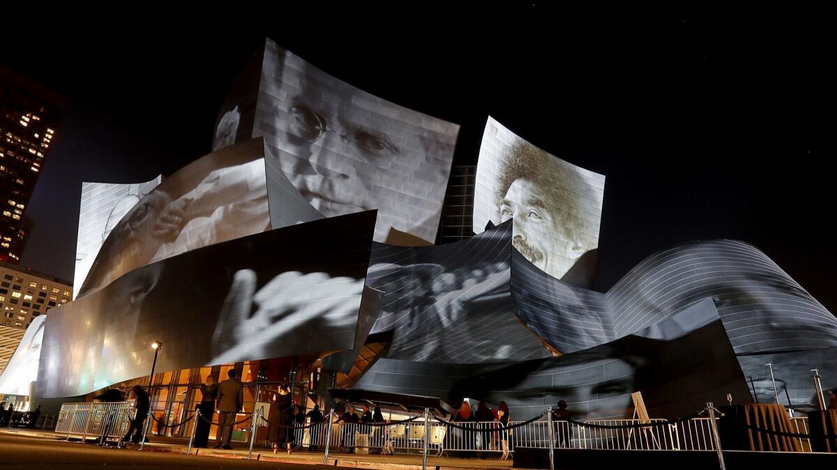
When the Los Angeles Philharmonic launched its centennial season last September, media artist Refik Anadol projected a series of giddy hallucinations onto the facade of Walt Disney Concert Hall: The stainless-steel skin peeled back to reveal its twisting structure, like an X-ray of a dancer in mid-whirl. Musicians, scores, programs, sounds translated into pictures — the orchestra’s entire memory, stored in its archives and exploded by algorithm — danced on the building’s surfaces. Anadol’s public artwork, “WDCH Dreams,” was an expression of the architecture’s extroverted personality, its ability to reach out into a vast megalopolis with an important message from a palace of high culture: This is fun!
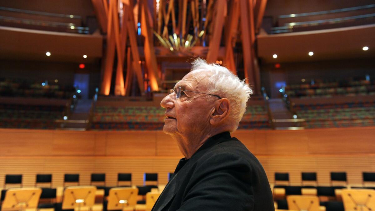
Sixteen years after Frank Gehry’s marvel opened — and 30 since Lillian Disney made the down payment — Disney Hall is still spinning off energy, and the neighborhood around it is still being born. Now that Gehry’s new billion-dollar baby, a cluster of apartment towers called the Grand, is finally starting construction, the 90-year-old architect may yet get to walk around the effervescent urban core he envisioned, with art and music at its center. In the meantime, he’s designing another set of performance spaces for the Colburn School, which will turn this once dour stretch of Grand Avenue into a compendium of late and later Gehry. I’m as impatient as he is.
FULL COVERAGE: Grand Avenue project »
Grand Avenue has been making grand promises for as long as I can remember, and it has usually failed to deliver. The stretch from California Plaza to the Cathedral of Our Lady of the Angels is an allée of palazzo-sized buildings running along the crest of a ridge, with the city spilling down on both sides, as if L.A. were a Sicilian hill town. Architects have not generally made the most of this setup. In the 1960s, Welton Becket treated the hill as a pedestal for his Music Center, a handy bit of topography under which to stow a massive garage. Two decades later, Arthur Erickson planted a pair of Anywhereseville towers on the sunken (and heart-sinking) deck of California Plaza.
Even the most ambitious architectural statements demonstrated a wounding ambivalence toward the idea that a street in downtown L.A. could behave like a … street. Rafael Moneo’s 2002 cathedral gives the avenue a cool concrete shoulder. Arata Isozaki pulled his 1984 Museum of Contemporary Art above, below and away from the sidewalk, as if the public realm were dangerously profane. The red sandstone complex, like a kit of assorted blocks, closes in on itself, a monastery of art struggling to maintain its integrity on a corporate mountaintop. In the late 1990s, Hardy Holzman Pfeiffer contributed Colburn’s low-slung patterned-brick box topped by an oversized lantern, a wan response to MOCA that looked both inward and backward.

Then, in 2003, Gehry gave the Los Angeles Philharmonic its new home and showed that, every once in a while, a work of architecture can transform all it touches — in this case, the orchestra, the audience, music itself, the neighborhood and the city beyond.
Hit a drum or pluck a note on the stage of Disney Hall and it rings with the high-definition clarity and soft sheen that defines American classical music in the digital age. A long time ago and in another part of the country, Carnegie Hall was built to bathe massed strings and horn chords in a warm acoustic vapor. Disney Hall flatters a different set of sounds: the short, sharp shocks of Stravinsky, the tight “tikka-tikkas” and amplified voices of John Adams, the kaleidoscopic whorls of Esa-Pekka Salonen — California composers all.
A concert hall is not a neutral container but an active participant in making music, and here the synchronicity among orchestra, conductor, repertoire and acoustics has helped shape the story of the art form, much as Notre Dame, San Marco, Vienna’s Musikverein and CBGB did. I remember hearing the opening concerts at Disney Hall and thinking that the orchestra was going to have to ratchet itself up a handful of notches to meet the demands of its new home. It has: Today there is no nimbler or more influential orchestra, or one more confident in its artistic identity, than the L.A. Phil. Acoustician Yasuhisa Toyota deserves plenty of credit for that, and so does Gehry, who embedded those sonic qualities in such an ebullient building.
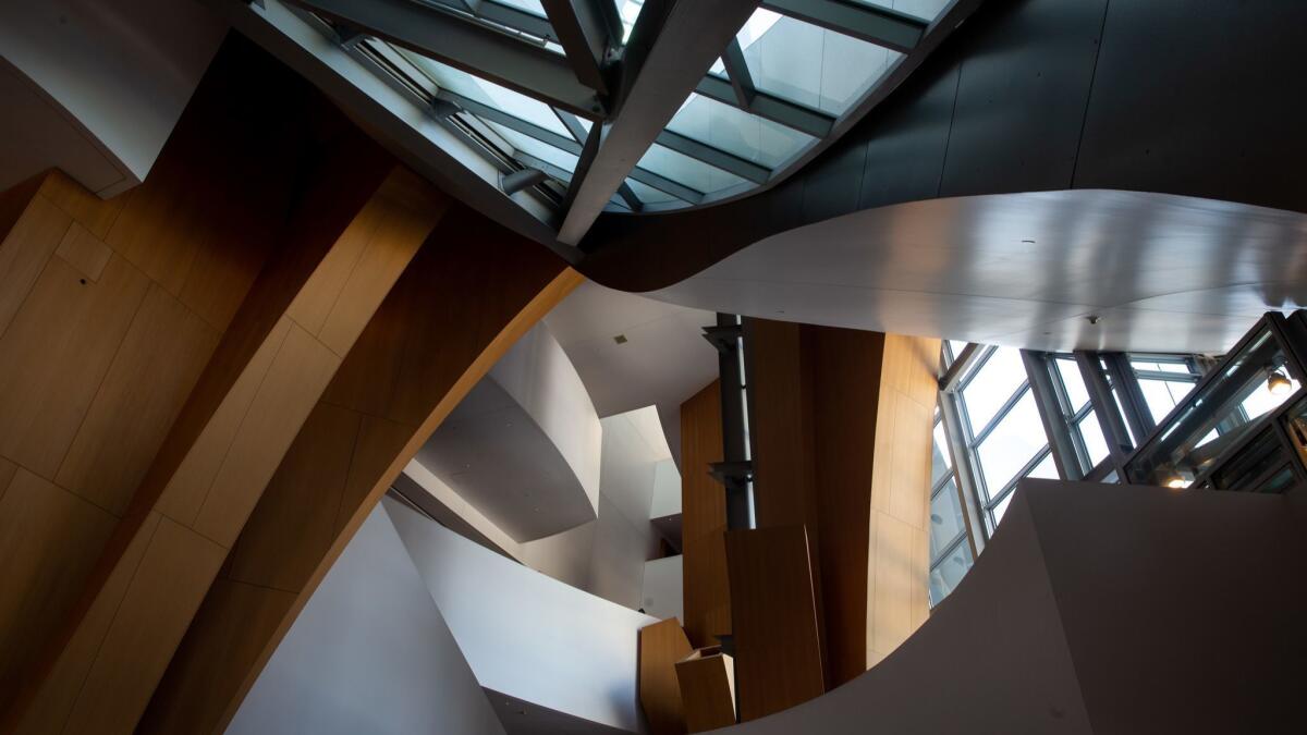
Audiences don’t move along orderly hallways here, but through a sequence of tight and vast spaces, accompanied by a rhythm of syncopated views — in toward the auditorium, out to the street and sky. Even getting to your seat is a musical experience. That sense of procession surely ignited the imagination of one particular audience member, Yuval Sharon, the visionary director who moved from New York to L.A. in 2009 and soon started staging operas in motion: Christopher Cerrone’s “Invisible Cities” among the unsuspecting crowds in Union Station, and the three-composer “Hopscotch” in a fleet of moving cars. Disney Hall gathers artists in its embrace — and then unleashes them on the city.

Any building in a dense downtown slips into an intricate network of urban relationships, like a new spouse joining an extended clan. Disney Hall incorporates the landscape that Gehry’s predecessors on Bunker Hill resented. He even extended the immediate topography by lifting it up onto the hall’s shoulder in the exquisite, quasi-secret Blue Ribbon Garden. And with its evocations of cliffs, peaks, sails and spume, the building’s form relays a sympathetic message from the San Gabriel Mountains looming to the northeast to the surf at the city’s other end.
A building this complete and complex can be tough on the architects next door, which is one reason Gehry’s masterpiece is now generating more Gehry. Still, Diller Scofidio + Renfro is not easily intimidated, and the firm’s design for the Broad is a master class in how to be assertive and respectful at the same time. Disney draws people to its light, reverberant sanctum; the Broad pulls visitors up through a cave-like passage, allowing just a peek or two at the vaults along the way, and delivers them to a wide, elevated platform full of art. Textured, matte and rectilinear where Disney is sleek, glossy and calligraphic, the Broad negotiates between the concert hall’s effusiveness and the lineup of introverted boxes along Grand.
A garment gets its oomph from the places where it parts and lifts, and DS + R makes canny use of the white concrete mesh that drapes the box inside, opening an eye-shaped slit on one wall and lifting the hem at the corners. It’s as if a breeze from a subway grate has started ruffling the drape; the next gust could make it billow up like Marilyn’s dress in “The Seven Year Itch” — or like the costume on the steely diva next door.
Justin Davidson is the architecture and classical music critic at New York magazine, where he writes about a broad range of design issues. As a classical music and cultural critic at Newsday, he won a Pulitzer Prize for criticism in 2002.
More to Read
The biggest entertainment stories
Get our big stories about Hollywood, film, television, music, arts, culture and more right in your inbox as soon as they publish.
You may occasionally receive promotional content from the Los Angeles Times.


