Review: An early look in the Broad museum reveals a show that doesn’t quite gel

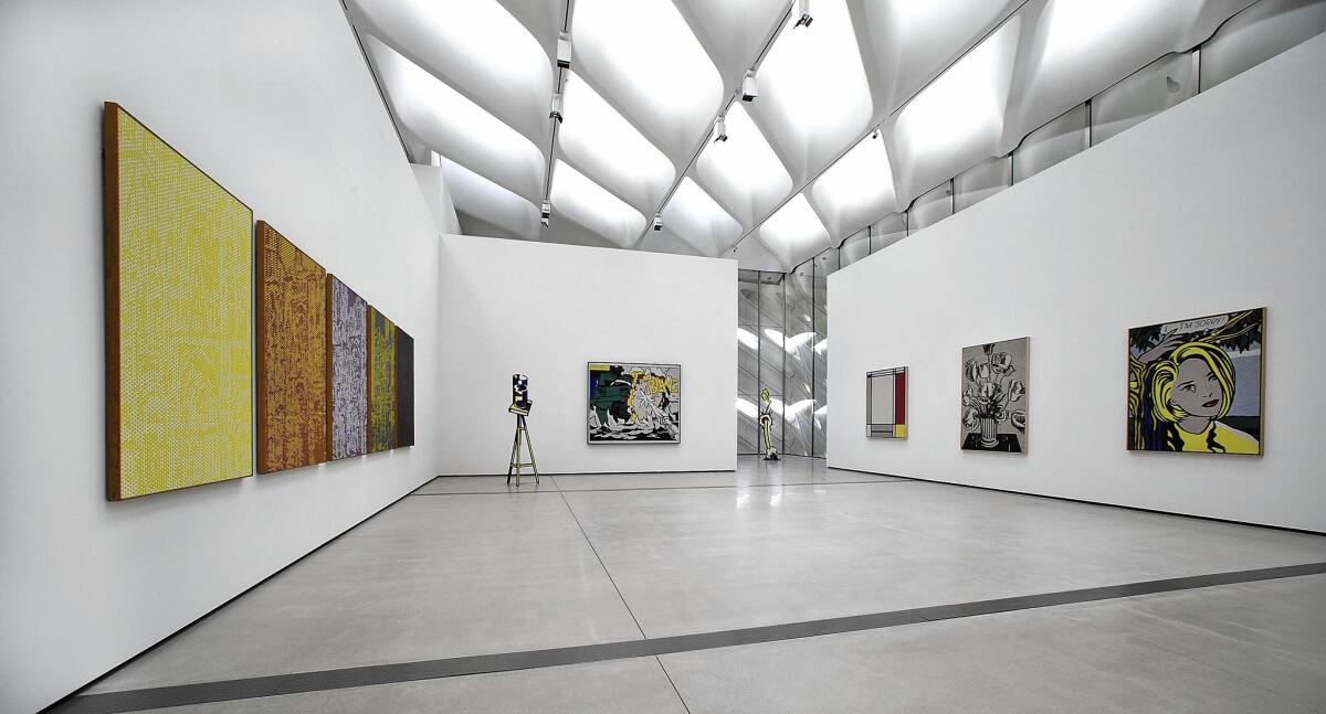
A view of works by Roy Lichtenstein inside the Broad museum.
- Share via
The city’s urban culture gulch is on the brink of opening a major new art museum — L.A.’s seventh — as the Broad finishes preparations for its Sept. 20 debut downtown.
The flashy new building stands next to Walt Disney Concert Hall and REDCAT and across Grand Avenue from the Museum of Contemporary Art and the Colburn School. The latest project of billionaire philanthropists and art collectors Eli and Edythe Broad, it launches with a 50,000-square-foot exhibition drawn exclusively from its wide-ranging permanent collection.
Unfortunately the show doesn’t gel, although many works are superlative. Roughly 250 pieces by about 60 artists have been chosen from around 2,000 possibilities by nearly 200 artists.
Any curator will tell you that it takes time to learn a new building’s personality quirks — to figure out how best to configure temporary walls, take advantage of sight lines that let art pull a visitor through the galleries and calibrate an installation so that objects visually speak to one another. The Broad’s inaugural installation began only in June. That’s quick.
Three visits over that relatively brief period revealed a work in evolutionary progress, with many changes along the way. Some may yet come before doors open to a curious public next week.
The museum bills the exhibition as “a sweeping, chronological journey” through the collection. But, in addition to feeling random (why this artist and not that one?), much of the best work has been seen before. Two large Broad exhibitions — in 2001 and 2008 — were held at the Los Angeles County Museum of Art, so this opening has a lot of déjà vu.
SIGN UP for the free Essential Arts & Culture newsletter >>
The strongest feature is the collection’s depth in the representation of individual artists, especially Pop-related. When the couple commit to acquiring an artist’s work, usually they collect in depth — a practice surely inspired by the example of Giuseppe and Giovanna Panza di Biumo, the great Italian collectors of postwar American art whose collection is an anchor at MOCA.
Few museums have the resources to acquire, say, two dozen Jeff Koons sculptures, as the Broad has. (The inaugural features eight — plus one dreadful painting, a medium for which he has no talent.) Several bountiful single-artist rooms make you linger longer.
Among Andy Warhol’s 11 paintings is a 1962 “Dance Diagram” correctly displayed on the floor, not hanging on a wall. (It’s meant to send up Jackson Pollock, who dripped paint while dancing around a canvas unfurled on the floor.) Roy Lichtenstein’s 10 Pop paintings provide a stunning survey of his 1960s breakthrough, giving mass-media makeovers to Impressionist, Fauve, Cubist and other historic paintings.
Just four Ellsworth Kelly paintings fill another room, but their seamless fusion of bold geometric shapes, crisp composition and saturated colors grabs you by the lapels. Among them is one from a breakout 1963 series, a masterpiece acquired two years ago.
A vivid green rectangle and a bright blue oval are surrounded by a crimson field. All calmly share the same flat plane, perfectly balanced in scale and chromatic intensity, yet straining to burst their optical bonds. Kelly makes poise look easy.
Closer to the present, five paintings and sculptures by Takashi Murakami push the collection’s Pop art focus forward in time. Murakami’s creepy cartoon cheerfulness about a Japanese society riven by post-atomic tensions takes a monumental turn in a new, 82-foot-long mural.
“In the Land of the Dead, Stepping on the Tail of a Rainbow” conjures a mythic narrative inspired by the 2011 earthquake and tsunami that tore open the Fukushima Daiichi nuclear power plant. Great waves of storm-tossed sea monsters cavort around a grim mountain of skulls — a landscape of elegant, stylishly sophisticated awfulness.
Writer Pico Iyer wryly observes in the 8-pound, 2-inch-thick collection catalog published to coincide with the show that wartime emperor Hirohito was buried with the Mickey Mouse wristwatch he snagged on a 1975 trip to Disneyland. Murakami’s art unpeels the perpetual violation of innocence that characterizes modern Japan.
Perhaps the most viscerally gorgeous room is Cy Twombly’s, with seven lush paintings and three ghostly sculptures. A difficult artist, especially for audiences of the “My Child Could Do That” school of fusty art criticism, Twombly’s paintings mix drawing and writing. The aim is to free them from established strictures of earth-bound depiction.
It’s no mean feat. An epic array of unruly lines unfolds — tightly crabbed scratches, abstract penmanship and luxurious, billowing slathers. Marks lodge inside or sometimes bleed through translucent layers of paint, bursting through the pentimento into enormous floral thunderclouds. Twombly’s art is like an insistent echo of forgotten graffiti, murmuring from ancient walls.
NEWSLETTER: Get the day’s top headlines from Times Editor Davan Maharaj >>
I wish the exhibition continued on this way, with only monographic rooms. A core collecting philosophy for nearly 40 years would take center stage.
Instead, except for rooms for John Currin and Glenn Ligon, the show mostly flips into conventional mode. Packaged art movements popular in New York in the late 1970s and after are chronicled. Blandness settles in.
Galleries advance the image-scavenging of appropriation art, such as Richard Prince’s sly painting of an old barroom joke and Sherrie Levine’s cast-bronze copy of a Marcel Duchamp urinal. Neo-Expressionism includes the smashed crockery of Julian Schnabel and the psycho-sexual unease of Eric Fischl’s suburbia, both rejecting Minimal and Conceptual coolness and returning to easel painting. In graffiti art, socially marginalized artists like African American whiz-kid Jean-Michel Basquiat and gay activist Keith Haring invade the patrician canvas with the street’s rough-and-tumble.
A choppy, incomplete history is told with too many works juxtaposed in spaces too confined. Many individual works are fine but together feel jumbled and thin.
One feature gives me the willies. It concerns conservation of fragile art. The show is peppered with works on paper, photographic and painted, which should be kept from sunlight but aren’t.
It’s divided between a first-floor suite of rooms, which in the future will house temporary and traveling shows, and a wide-open third-floor space, topped by a dramatic ceiling. A 35,000-square-foot honeycomb of fixed skylights faces north, bringing in flat, cool, filtered natural light.
Display cases for 16 of Cindy Sherman’s great “Untitled Film Stills,” which ooze all-American anxiety, have the photos lying flat and facing up at the skylights. A monumental Mike Kelley acrylic on paper shows nested picture frames around the tiny vista of a bucolic mountain cabin, which gets swallowed up in a psychedelic frenzy of painted wood-grain that surrounds it.
Barbara Kruger transforms the language of popular graphic design into a subversive threat in an oversized photo-triptych of a sleek, predatory jungle cat underscored by the off-kilter legend, “Make my day.” Jasper Johns’ exquisite 1960 study “White Flag,” an ironic symbol that pleads for negotiated surrender, makes me gulp: It’s oil on newspaper on paper over lithograph.
A triple whammy. Museum director Joanne Heyler, who organized the show with Eli Broad, assures me that conservation precautions are being taken and works will rotate. But why take the risk? I’d feel better if the paper works were all downstairs, shielded from the mischievous sun.
That vast skylight is integral to the building’s narrative. When the $140-million museum was going up, attention was riveted on the façade’s elaborate lattice work, punctuated by a bellybutton window out front. The New York architecture firm Diller Scofidio + Renfro dubbed the lattice a “veil” shrouding the museum’s inner “vault,” which houses the $2-billion art collection.
But inside the front door an eccentric, head-turning entrance hall is now revealed. Undulating walls and ceiling in dark gray plaster create a long, narrow, organic space. Think urban cavern. The room is a theatrical imitation of a cavity burrowed deep inside the Earth.
It’s art-spelunking time: Welcome to Plato’s Cave.
Plato, student of Socrates and teacher of Aristotle, used his famous myth of the cave, where deceptive shadows lurk, to frame an aesthetic quandary: Does art’s friction between illusion and reality generate light or merely heat?
Board the Broad’s 105-foot escalator or glass-enclosed elevator, and you shoot up two floors, “Star Trek”-style, past the second-floor vault to the galleries above. There, art is poised between the shadowy illusion below and the clear California sun above.
The design’s pop-classical mythologizing is likely to slip by unnoticed to most visitors. (Maybe Hirohito would see Pirates of the Caribbean in the entry, not Plato’s Cave.) Theme architecture is always a bit much.
Anyhow, art does it better. Dead ahead off the escalator, Koons’ big, multicolored flower sculpture is laid out at the public’s feet — a fond welcome offering. Machined in stainless steel, these giant tulips, pristine and perfected, will never wilt, unlike nature’s fragile kind.
They’re beyond death. Koons flips the traditional role still-life flowers play, symbolizing mortality.
He further invokes the legendary tulip mania of 17th century Holland. The era also marks the art market’s modern emergence. Paintings and tulip bulbs became mediums of fevered commercial exchange.
“Tulips” tells us something we don’t always want to hear. The prospect of immortality, however vain, can be vested in precincts of incalculable wealth and extraordinary power. Like pyramids, say. Or the Broad.
The sculpture’s witty placement underscores the narrowness of the collection. It’s mainly rich in blue-chip art, defined by market value decided through consistent years of sales and confirmed at auction.
The market, subject to commercial limitations, is hardly infallible. It leaves a lot out. That’s why the show’s “sweep” feels choppy, and why about 80% of the 92 artists featured in the collection’s new catalog are male, which the art market favors.
It’s also why the show stresses art from New York and Europe, where art’s primary trading floors are located, but not Los Angeles, where the collection was assembled. Ironically, in “Tips for Artists Who Want to Sell,” his cheeky 1966-68 sign painting, L.A.’s John Baldessari gives the sardonic lowdown. “Paintings with cows and hens collect dust,” it declares, “while bulls and roosters sell.”
Markets always distinguish between what’s salable and what’s not, but they can’t calculate quality.
Twitter: @KnightLAT
More to Read
The biggest entertainment stories
Get our big stories about Hollywood, film, television, music, arts, culture and more right in your inbox as soon as they publish.
You may occasionally receive promotional content from the Los Angeles Times.


