Review: Nature sinks its roots into Santa Monica’s new parks
- Share via
Who knew James Corner, the landscape architect best known for his work on the acclaimed High Line elevated park in Manhattan, had such a picturesque streak?
The British-born Corner and his New York firm Field Operations have just finished their first major project in California. The $46.1-million park covers seven acres just west of Santa Monica City Hall, two blocks from the beach. It will open officially with a ceremony on Oct. 19 but could be accessible to the public, once the construction fencing is taken down, as early as a few days after Labor Day.
It’s actually two parks in one. A small park right at the foot of City Hall, partly open already, is called Ken Genser Square, in honor of the city’s late mayor. A much larger space, named Tongva Park after one of the L.A. basin’s original Native American populations, is on the other side of Main Street, filling six acres on the site of the old Rand Corp. headquarters.
RELATED: A tour of Los Angeles’ boulevards
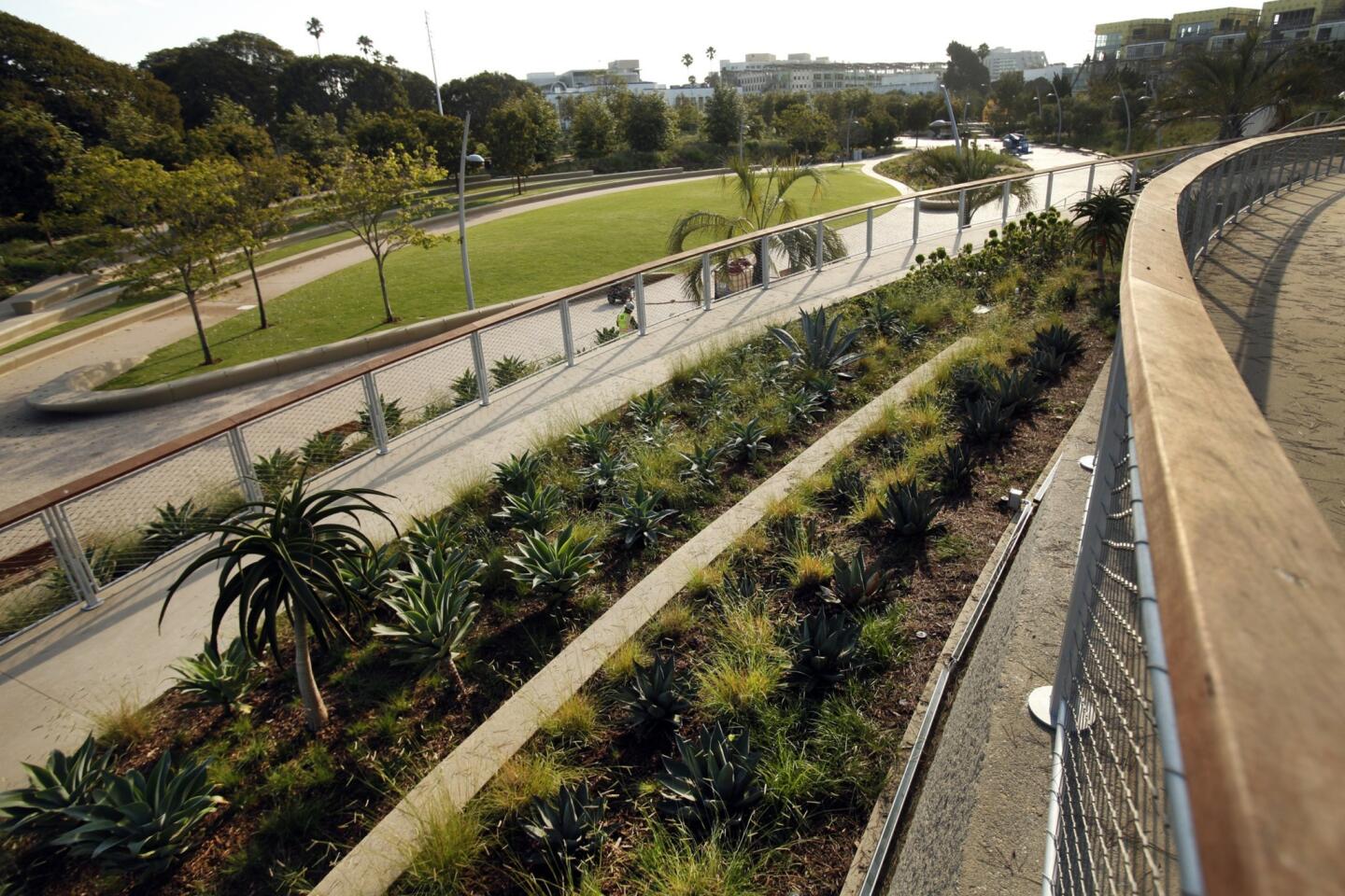
What’s most surprising about the design of the bigger section is how organic and naturalistic it has turned out to be. Based on the rather earnest theme of the arroyo — and with a site plan matching the spreading veins of a leaf — Tongva Park is dominated by a series of winding paths and modest hills thickly planted with a mixture of native and drought-tolerant plants.
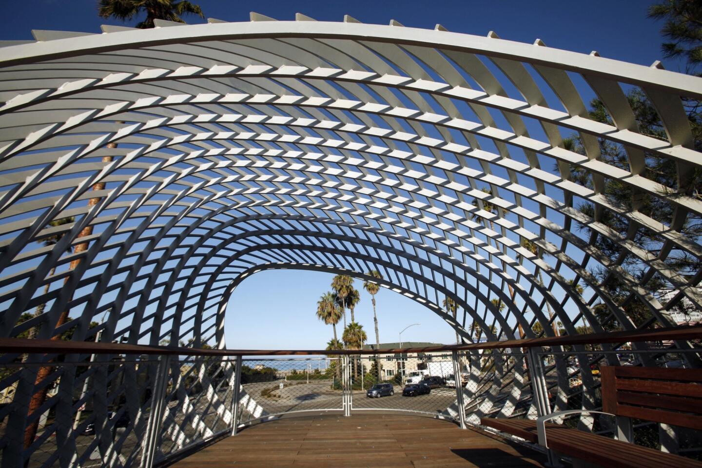
Viewing platforms overlooking the ocean and the Santa Monica Pier are wrapped inside oval forms that suggest both breaking waves and woven baskets.
An early version of the design, published not long after Corner beat out prominent competitors for the park including Frank Gehry and the veteran landscape architect Peter Walker in early 2010, featured spare rectangular frames atop the overlooks.
They paid indirect homage to art’s Light and Space movement, which was led by Robert Irwin, James Turrell and others and got its start in and around Santa Monica in the 1960s.
In the finished version those frames are gone. So, in a broader sense, is any significant connection between the park design and the postwar or contemporary artistic and architectural culture of Santa Monica — or even its particular climate. Most arroyos, after all, are a lot more arid and lot farther inland.
Still, the project is unquestionably a rare example of farsighted urban planning in Southern California, which may in the end be its most important legacy. Santa Monica is ready to unveil an ambitious new public space more than two years before the completion of the second phase of the Expo Line, whose final stop, at 4th Street and Colorado Avenue, will be just two blocks away.
PHOTOS: L.A.’s broken civic promise
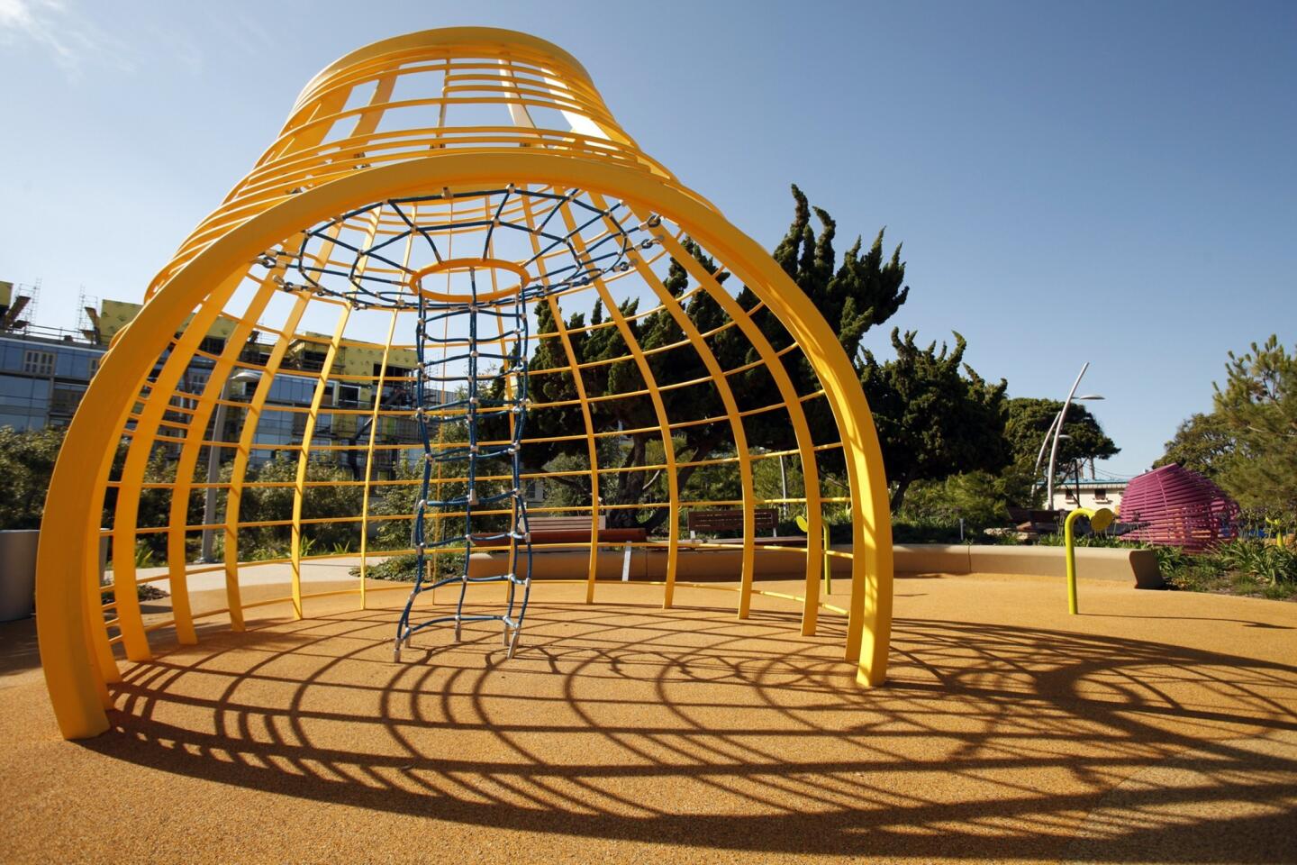
Certainly the park is poised to be hugely popular both as a place to walk and as a shady refuge from the lively, aggressive commercialism of the pier and nearby Third Street Promenade. It includes dense clusters of large sycamore, olive, pine, ficus and strawberry trees, a children’s playground, a generous supply of benches and large tables and a shaded picnic grove.
In large part the park’s calm, fluid character represents the canniness and political sophistication for which Corner is well known. In the arroyo theme he found an approachable aesthetic that he figured would win broad support in a city known for a tricky and sometimes punishing kind of public-design process. And he was right.
Still, it would hardly be fair to describe Corner’s approach here as pandering or insincere. The High Line was a project fraught with tension about who deserved credit as lead designer. Corner and Field Operations were officially the chief designers, but many writers showered primary praise instead on architects, who sometimes did little to correct them.
Corner teamed with an architect in Santa Monica too — the L.A. firm Frederick Fisher and Partners. But this time around Corner hasn’t left any doubt about who’s running the design team. He wasn’t about to make that mistake again.
What Corner has produced here seems equal parts strategic and genuine. You might say he’s found the sweet spot between his own design sensibility and one capable of surviving public meeting after public meeting in Santa Monica.
The design of Ken Genser Square has gone through several iterations, in part over concerns about how it might affect Santa Monica City Hall, a 1939 PWA Moderne building by Donald Parkinson and Joseph Estep. It shows the strain of that long and involved process.
PHOTOS: Arts and culture in pictures by The Times
It might have worked well as an emptier space, a kind of lightly planted civic plaza. Or it might have succeeded as an obvious and direct extension of Tongva Park.
Instead it hovers somewhere in between, more formal than the design across the street but not nearly open enough to work as a real gathering spot or location for political protest. And the crosswalks leading from it to Tongva Park leave pedestrians surprisingly exposed to the car and bus traffic along this stretch of Main Street.
The most ambitious feature of Tongva Park, meanwhile, is the way Corner and his firm have remade the topography of the site, turning a relatively flat piece of land into a gently rolling landscape. The biggest hills, clustered together on the west side of the park, lift visitors just high enough for views of the coastline and the Santa Monica Pier. Smaller ones help carve out secluded paths on the north and south side.
In some ways the project is Santa Monica’s answer to the year-old Grand Park in downtown Los Angeles. But at Grand Park the main design challenge was how to deal with the existing topography on an awkward, sloping site. Here it’s been the opposite: how to introduce some hills and dramatic views to a piece of land that in its pre-park state had neither.
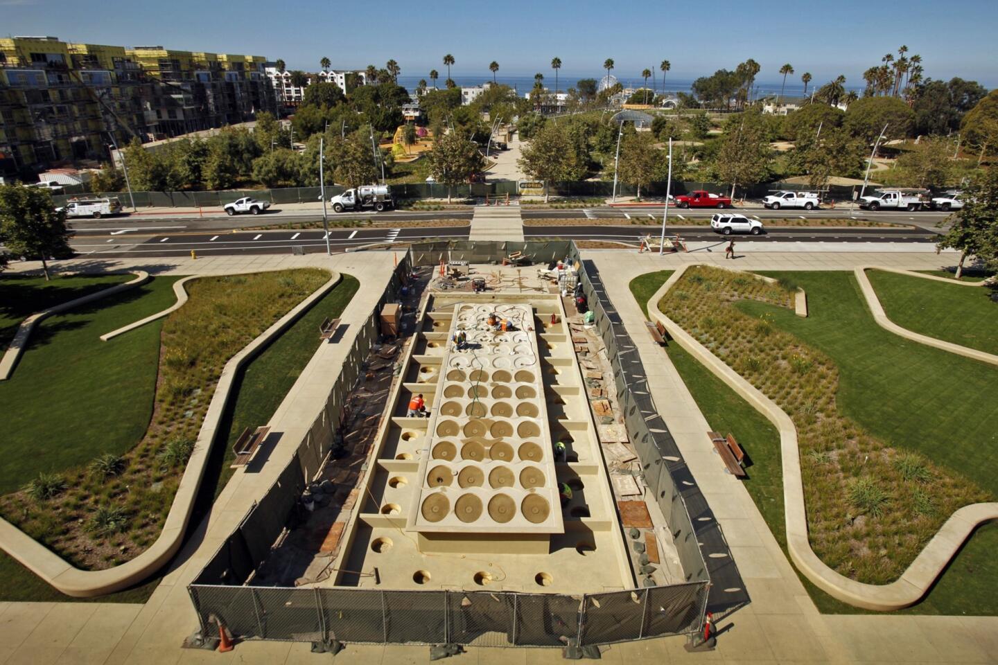
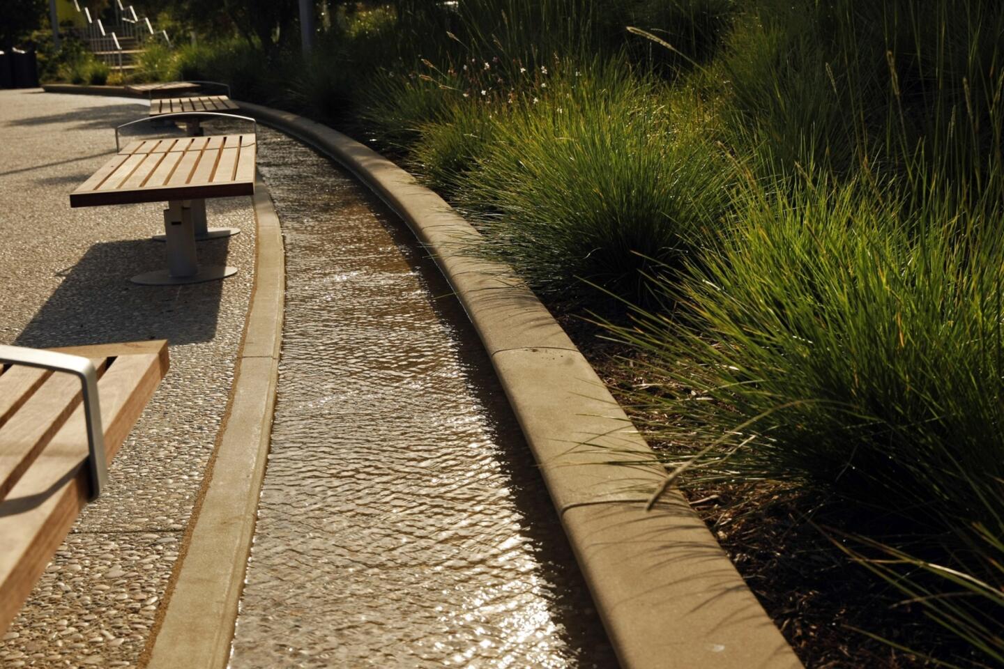
Most of Tongva Park’s major attractions are strung along its wide, curving main path. They include a number of fountains and water features, the playground, a sizable event lawn and an installation by the artist Inigo Manglano-Ovalle that was still unfinished when I walked through. The most densely planted section of the park is along its southern edge, alongside the new Ocean Avenue South, a residential complex by New York developer Related Cos. that is nearing completion.
A bathroom structure designed by Fisher nestles into the park’s highest hill. Despite his efforts to make it look modest and reticent — he calls it a “non-building” — the bathroom became the magnet for a lot of last-minute design attention as the park was being built, in part because of its unusually open layout. (The men’s and women’s sides are divided only by a double-sided line of sinks.) City officials installed netting across an open skylight in the center, compromising that detail as a last remaining nod to Turrell, because they worried people might throw things into the bathroom from the path above.
The planted sections of the park and its hardscape both suggest an attention to detail and level of craftsmanship rare in public projects of this kind. Building on its experience with other parks near or along the ocean, the city has insisted on materials and finishes it says will withstand sun, marine air and winds.
Corner’s collaborators in choosing and arranging the plants — the horticulturalists Perry & Associates and Greenlee & Associates — settled on a rich variety that includes succulents and native shrubs and grasses.
So count the new parks as a triumph of execution and urban planning. Their design is a more complicated story. While Corner hasn’t abandoned the crisply forward-looking approach that marks the High Line and other projects from Field Operations, he is soft-pedaling it here.
The light poles, benches and other elements are streamlined or quietly modern. But overall this is a painterly spin on a contemporary park, with the sharper edges rounded off or sanded down.
More to Read
The biggest entertainment stories
Get our big stories about Hollywood, film, television, music, arts, culture and more right in your inbox as soon as they publish.
You may occasionally receive promotional content from the Los Angeles Times.
