Review: Mike Kelley retrospective resonates at MOCA
Last fall, when the big traveling retrospective of Los Angeles artist Mike Kelley (1954-2012) opened at MoMA PS1, the Museum of Modern ArtŌĆÖs outpost in Long Island City, N.Y., the show looked smashing.
Largely that was due to the intrinsic quality of KelleyŌĆÖs diverse work in a staggeringly wide range of media ŌĆö sculpture, painting, drawing, installation, video, performance, mosaic ŌĆö plus various mash-ups of just about all of them.
Partly, though, it was serendipity.
PHOTOS: ŌĆśMike KelleyŌĆÖ exhibit
A primary subject of KelleyŌĆÖs art is the way familiar social institutions of daily life ŌĆö especially school and church, but also including art museums and other representatives of authoritative points of view ŌĆö inevitably conspire to constrain, pressure and sometimes even warp the very adherents they seek to console and liberate.
Seeing his work in PS1 ŌĆö an old, blighted, urban public school long since reconfigured as an art museum ŌĆö provided a multilayered context that illuminated his art.
Now that the eagerly anticipated retrospective has arrived in Los Angeles, where it opens March 31 at the Museum of Contemporary ArtŌĆÖs Little Tokyo warehouse, the Geffen Contemporary, the unexpected has occurred: The show looks even better here than it did at MoMA PS1.
One small gallery at MOCAŌĆÖs Grand Avenue building houses a few paintings Kelley made late in his career, but the bulk of the show is at the Geffen. And itŌĆÖs big ŌĆö roughly 250 works, spanning more than three decades. Kelley was nothing if not prolific. The quality rarely flags.
The show was organized in 2012 by AmsterdamŌĆÖs Stedelijk Museum and then traveled to the Centre Pompidou in Paris and on to New York. As it toured, it changed substantially (in Paris, it was only 40% of its size here). MOCA curator Bennett Simpson has added several works not seen in L.A. before.
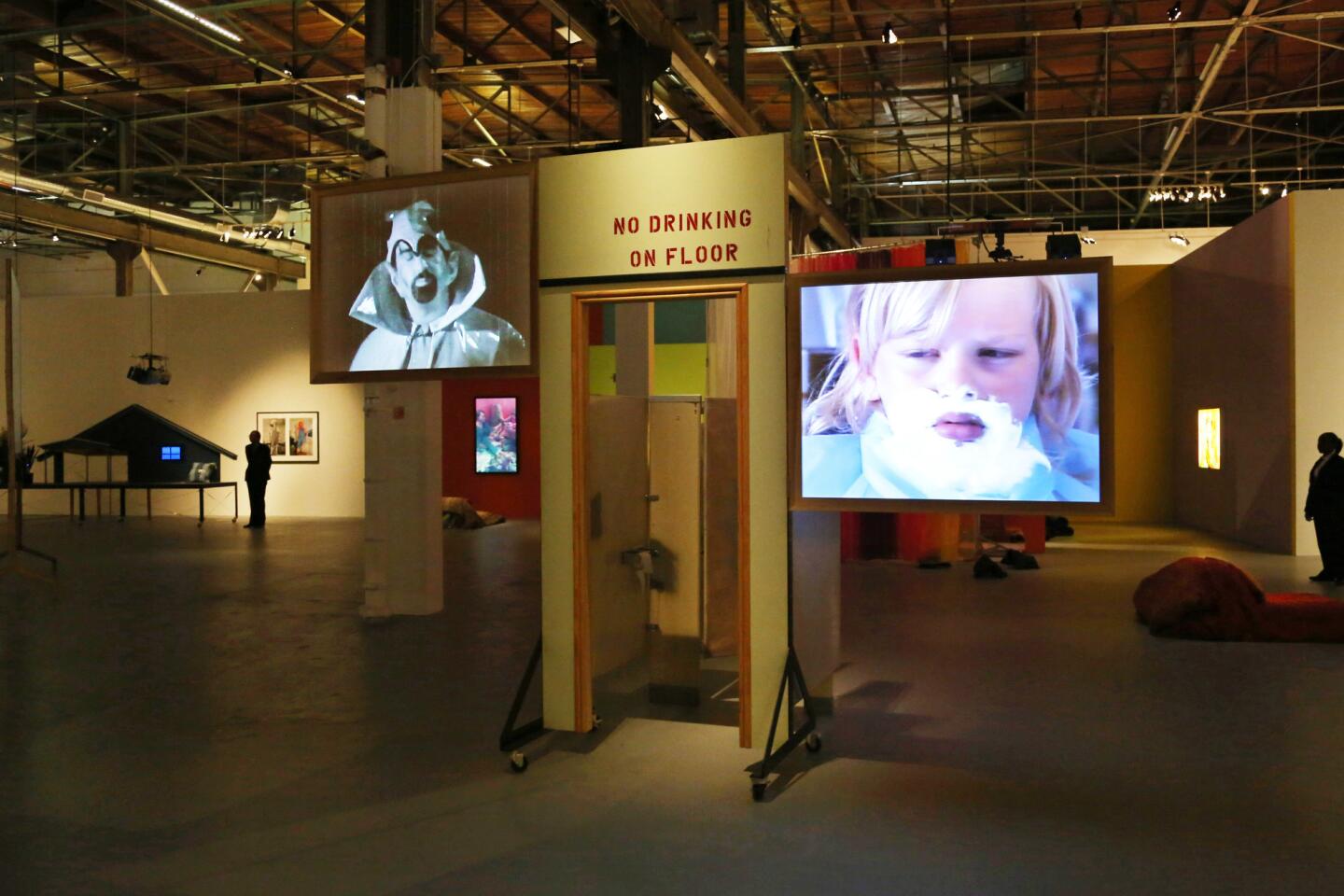
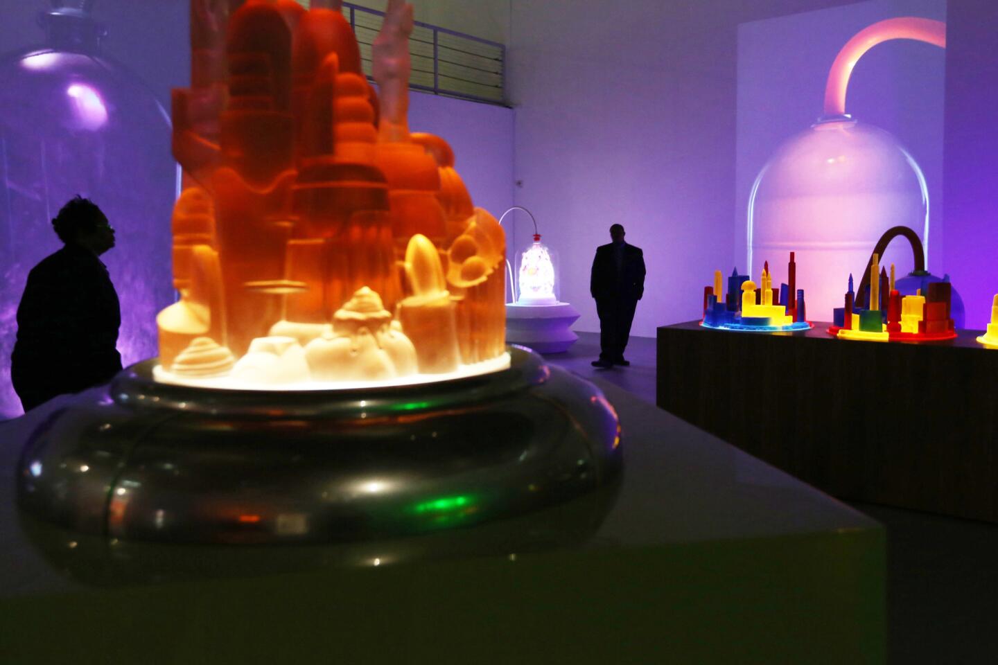
At MoMA PS1, only a few works could be displayed together in mostly modest-sized former classrooms. The show felt episodic. In the wide open spaces of the Geffen warehouse, which can accommodate multiple works together, surprising visual connections crop up.
PHOTOS: Arts and culture in pictures by The Times
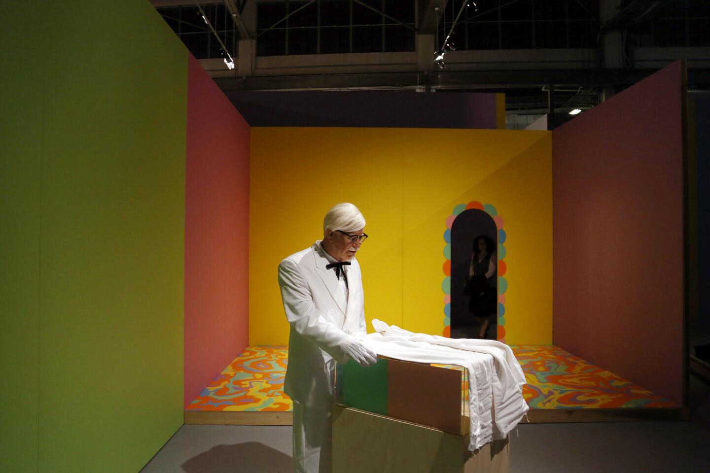
The sprawling exhibition now has the restless feel of a morbid fun house. School is definitely out.
SimpsonŌĆÖs installation generally conforms to the showŌĆÖs excellent catalog ŌĆö groupings determined not solely by date but according to discrete bodies of work.
Kelley, for all his artŌĆÖs low-down sources in the ephemera of popular culture and the rag-tag crudeness of many of his materials, was a brilliantly well-read intellectual. He often returned to themes and revisited materials, deepening his explorations as he went and extrapolating among them. Seeing those bodies of work together helps to underscore his artŌĆÖs ricocheting resonance.
Take the ancient allegory of PlatoŌĆÖs cave, where shadows cast on a wall from a flickering fire can be confused with ŌĆö or are sometimes inseparable from ŌĆö reality. The fire was meant to provide sustaining warmth, but its ominous shadows also chill. Kelley made the cave a central motif in a pivotal 1985 mixed-media installation.
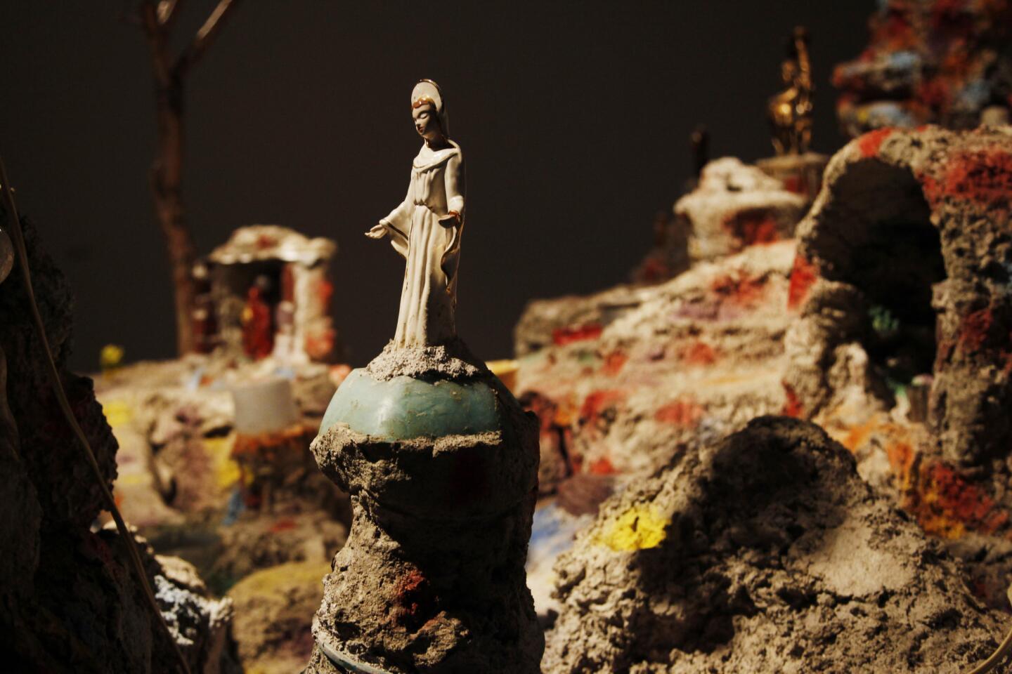
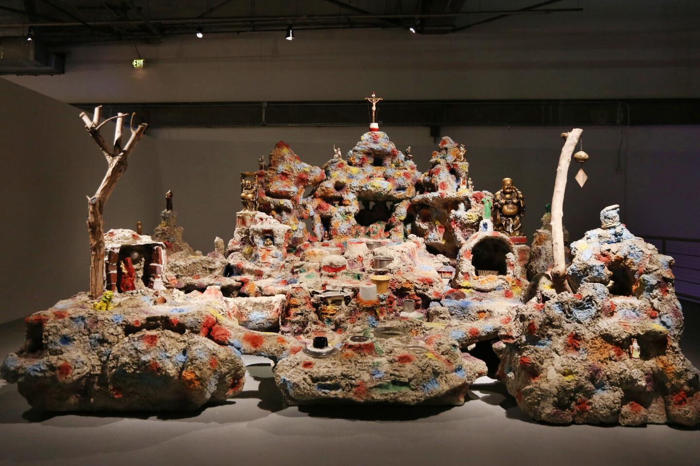
Then, 14 years later, it turned up in a wholly different way. One element of a mammoth, two-part installation sculpture is based on the eccentric ŌĆ£wishing wellŌĆØ that graces a Chinatown plaza in downtown L.A. The wellŌĆÖs mountain design derives from a famous limestone cave in Guangxi, China.
Go around to the back of KelleyŌĆÖs version, and youŌĆÖll find a small opening. The crawl space within is outfitted with a tacky mattress, condoms and a boom box. PlatoŌĆÖs cave is transformed into a wish-fulfillment love shack for disaffected souls.
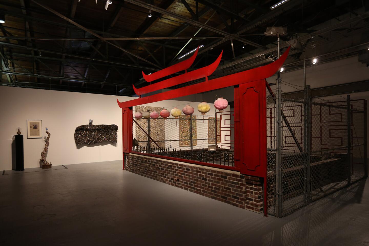
Titled ŌĆ£Framed and Frame,ŌĆØ the installation sculpture is being shown for the first time in L.A. Its other half is a mammoth cage built from chain-link fence, razor wire, a low brick wall and a kitschy ŌĆ£Chinese gate.ŌĆØ The cage could fit over the wishing-well mountain, imprisoning its wild fantasy.
CRITICSŌĆÖ PICKS: What to watch, where to go, what to eat
Physically, the big sculpture is at the other end of a broad spectrum that starts with small drawings, some no bigger than a notebook page.
On one little sheet, Kelley used felt-tip pen to diagram a 1978 performance piece. (Notoriously shy about performing, he eventually abandoned the genre, letting objects and videos perform on his behalf.) The brief text, not quite 130 words, ponders existential freedom.
During the performance, Kelley spoke the text as a ritual incantation, a philosopher speaking in tongues, all while rolling around the floor in overlapping circles on a large sheet of paper, pen in hand. When he was done, he had drawn a simple daisy.
An absurd, even childish representation of nature was inflected by the ŌĆ£flower powerŌĆØ utopianism of his 1960s adolescence. The sardonic title: ŌĆ£My Space.ŌĆØ
Modern art, especially when presented as pure abstraction, always promised wholeness, a unified sense of transcendent harmony equivalent to nature. KelleyŌĆÖs abstractions dismantle that dream, often with wit and rarely without pathos.
Take his 1988 ŌĆ£garbage drawingsŌĆØ ŌĆö exquisite splatters of sludge, with a chicken bone protruding here and a crumpled tin can flying off there. The black acrylic splatters arc and flow across pristine sheets of white paper in beautiful, baroque interlaces.
The drawings are burlesques of Abstract Expressionist art, evoking paint flung at a canvas. What they actually depict is trash, the residue and refuse of daily life.
CHEAT SHEET: Spring arts preview 2014
Kelley made them by appropriating motifs from old Sad Sack comic books. The hapless World War II Army private could never seem to escape duty on kitchen patrol, about as far from the heroism of the battlefield as he could be. Often, he ended up covered in slop.
For the drawings, delicate and perversely elegant, Kelley simply removed the figure. The mess left behind said something about what had been crowned ŌĆ£the triumph of American painting.ŌĆØ That such beauty depicts rubbish is typical Kelley.
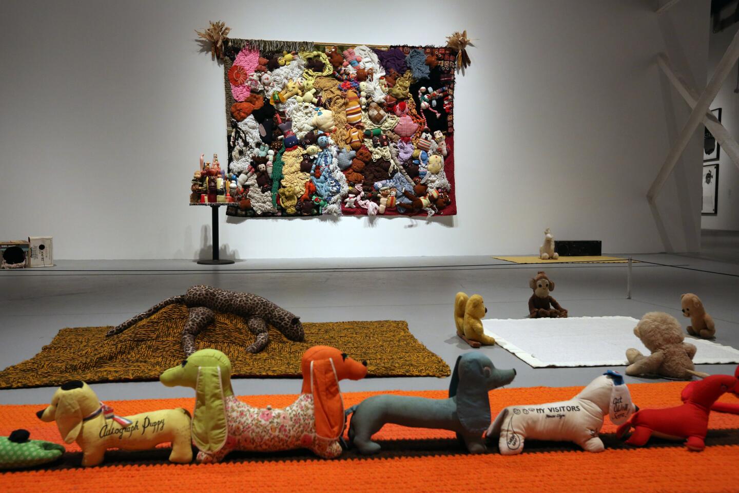
Cartoonist (and Disney illustrator) George Baker, who based Sad SackŌĆÖs flouted yearnings on his own war-time experiences, was as important to KelleyŌĆÖs world-view as Mark Rothko or Caravaggio. Likewise, his wide-ranging materials, whether the traditionally exalted medium of painting, the antiquated mosaics of a hobbyist, the felt banners of a Sunday school class or the homemade videos of a YouTube enthusiast, all receive the same dedicated respect. Using multiple mediums with equal aplomb refuses established artistic hierarchies, with their inescapable implications of class distinction.
ThatŌĆÖs also echt Kelley.
The exhibition has a four-month run (it closes July 28) and will reward repeat viewing. Kelley, born in suburban Detroit, was based in Los Angeles throughout his artistic life, and his trajectory as an artist since the 1980s paralleled the emergence of the cityŌĆÖs art scene into international prominence.
For MOCA, which is emerging from a harrowing rough-patch and now seems poised for a constructive turn-around, itŌĆÖs a homecoming of considerable significance.
twitter.com@KnightLAT
-----------------------------------------
ŌĆśMike KelleyŌĆÖ
Where: Geffen Contemporary at MOCA, 125 N. Central Ave., Los Angeles
When: Thursdays-Mondays, through July 28
Info: (213) 626-6222, https://www.moca.org
More to Read
The biggest entertainment stories
Get our big stories about Hollywood, film, television, music, arts, culture and more right in your inbox as soon as they publish.
You may occasionally receive promotional content from the Los Angeles Times.
