Review: Ed Ruscha show wowed in New York. Why itŌĆÖs even better in L.A.
ŌĆ£Ed Ruscha / Now Then,ŌĆØ the sprawling and much-anticipated retrospective of the great American Pop and Conceptual artist, opens Sunday at the Los Angeles County Museum of Art. I am happy to report that the exhibition stinks.
I mean that in a good way.
When it had its debut at the Museum of Modern Art in New York last fall, the otherwise engrossing, beautifully orchestrated presentation suffered only one significant flaw. ŌĆ£Chocolate Room,ŌĆØ RuschaŌĆÖs 1970 contribution to the Venice Biennale, wasnŌĆÖt installed quite right.
A room shingled inside, top to bottom, with hundreds of rectangular sheets of paper screen-printed with warm brown chocolate paste, the sweet environment should have been fragrant in a contradictory way ŌĆö enticing and sickly, indulgent and off-putting, decidedly lovely and vaguely gross. A be-careful-what-you-wish-for moment, in other words, because a world of excessive pleasure would surely attract bugs.
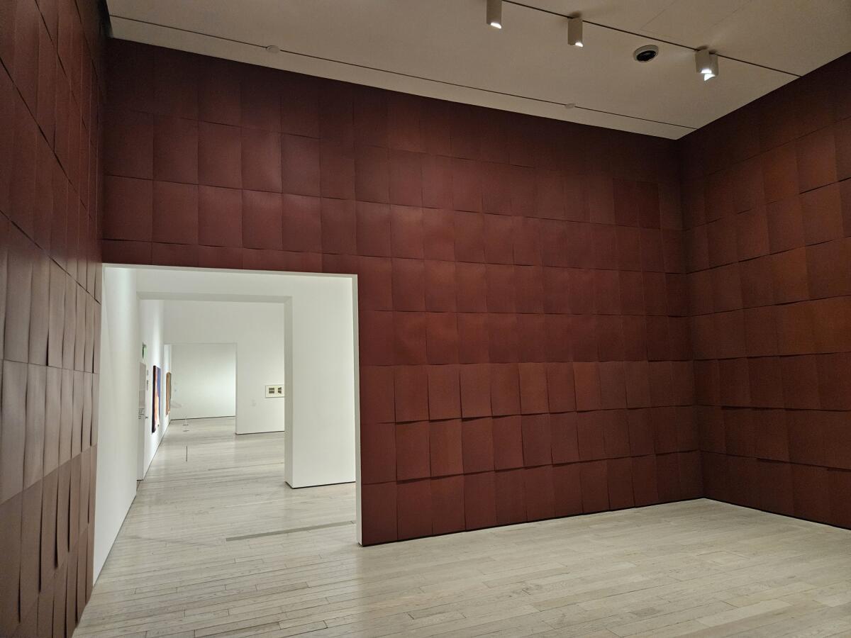
The room MoMA chose for RuschaŌĆÖs literal box of chocolates, however, was a pass-through gallery, with doorways on two sides. Think flow-through teabag, which lets fluids circulate ŌĆö in this case, air. Unlike a closed space, it couldnŌĆÖt hold the aromatic fragrance of the chocolate. The less than pungent environment felt rather inert.
LACMA has installed ŌĆ£Chocolate RoomŌĆØ correctly, in a contained room with a single door. ThatŌĆÖs how it was displayed in Venice, Italy, and again when shown years ago at the Museum of Contemporary Art downtown, where the eccentric piece is part of the permanent collection. Now the installation draws you in, and after lingering a while the scent begins to seem like a disagreeable odor that sooner or later pushes you out.
The Ruscha retrospective was jointly organized by MoMA and LACMA, and it traveled to Wilshire Boulevard largely intact. (That doesnŌĆÖt always happen; traveling shows often shrink significantly.) Seventy-six paintings ŌĆö 80 were in New York ŌĆö range in date from 1958 to 2022. They are accompanied by a slew of works on paper, including drawings, photographs, prints and books, all of it filling the BCAM buildingŌĆÖs second floor. The show opens with small, tentative forays into drawing and painting, some inspired by the Nebraska-born artistŌĆÖs seven-month trip to Europe in 1961, when he was 23, five years after he had moved to Los Angeles.
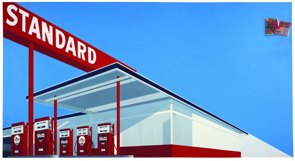
Art barely had a presence in the city then. RuschaŌĆÖs sojourn abroad helped to cement his decision when he returned to become an artist. He had been schooled in graphic design and was working in advertising. Commercial artŌĆÖs ubiquity in L.A. made signs and logos virtually natural as a visual language ripe for artistic use. The exhibitionŌĆÖs first three rooms are filled with what we now think of as ŌĆ£classic RuschaŌĆØ from the 1960s ŌĆö single word paintings (ŌĆ£Boss,ŌĆØ ŌĆ£Honk,ŌĆØ ŌĆ£Oof,ŌĆØ ŌĆ£Smash,ŌĆØ ŌĆ£Radio,ŌĆØ ŌĆ£Annie,ŌĆØ ŌĆ£WonŌĆÖtŌĆØ and many more); pictures of buildings sporting big signage (Standard gas stations, NormŌĆÖs restaurants, the 20th Century Fox movie studio); and the Hollywood sign up in the hills, tagging the city below.
RuschaŌĆÖs Hollywood signs are emblematic of the discombobulating ways in which his art works. Always, what we casually assume to be a realist depiction taken from everyday life, in fact, turns out to be a cleverly stage-managed fiction.
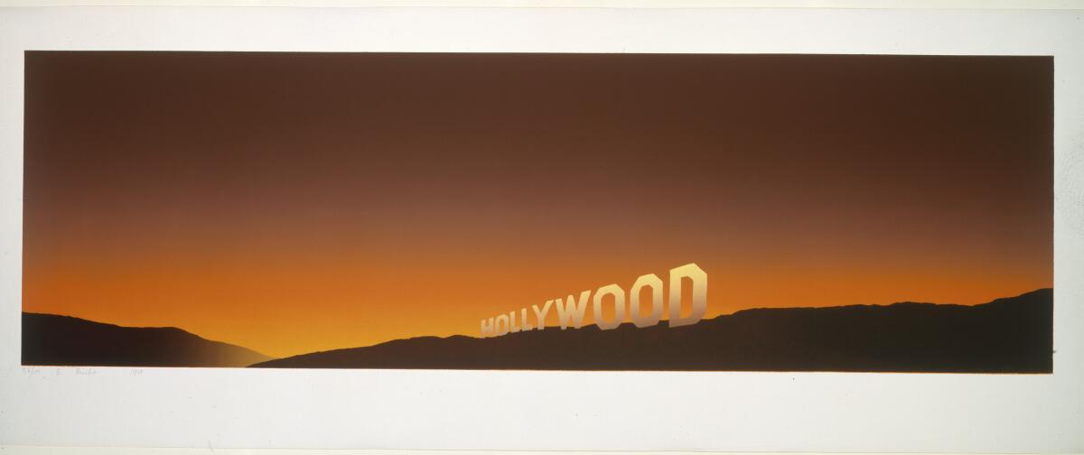
Take his narrow screenprint, nearly 4 feet wide, where the word ŌĆ£HollywoodŌĆØ rides along the crest of a dark hilly ridge. The sky behind it is aglow with a bright golden hue that rises through orange and red into a warm chestnut brown, suggesting night. YouŌĆÖd never see anything like that looking up from Beachwood Canyon, however, or anywhere else in L.A.
The actual Hollywood sign is not on a ridge but sits below it. The light glowing behind it, implying dawn or dusk, is impossible since the real sign faces south, not east or west, where it could be backed by the rising or setting sun. The strict diagonal line made by the top edge of letters that, on the actual hillside, undulate a bit jumps down in RuschaŌĆÖs picture to follow the ridge line disappearing into a ravine ŌĆö Hollywood and the abyss.
Is it falling in or climbing out?
The overall hellish look of the 1968 print is familiar to any Angeleno who has experienced the spookily resplendent skies during the annual infernos of fire season. Did RuschaŌĆÖs image have anything to do with the infamous and deadly Canyon fire that year, even though the disaster took place east of Hollywood? Or how about ŌĆ£The Day of the Locust,ŌĆØ Nathanael WestŌĆÖs landmark novel of American malignancy, in which a painting of the burning of Los Angeles is a hinge that foretells a lethal mob scene outside a star-studded Hollywood movie premiere?
Maybe yes, maybe no, to one or both speculations. This Hollywood sign resides in our collective consciousness ŌĆö our mindŌĆÖs eye ŌĆö as much as itŌĆÖs a visible presence on the land. RuschaŌĆÖs work always rides a thin line between fact and fiction, a larger cultural memory, smaller daily life and eternal mystery. The dexterity of the printŌĆÖs convincing composition summons the inevitable clich├®: The execution is like a surfer skillfully riding a perfect wave.
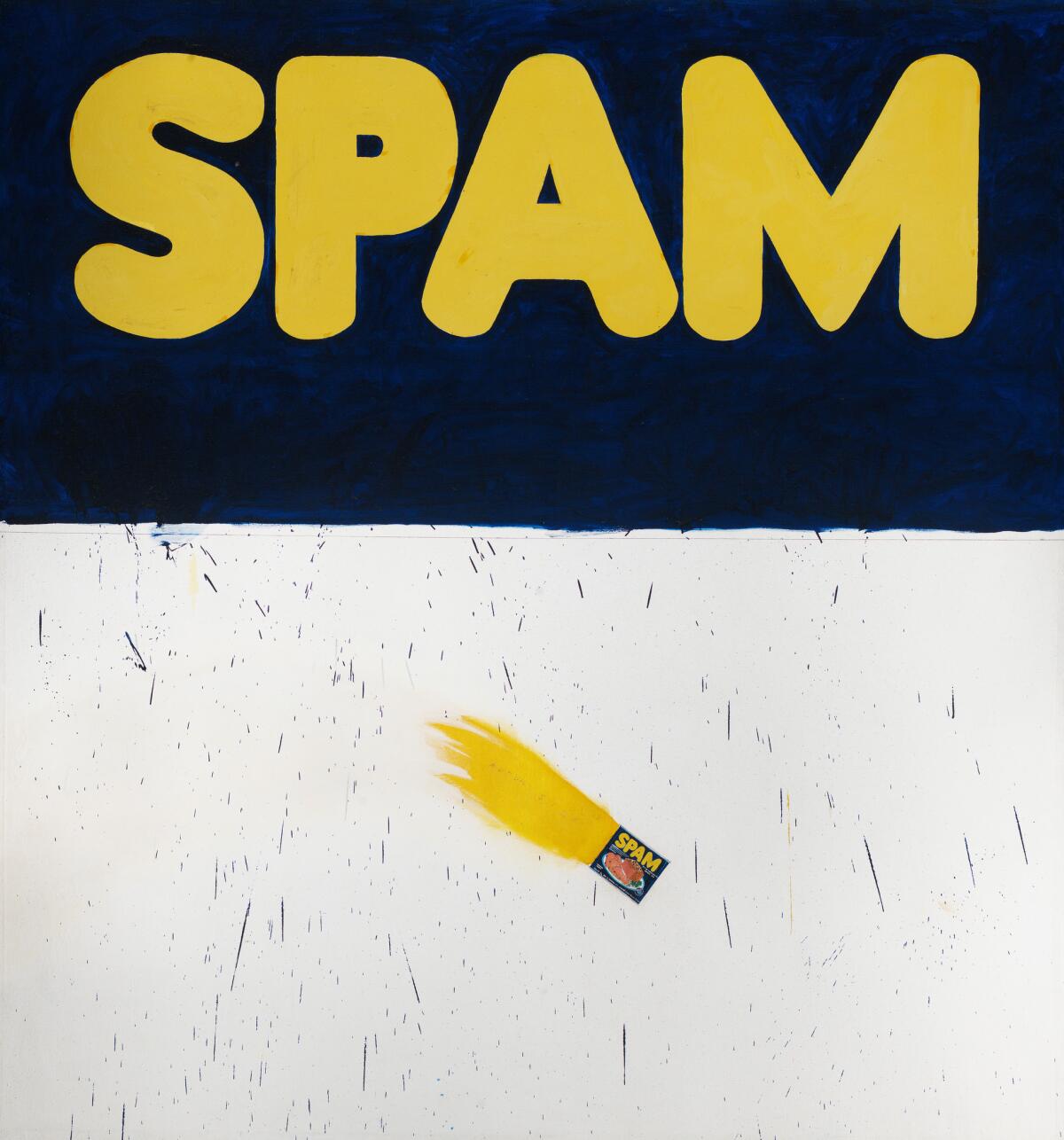
Or like an astronaut preparing for the seeming impossibility of a moon-landing, as it turns out to be elsewhere. The painting ŌĆ£Actual SizeŌĆØ features a can of Spam rocketing across the canvas, trailing flames amid a shower of splattered blue paint. Made in 1962, the same year Andy Warhol had his solo gallery debut in L.A. with paintings of cans of CampbellŌĆÖs soup, RuschaŌĆÖs supermarket can followed John GlennŌĆÖs inaugural Earth orbit in a compact space capsule. Legendary test pilot Chuck Yeager gave the Mercury astronauts the sassy nickname ŌĆ£Spam in a can,ŌĆØ given their role as relatively passive passengers in a largely automated space flight.
RuschaŌĆÖs painting juxtaposes that epic event with a giant yellow and blue product logo for the spiced ham luncheon meat, looming above. Spam is a very funny crack that reduces ŌĆ£meaty painting,ŌĆØ high praise for the gestural muscularity recently demanded of Abstract Expressionist art, to a commercially processed product. And it resonates against the ŌĆ£actual sizeŌĆØ cited in the paintingŌĆÖs title, since words donŌĆÖt have fixed dimensions.
How big is Spam anyway?
In postwar America, fights about painting were underway. The supposed death being claimed for easel painting (small) in the face of mural scale (large) appropriate to the nationŌĆÖs new and outsize international role, both politically and culturally, is sliced-and-diced by Ruscha. He offers up a canvas just under 6 feet tall and just over 5 feet wide, roughly the same as a person standing before it with arms outstretched. For art, actual size is human.
The Huntington Art MuseumŌĆÖs Sargent Claude Johnson survey is the first in more than a quarter century.
Many vitrines in the exhibition contain fascinating sketches, photographic contact sheets, studies, storyboards and mock-ups that reveal how Ruscha assembles his work. Artist-produced photo-books like ŌĆ£Thirtyfour Parking Lots in Los Angeles,ŌĆØ with its black-and-white aerial views of unpopulated, car-free, white-striped asphalt lots around town, from baroque Dodger Stadium to geometric Universal Studios and beyond, are initially off-putting because they seem quick and easy and, well, anyone-could-do-that dumb. They are anything but.
Their eloquence as unprecedented urban landscapes, which reveal nature to be a wholly cultural construction in which lives are lived, turns out to be the product of elaborate, worried-over, carefully composed artistic insight and skill. Details illuminated in the vitrines also attune viewers to connections among seemingly unrelated works among the variety of mediums Ruscha has employed over 60 years.
The parking lot designs, rigorous and formal, are enlivened by the accidental stains in the pavement organically left by cars. Stains are a big deal in RuschaŌĆÖs work of the late 1960s and early 1970s, a moment when warring factions in the art world were busy arguing over the prominence of abstraction in new art. Stain painting, made with thinned oil or acrylic pigments soaked into raw canvas, was heralded as abstractionŌĆÖs next big advance. RuschaŌĆÖs stains were left by automobiles parked out in the lot ŌĆö ordinary, figurative images recorded by a cameraman the artist hired at a time when photography was a second-class medium for art.
So much for ŌĆ£progressŌĆØ as a reigning artistic virtue. Then beloved in critical discourse emanating from New York but now a widely dismissed myth, aesthetic progress is supplanted by depth of imagination. L.A., the new horizontal city promoted as a model for the future, couldnŌĆÖt be more different as a place than the old vertical megalopolis across the Hudson River, representing the culmination of the past. RuschaŌĆÖs faith in the power of imagination over progress is among his primary artistic achievements.
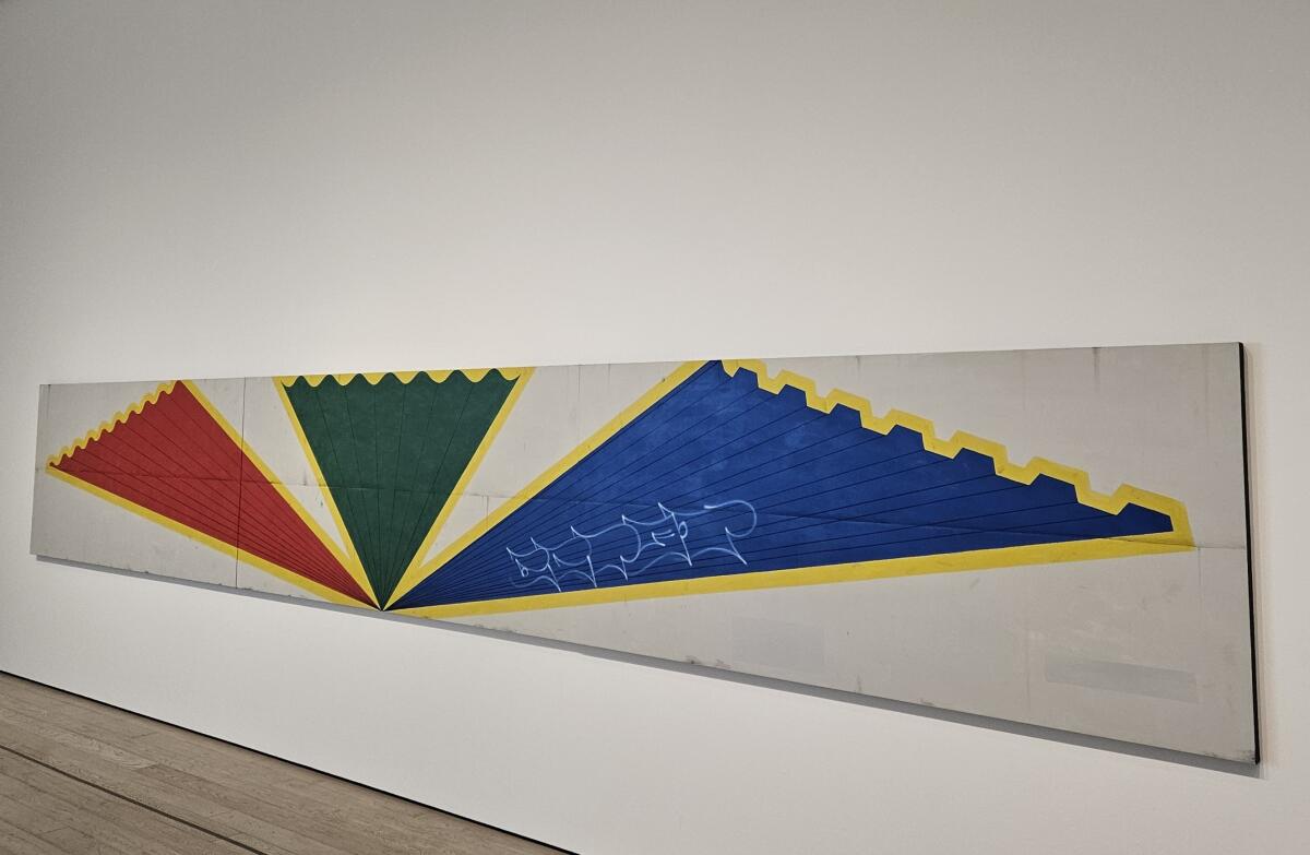
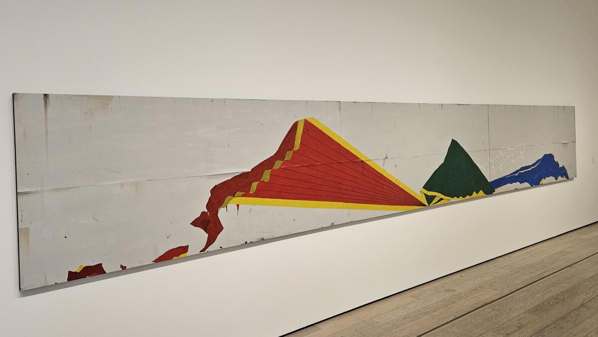
It manifests itself in a wonderfully strange pair of 2007 paintings in the showŌĆÖs last room. Each is a wide, skinny horizontal ŌĆö just 4 feet high but 27┬Į feet wide ŌĆö making the full 55-foot expanse into scenography that one instinctively reads from left to right. Three crisp, sharp triangles in flat primary colors are edged in scalloped yellow. They look oddly like awnings or perhaps pennants. The three meet in a vanishing point at the bottom edge as if a textbook illustration for Renaissance one-point perspective.
In the canvas at the right, those same three shapes lie crumpled, twisted and disheveled, as if they were balloons with the air let out. Change happens; progress, not so much.
The knockout duo, titled ŌĆ£Azteca / Azteca in Decline,ŌĆØ is based on a wall mural Ruscha saw out of the corner of his eye while driving through an industrial suburb of Mexico City. From left to right the imagery generates a remarkable one-two punch for a viewer: I donŌĆÖt know what that is ŌĆö but, wow, whatever it is is now in complete collapse! As a narrative of life ŌĆö or ancient history or modern America ŌĆö the paintings mesmerize.
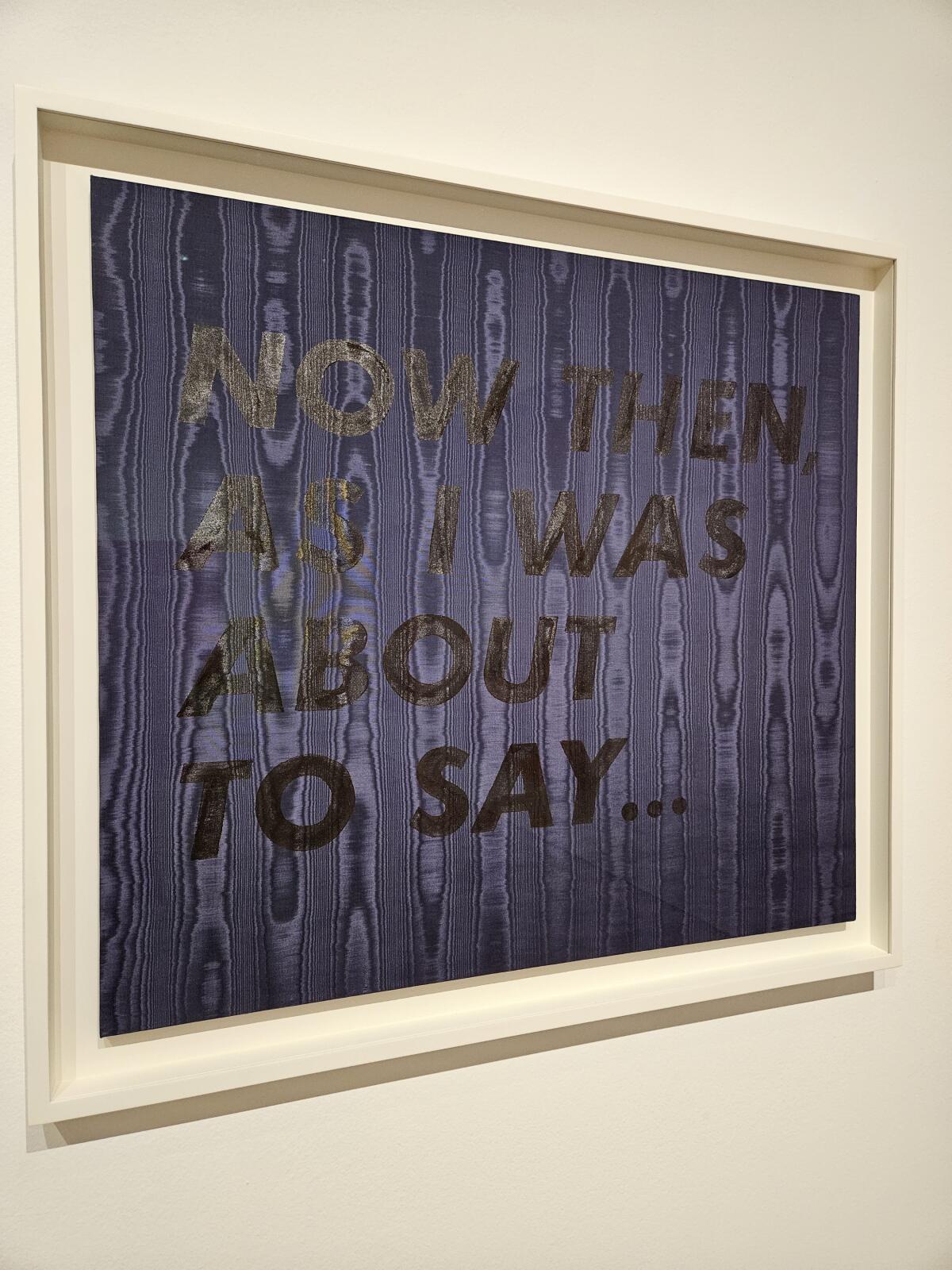
Stains, like those in his parking lot pictures, do have metaphoric power for an artist raised Catholic in the Midwest. ThereŌĆÖs an inescapable implication of depredation and sin. But the human stain is not without a comic essence, too, which Ruscha drew out in a wonderful group of word-paintings on shiny moir├® fabric. They have no paint. Instead, ŌĆ£People getting ready to do thingsŌĆØ is spelled out in egg yolk, besmirching the virginal purity of its white satin support; and ŌĆ£ItŌĆÖs only vanishing creamŌĆØ is translucent shellac disappearing against deathly black. Words and colors bond.
These are wild anagrams for a stain on satin, giving material heft to ephemeral language. Another of them, rendered almost invisibly in shellac on deep cobalt blue moir├®, circles around to give the exhibition its trenchant title: ŌĆ£Now then, as I was about to say ŌĆ”ŌĆØ
RuschaŌĆÖs retrospective has plenty on its mind and much to say. Now then, donŌĆÖt miss it.
┬Ā'Ed Ruscha / Now Then'
Where: Los Angeles County Museum of Art, 5905 Wilshire Blvd., L.A.
When: Through Oct. 6; closed Wednesdays
Admission: $13-$28; discounts for L.A. County residents
Information: (323) 857-6000, www.lacma.org
More to Read
The biggest entertainment stories
Get our big stories about Hollywood, film, television, music, arts, culture and more right in your inbox as soon as they publish.
You may occasionally receive promotional content from the Los Angeles Times.
