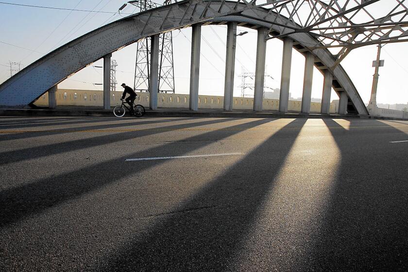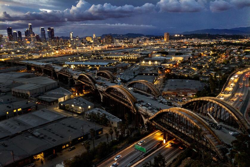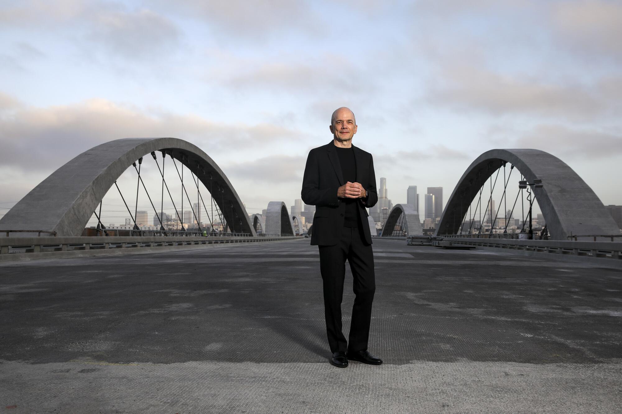
Descend one of the pedestrian ramps of the 6th Street Viaduct and there is a point at which it boomerangs under the bridgeŌĆÖs deck, suspending you above the Boyle Heights flats a couple of dozen feet below. YouŌĆÖll catch glimpses of rail yards and old warehouses drenched in graffiti. Hovering overhead is the underbelly of the bridge, a gentle concrete curve that evokes the ribbed carapace of some land-dwelling kaiju.
ŌĆ£I love this space,ŌĆØ says architect Michael Maltzan. ŌĆ£This is like a huge civic hall.ŌĆØ
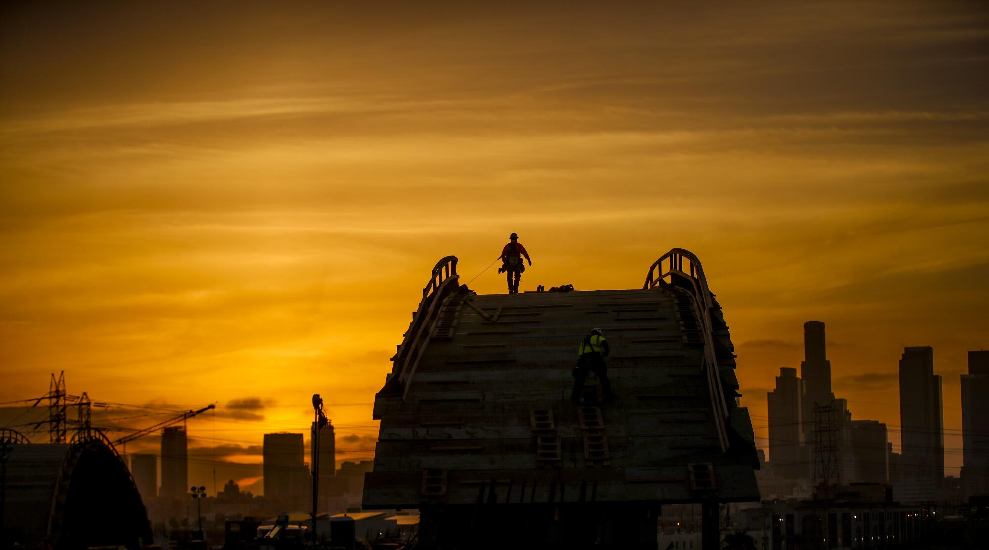
Construction workers and engineers are putting the finishing touches on the new 6th Street Viaduct, an enormous, decadelong public works project ŌĆö current tally: $588 million ŌĆö that is set to open early next month. (A community celebration is scheduled for July 9 and 10, after which the bridge will be officially open for business.)
ItŌĆÖs a project that has been scrutinized and dissected, hailed and assailed. Soon it will beckon the public with a new form, a series of arches that bound effortlessly over a panoply of industrial sites just east of downtown, redefining the cityŌĆÖs skyline in the process. It also will have a revised function ŌĆö one that attempts to soften the hard edges of transportation infrastructure, which have generally shown little regard for the communities in its path.
The project marks a moment in the limelight for Maltzan and the two-dozen members of Michael Maltzan Architecture who designed the bridge as part of a team that also included engineering firm HNTB and AC Martin Partners (which worked on the urban plan).
Maltzan is excited ŌĆö as excited as this famously soft-spoken architect gets. ŌĆ£I donŌĆÖt get tired of it,ŌĆØ he says, as he surveys a truck carting away detritus. ŌĆ£Especially as the construction comes to completion.ŌĆØ
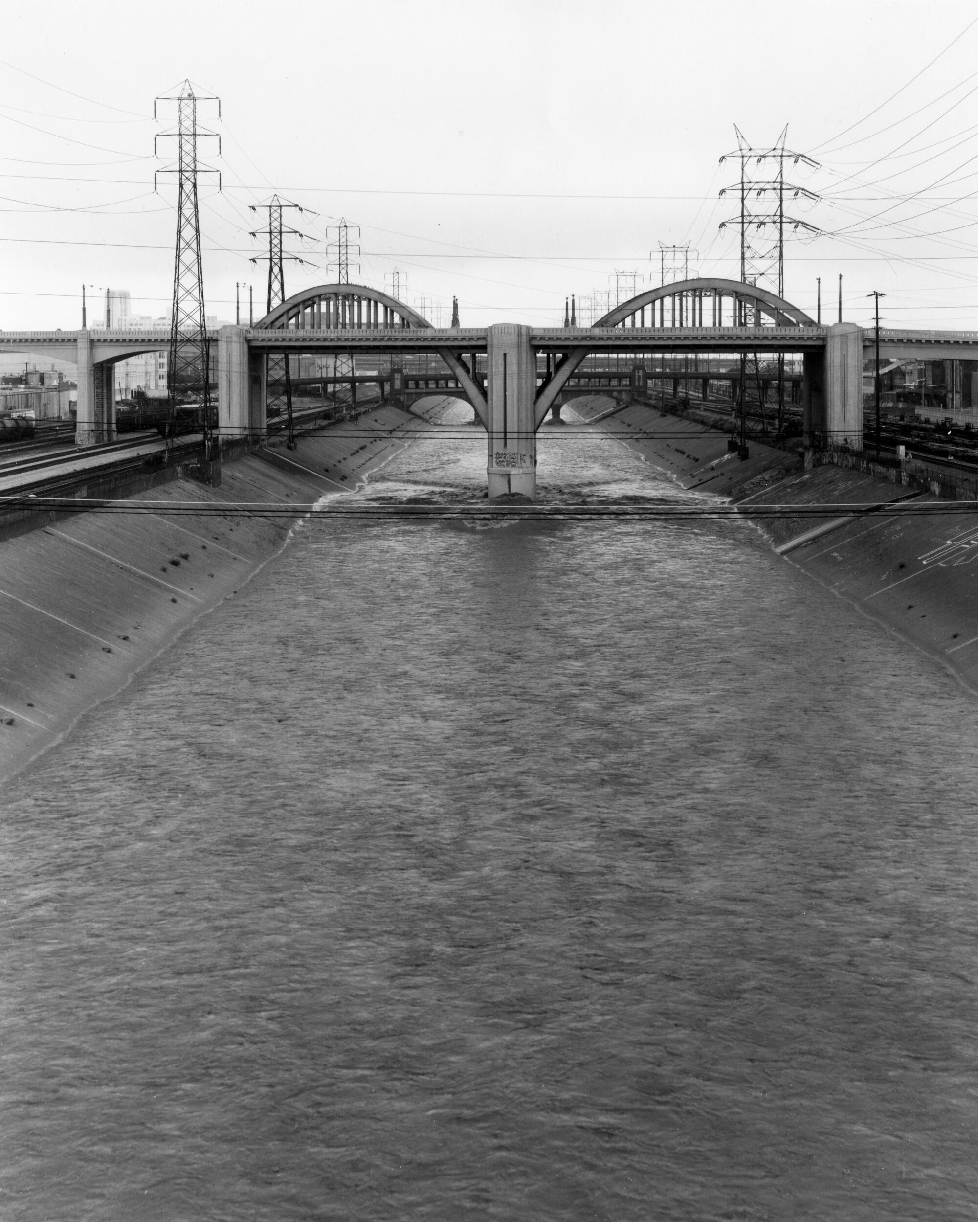
MaltzanŌĆÖs design for the 6th Street Viaduct replaces a 1932-era design by city engineer Merrill Butler that had succumbed to structural problems. That bridge ŌĆö a beloved lowriding thoroughfare and international cinematic icon ŌĆö consisted of a flat deck that traveled over an industrial spaghetti of railways, freeways and the channelized Los Angeles River. Its most notable flourish was a pair of steel arches that marked the point at which the bridge traveled over the water.
MaltzanŌĆÖs design tips its hat to Butler ŌĆö while also creating something daringly new. Spanning 3,500 feet from end to end are 10 pairs of arches whose forms echo ButlerŌĆÖs design, with the tallest arches framing the river crossing. Imagine the ebullient pattern left by a bouncing ball or a rock skipping across water.
But even as he nods to history ŌĆö aesthetics were important to Butler, Maltzan notes ŌĆö the team was intent on making improvements.
ŌĆ£The bridge,ŌĆØ says Maltzan, ŌĆ£needed to represent something that could knit the city together in a more consequential way.ŌĆØ
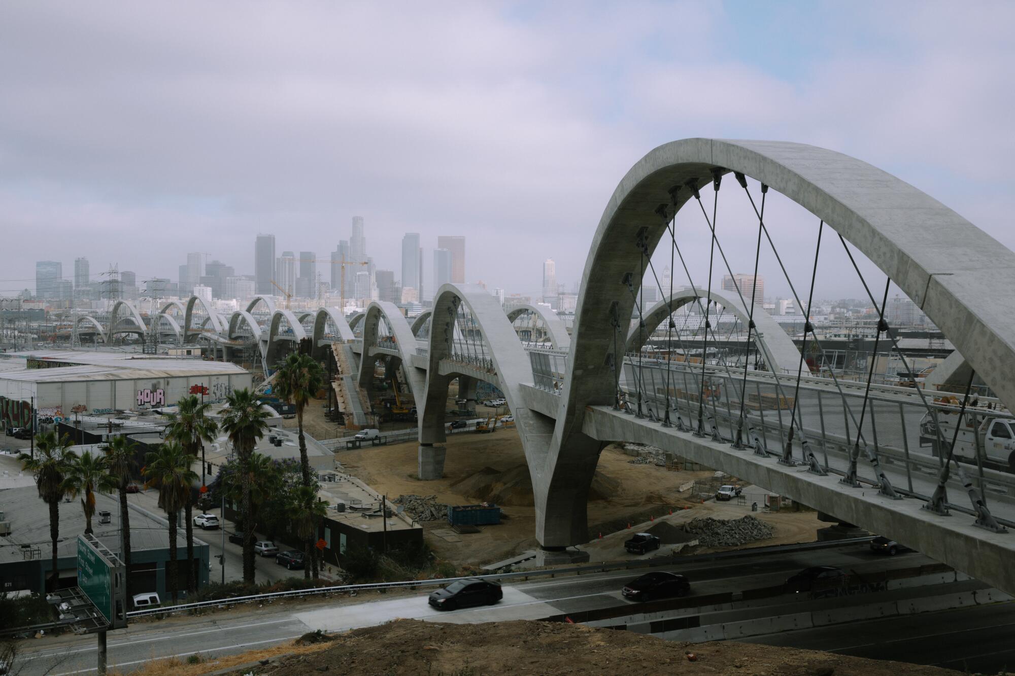
No one expected the squiggle.
This included some obvious design choices: adding protected bike lanes and pedestrian areas to encourage its use as a multimodal artery.
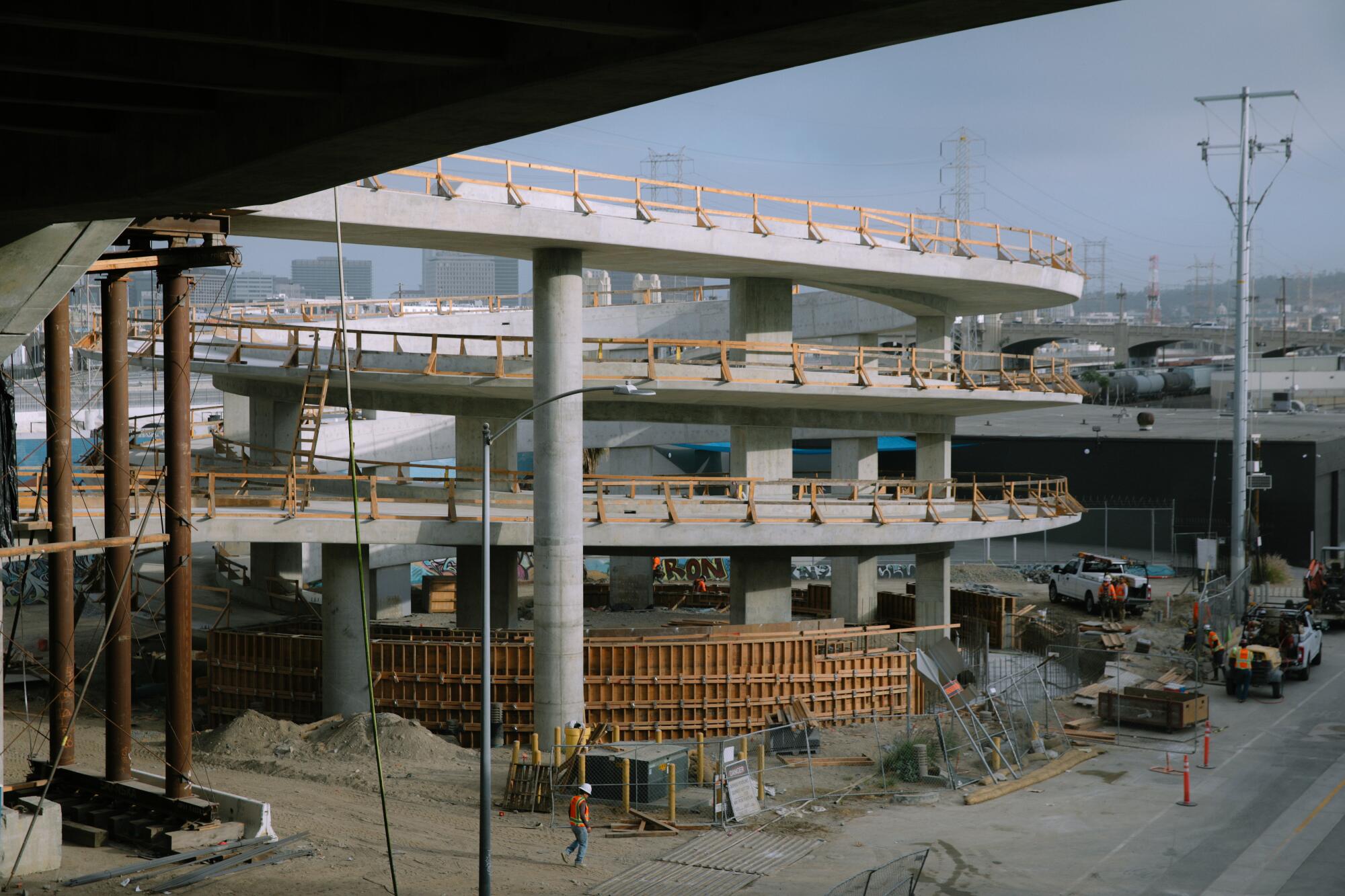
It also resulted in some interesting new features below the deck ŌĆö which is why Maltzan is particularly obsessed with this space.
On the east side of the river, the viaduct touches down in Boyle Heights, a neighborhood that over the last century has been riven by freeways and rail lines. The 6th Street Viaduct, in its original iteration, was a key point of connection to downtown. But its deck, which begins at Whittier Boulevard and Boyle Avenue, flew over the neighborhoodŌĆÖs flats, cutting off easy access between the residential areas, located on a bluff, to the light industrial areas below.
Maltzan says it was therefore important to make vertical connections ŌĆö from the bridgeŌĆÖs deck to the flats where, by 2024, a 12-acre community park will rise (designed by landscape architects Hargreaves Jones). To create this access, the architects incorporated staircases into the design, as well as a pair of broad ADA-compliant ramps accessible to pedestrians and cyclists. One of these takes a particularly dramatic helical shape. (Looking forward to seeing it in cinema.)
The design of a shiny new bridge has sparked concerns about further gentrification in Boyle Heights, a working-class, predominantly Latino community that has grappled with a burgeoning gallery district (now all but gone), as well as the possible redevelopment of the 1927 Sears, Roebuck & Co. building into market-rate lofts. The park will also be the second in the neighborhood to be tucked beneath transportation infrastructure ŌĆö not exactly a picture of urban equity. (The other, Hollenbeck Park, has the 5 Freeway running through it.)
But Maltzan says it would have been untenable to replace the old bridge with a design that didnŌĆÖt attempt to address the mistakes of the past ŌĆö and didnŌĆÖt take cyclists and pedestrians into better account. (He is an avid cyclist.)
ŌĆ£We spend enormous amounts of money on infrastructure,ŌĆØ he explains. ŌĆ£We should demand that infrastructure do more for the city.ŌĆØ

The bridgeŌĆÖs ribbed undercarriage does bring greater intention to infrastructure design. A bridge with a steel deck would have been more inflexible, a harder surface overhead. By crafting the structure out of concrete, the architects were able to give it softer, more elegant contours.
Plus, if youŌĆÖre a structure geek, these ribs reveal the ways in which the bridgeŌĆÖs weight is distributed. As Tim Williams, a managing principal at MaltzanŌĆÖs firm, tells me later: ŌĆ£If youŌĆÖre a civil engineer, you would really love the underside. ItŌĆÖs like looking underneath the hood of a car.ŌĆØ
New design showcases iconic arches from the original bridge
For Maltzan, who is 62 ŌĆö adolescence, as far as architecture is concerned ŌĆö the 6th Street Viaduct will function as his most visible mark on Los Angeles.
Born outside of Levittown on Long Island, Maltzan first came to L.A. as part of a student research trip with Harvard UniversityŌĆÖs graduate school of design in 1987. ŌĆ£All of my classmates couldnŌĆÖt wait to get out of here,ŌĆØ he recalls. ŌĆ£But I felt really comfortableŌĆØ ŌĆö noting his familiarity with suburban environments.
The second time he came to L.A. was in 1988 to work in Frank GehryŌĆÖs office, on the design of Walt Disney Concert Hall. That time he stayed for good.
Since breaking out on his own in 1993, the architect has worked on buildings that have experimented with purpose and form, as well as construction technique. And there are a lot of them. In fact, you may have, at one point or another, set foot in a Maltzan structure. His firm has designed dormitories, educational buildings, apartment houses and permanent supportive housing. TheyŌĆÖve also designed museum installations ŌĆö including the ongoing fashion exhibition ŌĆ£Lee Alexander McQueen: Mind, Mythos, MuseŌĆØ at the Los Angeles County Museum of Art.
But one of the major throughlines of his practice has been in the cultural arena.
The project that built MaltzanŌĆÖs reputation in L.A. was the design of the Inner-City Arts complex, an early arts education campus that in the ŌĆś90s transformed a gritty acre in skid row into a gleaming village of buildings for at-risk youth. He subsequently drew national attention for thoughtfully repurposing an old stapler factory in Queens, N.Y., into a temporary home for the Museum of Modern Art while the museum expanded its Manhattan building.
ŌĆ£The overall effect is mesmerizing,ŌĆØ wrote former Times architecture critic Nicolai Ourossoff of the MoMA project. ŌĆ£Maltzan has created the museumŌĆÖs identity out of almost nothing ŌĆö some paint, some boxes, a few fluorescent lamps.ŌĆØ
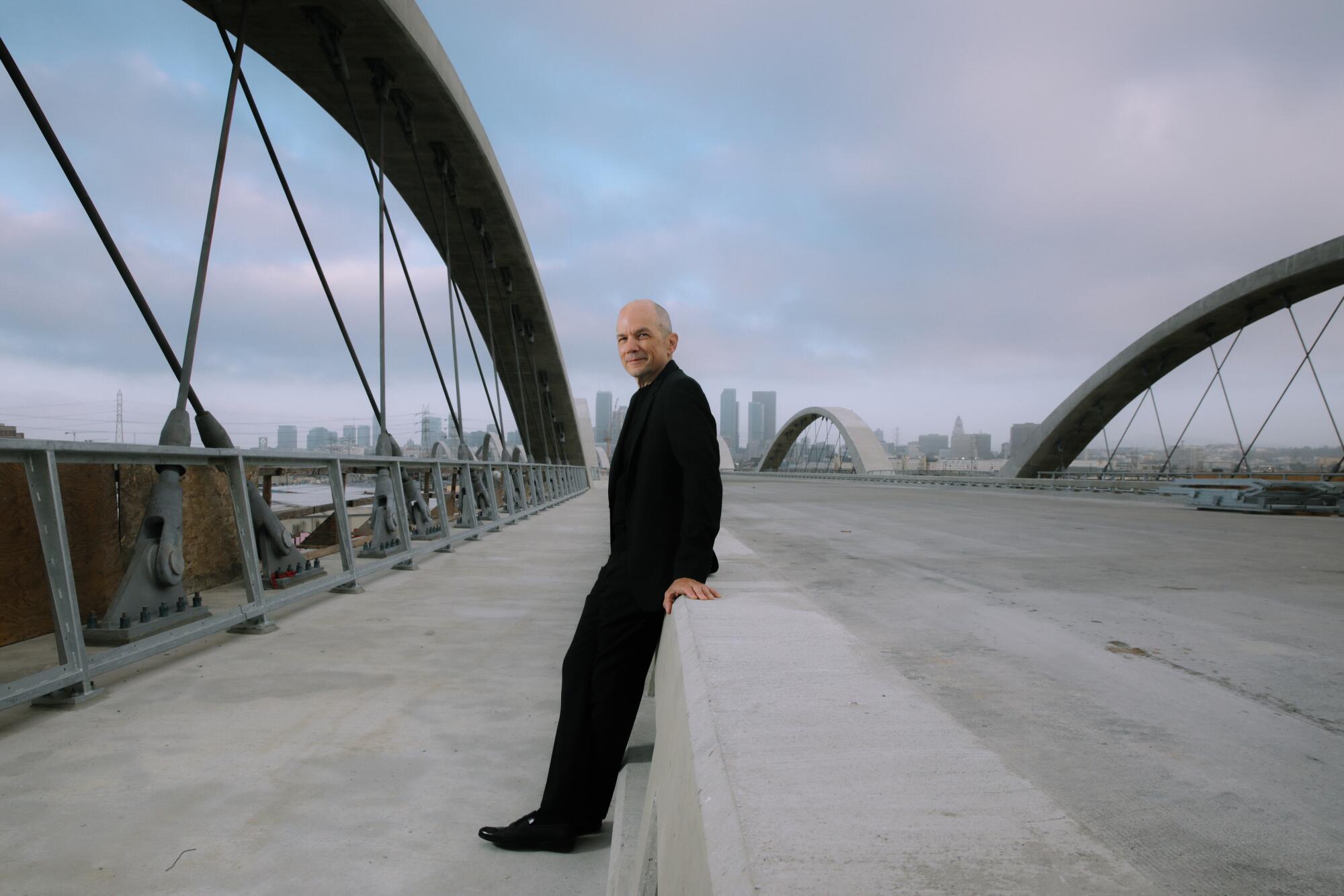
For the record:
9:08 a.m. June 30, 2022An earlier version of this article included a photo caption that said a concrete guardrail on the bridge will protect a path for pedestrians and cyclists. That particular path is for pedestrians only.
Closer to home, Maltzan has overseen a two-decade-long master plan for the Hammer Museum, which has expanded and tweaked Edward Larrabee BarnesŌĆÖ original Modernist design from the ŌĆś80s. He raised ceilings, added a theater and, most recently, created a gallery for prints. The museum has been able to achieve all of this without closing down.
The work reveals an architect who is willing to fade into the background when necessary. ŌĆ£In some places, our work there is very visible,ŌĆØ says Maltzan, ŌĆ£in other cases it is not.ŌĆØ
One of the eye-catching additions is a second-story pedestrian bridge, added in 2014, that helped to unify the museumŌĆÖs galleries. Made from perforated steel, its curved design offers a touch of panache amid the staid Modern architecture.
ŌĆ£ItŌĆÖs pure functionalism matched with incredible warmth and the ability to find a gesture that is fluid and soft in the middle of a hard thing,ŌĆØ says Hammer Director Ann Philbin. ŌĆ£ItŌĆÖs never just decorative.ŌĆØ
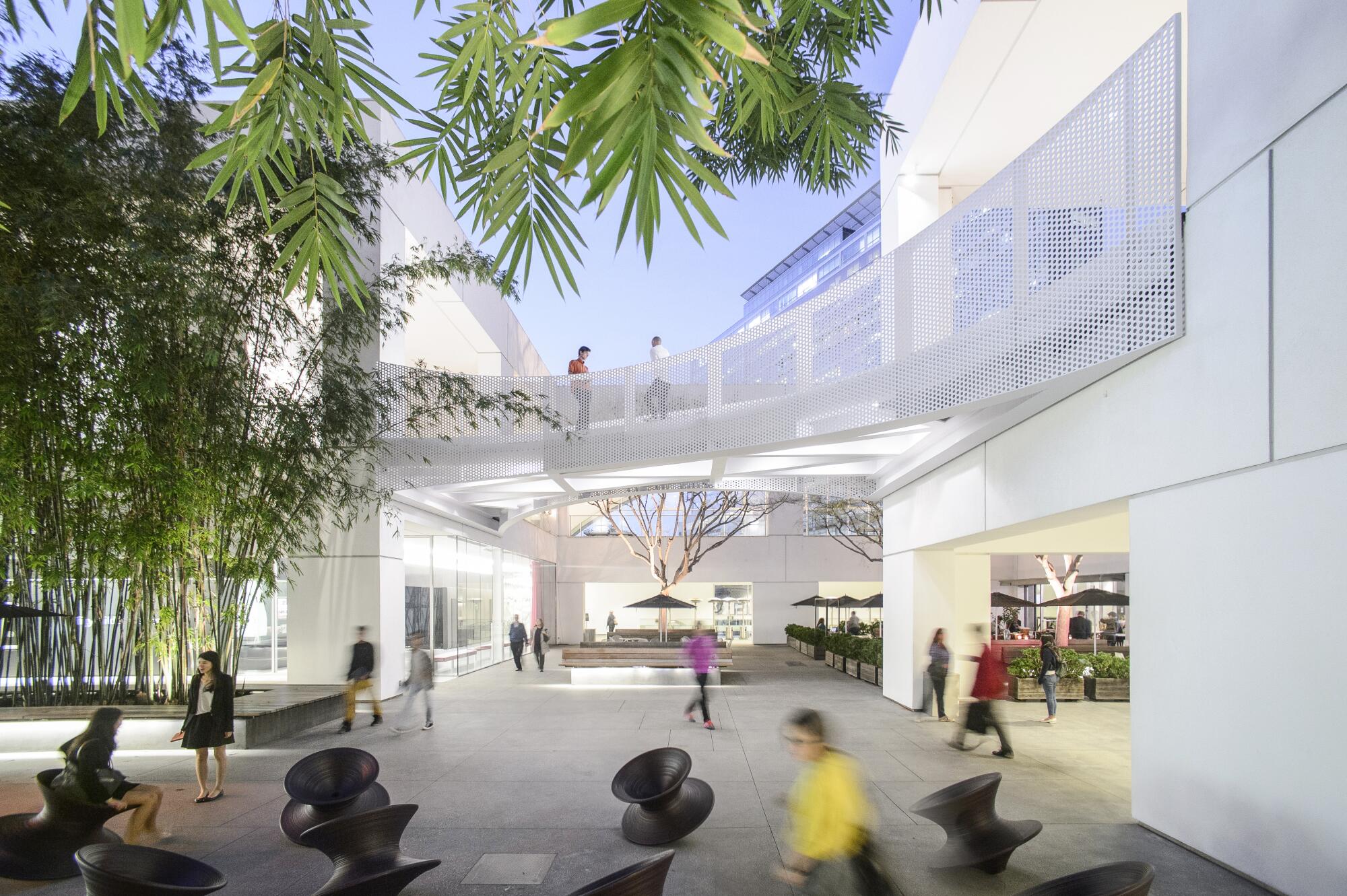
Michael MaltzanŌĆÖs route to success is as carefully thought out as his high-profile commissions
If at the Hammer, Maltzan has helped reimagine a museum, for a recent ground-up project in Canada, he helped reimagine some of its fundamental ideals. As the viaductŌĆÖs arches were taking form in L.A., MaltzanŌĆÖs studio, in collaboration with Cibinel Architecture in Winnipeg, was putting the finishing touches on Qaumajuq, a 40,000-square-foot center for Inuit art at the Winnipeg Art Gallery.
Unveiled last year, the design had to achieve a daunting number of tasks. Among them: seamlessly connect with the museumŌĆÖs acclaimed Brutalist building from 1971, designed by Gustavo da Roza, while addressing a host of concerns about the ways in which Indigenous art is presented in museums (which are a Western conceit).
For his research, Maltzan made a journey to the Arctic Circle to better understand the conditions under which much of Inuit art is made and seen. (Winnipeg sits on the Canadian prairie, more than 1,000 miles to the south and a world apart from the more austere landscapes of Nunavut, where many Inuit artists are from.) He also worked with the museumŌĆÖs Indigenous advisory circle, whose ideas helped shape the design.
ŌĆ£Inuit artists and elders would often talk about how Western space is so problematic: the defined right angles, with corners that stopped movement,ŌĆØ says Maltzan. ŌĆ£It was antithetical to the culture and the context for art.ŌĆØ
Instead, Maltzan sought to create gallery spaces that felt ŌĆ£boundless,ŌĆØ with gently rippling walls. Within the building, an undulating three-story visible vault showcases ŌĆö and brings back to life ŌĆö works that once languished in storage. From the exterior, the building resembles a glacier that has been whittled by heavy wind.
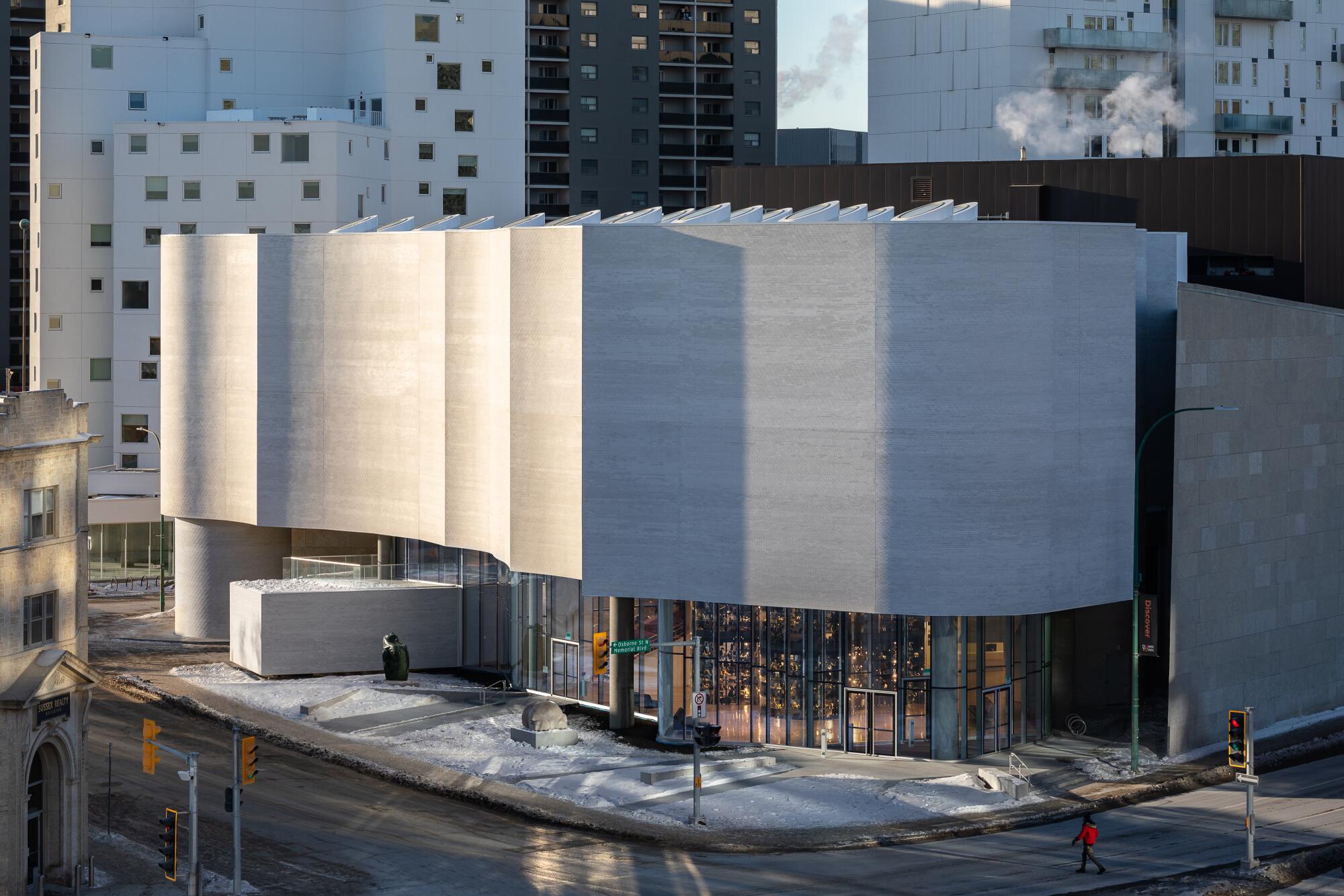
Until the 6th Street Viaduct, some of MaltzanŌĆÖs most visible work in L.A. has been housing ŌĆö marking a moment in which the design of housing in the city has gone from house-with-a-lawn to a whole lotta podium apartments.
Maltzan has countered with projects such as One Santa Fe, in the Arts District, which features a pair of long, narrow, six-story structures that from overhead resemble train cars, a design inspired by neighboring rail lines that lead to Union Station. The scale of the project ŌĆö it is a quarter-mile long ŌĆö is monumental, but Maltzan judiciously broke up all that mass for its residents with light wells, small bends and plazas. In one fell swoop, the complex added 438 homes to the neighborhood, a portion of which were set aside as affordable units.
It contends with a difficult site ŌĆö a narrow strip of land bathed in the din of moving trains ŌĆö with efficiency, albeit one that feels industrial-strength. A friend of mine who lives in the complex likens the design to Dutch social housing.
More significant has been MaltzanŌĆÖs long-running work with the Skid Row Housing Trust, which represents some of the earliest experiments in permanent supportive housing in Los Angeles.
Around downtown, this includes the Rainbow Apartments, which are built around a courtyard on San Pedro Street (completed in 2006); the New Carver Apartments (2009), which occupy a distinctive pleated structure that peaks out above the westbound 10 Freeway, as well as the Star Apartments (2013), which are stacked, Tetris-like, over a block of old commercial storefronts on E. 6th Street.
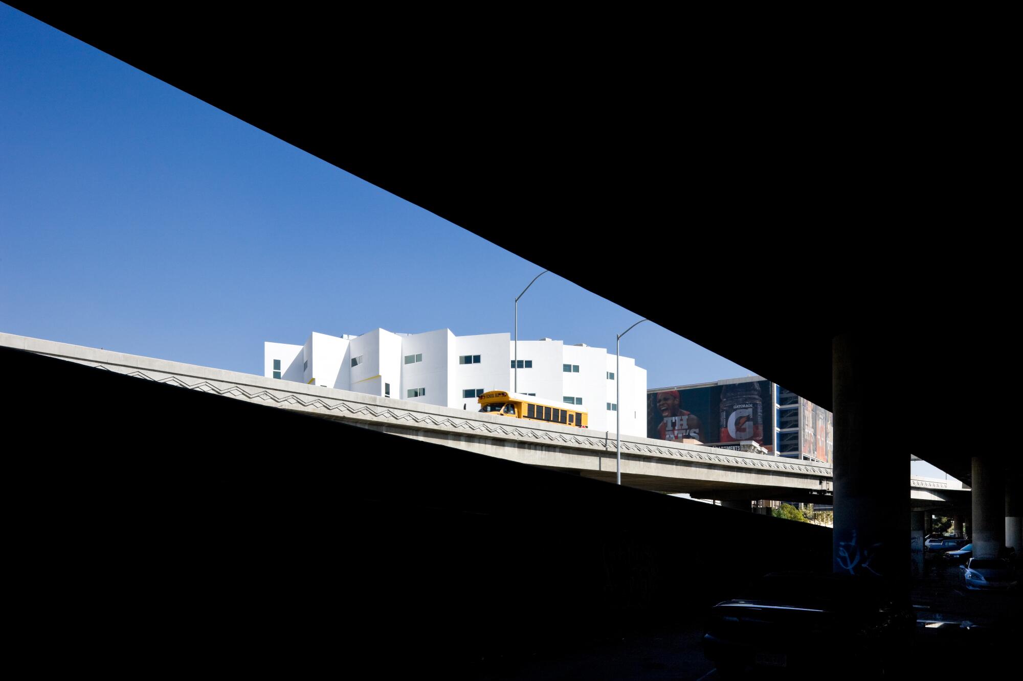
Each design has evolved from one iteration to the next, each adapting to complex sites. The New CarverŌĆÖs inhospitable freeway-adjacent location helped determine its inward-facing form, centered on a futuristic central atrium (which could offer more shade). But they have also evolved in the ways in which they serve their clientele ŌĆö over time, adding public spaces, at various scales, so tenants can choose to gather or find some alone time.
ItŌĆÖs not about creating a cookie-cutter template, says Hannah Hoyt, a designer in MaltzanŌĆÖs office. ŌĆ£They are really different. ThereŌĆÖs not a visual move that is signature.ŌĆØ
Each design has challenged preconceived notions about architecture for the unhoused. ŌĆ£People think that it will look terrible,ŌĆØ says Mike Alvidrez, a former chief executive of the Skid Row Housing Trust, who now serves as an ambassador for the organization. ŌĆ£MichaelŌĆÖs buildings really helped flip the script ŌĆö and not just for the public, but for the government.ŌĆØ
The designs have also innovated the ways in which we build in L.A.
Star Apartments were made out of prefabricated modular units that could be craned into place, a technique that saves time and the amount of land needed for staging construction. The Crest Apartments, a 2016 project for formerly unhoused military veterans in Van Nuys, employs prefabricated walls ŌĆö another timesaver.
ŌĆ£Every project,ŌĆØ says Williams, ŌĆ£pushes harder and further on how to build faster and better housing.ŌĆØ
The 6th Street Viaduct is not MaltzanŌĆÖs first bridge. In 2016, the firm completed a transit bridge in Chengdu, China. But so far, itŌĆÖs the biggest ŌĆö and itŌĆÖs the one that will most reveal his thinking about Los Angeles: a city can be quite fugitive, eluding classical definitions of space.
It also reflects the ways in which Maltzan is inspired by form and by color. His chosen shade is often a gleaming white ŌĆö a white that former Times architecture critic Christopher Hawthorne once compared to ŌĆ£the surprising brightness of a soap-opera actorŌĆÖs teeth.ŌĆØ
ItŌĆÖs a shade that may seem almost too radiant, too impractical, in a city whose palette leans to smog and cement. But, in white, Maltzan sees the history of stucco plaster as it has been employed in Southern CaliforniaŌĆÖs vernacular architecture. It also serves as canvas for those magic moments of shifting light. In that space, he says, he finds ŌĆ£lightness and optimism.ŌĆØ
Lightness and optimism.
A good way of describing the ebullient forms of the viaduct ŌĆö a structure that connects downtown to points east, as well as L.A.ŌĆÖs past with its future. ŌĆ£ItŌĆÖs an opportunity,ŌĆØ says Maltzan, ŌĆ£to represent an idea of Los Angeles as it continues to evolve.ŌĆØ
That is a hopeful idea. Lucky will be the first lowriders to cross its span.
More to Read
The biggest entertainment stories
Get our big stories about Hollywood, film, television, music, arts, culture and more right in your inbox as soon as they publish.
You may occasionally receive promotional content from the Los Angeles Times.
