- Share via
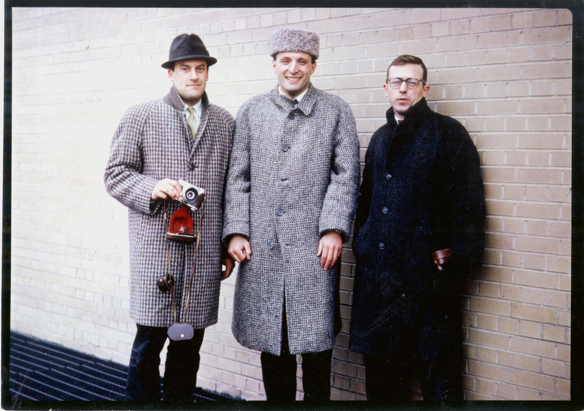
In the early 1960s, a young British graduate student in the architecture program at Yale University set out with two fellow British students for an architectural road trip around the United States. Their first stop was Chicago, where they took in the steel-structure buildings in the city’s core, followed by a series of missions to the suburb of Oak Park to inhale the residential designs of Frank Lloyd Wright.
In Los Angeles, they made pilgrimages to the Case Study Houses, the program that commissioned architects to create practical residential design solutions to contend with the post-World War II housing crunch. On the trio’s checklist were designs by a who’s who of L.A. design: Craig Ellwood, Pierre Koenig, Raphael Soriano and Charles and Ray Eames.
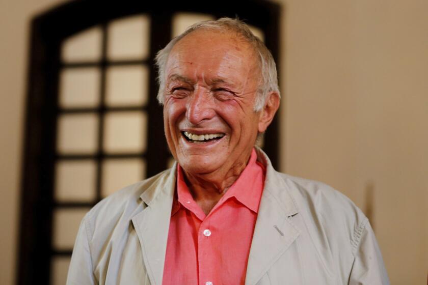
That young British graduate student was Richard Rogers, who would go on to become a Pritzker Prize-winning architect and, with Renzo Piano, came out of nowhere to design the machine-like Centre Pompidou in Paris in the 1970s. Accompanying Rogers on his California journey was Su Rogers (Rogers’ first wife), an architect who also later served as an educator, and architect Norman Foster, another future Pritzker winner whose projects have helped define skylines from Hong Kong to Barcelona.
It was a trip that would help shape architecture as we know it. As Rogers told The Times’ William Tuohy in 1995, “The California experience was very influential.”
Rogers, who gleefully upended architectural convention throughout his career with projects that celebrated the often obscured mechanics of building design — their frames, their escalators, their duct work and their grimy service cores — died Saturday at the age of 88. His death was confirmed by a press representative for Rogers Stirk Harbour + Partners, the London-based architectural firm he helped found and from which he retired last year.
The son of British Italian parents, Rogers was born in Florence in 1933. The family fled Italy during fascism’s rise, ultimately making their way to England. Having grown up in the grim, war-time landscapes of Europe, he was absolutely dazzled by modernity when he landed in the United States.
In the 2013 BBC documentary “Richard Rogers: Inside Out,” he recalled arriving in New York City by ship in the early 1960s. “One of my great memories is leaving Southampton, where the Queen Elizabeth [ship] was the largest thing you’d ever seen,” he said. “The boat arrived at dawn and I remember going out on the deck and being absolutely shocked, awed by the change of scale — toy town England to these immense steel structures of high-rise buildings and these great canyons all the way down. I’d never seen anything like it.”
He was just as compelled by the architecture that arose from modernity — courtesy of the European architects who flocked to the United States due to the war, such as the German Mies van der Rohe, as well as homegrown American talents, such as Frank Lloyd Wright, whom Rogers was deeply intrigued by. “I always say jokingly that it took me 20 years to get rid of the influence of Frank Lloyd Wright,” he said in the same BBC documentary.
Richard Rogers, the lauded modern British architect who put features like elevators and air ducts on the outside of his buildings, dies at 88.
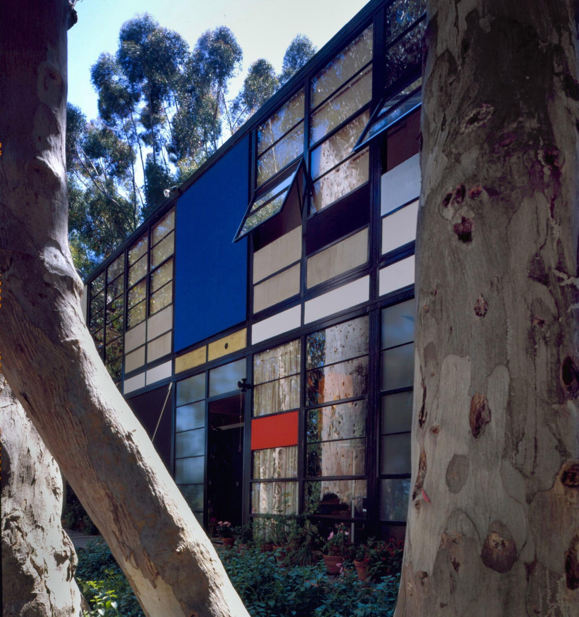
In L.A., Rogers was inspired by the formal and material experimentation he found in the Case Study Houses. “The Eames House is one of the prime exemplars that have shaped my mind,” he once told The Times’ Leon Whiteson, of the Pacific Palisades Home built by the Eameses in 1949. “Its amazing simplicity and economy of style, that seems to have sprung fully fledged from Eames’ head, is a model of perfection in Modern design.”
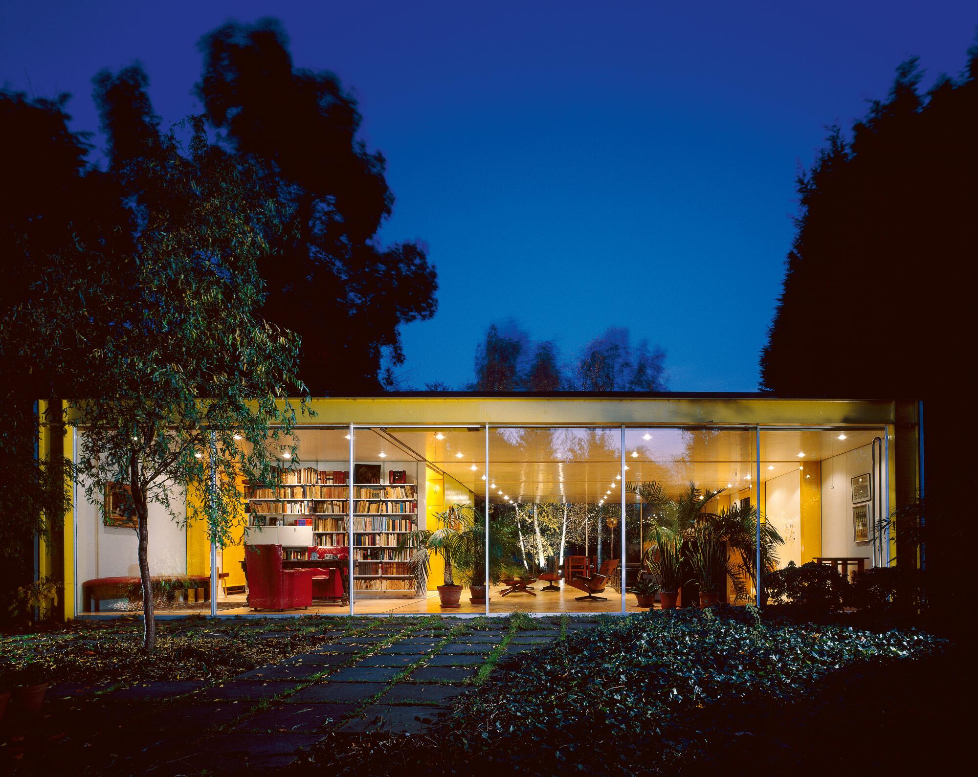
Some of the home’s ideas found their way into the pivotal house he and Su designed for his parents in Wimbledon in the late 1960s. The airy Rogers House in London (now known as the Wimbledon House, and operated by the Harvard Graduate School of Design as a residency center) is composed of a series of repetitive steel frames with walls on two sides and floor-to-ceiling glass windows on the other. The pragmatic materials choices — such as panels that are generally employed by the refrigerated transport industry — hearken to the Eames’ use of prefab Cemesto wall panels in their own home.
The glass walls created transparency and invited the garden into the home’s interior. In addition, the steel beams that supported the structure were painted a sparkling, very un-British yellow — part of a buoyant color palette that would appear in some of Rogers’ future endeavors, including the terminal he designed for Madrid’s Barajas Airport and the interior of the Leadenhall Building, a London skyscraper known as “the Cheesegrater,” completed in 2014. (Rogers’ taste for color also extended to his wardrobe, which included ensembles in shades of brilliant orange and lime green — a palette that led one British journalist to state that it made him stand out in drab settings “like a fog light.”)
Architect José Castillo, principal of the Mexico City studio a911, who spent several months at Wimbledon House for a residency in 2017, tells The Times that living in the home was an education. “The house is radical in its premises and experimentations,” he says. “It precedes innovation on certain topics that would later appear in the Pompidou Centre in Paris. At the same time it is incredibly domestic.”
The ideas embedded in the house, so redolent of Los Angeles at midcentury, would mark Rogers’ career moving forward. “It was,” he told the BBC documentary crew, “the seed of our future work.”
Sir Richard Rogers is accustomed to controversy. He’s an architect.
Rogers’ passing marks the end of an architectural career that lasted almost six decades and influenced countless others.
“We achieved more than I ever imagined possible, practicing together, learning from each other, always looking to the future, always looking to make things better,” Ivan Harbour, a partner who worked with Rogers for more than 30 years, said in a statement on behalf of Rogers Stirk Harbour + Partners. “His absence is very close, but his presence remains with me.”
Foster, with whom Rogers would remain dear friends throughout his life, wrote on his Instagram page: “My longest and closest friend Richard just passed away — I will miss him dearly.”
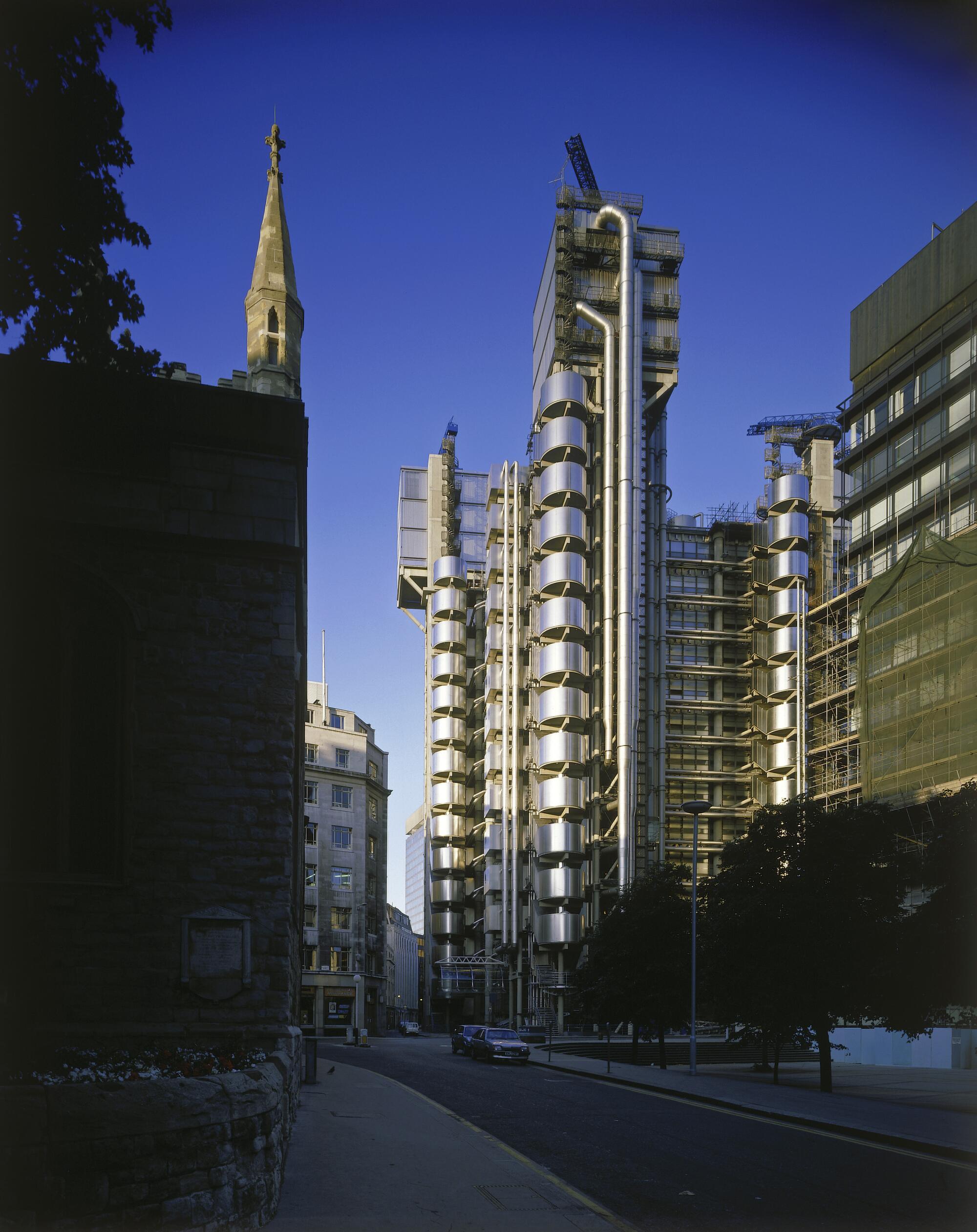
Rogers was the recipient of countless honors, including a knighthood and the 2007 Pritzker Prize. Plus, he had an architectural portfolio stuffed with well-known buildings. This includes the bright, undulating, award-winning terminal for Barajas (completed in 2005); 3 World Trade Center in New York City, a commercial tower built on the site of a Marriott destroyed during 9/11 (opened to the public in 2018); and the acclaimed Lloyd’s of London building, which forever upended the city’s profile when it opened in 1986 — looking like sci-fi Japanese mecha in the middle of prim, Victorian London.
Lloyd’s wasn’t initially well-received by the public (or Prince Charles, for that matter, who has spent his non-monarchy inveighing against Modern architecture). But he wasn’t Rogers’ worst critic. One British news report from the era featured an interview with a bloke on the street who described it as “an abortion — it’s an excrescence.”
But the building, with its soaring internal atrium, delighted the critics. Paul Goldberger in his critique of the structure in the New York Times in 1987, described it as “the most exuberant new commercial building London has seen in more than a generation.”
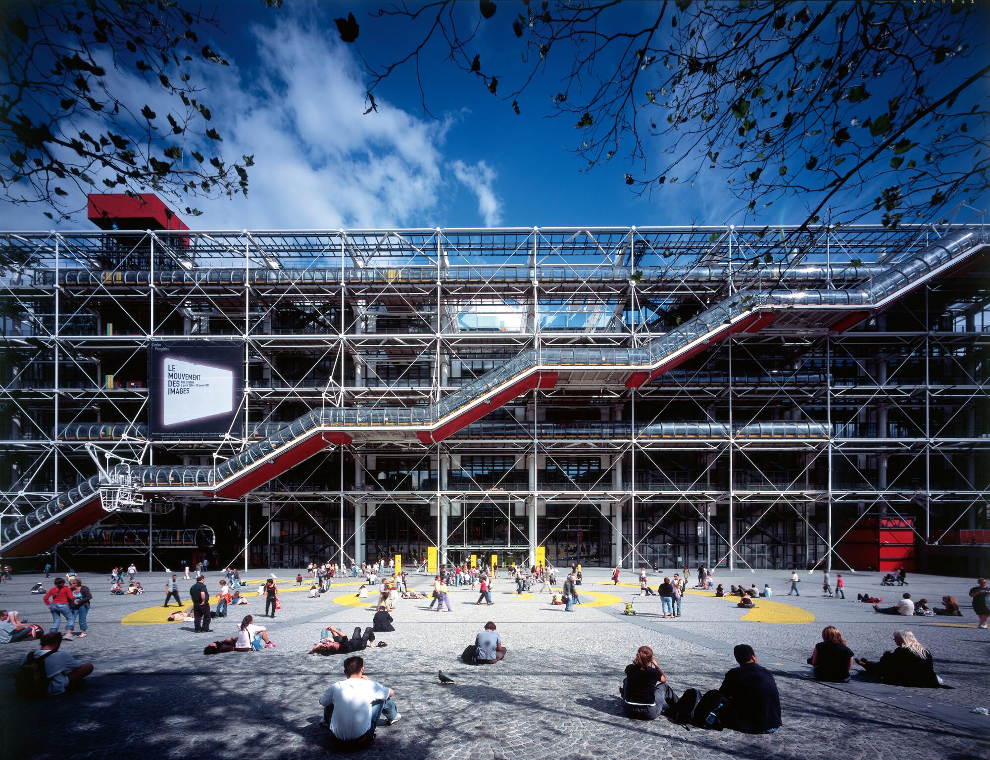
Rogers, however, will likely best be remembered for the Paris museum he designed with fellow architects Renzo Piano and Gianfranco Franchini, a building at once reviled and esteemed: the Centre George Pompidou.
The fact that the team received the commission for the prestigious cultural center came as a surprise to everybody, including the architects. At the time, Piano’s main claim to fame was a temporary pavilion for his native Italy at an expo in Osaka. Rogers, in the meantime, had a few houses under his belt, along with a flexible office building/factory for Reliance Controls, an electronics manufacturer in Swindon, England — a structure he designed with Foster and Su Rogers, as part of their early architectural studio, Team 4. (Interestingly, that building, too, was directly influenced by the design of L.A.’s Case Study Houses.)
Rogers, initially, was opposed to submitting an entry for the Pompidou competition, which he regarded as another palace of culture. But Piano figured the process could get their work seen by the prestigious jury, which included figures such as Oscar Niemeyer, Jean Prouvé and Philip Johnson. With nothing to lose, the team leaned into the radical: Their proposal took the building’s mechanical viscera — the ventilation and water ducts, the electrical and transportation systems — and splayed them all over the building’s exterior, thereby leaving the interior entirely unobstructed.
Somehow, their proposal won. And thus began the project that would change the course of their lives and remake a Paris neighborhood.
Naturally, there were opponents — with some comparing it to an airplane hangar and others to an oil refinery. At one point, as the New York Times’ obituary recounts, Rogers was pummeled by a Parisian woman wielding an umbrella when she discovered he was one of the architects.
Richard Rogers, who is also a British peer, wins the $100,000 Pritzker Architecture Prize in his 70s.
But by the time it was completed in 1977, the Pompidou remade a joyless parking lot in a gritty stretch of Paris into a lively cultural hub, with a welcoming outdoor plaza that became — and remains — a bustling gathering spot. New York Times critic Ada Louise Huxtable wasn‘t entirely sold on the building’s function as a museum, but in a 1977 piece, she described the Pompidou as an “unequivocal success as urban theater.”
Rogers was concerned that the building serve the public’s needs above all. As he told the Associated Press in 2007, “I described it as a place for all people, all places, all creeds.”
Rogers never designed any buildings in California. (The closest he came was the competition for the Transbay Transit Center in San Francisco, where his firm’s concept ultimately lost out to a proposal by César Pelli.) But California remained an influence and Los Angeles remained top of mind — though frequently as an example of what not to do.
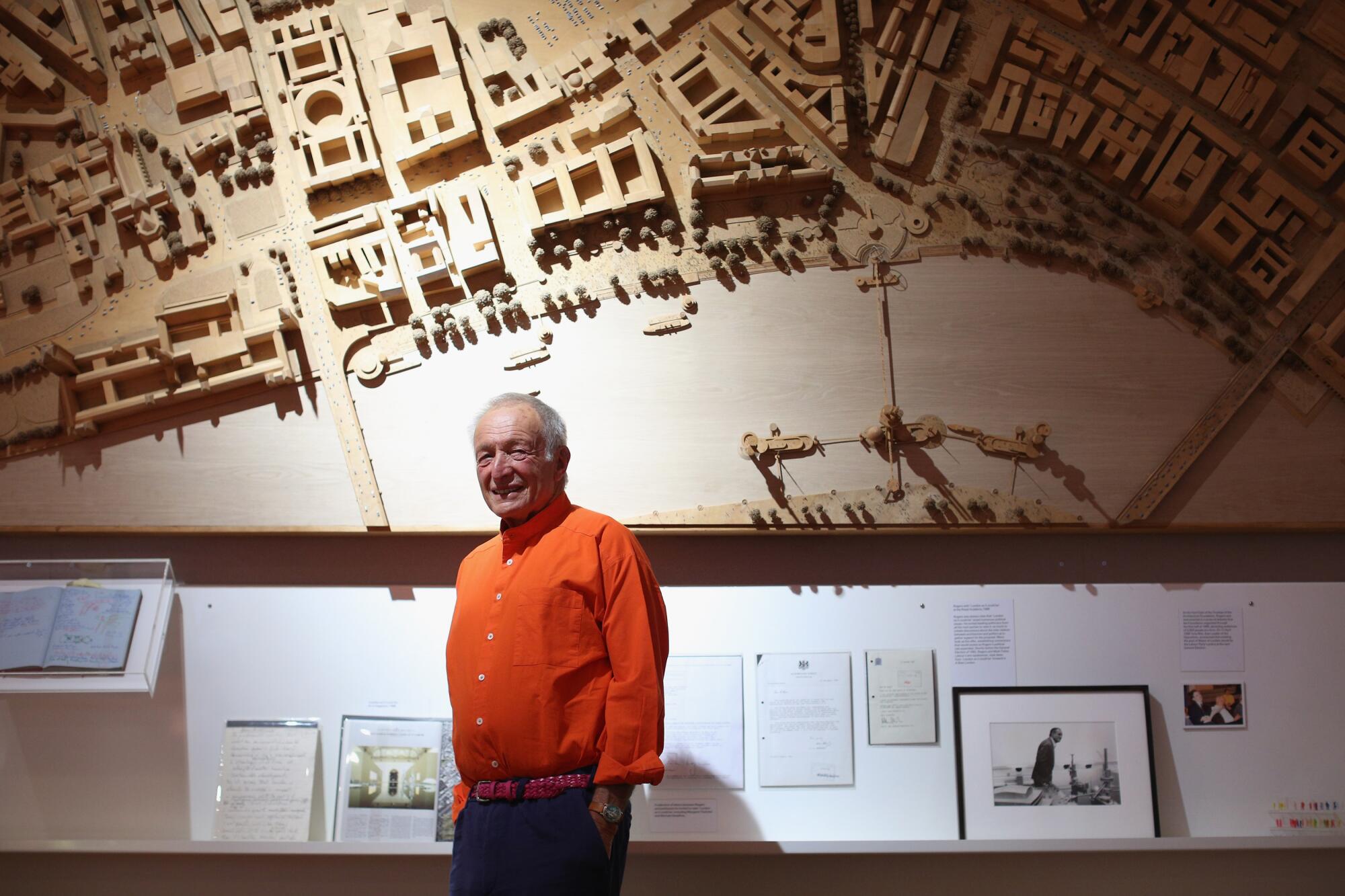
Later in his career, Rogers would become involved in advocacy issues related to the design of cities. In the late 1990s, British Prime Minister John Prescott asked him to chair a national task force on urbanism, an effort that produced a report titled “Toward an Urban Renaissance,” which examined the ways in which planning and urban design could be improved in England. In the 2000s, he served as an unpaid urbanism advisor to London Mayor Ken Livingstone.
One of the demons that Rogers frequently fought was sprawl: never-ending suburbs that plowed freeways through the countryside, were disconnected from public transportation, and where public space was treated as an afterthought. “Toward an Urban Renaissance” sounds a note of caution about British planning going the route of “the extreme forms of social isolation of many American suburbs.” As a chilling example it featured a photograph of Los Angeles: a bird’s eye view of the 110 and 105 Freeway interchange carving an indiscriminate path through South L.A.
L.A. sprawl likewise appears as a cautionary tale in his 1998 book, “Cities for a Small Planet.” He described the car as a “mobile fortress” and paints an exceedingly dour view of a desolate city center disconnected from suburbs rife with paranoias about security. (It may come as little surprise that he cites Mike Davis of “City of Quartz” fame in the process.)
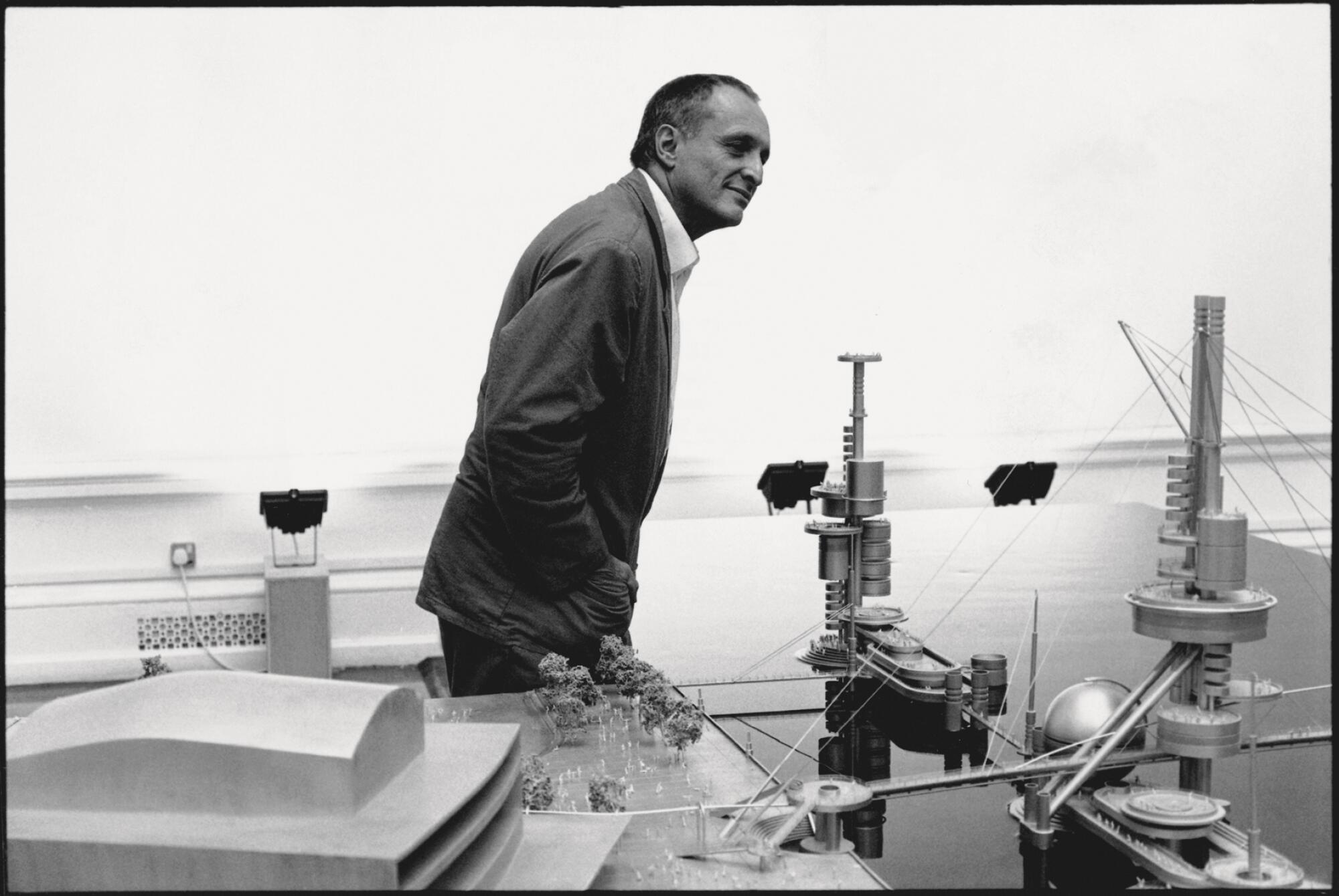
Rogers therefore committed to build only on previously developed or former industrial lands. He also aimed to shift the way the public conceives of its cities and, most significantly its public spaces — which, in his view, shouldn’t simply be occupied by cars, but instead exist as lively places of human exchange, an idea inspired by the piazzas of his native Florence.
Ask people about cities, he wrote in his book, and “they are more likely to talk about buildings and cars than streets and squares.”
At times, his preaching could be better than his practice. In a 2014 piece in the Guardian, architecture critic Oliver Wainwright was critical of the ways in which some of the “public” space designed into Rogers’ buildings consisted of public-private plazas and were, therefore, heavily policed. Even so, his ideas remain relevant — especially in Los Angeles, which is in the process of growing taller and denser.
As he wrote in an essay on CNN.com in 2017: “Everyone should be able to see a tree from their window, find a bench to sit on at a street corner, be able to walk to a small park with their children.”
Here’s to that. And here is to Rogers and his long and storied career.
The Pritzker Prize-winning Italian architect says that L.A.’s new film museum responds to the evolving city
More to Read
The biggest entertainment stories
Get our big stories about Hollywood, film, television, music, arts, culture and more right in your inbox as soon as they publish.
You may occasionally receive promotional content from the Los Angeles Times.
