Essential Arts: ItŌĆÖs time to redesign the electoral map

Election day is now election week, so thank goodness IŌĆÖve been amply supplied with bourbon and Doritos. IŌĆÖm Carolina A. Miranda, columnist at the Los Angeles Times, with your weekly dose of all things culture:
Scrap the electoral map
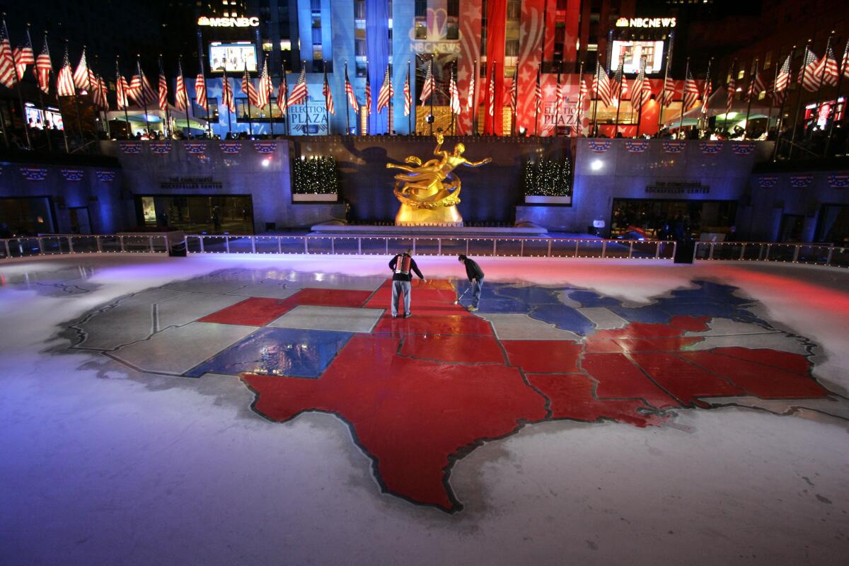
To survive a presidential election is to have the U.S. electoral map branded into our skulls. These cartographic depictions take our vast United States and reduce every nuance of politics down to a dichotomy of blue and red ŌĆö no texture permitted.
President Trump may have won Texas with nearly 5.9 million votes (as of Friday afternoon), but former Vice President Joe Biden still raked in more than 5.2 million votes in the state. This reality is not reflected in the electoral maps blanketing every news website ŌĆö leaving one to think that everybody in Texas is a Republican. (The vote tally indicates that more than 5 million people would beg to disagree.)
And what about blue-blue California, where the map overlooks the nearly 4.2 million people who voted for Trump? Or Nebraska, which actually splits its electoral votes? Biden won one of the five electoral votes in that state, yet Nebraska is nonetheless shown on most electoral maps as a sea of red ŌĆö which is not just a distortion, itŌĆÖs patently incorrect. (Kudos to MSNBCŌĆÖs exuberant Steve Kornacki for showing Nebraska marked by blue and red stripes.)
In addition, the electoral map as we know it distorts the size of the different voting populations. The state of my birth, Wyoming, is the 10th largest U.S. state by area, but with a population of only 579,000 people, it has only three electoral votes. Yet its broad swath of redness plays an outsized role in our electoral maps. New Jersey, by contrast, with 9 million people and 14 electoral votes, takes up far less room.
Naturally, this design reflects the design of our electoral system, in which the votes for president are tabulated by state in a winner-takes-all fashion ŌĆö part of the electoral college system (which, frankly, has no place in a 21st century democracy). But as these maps continue to be widely employed by media across the political spectrum, they systematically reinforce the idea that the U.S. is either Red Territory or Blue Territory without overlap or exception. And that is wrong.
In response, designers have been trying to find better, more nuanced ways to visualize election data ŌĆö such as the unusual honeycomb-patterned map, created by the politics site FiveThirtyEight, which shows electoral college votes from the 2016 election to scale. Likewise, Greg Albers, an L.A.-based digital publisher who writes about issues of digital literacy, created an experimental map that shows the U.S. in gradients of purple.
During this election, FranceŌĆÖs Le Monde has experimented with more proportional graphics, showing the number of electoral votes for each state laid over a geographical map ŌĆö so Wyoming is marked by three red blocks, while New Jersey gets 14 blue ones. And the New York Times has also been experimenting with map design on its election site, including a Blokus-style electoral votes map, but the page opens with a traditional electoral map and you have to click through to find the alternates.
This week, a series of GIF maps created by Karim Douieb, co-founder of Jetpack.AI, a data science company based in Brussels, went viral for showing different ways in which election data might be displayed in map form. His designs, first released in 2019, visualize election returns in ways that give more texture to where and how Americans are voting.
As he notes in an online presentation: ŌĆ£Acres donŌĆÖt vote, people do.ŌĆØ
Case in point, the two maps below:
Douieb says he was inspired to create his maps after seeing a tweet posted last year by Lara Trump (a former TV producer who is married to Eric Trump) that showed a traditional county-by-county map along with the inscription, ŌĆ£Try to impeach this.ŌĆØ
ŌĆ£I took that as a challenge,ŌĆØ he tells me via email. ŌĆ£The picture she was showing was plain wrong given the context. By that I mean that it is an accurate map (displaying what party won each county) but used in a misleading way.ŌĆØ
While designing better maps wonŌĆÖt fix the fractures in our electoral system, they can help tell a better story about who we are and the spaces that we share.
ŌĆ£I believe traditional electoral maps are not bad as such,ŌĆØ says Douieb, ŌĆ£but they are often used in a misleading way as they advantage geographical accuracy over electoral importance ... [And] they donŌĆÖt represent how the people voted nor are they a good representation of how the electoral system works.ŌĆØ
Make the most of L.A.
Get our guide to events and happenings in the SoCal arts scene. In your inbox once a week.
You may occasionally receive promotional content from the Los Angeles Times.
Our country is more complicated than blue and red. To illustrate that, IŌĆÖd like to go back to Wyoming ŌĆö specifically, Casper, the town where I was born. In 2017, Marcus Patrick Ellsworth reported this very wonderful story about the LGBTQ community in Casper for MTV News.
ŌĆ£There is a tendency among certain swaths of liberals and leftists to disregard entire states like Wyoming,ŌĆØ he wrote, ŌĆ£places where the populace tends to vote Republican and pass regressive laws.ŌĆØ
But look beyond the red, he adds, and youŌĆÖll find that ŌĆ£places like Casper, homes of fearless resistance waged out of necessity, shine bright with hope when seen up close.ŌĆØ
We need maps that speak to that.
Election theater and more
Performance artist and comedian Kristina Wong serves as an elected representative on her neighborhood council in Koreatown. That political journey is now fodder for a new work of theater that is streaming courtesy of the Center Theatre Group and the Broad Stage. ŌĆ£Kristina Wong for Public Office,ŌĆØ writes Times theater critic Charles McNulty, ŌĆ£champions inclusion through ironic commentary that captures our national muddles in the squabbles of a neighborhood bureaucracy.ŌĆØ Best of all? He reports that youŌĆÖll feel ŌĆ£sanerŌĆØ after the show.
McNulty also reviews ŌĆ£November,ŌĆØ a film by Phillip Youmans that is a response to poet and artist Claudia RankineŌĆÖs play ŌĆ£Help,ŌĆØ which had been in previews at the Shed in New York when the pandemic landed. At the heart of the work is a Black woman who refuses to be silenced. ŌĆ£The stageŌĆÖs loss has turned into the screenŌĆÖs gain,ŌĆØ he writes, ŌĆ£in this beautiful mixed media homage of words, bodies and images.ŌĆØ And he reports that itŌĆÖs perfectly timed for our turbulent election season.
Enjoying this newsletter? Consider subscribing to the Los Angeles Times
Your support helps us deliver the news that matters most. Become a subscriber.
Chris Mann has been a contestant on ŌĆ£The VoiceŌĆØ and the lead in a touring production of ŌĆ£The Phantom of the Opera,ŌĆØ and now he has become a viral sensation with his song parodies. He talks to The TimesŌĆÖ Michael Ordo├▒a about his new album ŌĆ£NoiseŌĆØ and his newfound fame as a parodist, which began early on in the pandemic: ŌĆ£All of my concerts are canceled ... Everyone was freaking out. Toilet paper was gone. It was panic and I came home and wrote ŌĆśMy Corona.ŌĆÖŌĆØ
And contributor Nikki Munoz reviews a socially distanced production of Jon Lawrence RiveraŌĆÖs ŌĆ£March,ŌĆØ staged in the parking garage of the LGBT CenterŌĆÖs Lily Tomlin/Jane Wagner Cultural Arts Center. The story takes place 25 years in the future ... in the middle of a pandemic.
Election landscape
Election season has filled me with lady rage. And to channel it, I highly recommend taking a gander at painter Judith BernsteinŌĆÖs bawdy, funny, righteously exasperated solo show at the Box in the Arts District. In large canvases that are wildly scatological and very acerbic, she skewers the toxic masculinity that seems to have infused just about every aspect of politics.
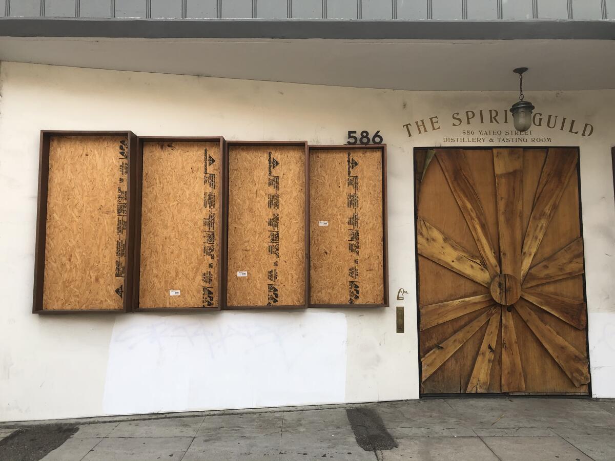
On election day, I took a tour around Los Angeles as businesses boarded up in anticipation of electoral strife. Trump got his wall. But itŌĆÖs not great. And itŌĆÖs not on the border. And Mexico is not paying for it. Instead, itŌĆÖs all over town and itŌĆÖs made from plywood. Though as I note in my visual diary, some of this architecture of unrest does make an attempt to be aesthetically pleasing.

Listening notes
This week, Mark Swed continues his deep listening tour with Osvaldo GolijovŌĆÖs 2004 song cycle ŌĆ£Ayre,ŌĆØ which focuses on songs from the Andalusian Middle Ages. The ŌĆ£often theatricalŌĆØ 40-minute, 11-part cycle, writes Swed, shows the ways in which music can embrace myriad traditions, including Jewish, Arab and Christian. ŌĆ£How little you have to change to go from one culture to another,ŌĆØ Golijov once said, ŌĆ£maybe even nothing.ŌĆØ

Find SwedŌĆÖs entire ŌĆ£How to ListenŌĆØ series right here.
L.A. fashion
As fall lands, my colleague Daniel Hernandez explores his deep sartorial appreciation of crew socks and shorts ŌĆö for the look known as ŌĆ£L.A. Guy.ŌĆØ Naturally, it means that he also gets mistaken for a ŌĆ£homieŌĆØ or a ŌĆ£choloŌĆØ ŌĆö which is ŌĆ£laughable,ŌĆØ he writes, ŌĆ£but a reality nonetheless.ŌĆØ

Essential happenings
Since we could all use a break from the doom scrolling, Matt Cooper has graciously rounded up 13 culture picks to give your cable TV-addled brain a rest. On the docket are a streamed Kylie Minogue concert and Perla BatallaŌĆÖs ŌĆ£Discoteca Batalla,ŌĆØ in a performance filmed at Royce Hall. Sounds like perfect election distraction to me.
Passages
Doran Ross, a Ghanaian arts scholar who led UCLAŌĆÖs Fowler Museum in various capacities for 20 years, has died at 73.
Robert Bechtle, a photorealist painter from the Bay Area, who was known for his depictions of the mundanities of middle-class life, is dead at 88.
Enzo Mari, a Milanese industrial designer intent on making functional objects that also brought pleasure to the worker who made them, has died at 88.
In other news
ŌĆö Mexico has asked the Vatican for the temporary return of Indigenous manuscripts, including the Codex Borgia, one of the best-preserved pre-Columbian painted manuscripts.
ŌĆö A report by the Australian Strategic Policy Institute shows that two-thirds of Uighur mosques have been destroyed or damaged as the Chinese government continues its campaign of iconoclasm.
ŌĆö The story behind the lightning bolt symbol being used in PolandŌĆÖs pro-choice marches.
ŌĆö The Philip Guston retrospective that was postponed until 2024 over uncertainty related to the content will now start touring in 2022.
ŌĆö An attempt to build a monument to Maya Angelou in San Francisco turned into a debacle. City Hall is now making amends.
ŌĆö The National Endowment of the Humanities is allocating $90,000 to repair statues toppled during the summerŌĆÖs protests.
ŌĆö ChicagoŌĆÖs Lori Waxman has a good piece on what it means when there is no critic to engage the art of a community.
ŌĆö An architecture critic won a state Senate seat in Pennsylvania.
ŌĆö A good essay about the crisis of deferred maintenance.
ŌĆö CurbedŌĆÖs Alissa Walker has the needed take on the passage of Prop. 22: ŌĆ£Uber and Lyft have proved they are able to outright purchase legislation that allows them to shape local transportation policy while actively undermining existing public services.ŌĆØ
ŌĆö It seems like a good time to read Andrew RussethŌĆÖs story about art about waiting.
ŌĆö A little bit of fashion eye candy: ballerinas photographed by Elizaveta Porodina model Carolina HerreraŌĆÖs latest.
And last but not least ...
If you want to stress eat and be high-brow about it, try these nine recipes from ancient Rome and Greece. IŌĆÖm here for the very garlicky cheese.
The biggest entertainment stories
Get our big stories about Hollywood, film, television, music, arts, culture and more right in your inbox as soon as they publish.
You may occasionally receive promotional content from the Los Angeles Times.


