Push-and-pull exercises are MayneŌĆÖs recreation
CINCINNATI ŌĆö Early in their careers, Thom Mayne and Michael Rotondi, partners in the Santa Monica firm Morphosis, often tried to shoehorn the complexities of an entire city block into a single small house or restaurant interior. During that period, the firm operated a bit like a young chef who turns every bowl of soup into a complicated culinary manifesto.
Since Rotondi left Morphosis in 1991, Mayne has moved in the direction of larger, more unified designs, an evolution that culminated in the monolithic Caltrans building downtown. But Mayne never gave up on the impulse to jam competing ideas into the same project; his 1999 Diamond Ranch High School and forthcoming federal building in San Francisco could hardly be called examples of architectural single-mindedness.
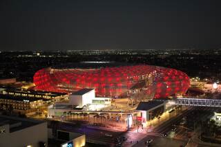
Now, in a $113-million, 350,000-square-foot recreation center for the University of Cincinnati, which will open on Monday, Mayne may have found the perfect opportunity to combine those two sides of his architectural personality, mixing the ADD-like distractibility with the Nietzschean will to power. The first project Morphosis has completed since Mayne was awarded architectureŌĆÖs highest honor, the Pritzker Prize, last spring, it is essentially five buildings folded into one. It includes a gym, a dormitory for 225 students, a food court, a curving wing of six classrooms and provides end-zone seats and locker rooms for the universityŌĆÖs football stadium, which until now was horseshoe-shaped.
The center, by Mayne and another Morphosis architect, Kristina Loock, along with the Cincinnati firm KZF Design, is boxy and, yes, monolithic on its northeastern edge, where it overlooks an open, landscaped area. On this side, dorms fill a prominent rectangular bar thatŌĆÖs propped up on concrete columns and sheathed in glinting metal panels that resemble the Caltrans facade. But the center becomes low-slung and eccentrically shaped as it moves west and south. It hews close to the arcing line of a pedestrian walkway before picking up the oval curves of the football stadium, and it tucks most of its bulk under a huge sloping roof.
Inside, its spaces are crisscrossed with massive trusses and other structural elements and bathed in light from three dozen circular skylights of varying sizes. Every level of the interior seems to offer views of dramatic spaces above and below. From the food court, you catch glimpses of the football field. From the juice bar you see the climbing wall.
The building is the last architectural puzzle piece in an ambitious plan, overseen by the landscape designer George Hargreaves, to remake the western half of the Cincinnati campus and to help the university shake its reputation as a commuter school. That $233-million Main Street project is the biggest capital effort in the history of the university, which was founded in 1819 and now enrolls 35,000 students. It squeezes projects by well-known firms -- including Gwathmey Siegel and Santa MonicaŌĆÖs Moore Ruble Yudell -- around a series of walkways and small plazas. A building for the athletic department by New York architect Bernard Tschumi, located behind the rec center and just outside the official boundaries of the plan, is scheduled to open in the spring.
Together with existing buildings by Frank Gehry, Michael Graves, Peter Eisenman and others, Main Street gives the university one of the most impressive collections of contemporary architecture on any American campus. Zaha HadidŌĆÖs 2003 Contemporary Arts Center in downtown Cincinnati, about three miles south of the university, has already become a required stop on any architectural tour of the Midwest.
HargreavesŌĆÖ goal with his Main Street design has been to use the new buildings not as icons but to bring vitality to a part of the university that for years was covered mostly by parking lots. Though the architectural results are mixed -- the Gwathmey Siegel project, in particular, is underwhelming -- the public spaces between the buildings are dynamic. And the plan has given Mayne a uniquely appropriate site -- prominent but unusually shaped -- to display his strengths as an architect.
To be sure, there are moments when he falls into familiar habits, even tics. He overloads the design with brooding, oppressive gestures, such as a walkway on the east side of the building that is squeezed under a wide overhang formed by the classroom wing above. That space promises to be depressingly dark in all but the sunniest of weather -- and Cincinnati has quite a few more days that are dreary than Santa Monica.
Some parts of the exterior are layered so thickly that every metal screen seems to beget two more. And while Mayne has tacked one of his signature oversized staircases to the west side of the building -- giving prominence and sunlight to a feature that is often empty of students -- the main entrances to the building are so anti-monumental that they become cave-like. (Inside, the dark-gray-and-chartreuse color scheme may not take long to look dated.) ItŌĆÖs as if Mayne, having dutifully shaped the building in certain areas to follow the Hargreaves blueprint, feels the need to push back against the rationality of that master plan in other ways, to make it clear that he is neither compliant nor easily cowed.
That sort of posturing has undermined MayneŌĆÖs architecture before. But in general the colliding forms of the rec center and its dramatic shifts in scale and perspective -- not to mention the changing palette of materials, which include metal panels, cement fiberboard, concrete and tile -- seem a natural response to the challenge at hand.
The result is a spatial complexity that seems a good deal less contrived than in MayneŌĆÖs earlier designs. This is a complicated building in large part because it serves a complicated set of institutional needs.
The design also proves that Mayne is capable of breathtaking interior spaces: in contrast to that walkway outside, where the architecture bears down on you, the most memorable spaces inside seem to explode up and out. Surprisingly, he has had few chances to display this ability in previous buildings. The only other American project heŌĆÖs yet completed at this scale is Caltrans, whose offices are stripped down and banal and whose entry court is far less impressive than MayneŌĆÖs rhetoric about its importance as a social mixing space would have you believe. Anyone who has spent time inside can describe the remarkable contrast between the shimmering allure of its facade and its cubicle-filled floors.
The revelation of the Cincinnati project, therefore, is its collection of spatially complex rooms. There is a sublimely large swimming facility jammed up against the northern edge of the building, so that if you are walking near the front entrance to the dormitory you are suddenly confronted with a bank of windows and can look straight down into the water.
But the star of the building -- the place where its sometimes tortured structural logic comes into dazzling focus -- is the 36,000-square-foot gym, with a four-lane running track suspended from the huge trusses that cross its 65-foot-high ceiling. This is a space that combines the imposing structural heft of a large 19th century room -- a train station arrival hall, say -- with the transparency of a modernist building, the cut-through, sectional views of a Rem Koolhaas design and some Piranesian intrigue.
Especially as viewed from the running track, it is among the most dramatically impressive interior spaces produced by any firm in the last decade. Architecture students will be studying images of it 30 years from now.
More to Read
The biggest entertainment stories
Get our big stories about Hollywood, film, television, music, arts, culture and more right in your inbox as soon as they publish.
You may occasionally receive promotional content from the Los Angeles Times.


