Grand, Yes, but Public Expects More
When the New York developer Related Cos. hired Frank Gehry to design the $750-million first phase of its huge mixed-use project along Grand Avenue, directly across from GehryŌĆÖs Walt Disney Concert Hall, the deal immediately raised eyebrows -- and more than a few architectural questions.
Would Related, which usually works with corporate firms on high-end developments, pull Gehry in the direction of sleek, well-behaved commercialism? Would Gehry drag Related toward the exuberant, democratic spirit of his iconic cultural buildings?
Today, the city gets its first look at plans for the site. They suggest that so far, in that tug of war between architect and client, Related is hardly breaking a sweat.
ItŌĆÖs early, of course. Quite a few architectural details -- including the facades of the two towers that will loom over the site -- are not yet worked out. But that unfinished state makes the planŌĆÖs priorities easier to read. Its attitude toward the city is laid bare in these models, and, stripped of architectural flourish, they reveal a project a good deal less public-minded than many of us had hoped.
There is a lot to admire in the design, to be sure. Working with partner Craig Webb, Gehry has created an architectural ensemble that despite its huge scale and boisterous forms plays subtly off the extroversion of Disney Hall. Where the concert hall is a study in convex curves, with not just the walls of its auditorium but also its exterior radiating outward, the new complex has a concave shape.
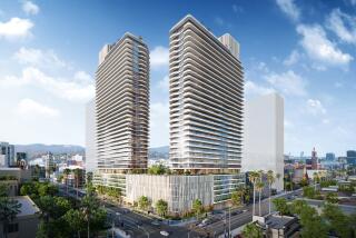
Each of its two towers is L-shaped, in elevation as well as in footprint, and connected by a multilevel collection of shops. Pushed to the extreme edges of the site, and designed to frame and maximize views of Disney Hall, the towers enclose the site like a pair of cupped hands.
The design also reflects a recent evolution in GehryŌĆÖs formal language.
The new buildings -- particularly the pair of four-story retail pavilions on Grand near 1st Street -- are angular and planar while the Disney facade is undulating. The pavilions will be largely transparent -- glass alternating with giant tilting slabs of limestone at street level and more glass sheathing the towers above -- while the shimmering concert hall is opaque.
With landscaping by Laurie Olin hanging down from the upper levels of the retail spaces, the models suggest a dynamic interplay along Grand of architecture, signage and greenery.
The relationship between the towers -- GehryŌĆÖs first L.A. high-rises -- promises to be highly effective as well. The 47-story building at 2nd Street and Grand, which will contain high-end condos on its upper floors and a luxury hotel below, will be fluid and feminine, encased in a loose drape of glass. (Gehry hasnŌĆÖt decided exactly what kind of drape: It may be a pleated form or it may be a curtain-wall with a pinstripe effect created by a vertical ceramic frit.) The 24-story tower, at 1st and Olive Streets, will be squared off and less expressionistic: a foil, the architects say, to the dramatic forms of its neighbor.
It is precisely this collection of assured urban gestures, though, that throws the stubbornness of the remaining challenges into high relief. Particularly on its lower levels, the design is clogged with retail space -- 250,000 square feet of it in total above a labyrinth of underground parking. As a result, the project is shaping up as something of a commercial cul-de-sac: a place thatŌĆÖs designed, like a casino or a mall, to make getting in easier than getting out or walking through. The spaces between the retail buildings that will line Grand, facing Disney Hall, are inviting and generous, as are the connections to parking garages along 1st and 2nd streets. The openings on the downhill side, along Olive, are pinched off and noticeably less welcoming.
In most mixed-use developments, such a layout would be a given, barely worth comment. This one, however, is rising on land owned by the city and county, adjacent to a civic park the developer is helping to finance. Its path has been smoothed by the Grand Avenue Committee, led by Eli Broad, and a joint powers agreement between the city and county. The public is rightly expecting that along with apartments, condos and a place to get a drink before a performance at Disney Hall, the first phase of the project will create a fluid, reasonably porous connection between Bunker Hill and the rest of downtown.
In cities, successful outdoor spaces require a balance between openness and density that leaves some room for whim, even wandering. Purely commercial development, on the other hand, follows a deterministic model, in which shoppers are guided by the architecture to behave, and spend, in predictable ways. Unless Related and Gehry can figure out a way to carve out more undedicated space on the lower levels, this project will have trouble reaching its civic potential.
That space doesnŌĆÖt have to be a grand plaza with sculptures and a fountain. Gehry and Webb pushed, for example, for an escalator at the corner of 2nd and Olive that would open that edge of the development and draw pedestrians in and through the project. Related, which would prefer that most of its customers arrive by car or from Disney Hall, insisted that the escalator be built several yards north, away from the corner, and that it take visitors directly into a bookstore that will occupy a multilevel space there. You can guess where the escalator wound up.
Even on the main plaza, opening up from the sidewalk along Grand, there are spots where the design could take a more public stance. The axis running through the plaza from 1st to 2nd streets, which will become a crucial passageway leading to the new civic park if the Stanley Mosk Courthouse is eventually relocated, is too cramped, for example, as is the staircase leading down to 1st Street.
These are the decisions that determine how a new development greets the city and, in turn, how it helps shape the neighborhood around it. Indeed, what seemed to make this project more promising than all the other starry-eyed plans to remake Bunker Hill over the last half century is that its goals -- BroadŌĆÖs references to the Champs Elysees notwithstanding -- seemed practicable.
Instead of seeking to turn downtown into the absolute center of Los Angeles, the elusive aim of those much-hyped earlier projects, it appeared this one might focus on making downtown more vital and friendlier to pedestrians and on knitting together its collection of architectural icons. Once Gehry, who was part of a design team that nearly won a Grand Avenue competition in 1979, was on board, those goals seemed more reachable.
The stakes in this project are high not just for L.A. but also nationally, because it offers a crucial test for the public-private partnership model that is coming to dominate city-making in this country. The governmentŌĆÖs commitment to the public realm -- even the phrase sounds creakingly archaic these days -- has withered to almost nothing.
Instead we are experimenting with a new approach that asks developers to build quasi-public space, ringed with retail, in exchange for land, streamlined approval or help with the bottom line. If Gehry, who has amassed more cultural capital for negotiating with developers than any other architect in the country, canŌĆÖt make the method work in his own backyard, itŌĆÖs hard to imagine it succeeding anywhere.
ŌĆ£You have to pay for the public life,ŌĆØ the late architect Charles Moore suggested in a prescient 1965 essay, just as this shift in American culture was emerging. But even Moore might be surprised how steep the price has become.
*
Hawthorne is The TimesŌĆÖ architecture critic.
More to Read
The biggest entertainment stories
Get our big stories about Hollywood, film, television, music, arts, culture and more right in your inbox as soon as they publish.
You may occasionally receive promotional content from the Los Angeles Times.


