Marriage of Minds
For architect Glen Irani and his wife, artist Edith Beaucage, their two-story modern home on a narrow lot on a Venice canal represents a fusion of talents. ŌĆ£Both our work revolves around light, color and the language of forms,ŌĆØ says Quebec-born Beaucage, whose abstract canvases reflect exuberant free-form shapes in eye-popping colors. ŌĆ£Glen brings more structure to my work and I bring color and less structure to his. We have a little collaboration going on.ŌĆØ
The 3,000-square-foot home, which incorporates IraniŌĆÖs architectural office and BeaucageŌĆÖs painting studio, is the second the couple have built in the bohemian enclave in the past five years. Like their first canal home, itŌĆÖs a marriage of linear and organic forms. ŌĆ£People respond to gestures of natural form, as well as to the more rigid classical orders and geometries,ŌĆØ says Irani, who worked with both Richard Meier and John Lautner before establishing his own firm in 1995. ŌĆ£The two bookends of influence for me are LautnerŌĆÖs organic style and the strong order of MeierŌĆÖs. Working for both taught me that each are important.ŌĆØ
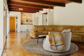
In that spirit, Irani juxtaposed the rectilinear lines of his Modernist home with an amoeboid-shaped gravel garden reminiscent of the figures in his wifeŌĆÖs paintings; a nautilus-shaped stairwell leading to his upstairs studio adds a sensuous fluidity in the narrow side garden. Inside, the architect throws more curves in his rounded Pad chairs, boomerang-shaped den sofa, and kitchen cabinetry. ŌĆ£The softness of the forms makes it more pleasing to your eye and helps with the transition from one space to another,ŌĆØ says Irani. ŌĆ£ItŌĆÖs also more body-friendly to brush against something rounded than something sharp.ŌĆØ
Outdoors, BeaucageŌĆÖs pavers of tinted concrete create playful free-form paths leading to the houseŌĆÖs pair of entrances. ŌĆ£Glen came up with the shape of the garden, I designed the pavers in the same spirit,ŌĆØ says the artist, who hand-cut wooden molds, then poured in concrete, unmolding them when they were dry in a spectrum of light-to-dark blue shapes. ŌĆ£It was like making a batch of very large cookies,ŌĆØ she says, laughing. Furnishings and art in a harmonious blend of shapes, textures and colors decorate the loft-like living, dining and kitchen area on the first floor. A multi-height divider of maple and cherry panels separates the kitchen from the living room, while a grid of alternating maple veneers of quarter-sawn and plain-sliced grains faces the fireplace and kitchen wall. ŌĆ£I didnŌĆÖt want the paneling to match, but instead to create a texture and pattern that was more active. I wanted to show an attention to detail and love for the wood,ŌĆØ explains Irani, who laid out more that 150 sheets to select the final two dozen that were ultimately used. ŌĆ£I drove the supplier crazy.ŌĆØ
Modern furnishings--both IraniŌĆÖs designs and a few mid-century pieces--in a Necco-wafer sampling of hues decorate the space while white paper lanterns sway with incoming breezes. ŌĆ£Every room in the house is based on a painting palette,ŌĆØ says Beaucage, who used Johannes IttenŌĆÖs color wheel, a scientific basis of color harmony developed in the ŌĆś20s by the color theorist who once taught at the Bauhaus. ŌĆ£The orange, blue and violet living room painting, turquoise and purple chairs and deep-plum sofa, as well as the colors of the wood paneling and deck and the grayish hue of the stainless steel, were all harmonized together like a painting,ŌĆØ she explains. ŌĆ£The colors each have a correspondence to one another. ItŌĆÖs really all about light.ŌĆØ
The couple also collaborated in the kitchen, where cabinets are topped with translucent plastic shadowboxes. ŌĆ£I was working on boxes with transparent layers of acetate--like my paintings--and Glen thought they would make an interesting counter top,ŌĆØ says Beaucage, who used the imagery of a golf-course landscape as seen from above to create miniature sculptural lagoons, dunes and rounded mounds just beneath the counterŌĆÖs surface. ŌĆ£We kept it translucent to make it more intriguing,ŌĆØ says the artist. ŌĆ£We wanted an element of mystery.ŌĆØ Tucked behind the kitchen is the homeŌĆÖs central stairway, which leads to the master bedroom, work areas and roof garden. Cut out and sculpted much like a tree trunk, the stairway commemorates a Monterey cypress that grew on the lot but which the architect was unable to save. Thirteen punched openings of varying sizes on the side wall admit light as if through a leafy canopy, while thick maple plank stairs resemble the ladder of a tree house. ŌĆ£ItŌĆÖs my abstract metaphor for a tree,ŌĆØ says Irani. ŌĆ£When I sit in the house IŌĆÖm always aware of its composition,ŌĆØ muses Beaucage, ŌĆ£from the frameless mitered window in my studio that almost seems like itŌĆÖs not there to the ceiling in GlenŌĆÖs office that looks like a rolling wave. Architecture is like a three-dimensional painting filled with light and space.ŌĆØ
More to Read
The biggest entertainment stories
Get our big stories about Hollywood, film, television, music, arts, culture and more right in your inbox as soon as they publish.
You may occasionally receive promotional content from the Los Angeles Times.


