Classic & Kitschy
- Share via
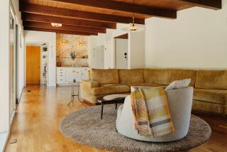
Michael Giaimo had just finished art directing Disney’s “Pocahantas” three years ago when he decided to take a well-earned sabbatical. A little more than a week later, he owned a new home. “I wasn’t seriously looking. On a lark, I said to a real estate friend: ‘If you ever find a post-and-beam, mid-century home with an open floor plan, studio space, a great view and a courtyard with a pool--call me.’ ” A few days later, Giaimo’s friend showed him a 1953 light-filled Silver Lake house designed by architect Edward Fickett. As Giaimo describes it: “It was love at first sight.”
The animation artist approached decorating his new home, situated only 10 doors away from his old one, as if he were art directing a movie. “I did a lot of research about the period first, then set about looking for the right elements,” he explains. “It’s so easy to make a house filled with period furniture look like a furniture showroom. I wanted to personalize it.” In two years, about half the time it took to make “Pocahantas,” Giaimo’s 2,600-square-foot house boasted modern classics such as an Eero Saarinen pedestal table and chairs in the kitchen and a George Nelson platform bench in the living room, as well as less-pedigreed finds such as ‘50s lamps, planters and biomorphic clocks. “Mid-century furnishings generally fall into two types: kitsch and classics,” Giaimo says. “A house full of either one exclusively is uninteresting. I like the mix.”
But it’s the eye-popping colors of the accessories that enliven the interiors and most reflect Giaimo the artist. “I wanted a Technicolor look, not garish, but playful,” explains Giaimo, who is currently working on another animated Disney feature to be released shortly after the millennium. “In my work, I try to bring an emotional resonance through design and color. That’s what I wanted to do with the house.” To that end, an electric blue Saarinen “Womb” chair stands between a turquoise plastic planter and an orange plexiglass floor lamp. In the same room are a fuchsia “Easy” armchair by Pierre Paulin and a pair of red “Corona” chairs by Poul Volther.
In addition, Giaimo’s own brightly colored paintings, influenced by ‘50s textiles, hang on the walls. To give colors “something to bounce off,” Giaimo painted all rooms gallery white and installed neutral-colored wool sisal carpet. He also used plenty of honey-colored woods. “I didn’t want the house to feel austere and cold,” he says. “I wanted the warmth of wood to work with the crisp, cool lines of the architecture.” Summing up his style as “elegant whimsy,” Giaimo insists: “Even if people can’t embrace this kind of architecture, at least the furnishings should make them smile a little.”


