ARCHITECTURE : Fantasy! Thrills! Dazzling! A 10! And ThatŌĆÖs Just the Theater Itself
PacificŌĆÖs El Capitan Theatre offers the most magnificent movie-going experience you can find beyond the arms of MannŌĆÖs Chinese. After decades of decay and a preservation scuffle, this former live-performance theater has become the showplace for Disney films.
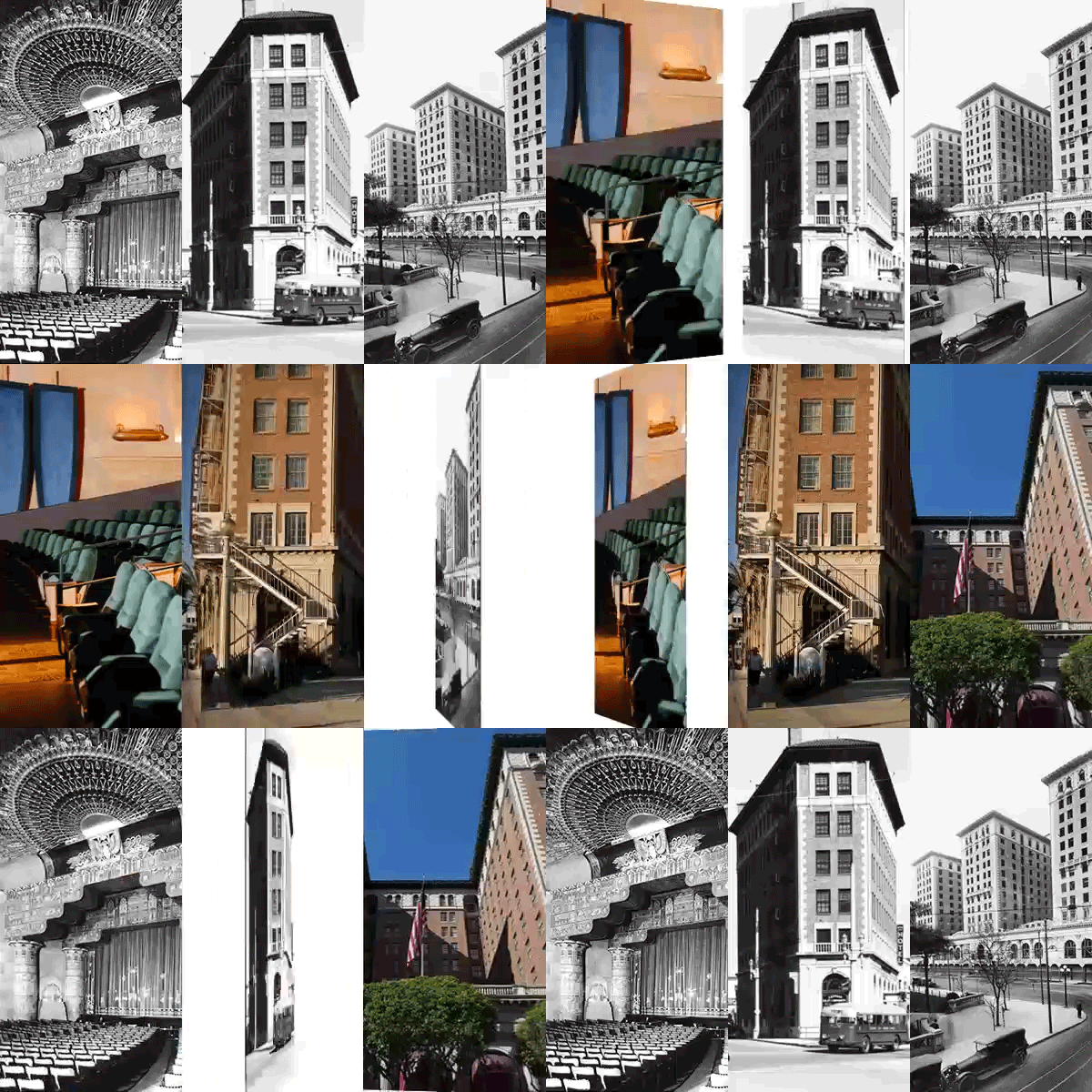
As you wander through the low-ceilinged lobbies and take your seat in the lush auditorium, you will find yourself transported into a 1920s fantasy of exotic splendor restored with all the loving care that money and the lust for prestige can buy. This is ŌĆ£imagineeringŌĆØ (what Disney calls the process by which it designs its fantastic theme parks) with a twist: starting from a real building, Disney has created an illusion of a spectacle.
The El Capitan was always a flashy showstopper. When developer Charles E. Toberman commissioned the kings of Art Deco L.A., the architecture firm of Morgan, Walls & Clements, to create a rectangular box that encased ŌĆ£HollywoodŌĆÖs Temple of Spoken DramaŌĆØ in a layer of leasable office space, he was intent on competing with the silver screens that were then cropping up along Hollywood Boulevard. He chose the firm that also gave us the Wiltern, the Samson Tire Factory and the Mayan Theater.
In response, Morgan, Walls & Clements in 1926 created a restrained facade festooned with an elaborate marquee (now jazzed up with lots of neon). Working with theater designer G. Albert Lansburgh, they developed interior spaces that made up with a surfeit of decoration for what they lacked in spatial drama.
Every inch of space in El Capitan is painted, garlanded, gilded or stenciled. The main motif is a kind of basket weave of filigree or lozenges, but there really is not much that makes it all pull together other than the layering of hues and patterns. The interior is a tapestry in three dimensions, a coat of so many colors that the eye is dazzled into the kind of suspension of belief demanded both in a theater and for the appreciation of this kind of eclectic architecture.
After a while, though, you begin to sense a model for this kind of fantastic raiment: It is done in the Churriguesque, which is a name for the kind of peasant baroque we know in California from Mission churches and other Mexican religious structures. Updated with Art Deco dash and boosted by concealed lighting, the rough but religious aura of this kind of architecture suffuses this temple of stage and screen.
The other great blessing that the auditorium of El Capitan offers is its configuration. It is tall and narrow, with a large balcony (to be as close to the actors on stage as possible). As a result, the screen can overwhelm you. This is no cineplex shoe box, but a spectacle with rays of decoration that seem to arch over you as you sink, suitably humbled, into your chair.
Too bad that everything new that has been added to make the place work as a ŌĆ£film exhibition locationŌĆØ is horrid. The run-of-the-mill candy counter, the ridiculous cartoon of flapper-era scenes painted on one of the walls, and the sequined inner curtain that parts when the movie starts make you realize how unimaginative we have become in the past 60 years.
Disney originally had no intention of preserving the interior quite as magnificently as it has, but alert preservationists forced the companyŌĆÖs hand. Once given the go-ahead, restoration architect Martin Eli Weil did a magnificent job, leaving the firm of Fields & Devereaux and theater consultant Joseph Musil (along with forces like building codes, the operatorŌĆÖs ways of doing things and the client) to blame for the contemporary missteps.
If you squint a little, you now have a place where viewing ŌĆ£101 DalmatiansŌĆØ or even the recent ŌĆ£NewsiesŌĆØ can be a bit of a religious experience.
More to Read
The biggest entertainment stories
Get our big stories about Hollywood, film, television, music, arts, culture and more right in your inbox as soon as they publish.
You may occasionally receive promotional content from the Los Angeles Times.


