Design : TURNING INWARD . . . A SPECIAL REPORT ON THE PEOPLE AND IDEAS THAT ARE SHAPING OUR HOMES, OFFICES AND STYLES OF LIVING : Mix It Up : Making the Old Work Along With the New
ŌĆ£Sweets to the sweet,ŌĆØ says HamletŌĆÖs mother, Queen Gertrude, when strewing flowers on OpheliaŌĆÖs grave. Some people believe in ŌĆ£Antiques to the antiqueŌĆØ--the idea that old objets dŌĆÖart should be shown in settings of the appropriate periods, in paneled rooms or under neoclassical ceilings of molded plaster.
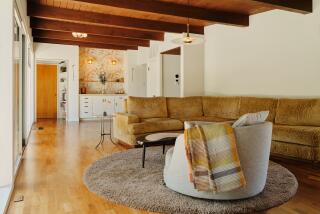
But another school of interior designers thinks that antiques can be used to give accents and focal points to new interiors that might otherwise be simple to the point of sterility. They suggest that antiques look better in contemporary rooms, where they donŌĆÖt have to compete with Corinthian columns or blend in with the tapestries, but stand out as conversation pieces. Traditionalists continue to regard such mixtures of old and new with the horror of a gourmet confronted with a surf ŌĆśnŌĆÖ turf dish.
ŌĆ£Too many people are afraid of mixing old and new furnishings,ŌĆØ said B. J. Turner, showroom manager of Connoisseur Antiques, 8478 Melrose Place. ŌĆ£But the different styles can complement each other very favorably. In stark modern rooms, you get some intimacy and homeliness from the old wooden pieces.ŌĆØ
Charles Pollock of Charles Pollock Antiques, 8478 Melrose Place, agrees. ŌĆ£Antique accessories take the hard edge off the modern look,ŌĆØ he said. ŌĆ£We find that most of our clientele do their decorating in this general manner, of mixing comfortable contemporary seating and contemporary backgrounds, with focal pieces which may be Oriental, or perhaps Biedermeier (a solid, neoclassical style of furniture popular in Germany and Austria circa 1820-50).ŌĆØ
Pollock mentioned two pieces currently in stock that he thought would make good focal points in a modern setting: an art nouveau lamp in the form of a monkey ($2,700) or an iron-red Chinese Coromandel screen ($120,000). Pollock said that most modern design tends toward casualness: Antiques can give a bracing dash of formality. ŌĆ£Gilt is back in now. ItŌĆÖs like the right pin on a black dress, the right accessory. ItŌĆÖs the elegant final touch that really sets off the design,ŌĆØ he said.
John and Louise Good of John Good Imports, 469 Melrose Place, think that a French 18th-Century china cabinet looks fine against the stark white of a kitchen; 17th-Century Italian altar pieces serve as end tables at either side of a sofa.
Kurt Nielson of Morey Palmer Associates, 8457 Melrose Place, said, ŌĆ£You can mix more or less anything. The eclectic look is easy to live with.ŌĆØ Pressed to think of a modern setting and an antique that would not mix, he replied: ŌĆ£There are almost no rules to this game.ŌĆØ He suggested as an ensemble that would enhance any modern setting, a French 18th-Century console ($4,600) with, above it, a Dutch 19th-Century mirror framed in repousse brass ($11,250).
As a contrast to these galleries of museum-like elegance, Don Badertscher, 716-A N. La Cienega Blvd., has narrow corridors crammed with anything from good-quality antiques to purest junk. Visiting his store is like going on an antiques safari. In the upper range is a wood sailor figure looking through a telescope, at $3,000. But there are also old rows of theater seats, some hat pegs, a turn-of-the-century toilet pedestal decorated with blue flowers and a plastic champagne bucket in the form of a top hat.
Art Deco pieces of the 1920s and ŌĆś30s in contemporary rooms cause fewer culture-shock waves than Louis XV furniture with oodles of gilt, marquetry and tumbling cherubs. For the last 12 years, Maddie and David Sadofski have run Thanks for the Memories, an Art Deco shop at 8319 Melrose Ave. Perhaps overstating the case a little, they believe that Art Deco is the beginning of modern, and ŌĆ£everything you see today is just an extension of that period.ŌĆØ As well as stylish pieces of furniture, such as a semi-circular 1930s desk by Gilbert Rohde (1894-1944) in glass and black-lacquered wood, the Sadofskis often have old telephones, radios and electric clocks. You can even buy from them a pair of 1930s doctorŌĆÖs health scales ($3,200), a pre-World War II touch for the bathroom.
A ŌĆ£periodŌĆØ bathroom is not an entirely new idea. In his short story ŌĆ£TotentanzŌĆØ (ŌĆ£Such Darling Dodos,ŌĆØ 1950), British writer Angus Wilson described an interior decorator refurbishing a London mansion. ŌĆ£His greatest triumph of all was a large lavatory with tubular furniture, American cloth and cacti in pots. ŌĆśLetŌĆÖs have a dear old prewar lav in the nice old-fashioned Munich style,ŌĆÖ he had said, and the Cappers, wondering, agreed.ŌĆØ
Art Deco lighting fixtures look particularly good in modern rooms. Thanks for the Memories has a majestic chromium-plated chandelier that was filmed in the 1937 movie ŌĆ£Topper,ŌĆØ starring Cary Grant and Constance Bennett. That is priced at $12,000. Less expensive fixtures, including a chandelier in the form of Saturn, can be found at Papillon, which has showrooms at 8111 Melrose Ave. and at 13830 Ventura Blvd., Sherman Oaks.
ŌĆ£Art Deco was originally designed to go in very austere settings in order to accent very plain walls without a lot of fabric on them, without a lot of draperies,ŌĆØ said Martin Wolpert of Papillon. ŌĆ£So Art Deco is probably the most appropriate of all pre-World War II things to go in that type of decor. Maybe thatŌĆÖs why itŌĆÖs so popular now.ŌĆØ
A quick, easy and comparatively inexpensive way to give a modern room a garnish of the antique is to hang old prints--engravings, etchings, aquatints, mezzotints--on the walls. Gideon Gallery, 8748 Melrose Ave., has a good selection of hunt scenes, fashion prints and mezzotint portraits.


